The year 1917 was anything but uneventful. Though the First World War had been raging across Europe, Africa, and the Asia-Pacific region for 3 years, America finally joined the fight and declared war against Germany in the spring, just a month after Russia’s Czar Nicholas II abdicated in the wake of the revolution. Some might argue that this would be a poor time to launch a publication, especially one focused on business and entrepreneurship.

However, world events, as monumentous as they may have been, did not dissuade Bertie Charles (B.C.) Forbes and his business partner Walter Drey, nor did they stop readers from eagerly consuming what Forbes produced.
Forbes Magazine has withstood the test of time and survived the Great Depression, the Second World War, and the birth of a new millennium to emerge as one of the most influential business publications in the world. Today, they receive over 150 million website visits and reach more than 5 million print readers each month. Nearly 9 out of 10 C-suite executives say they use products and services recommended by Forbes to improve their companies, and 93% of high-net-worth individuals base financial and investment decisions on advice from Forbes.
The world has changed drastically since the first edition of Forbes magazine hit shelves, and so has the brand’s logo. As a purveyor of words and ideas, Forbes has consistently chosen a simple wordmark to represent their business, though they have been unafraid to experiment with the style to help them stay relevant throughout the decades.
A Brief History of Forbes Magazine
B.C. Forbes was born to a large working-class family in Scotland on May 14, 1880. By the age of 14, he had taught himself shorthand and earned a position as an apprentice at the Dundee Courier.

When he was 21, he went to South Africa to cover the Boer War and eventually became a journalist with the Rand Daily Mail in Johannesburg. He first emigrated to the U.S. in 1904 to work at the Journal of Commerce in New York City. By 1911, he had established a strong network of contact with rich and powerful business magnates. Seeing an opportunity for exclusive content, W.R. Hearst brought Forbes onto the New York American as a columnist and editor.
Forbes’ passion was entrepreneurship, and his unique style of financial reporting focused on the men behind the businesses they ran. He initially wanted to call his magazine Doers and Doings, but was persuaded to use his last name, as was common at the time. He was fascinated by business owners who weren’t afraid to take chances, but he was very critical of those who he felt abused their employees. In the very first issue of his magazine, he said, “Business was originated to produce happiness, not to pile up millions.”
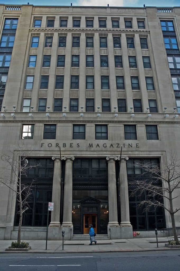
The first issue of Forbes Magazine was published on September 15, 1917, the same day that Russia declared itself a republic.
The magazine thrived during the 1920s, and B.C. Forbes turned down an offer from William Randolph Hearst to buy the magazine for a considerable sum in 1928. He would later question his decision, as the magazine barely survived the Great Depression.
However, the magazine recovered quickly in the post-war period, especially after Bruce and Malcolm Forbes joined their father in the family business. In January 1949, Forbes Magazine introduced its annual report card of
businesses and industries. In 1982, the magazine introduced the Forbes 400 list, ranking the 400 richest Americans. From then on, Forbes became known for its lists, such as the annual 30 Under 30 report. An online version of the publication, Forbes.com, hit the web in 1996.
Forbes Magazine has stayed within the Forbes family for over 100 years. B.C. Forbes’ grandson, Steve Forbes, son of Malcolm Forbes, currently serves as editor-in-chief.
History of the Forbes Logo, 1917-Present
The logo B.C. Forbes printed on the first edition of his magazine is strikingly different from the logo used by the Forbes brand today. However, we can trace its evolution along a continuous line over the past century as the Forbes family responded to world events and shifting design sensibilities.

1917-1918
By the time B.C. Forbes launched his magazine, Europe and America were thoroughly industrialized. The business leaders Forbes celebrated were making life easier and goods more accessible. However, many people felt that mass-produced goods were lower quality than traditional handmade products. In the late 19th century, the arts and crafts movement encouraged a return to handcrafted goods. The movement even had an effect on printing and typography.
The first Forbes logo from 1917 uses a bold, uppercase typeface accented with swashes that call to mind old-fashioned calligraphy in hand-copied books. It might seem at odds to use a design style inspired by independent craftsmanship for a magazine about industrial business leaders, but it nicely ties together and represents Forbes’ philosophy on business: entrepreneurship was an art in its own right.

1918-1922
Forbes Magazine did not keep its original logo for long. While world events did not delay the magazine’s debut, they likely had an impact on the logo. Within 12 months of the magazine’s first issue, WWI–at the time referred to as “The War to End All Wars”–came to an end, and the devastating 1918 flu pandemic was sweeping across the globe. Between artillery shells, mustard gas, and disease, the world witnessed a formerly unthinkable death toll in a few short years, especially of young, formerly healthy people.
World War I was the final nail in the coffin of the Victorian era’s flowery idealism, and the art and design of the period showed it. We can even see it reflected in Forbes’ logo. The more ornate typeface of the first issues was replaced with a much simpler, though still subtly elegant, wordmark. This logo featured a much thinner typeface with classic, clean serifs and elongated lines.
1922-1924
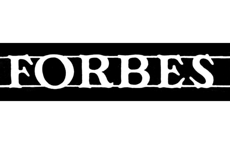
As America transitioned into the roaring 20s, Forbes Magazine added some ornamental touches back into its logo, though not to the same degree as its very first logo. The curved serifs on the ends of the letters are reminiscent of more subdued swashes.
The magazine also inverted the color palette. Instead of black letters, they used white letters on a black rectangle with two parallel white lines framing the top and bottom of the word mark. This ensured there was enough contrast between the title and the background to make the logo pop.
1924-1925
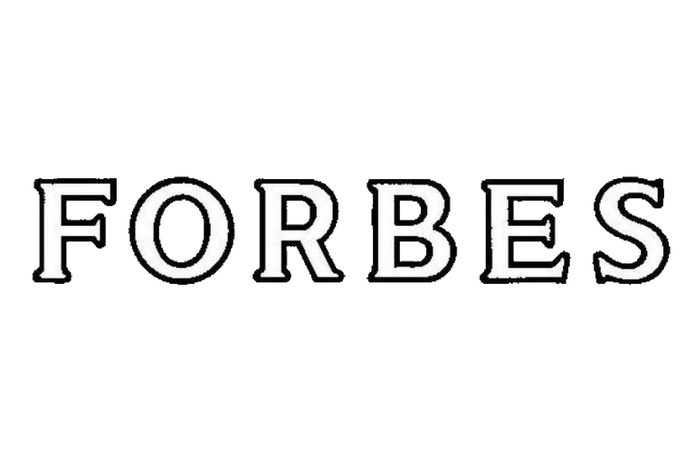
The white logo on a black rectangular emblem had advantages and disadvantages. While it ensured that the logo was always legible, it limited cover design options. The front cover always had to be designed around the logo, and the emblem itself could look clunky and awkward. Forbes streamlined the logo by replacing the rectangle with a thin black outline around the white letters. This made the logo more versatile as it took up less space but was still easy to read on any background.
The typeface itself only underwent a few modifications. The curved serifs were flattened out, moving away from the Arts and Crafts style and toward a more polished look.

1925-1930
Forbes stuck with the outlined white letters for the rest of the 20s, but they continued to make modifications.
A year later, they refined the typeface to be taller and skinnier with shorter crossbars.
This may have borrowed inspiration from the decade’s art-deco design fad, which emphasized vertical lines.

1930-1934
By 1930, America was caught in the throes of the Great Depression, and it was not a good time to be a business owner. When most people were losing their jobs and businesses, they didn’t want to read about the doings of America’s business moguls. The logotype Forbes used during the height of the depression returned to solid black letters featuring sharp angles. Overall, the typeface had a very industrial look, reminiscent of a local newspaper. This version of the logo looks more modern and practical. It positioned Forbes as a reliable news source for information regarding the economy and business market. Given that Forbes struggled financially throughout the Depression, this simplified logo may have also been a means of conserving costs.

1934-1937
In the latter half of the 1930s, Forbes suddenly took the logo in a brand new direction. It replaced chunky, all-caps lettering with a more delicate cursive logotype. Not only was this the first Forbes logo to incorporate lowercase letters, but the whole wordmark is made from a single thin black line. Throughout the years, many people have noticed that this version of the Forbes logo is strikingly similar to the Ford logo. Henry Ford revolutionized the automotive industry with his assembly process and the entire labor market by introducing a living wage and a 40-hour work week for his workers. He was exactly the kind of forward-thinker Forbes would have admired.

1937
In 1937, Forbes briefly experimented with Paul Renner’s Futura font, a modern sans-serif typeface inspired by the Bauhaus design style.
Futura was designed to be simple and easy to standardize so it could be reproduced almost anywhere.
The use of perfect geometric shapes, such as the perfectly circular “O,” was meant to distinguish the heavily mechanized font from scripts that tried to imitate individual handwriting.

1937-1938
The Futura logo did not last long. Within the same year, Forbes brought back the handwritten script logotype, this time with a slightly bolder, chunkier line.

1938
It wasn’t long before Forbes decided to change the logo again, this time returning to white letters with a black outline like they had in the 1920s. This time, however, they also added a drop shadow effect for extra impact.
1938-1939
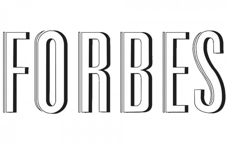
In 1938 alone, Forbes had 3 separate logos. They continued to play with white letters outlined in black with a drop shadow, but this time, they made the letters taller and thinner and added contour strips. Especially with the contour strips, this logo once again called to mind the design sensibilities of the Art Deco style.

1939-1953
By 1939, after nearly two decades, Art Deco had finally fallen out of style. That same year, World War II began in Europe, though America would not join the fighting for more than two years. However, it is not possible to look at the blocky, industrial stenciled style of the logo Forbes debuted in 1939 and not think of similar lettering styles used in military applications. Forbes would keep this logo throughout the Second World War and into the early 1950s, and it would set the tone for their future logos as well.
1953-1966
In 1953, as America fully embraced the “post-war” era, the brand ditched the stenciled logotype but kept a similar silhouette. They continued to use all-caps serifed black letters with heavy downstrokes and light crossbars, although the overall line weight was lighter than before. This version of the logo made the “F” larger than the rest of the letters in the word for impact.

1966-1973
In the 1960s and 70s, graphic design showed a preference for clean, simple, sans-serif fonts. At the same time, Forbes started to move away from the serifed version of its logo. In 1966, Forbes introduced a new logo based on the Univers font. Like Helvetica, Univers was a member of the neo-grotesque font group. Neo-grotesque fonts were designed to be simple and versatile with consistent portions and shapes so they could be used in many different means of production. However, Forbes updated the basic Univers font to include small serifs.

1973-1977
Throughout the latter part of the 70s, Forbes continued to follow graphic design trends and favor simple, sans-serif fonts. In 1973, they removed the serifs from the wordmark entirely but otherwise kept the logo mostly the same.

1977-1978
The logo used from 1977 to 1978 was one of the most simplistic logos in Forbes’ history. The previous logo had experimented with different line weights within the wordmark, but the lines of this blocky, black logo were consistent throughout. Even the slight curve in the leg of the R was replaced with a straight line to make the design as streamlined as possible.

1978-1999
In 1978, Forbes finally introduced the logo that most of us would recognize today, which went more than 20 years without any modifications. For the first time since the cursive logos of the 1930s, the logo used lowercase letters. Forbes also chose to backtrack on most of the design choices it had made throughout the 1970s by reintroducing serifs and rounded shapes with tapered lines. This version of the logo was simple and chic, with just enough character to stand out from the crowd.

1999-Present
Forbes made only slight modifications to its logo in 1999.
Most notably, they replaced the black they had used since the magazine first hit shelves with a dark periwinkle blue.
However, they still use a white or black variation of the logo to look cohesive on certain cover photos.
They also altered the serifs to be more blunted and added more space between the letters.
Major Design Elements
Forbes has a relatively simple logo. Like many magazines, it relies solely on a monochrome wordmark without any additional imagery.
Throughout its one-hundred-year-plus history, it has relied on color palette and typography to convey a sense of professionalism.
Color

For more than 80 years, Forbes used a simple black-and-white logo. In 1917, black-and-white printing was the quickest and most cost-effective printing method. Black is generally regarded as a serious, professional color, and most legal and business documents are still printed using black text. However, black can also be a very divisive color for a brand.
Blue, on the other hand, is the most common favorite color worldwide. Whereas yellow represents youthful energy, red conveys a lust for power, and green has strong associations with the environment and money, blue is considered more neutral. It is associated with trust and openness. This highlights Forbes’ mission to be a trusted source of business advice while also helping it stand out from other monochromatic business magazine logos like Inc., Entrepreneur, and the Harvard Business Review.
Type Face
While we often recognize how architecture, fashion, and fine arts have evolved over the decades, people are less likely to pay attention to trends in graphic design.

However, Forbes is an interesting case study of how period-specific design sensibilities affect typography. As a business magazine, Forbes wants to convey professionalism and authority.
Today, that means using a chic, simple serifed font reminiscent of Times New Roman–the default font for publications and business documents.
The Arts and Crafts style font used in the first 1917 issue would be considered too decorative today for a business magazine, but it reflected Forbes’ philosophy that industrialization had done more than create an overabundance of low-quality mass-produced products.
Similarly, while the stenciled font of the 1940s conveyed a sense of national unity in the face of World War II, it would seem out of place on anything not associated with the military today.
What can designers learn from the Forbes logo?
One of the most profound lessons designers can learn from studying the evolution of the Forbes logo is the impact of typography and wordmarks to communicate a brand’s identity. While a wordmark without any additional imagery might not be the perfect logo for every brand, for some brands, less really is more.
Even when designing more complex logos, designers should never discount the importance of choosing the right font. As design trends and sensibilities continue to evolve, the same typeface that looks modern and chic today may carry a very evoke very different feelings in just a few years.
Check out these awesome Logo Contests run on Hatchwise:


