


We tend to think of logos as those distinctive images that symbolize a brand. They appear on signage, product packaging, and marketing materials so we can easily recognize our favorite companies.
However, logos aren’t just for businesses, nor are they as immutable as we might imagine. That’s why we can still recognize the Apple, Nike, or McDonald’s logos even if they appear in different colors, proportions, or gradients.
As highly visual creatures, our brains associate visual patterns with ideas, aka pictographs. Logos are a type of pictograph, and they are anything but new! In fact, pictographs existed long before the written word.
Let’s dive into the fascinating and diverse history of logos, from primitive labels to sophisticated emblems.
Prehistoric Pictographs
Our ancestors relied on visual storytelling. When they weren’t sharing an oral tradition, they were documenting their stories on cave walls. The earliest known cave paintings date back to 70,000 BCE. Archaeologists have seen the same motifs used again and again, proving that humans have long relied on visual symbols to express ideas.
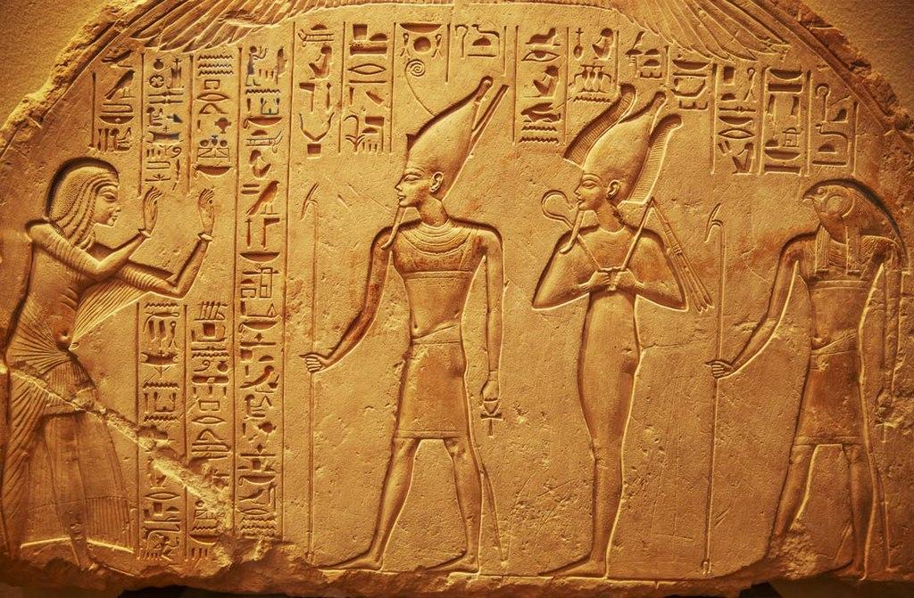
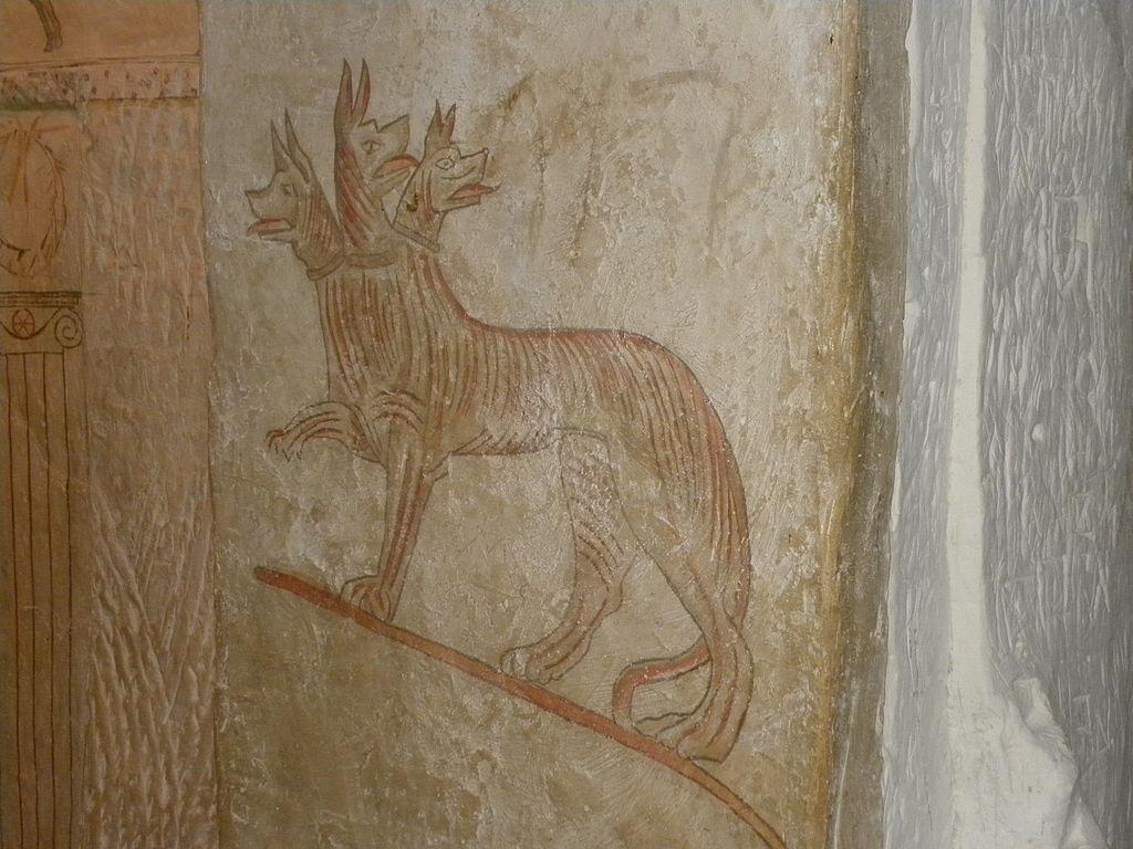
Ancient Egyptian society developed many innovations, but among their most enduring were hieroglyphs. These advanced pictographs formed an entire writing system, “hieroglyphics.” Each symbol represented a word or a sound, allowing Egyptian artists to record history and share stories in entirely visual form. On the other side of the globe, the Chinese created pictographic characters that eventually evolved into kanji.

Known for their incredible feats of architecture and engineering, it’s no surprise that the ancient Egyptians were among the first to introduce grid layouts for their designs. These key principles of proportion laid the foundation for mass reproduction, which would eventually be critical for logos!
However, these visual forms of “writing” were not true logos. While each pictograph had a clear symbolic meaning, they usually appeared alongside others. That meaning could even change depending on how the image was positioned.
What makes a true logo is that the image unambiguously expresses a distinct entity — something in the real world.
To see the first pictographs that met this qualification, we must travel forward in time to medieval Europe.
From Families to Fandoms
Even after written language emerged, it was many years before literacy became common. That’s largely because it was not possible to mass-print or otherwise distribute written materials. Most people in medieval Europe couldn’t read at all. However, they could recognize visual symbols.

To represent one’s tribe, family, or other group, people began adopting distinctive visual displays. Whether on the battlefield or at the marketplace, these identifying symbols helped people tell friend from foe.
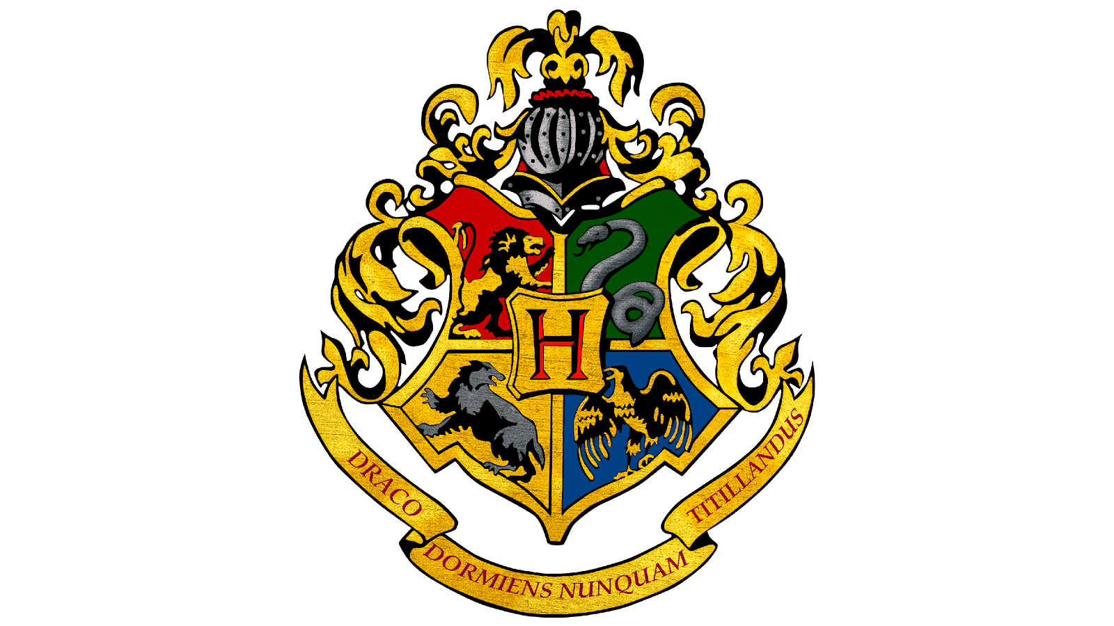
Eventually, these evolved into “coats of arms.” In heraldry, which denotes social status and affiliations, these were complex pictographs that uniquely identified a certain family or exclusive society. The coats of arms would be further combined with crests, which indicated accomplishments or rank, and supporters, which were usually animals or people. Today, coats of arms may appear on flags or emblems to signify a particular nation.
While medieval social structures are a thing of the past, we still use coats of arms to identify teams, educational institutions, and membership societies. Some fictional coats of arms, such as those for the Hogwarts houses, have become powerful symbols of fandom!
In sum, people enjoy having a unique, visually striking way to show off their allegiances and achievements.
Icons for Enterprises
Aside from identifying family affiliation or socioeconomic status, medieval Europeans also needed to navigate their world without written language. Pictographs have long been used in wayfinding. We still use simple visual symbols (aka pictograms) to show where children cross the road or to warn people of slippery floors.


Pictograms, which use more literal illustration to signify messages, also became popular in the world of early commerce. As more resources became privately owned and people began needing to “shop” for items, vendors used pictograms to attract customers. Often, simple illustrations did the trick. The anvil helped people find the blacksmith, the loaf of bread pointed to the bakery, and so on.
Eventually, though, marketplaces had multiple artisans and shopkeepers competing with each other. They need a way to visually differentiate themselves.
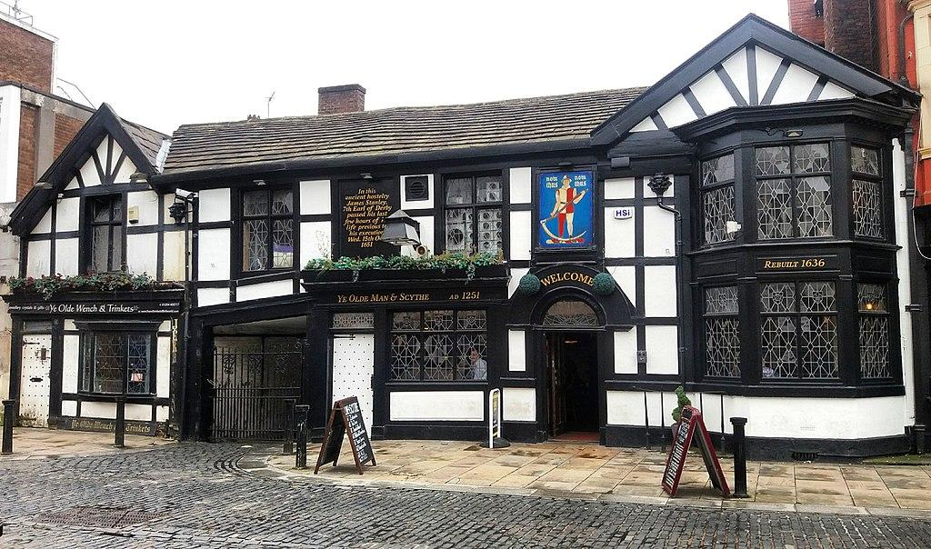
And so, visual branding was born. Just as noble families had a coat of arms, the local butcher, baker, or brewer would have a unique symbol. Often, this expressed their business name more than their wares. For example, the Ye Olde Man & Scythe is one of the world’s oldest pubs, dating back to 1251 CE. Their facade displays the coat of arms of the Pilkington family that inherited the pub.
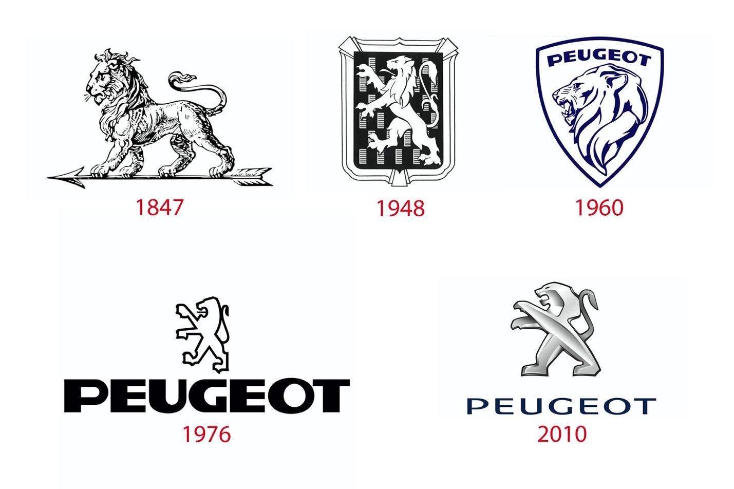
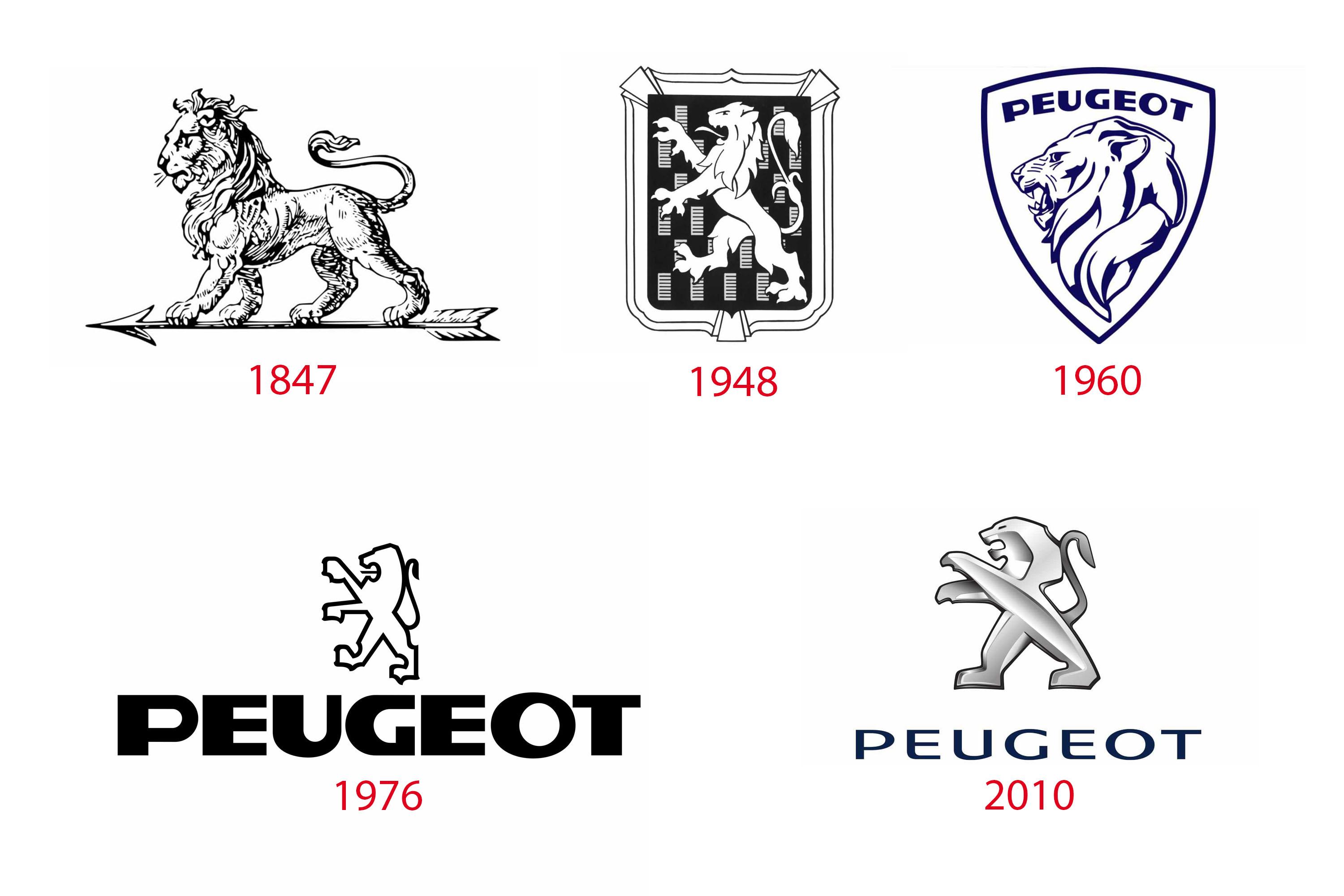
Indeed, some of the world’s oldest logos date back centuries because the enterprise successfully identified itself with an enduring symbol. Take a look at the logo for Peugeot, a bicycle manufacturer-turned-automotive company. The original emblem was a lion standing on an arrow — definitely a compelling and recognizable image. While the modern Peugeot logo looks different, the basic concept remains.

Even after the written word became more popular and literacy rates increased, people could not resist the urge to create distinctive pictures. That was smart, as the word “Bass,” for example, is not nearly as recognizable as the stylized wordmark for the Bass Ale brand (another one of the world’s oldest logos).
In sum, these pictographs came to unambiguously signify a specific business or vendor. And thus, the true logo was born as a key tactic for visual branding.
Defining the Modern Logo
A logo is essentially a pictograph that is fully associated with a brand. By “brand,” we mean the values, reputation, tagline, and other attributes of a person or business. Yes, even people can have logos, as the recording artist Prince proved!

Prince called this a symbol, but that’s exactly what logos are: a symbolic representation of a brand.
That said, they weren’t always as simple and recognizable as Prince’s symbol, Apple’s logo, or other well-known examples.
Early logos looked more like the paintings or emblems that those medieval vendors used. Some were so intricate that people could not easily understand or recognize them — which defeats the purpose of a logo!
For example, here is Apple’s original logo:
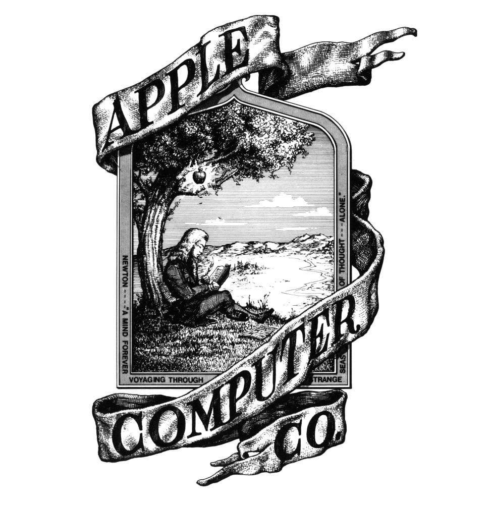
That image might be suitable for printing on a brochure or t-shirt, but it’s difficult to reproduce. At first glance, one might not recognize it, either. That presented a problem as Apple released yet more products into a global marketplace.
Indeed, the digital era forced logo designers to take a simpler approach. They minimized each element to its basic form that could capture the audience’s attention with little interference. This was a good thing as it allowed logos to become more recognizable and impactful.
Here are some old logos compared to their modern counterparts:
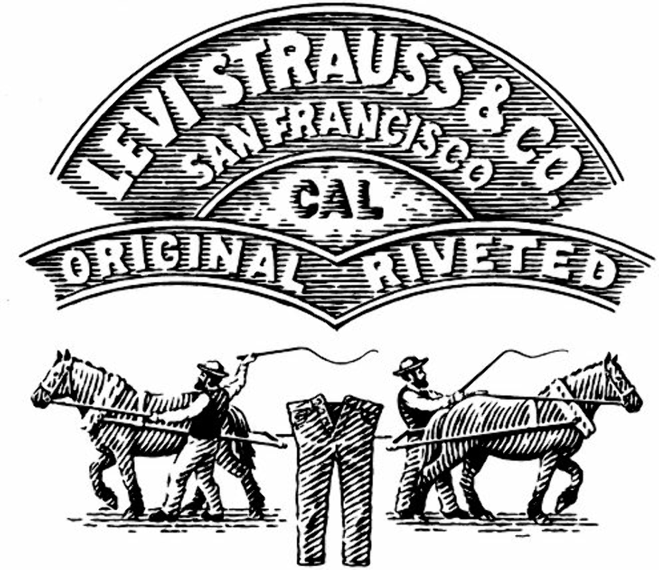
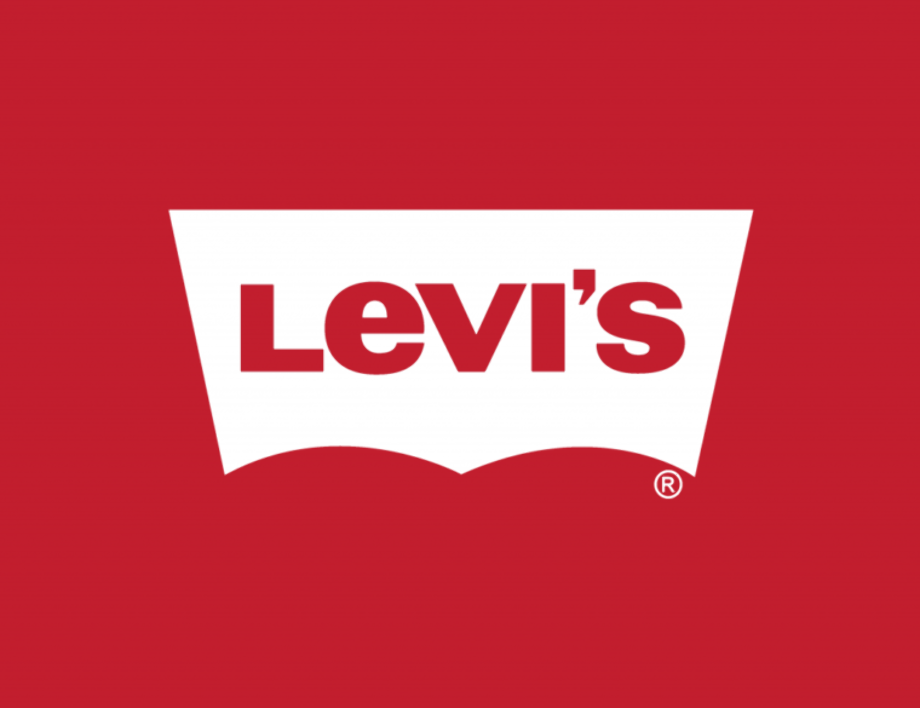
(Levi-Strauss: Early logo vs. modern logo)
And remember those coats of arms? Porsche borrowed heavily from these logo precursors! Their modern logo is tidier, having removed the elk supporters and other frills.
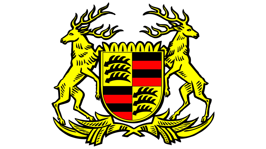
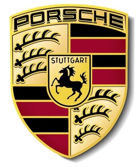
(Porsche: Early logo vs. modern logo)
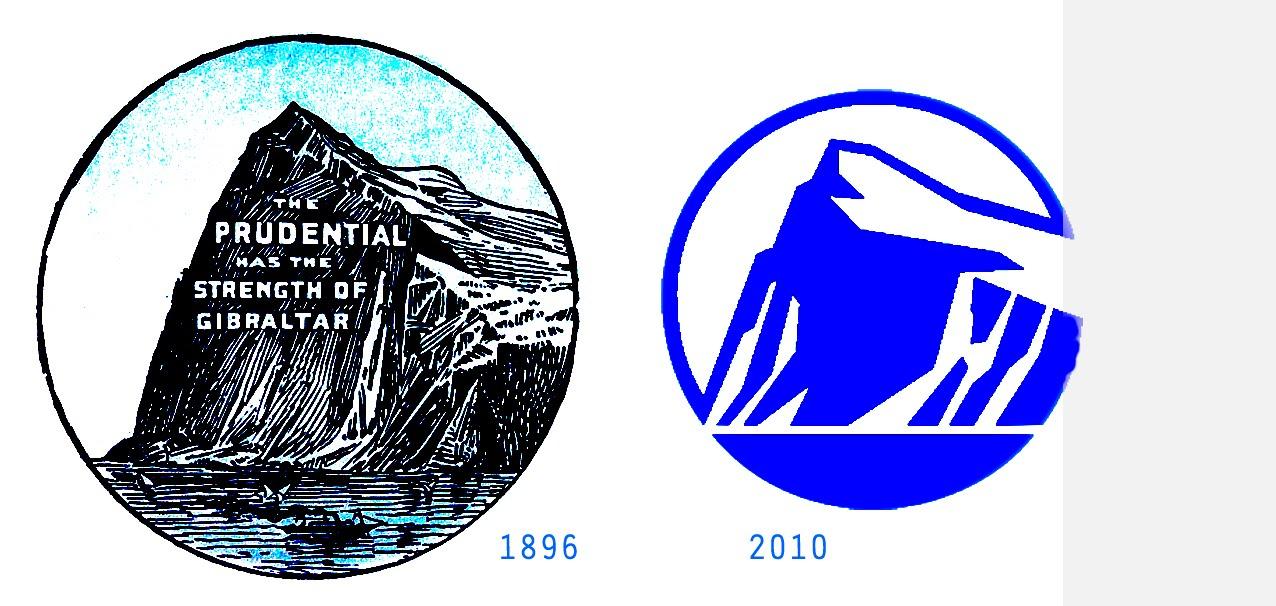
The more successful a brand becomes, the simpler its logo becomes. By reducing visual “clutter,” the logo becomes easier to process. A distinctive combination of colors and shapes is often more recognizable than a bunch of words and images stitched together — especially if you’re coming off the highway craving caffeine!
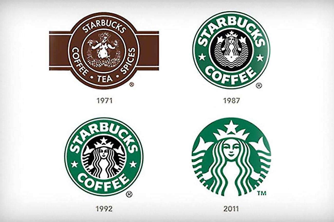
(From far away, the original Starbucks logo looks any other coffee shop. Image source.)
Simple logos can also even be broken apart without losing their recognizability, as demonstrated by Amazon’s use of “sublogos.” Far removed from its quite literal original logo that depicted a river, Amazon’s current logo is a distinctive combination of its wordmark, which may be reduced to a lettermark, and a “smiling arrow” that appears throughout its branding materials.
(The “smiling arrow” labels an Amazon box without the name. Image source.)

When logos are streamlined and simple, they’re more versatile. Brands can alter their color or even add graphic elements to suit different contexts without sacrificing the logo’s meaning. Here are a couple of examples:


(AT&T’s Pride logo and Target’s holiday logo)
Most importantly, simple logos can appear in any size or format, from giant billboards to teeny social media avatars. Imagine trying to squeeze the original Apple logo into their Instagram profile pic!
Wrapping Up: Humans have always been visual
Research indicates that we process and recall visual information much faster than text alone. Perhaps that’s because as a species, we have had pictographs for almost our entire history. By contrast, written language, such as what you’re reading right now, is relatively new.
Logos are the epitome of visual symbolism as a form of communication. When you see the Nike swoosh, the Starbucks siren, or even the Hogwarts coat of arms, you immediately recall all that you know about athletic wear, cappuccinos, and Harry Potter. These are simple yet powerful messages that clearly signify their respective brands.
And it all started with cave paintings.


.jpg)