News and inspiration for entrepreneurs and creatives, plus updates on new developments at Hatchwise.
Home / Blog Posts / The World’s Oldest Recorded Logos #3 Bass Ale
Hatchwise is #1 in Creative Custom Logo Design and Eyecatching Marketing Material Design.

The World’s Oldest Recorded Logos #3 Bass Ale
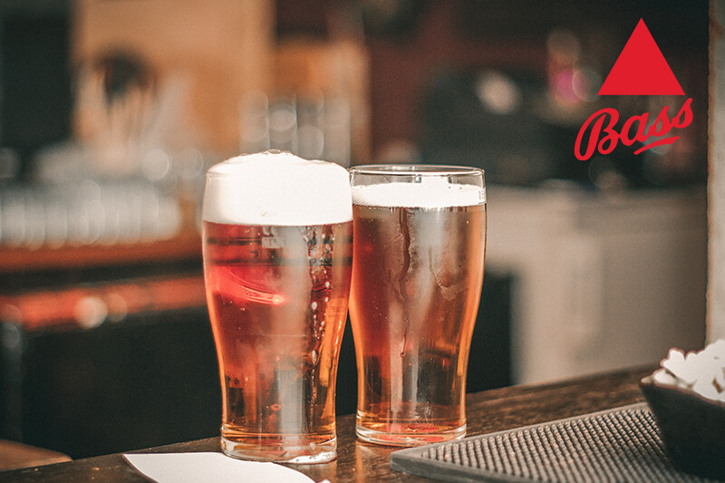
The Bass Ale logo has long been an inspiration in the arts. From Picasso’s collages to James Joyce’s Ulysses, the logo epitomizes simple elegance.
The logo was the first trademark recorded under the United Kingdom’s Trade Mark Registration Act of 1875. Bass Brewery had been established since 1777, however. It became one of the largest breweries in England.
The company was one of the first to be listed in the FT30 index of the London Stock Exchange in 1935.
Prior to the 1875 trademark registration, the Bass triangle was red on Pale Ale bottles and barrels. There were red or blue triangles on other products occasionally. It depended on the brewery they came from.
Not much has changed on the logo since then. The logo’s iconic simplicity lends itself well to paying center stage on jersey fronts and even famous paintings that include beer bottles.

Perhaps the simplest of all iconic logos, this one hearkens to a simpler time. It lends itself to reminiscence of the old days in importing, when literacy was lower and people sailed in wooden ships.
The letters play an almost secondary role in this logo, although they are iconic in and of themselves. They seem to surpass common ideas about era and style when it comes to lettering. They are universally appealing and recognizable everywhere in the world.
It’s notable that the logo has a sense of balance and even rhythm, even though it isn’t highly ornamented or even symmetrical.
Beer labels have come a long way in fashion since the time Bass was alive. But they are still influenced by this icon. Today, many beer labels feature delicate illustrations and a sense of rhythm, even coming across as slightly musical in appearance.
Many other brands have tried to capture the classic feel of this logo, but few have come close. It’s interesting to note that the triangle is proportioned just enough to be a focal point, even though it shares the same color as the lettering.

The whole logo is cohesive and easy to understand, in addition to being timeless.
Undoubtedly, the color choice was intended to make the brand stand out. What is interesting is that the choice of red hasn’t aged the brand a bit. It’s vibrant, classic, and clear even today.
Bass is known throughout the world, and stands out on shelves everywhere. This lettering seems to fit the beer style, and it is understated without being bland. The real star of the logo is the red triangle.
Few logos have a diagonal underneath another icon. This set of lettering is carefully balanced, drawing the eye around the whole image and gently ornamenting each letter.
Bass is owned by Anheuser-Busch today. It has faced several inquiries about antitrusts in recent decades. It had merged and bought out several other breweries in the mid-20th century and was already very large when it became part of the Anheuser-Busch family.
The parent company hasn’t altered the logo, which says something about the strength of the design. Universally appealing to customers and the art set, this logo utilizes the visibility of classic red and the simplest of shapes to draw the customer’s eye.
Although this logo has a very simple design, it’s design is also one of the strongest on the market. Not much is known about how it came about beyond the fact that Bass used to mark his barrels of Pale Ale with a red triangle.
The equilateral triangle in classic red tells a lot about the brand. The red is distinctively English and is similar to the reds found throughout the area. It’s close to other reds in English soccer jerseys, for example.
Equilateral triangles may be a simple mark easily understood in a time when people didn’t go to school as much, but they represent the brand well. They are visually strong and balanced, and they don’t need very much positioning to stand out.
Other shapes don’t make as much visual sense when placed front and center. The equilateral triangle is bold and equalizing on paper, similar to great beer on the palate.
The lettering is hand-drawn on the Bass logo, and it means a lot that the original maker’s name is there. There is little flourish and ornament, hinting at the fact that the beer was a practical one at the start.
With time, it has become harder and harder to find logos that are centered, balanced, and bold. Whoever designed the original logo may not have had a crystal ball to see into the future with.
But they did a great job of preparing the brand for a lasting impression throughout the world.
- Alexandra Wiggins
- April 21, 2020

