
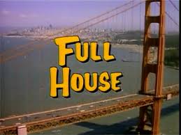
Even if you’ve only caught an episode or two, chances are you can picture it: that quirky yellow lettering with a bold drop shadow, dancing across your TV screen to the tune of “Everywhere You Look.”
But have you ever stopped to think about the logo itself? Where did it come from, how has it evolved, and why does it still resonate with fans decades later?
Let’s take a closer look at the design journey and cultural impact of the Full House logo, from its TV origins to its current life on merch and reboots.
A Sitcom That Became a Cultural Touchstone
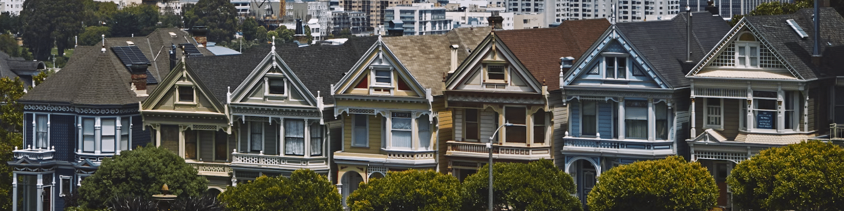
Full House made its television debut on September 22, 1987, and quickly found a loyal audience despite early lukewarm reviews. Set in San Francisco, the series followed the lives of Danny Tanner and his three daughters, along with the comedic support of Uncle Jesse and Joey.
The show offered a unique blend of heartfelt family moments and laugh-out-loud humor. What started as a lighthearted experiment evolved into a massive pop culture success, running for eight seasons and airing nearly 200 episodes.
The Logo Evolves: Reboots, Merch, and Nostalgia
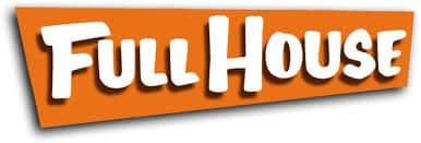
When Full House ended in the mid-1990s, the logo took a brief hiatus, only to return in 2005 with the DVD box sets. This version gave the design a minor refresh. The updated logo retained the same hand-drawn charm but added a new visual twist: the letters were now white, placed against an orange geometric background.
This added more contrast to the design and improved readability, particularly on printed media such as DVD covers, t-shirts, and streaming thumbnails. It kept the fun, energetic tone of the original while bringing it into a new digital era.
Fans of the Netflix sequel Fuller House will recognize this evolution. The updated version paid homage to its roots while feeling just modern enough for a new generation.
Typography / Font Style
The font used in the Full House logo is a custom, hand-drawn typeface, meaning it wasn’t pulled from a standard font library. It has an irregular and slightly tilted writing that gives it a casual and whimsical feel, matching perfectly the show’s tone.
Also, the uneven edges and brushstroke-like curves almost mimic a child’s handwriting or a chalkboard script, evoking warmth, humor, and approachability.
What makes this font special:
- Playful imperfections: No two letters are exactly alike in shape or width.
- Bold structure: Despite the lighthearted style, the font has thick strokes and large letterforms, making it stand out in TV intros and merchandise.
- Uplifted alignment: While vertical strokes are strict, most horizontal elements slant slightly upward, giving the logo a sense of optimism and energy.
Full House Logo Evolution
Logos matter. They help define the emotional tone of a brand or, in this case, a show. The Full House logo wasn’t just about aesthetics; it was a promise for the viewers to expect laughs, hugs, and moral takeaways wrapped in a cozy 22-minute package.
Design-wise, it succeeded by:
- Capturing the show’s youthful, fun-loving energy
- Staying memorable without being flashy
- Evolving subtly to remain relevant across decades
Color Palette
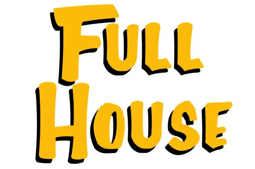
The original color scheme used for most of the show’s run (1987–1995) was a rich golden yellow for the text, set against a harsh black drop shadow. This combo gave the letters a bold 3D effect without feeling too heavy or dramatic.
- Yellow/Gold: Chosen for its associations with happiness, youth, and energy, ideal for a family sitcom.
- Black Shadowing: Adds depth and legibility against varied backgrounds (especially sky and cityscape footage used in opening credits).
In the DVD-era version (around 2005 onward), the logo was updated with a bright orange rectangle behind white letters. This change maintained the cheerful vibe while introducing more contrast and polish to printed materials.
Why it works:
- The orange background is energetic and attention-grabbing.
- White letters pop more clearly and feel cleaner, especially on merchandise or digital platforms.
Logo Structure and Layout
There were two main formats:
- Stacked Layout: The word “Full” appears directly above “House.” This was used in the opening title scene.
- Horizontal Layout: The words appear side by side, often used for T-shirts, VHS/DVD covers, and promotional posters.
In Conclusion
With such a popular show, there’s no doubt that a great logo comes with it and sticks in our minds, as the Full House logo. From its handwritten style in bright yellow to a warmer color palette in orange, this logo perfectly reflects the spirit of a beloved sitcom that’s unforgettable.
So next time you spot that cheerful lettering, take a moment to appreciate the design, and maybe even rewatch an episode or two.
Check out these awesome Logo Contests run on Hatchwise: