
The apple has long been a powerful symbol, representing knowledge, temptation, health, and innovation across cultures and industries. In branding, it’s a distinctive and versatile image that carries instant recognition. While Apple Inc. is by far the most famous example, it’s not the only company to build its identity around this iconic fruit.
Here’s a look at brands and organizations that use logos with apples, exploring how they apply this simple image to communicate everything from trust and learning to freshness and innovation.
Why Do Brands Use Apples in Their Logos?
Apples are rich in symbolic meaning. In design, they offer a shape that’s easy to stylize, simple to recognize, and adaptable across sectors. Depending on how the apple is illustrated or paired with other elements, it can suggest:
- Knowledge and education
- Health and nutrition
- Technology and creativity
- Freshness and nature
The image of an apple can appear friendly or sophisticated, depending on color choices, line weight, and context. It’s a flexible visual shortcut that quickly creates associations in a viewer’s mind.
Notable Logos That Feature Apples
Here are some standout examples of apple-themed logos across different industries:
1. Apple Inc.

The most famous apple logo belongs to Apple Inc. Their minimalist, bitten apple silhouette is among the most recognizable brand symbols in the world. Initially launched in rainbow colors in 1977, it’s since morphed into a sleek monochrome mark used across all of the company’s devices and stores.
The bite was added not only for visual distinction but also to play on the word “byte,” linking the image to technology. Apple’s logo is often referenced or echoed by other brands, intentionally or not, because of its global impact.
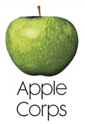
2. Apple Corps
Formed by The Beatles in the late 1960s, Apple Corps used a green Granny Smith apple as its logo. The image was simple, photographic, and a clear contrast to the minimal look that would later define Apple Inc.’s aesthetic.
Despite sharing the apple motif, the two companies have very different visual directions and a long legal history over brand naming rights.
3. Appletiser
Appletiser, a sparkling fruit juice brand, includes a stylized apple in its logo to emphasize its core ingredient and natural focus.
The apple mark communicates refreshment and fruit content while keeping the design clean and modern.
4. New York Apple Association
This organization supports apple growers across New York State. Its logo uses a stylized apple shape often paired with a state map or bright red coloring.
It emphasizes regional pride and agricultural tradition while maintaining broad appeal.

5. Apple Bank
Apple Bank, a U.S. financial institution, integrates an apple symbol subtly into its typography. Here, the apple lends a sense of reliability and familiarity.
In banking, fruit logos are uncommon, so the apple helps this brand stand apart without sacrificing professionalism.
6. Fruit of the Loom (honorable mention)
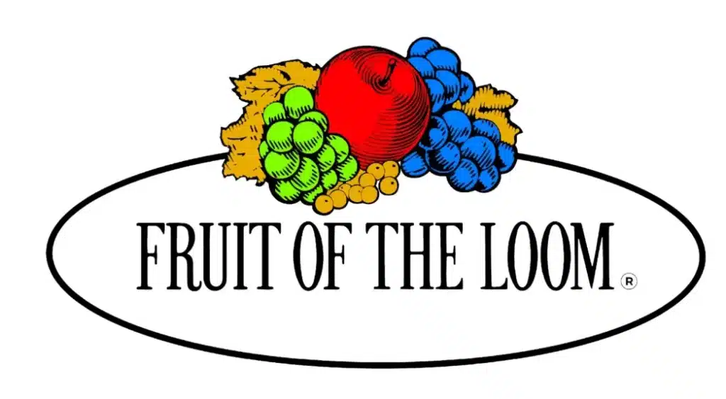
Although it doesn’t use a single apple as its core symbol, Fruit of the Loom includes one among several fruits in its logo. The apple sits alongside grapes and leaves, reinforcing a wholesome, natural image.
This colorful bundle has become closely tied to the brand’s identity and heritage.
What Makes an Apple Logo Effective?
Designing a strong apple-inspired logo comes down to more than just inserting fruit into the layout. Successful examples share a few key traits:
- Simplicity – Apple logos are often stripped of excessive detail, making them adaptable at any size.
- Symbolic clarity – The apple usually stands for something specific—innovation, health, education, etc.—depending on the brand.
- Distinctiveness – The best apple logos introduce a unique twist: a bite, a stem design, custom shading, or integration with typography.
- Color strategy – Red, green, and monochrome are most common, but brands can use gradients, textures, or even transparent versions to fit their aesthetic.
Common Industries Using Apple Logos
Apple imagery appears most often in:
- Technology – to represent innovation and intelligence
- Education – long associated with learning, due to historical and cultural links
- Food and beverage – especially products emphasizing freshness or fruit ingredients
- Healthcare and wellness – where the apple suggests vitality and nutrition
- Finance – using the apple as a symbol of trust, growth, or stability
Avoiding Legal Confusion with Apple Inc.
Because Apple Inc.’s logo is so dominant and legally protected, businesses using an apple in their logo should tread carefully. Over the years, Apple has taken legal action to defend its mark—even against small businesses using different styles or interpretations of the fruit.
To avoid infringement risks:
- Avoid a single bitten apple silhouette
- Don’t use similar proportions or color schemes (e.g., monochrome gray apple with a bite)
- Make sure your apple mark is stylized differently—more illustrative, abstract, or contextualized within another visual system
Final Thoughts
Apples have become one of the most powerful visual motifs in branding—not just for their shape, but for what they represent. From education to tech to food, a well-designed logo with an apple can convey trust, intelligence, and freshness in an instant.
For designers and brand strategists, the challenge lies in creating something distinctive while using a universally familiar symbol. And for companies seeking instant recognition, apple imagery offers a solid foundation—when done with originality and clarity.
Check out these awesome Logo Contests run on Hatchwise: