Graphic design is changing all the time and is usually dictated by the largest and most successful trends in the industry at any given point. Your company needs to keep an eye on these trends and brush up on what the public is asking for and looking for when they interact with the brands they know and enjoy. There are many new trends in the industry every year and 2021 is no exception. This year, the themes of the game are trending toward social consciousness and a greater emphasis on breaking barriers and boundaries, both within the world and within the selected design. Keying in on these themes is crucial to capture the imagination of your customer base and make your designs stand out among your competition. Read ahead to find out which seven graphic design trends are most likely to shape the 2021 year and give you the best edge possible in the field.
Another year is upon us which means another great batch of graphic design trends to be conscious of and use in your own work. The graphic design world is always evolving, and this year is no exception; trends this year are strongly mirroring the social and economic angst many are feeling, as minimalism is still in and typography is getting stranger and more surreal.
There are dozens of new trends throughout the industry, but there are seven main points of interest for those who are serious about staying up to the minute and competing within their own industry. Here are the seven graphic design trends you should take advantage of in 2021.
Socially Conscious Design
As noted above, marketing and graphic design have long been used to express the social unrest of the populace. This year, designers are keeping an eye toward and inclusion and diversity to help foster a unique and multifaceted culture.
The main themes of this trend and style are authentic representation, sustainability, and diversity, as well as keeping the pulse on imperfections. People are getting sick of things looking sleek and overly elegant, and the pendulum is quickly starting to swing back the other way. Don’t be afraid to make your graphic designs for the year look messy and imprecise.
Outsized Typography
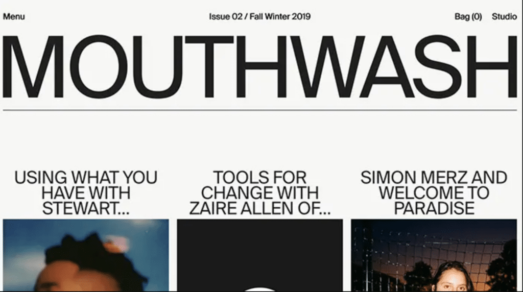
In line with the trend of socially conscious thinking, advertisers and others within the business are starting to see a trend toward outsized and large typography. This style represents a greater chance to diversify your font and make bold, big statements within the design context.
It also defies convention a majority of the time and signals that your brand or company is willing to think outside the box and really think about the processes and projects within your purview. In addition, making fonts absurdly large allows them to violate the borders of the design and signals a breaking down of traditional hierarchies.
Hand-Drawn Illustration
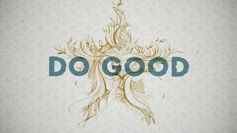
Another large trend people are taking notice of is using hand-drawn animation and illustrations within your design. For example, drawing your designs in real-time can really make them pop, and using animators who love and know how to draw by hand can give your designs a unique edge over the competition.
Brands are trying to do everything they can to make themselves stick out and separate themselves from their competition, and hand-drawn animation is quickly becoming the number one way to do this. Your audience will notice it and your creative departments will be proud of the traditional work they’ve put together.
Black and White
This trend is a continuation of the last year. Although there are plenty of brands and designs which use color to specifically pop and stand out, there are seemingly an equal number of designs that use black and white design to their advantage.
A dark palette makes sense in the mind of the viewer because of the social instability at the moment. Black and white is also more elegant and will catch the attention of people who are used to seeing their ads in a see of mesmerizing color. The stark contrast is a good way to stand out and make people take note of your stylistic choices. It also reduces eye strain for those who read at night.
Further Minimalism
This trend is going absolutely nowhere anytime soon. Though public opinion seems to be split on the effectiveness and aesthetic quality of minimalism, it’s a trend many companies are hitting hard. Tech companies and food companies in particular love this trend; companies like Google, Smuckers, and Warner Brothers have recently streamlined their logos with incredibly mixed results from the public.
Though you should be careful not to make your logos or graphic designs too minimalist, minimalism is often useful for communicating simple ideas in a streamlined and efficient manner. This style is evocative of the incredibly hectic and efficient lifestyle many lead today.
Sustainability
Another topic young people are incredibly passionate about is sustainability. Your brand should be doing everything to convey sustainability both in your regular values and your new and cutting-edge graphic designs. For example, you should try to avoid plastics whenever possible and stick to natural and biodegradable materials in your packaging.
This eye toward sustainability will pay off in the long run as you’ll gain more customers and make an impact in an attempt to stop the destruction of the earth, which customers everywhere will undoubtedly appreciate. You can convey your sustainability in your graphic designs as well.
Muted Color Palettes and Simple Data Visualization
Finally, there are companies that need to convey a large among of information and a substantial amount of data in a simple and streamlined way. These companies, such as medical companies and some watchdogs of the Covid-19 pandemic, are choosing to use muted color palettes and extremely simple visualization of their data.
The information they gather, and report usually faces the public, which means many people need to be able to understand it and process it in little to no time. Desaturated colors and simple line and bar graphs are great for getting information across in an interesting but urgent manner.

