


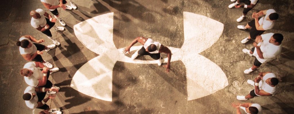
When you think of sports and apparel, a few iconic brands, like Under Armour, come to mind. Under Armour is the preferred brand for athletes and outdoor enthusiasts, offering superior gear that optimizes performance and ensures comfort during their outdoor escapades.
Under Armour is a brand that is known and recognized substantially due to the iconic logo that represents the brand.
When you first glance at the iconic logo, it appears pretty straightforward: a crisscross that forms the letters A and U. However, Under Armour hasn’t always been the logo we see today. The logo has undergone changes throughout the years to reach the logo we see today, and the brand has an interesting history.
Wondering how the brand got to its massive success now and how the logo has reached its famous masterpiece? Explore the inception of the Under Armour logo and delve into the captivating history behind this iconic brand.
The History Of The Under Armour Logo
1996–1997: The First Logo
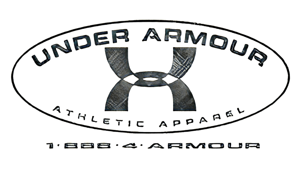
The first logo for Under Armour was introduced in 1996 and was a much more complicated version of the one we see today. As with the logo today, this first version featured two overlapping arches representing the A and U in the company’s name. One arch flipped upside down and the other straight, forming both an A and a U. In a way, these two elements mirror each other. The arches were primarily black, with only two white squares in the middle. The first part of the name was at the top of the arches, while the second was at the bottom, with “Atheltic Apparel” underneath, which is the brand’s tagline. The tagline was written in a classy serif font, keeping the logo stylish and different from the competition.
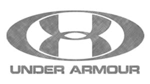
1997–1998: A Grey Change
The first logo stayed with the brand for a year before they decided it was time for a chance.
This time, they made a switch that involved mainly the color.
Now, the logo appears in a stretched oval with the wordmark in the center of it.
The wordmark was almost the same as before, with the biggest change being the color change.
1998–1999: The Logo Is Simplified
Once again, the logo only lasted a year before the brand decided to simplify it.
This time, the grey color scheme was darkened, and the oval was made smaller, now with only the emblem fitted neatly inside.
The extra wording was removed, with only the company name in all uppercase letters at the bottom of the logo.
Now, the logo was bolder, stronger, and cleaner. It almost appeared exquisite, with a more refined and luxurious look.
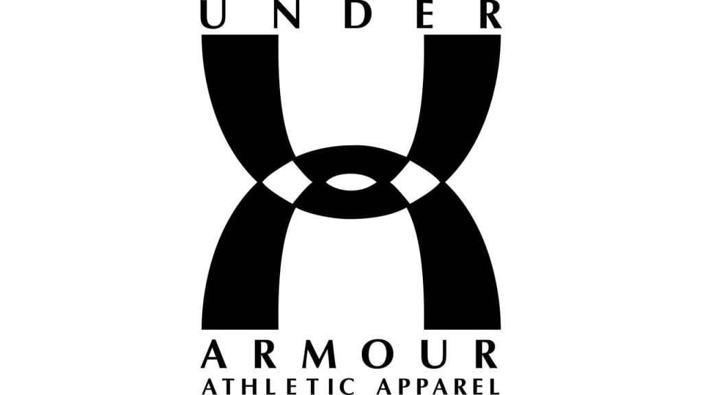
1999–2005: Back to the Black Color Scheme
The grey that the brand had used for the logo for the past few years was removed, and in its place, the original black coloring was returned. The emblem now featured the symbol without the oval around it. Underneath the symbol, the company name and tagline were shown.
A horizontal line separated the two lettering elements, showing a stylish and cohesive font that tied the design together and created a sleek new identity for the brand.
2005–Present: The Logo Today
In 2005, the logo was simplified, removing the tagline and horizontal line so that the famous logo would remain.
Now, the logo has a simple black-and-white color scheme, creating an icon that can be displayed on any marketing material. It was clean and sleek while simplistically showcasing what the brand was about. This logo is the one that we see used today on all of the brand’s marketing material and represents the company.
The Font

The font used for the logo is a significant aspect and what makes it stand out from the competition. The logo features a custom bold sans-serif type that displays the company name.
The name is legible, yet it has a unique and signature look that is easily identifiable. Not only does the logo stand out, but the font is part of what makes it the iconic piece it is today and enables it to be recognizable.
The Color
Of course, color is a substantial part of the brand’s logo and has helped mold it into the symbol we recognize today. Besides testing the grey color scheme, the brand has kept the black-and-white color scheme.
The black is bold, standing out and helping the brand come across as strong and a fighter. The white easily balances out the black, helping it stand out and bring new elements to the surface.
The History of Under Armour

Under Armour came into being in 1996, born from the ambition of Kevin Plank, a former University of Maryland special teams captain. Plank’s vision was to revolutionize the world of athletic wear, setting a new standard for performance gear.
Plank noticed that his compression shorts stayed significantly dryer when playing football than his shirts. He was tired of continually sweating through his shirts during practice.
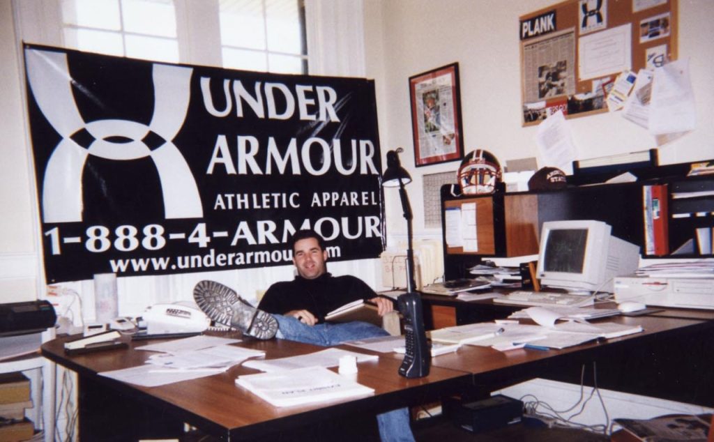
This got him thinking about creating a shirt that would work similarly to his shorts; they would keep moisture away. He started to tamper with the idea of making this shirt himself and, after creating a few rough versions, began to sell the shirts out of the trunk of his car and his grandmother’s basement.
He was creating moisture-wicking sports apparel that allowed athletes like himself to stay cool while playing and practicing. He began to sell shirts to former teammates who were now in the NFL. The breakthrough for Under Armour came when Plank secured his initial significant sale to a team, resulting in an annual revenue of $17,000.
This was only the beginning of Under Armour’s success, as they would go on to make over $3 billion in 2014 and have a market that swelled to $15 billion.
By 1998, the brand had relocated to Baltimore and went mainstream a year later. Under Armour was quickly meeting rapid success, landing huge contracts such as outfit actor Jamie Foxx and other huge stars.
What was originally a small start-up started by a college football player tired of sweating through his athletic wear was now drawing attention from everyone, even the big leagues. Under Armour started to earn deals with NFL teams and became one of the official apparel suppliers of the NFL.
By 2005, Under Armour had transitioned into a publicly traded company and initiated nationwide marketing campaigns to promote its brand.

Along with these campaigns, Under Armour began branching out with its merchandise and creating different sports apparel.
The brand broke $1 billion in annual sales in 2010–a record-breaking number for them.
Even now, Under Armour stands as a formidable presence in the sports apparel industry, trailing just behind the titan Nike.
How Did Under Armour Get Its Name?

One of the biggest questions that users of the brand have is how Under Armour got its name. It’s quite intriguing that a brand rooted in Baltimore would opt for the British spelling of “armour”. Mainly, people assume that the brand opted for the British spelling to be different for visual appeal or faux sophistication.
However, the answer is far simpler than the brand finding fancy ways to display itself. When Plank was developing the company, he originally wanted the name Heart. He thought this would be an excellent way to mark the company with a name that could be read as “wearing your heart on your sleeve.”
However, this trademark had already been taken, and unfortunately, Plank could not obtain it. Next, Plank went for the name Body Armor. However, this trademark was also denied, and it disappointed Plank terribly, considering he had prematurely disclosed to everyone that was the company name.
In recounting how he arrived at the name we know today, Plank mentioned feeling somewhat down. Despite this, he had lunch arrangements with his eldest brother, Bill, that day.
As he arrived to collect him, he knocked on the door, and Bill, in that unique way older brothers do, looked down at him and inquired, “How’s that company you’re working on, uhh … Under Armor?” Following this exchange, Plank, unsure if his brother was joking, promptly canceled his lunch plans and proceeded to complete a trademark application.
Only a few weeks later, Plank received the Under Armor trademark, the name we all recognize and order now.
But why the British spelling of Armor?
Plank shared that the ‘U’ in ‘Armour’ was a result of his skepticism about the internet’s future. He felt that 888-4ARMOUR was more memorable than 888-44ARMOR.
While there wasn’t a sophisticated marketing study behind it, the decision was straightforward.
Thus, the brand’s name wasn’t as intricate as some might think; rather, it evolved from a series of events into the familiar brand we see today.
Conclusion

The Under Armour logo is one of the most famous logos ever. The two mirrored arches showcase the initials of the company name, creating an iconic look for the brand.
The sleek black and white logo can be identified nearly anywhere due to its recognizable and iconic characteristics.
Yet, the logo’s evolution spans a lengthy history, undergoing numerous alterations before attaining its current form.
Above, we looked at the history of the iconic logo and the brand itself, looking at what has sculpted both into what we know today.
Check out these awesome Logo Contests run on Hatchwise:


