
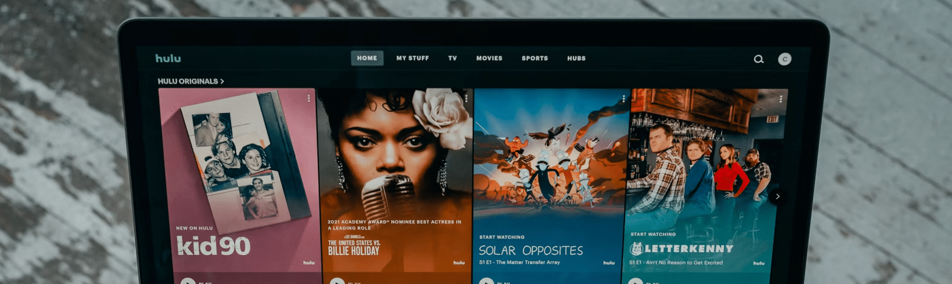
In the realm of streaming entertainment, Hulu has made a significant impact. Renowned for its extensive library of on-demand titles and innovative approach to original content, Hulu has become a household name. But how did the streaming giant come to be, and what role did its branding, mainly its evolving logo, play in capturing the market’s attention?

Founded in 2007 by three broadcasting and media powerhouses—NBC Universal Television Group, Fox Entertainment Group, and Disney-ABC Television Group—Hulu was destined to challenge norms. Drawing from their combined legacies and expertise in technology, content distribution, and marketing, the founders crafted Hulu into a mega-platform that has since redefined how we consume television and film.
In this article, we explore Hulu’s foundational roots, brand transformation, and how, over time, its logo reflects the platform’s growth from a disruptor startup to a content streaming juggernaut.
The Hulu Logo’s Evolution
From its inception, the Hulu logo has been a beacon of its brand identity, emblematic of its parent companies’ partnership and ambition. The merging of interests and expertise from NBC Universal, Fox Entertainment, and Disney-ABC was pivotal in sculpting Hulu’s image. Their collective influence infused Hulu with a DNA for innovation and the capacity to lead in a competitive market landscape.
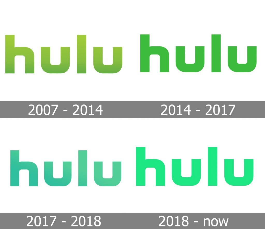
Hulu’s logo is a nod to this integration, and has progressively morphed over the years to stay in tune with the founders’ foresight for a service that straddles traditional TV’s legacy with the promise of digital-age entertainment. The visual evolution of Hulu’s logo closely shadows the company’s strategic growth and content expansion. Furthermore, the company’s iterative brand strategy has always been to create a youthful, dynamic, and approachable logo, creating an emotional connection with viewers. Now, let’s dive into Hulu’s first logo and what this initial emblem symbolized for the brand.
The Beginning Of The Hulu Logo
As with many startups, Hulu’s early days were marked by simplicity. When it launched in 2007, Hulu’s first logo was a simple green rectangle on a white background spelling out the company’s name in lowercase letters. This clean, no-frills design represented the company’s straightforward mission of providing streaming service for television programs and films.
In the competitive media streaming landscape, brand evolution is not just a matter of aesthetic preference but a crucial strategy for sustained growth. Brand evolution goes hand in hand with company growth for several reasons. First, it signals to the market that the company is dynamic, responsive, and committed to evolving alongside consumer expectations and technological advancements.
This adaptability can enhance consumer trust and loyalty and demonstrate a company’s commitment to improvement and innovation. Second, as a business expands its service offerings or enters new markets, its brand identity must reflect this growth to attract a broader audience while retaining its existing customer base. Therefore, Hulu’s subsequent logo redesigns serve as milestones that highlight its growth phases and align its visual identity with its expanding vision. This continuity has ensured that the brand remains relevant and appealing in a fast-paced industry where consumer preferences and streaming services constantly shift.
The First Hulu Logo: 2007 to 2014
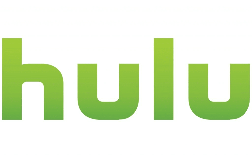
The platform began with a simple yet vibrant green and white logo in 2007. This initial design conveyed freshness, symbolizing growth and the blossoming of a new, innovative streaming service.
The custom sans-serif font used was approachable and friendly, inviting users to explore this new form of entertainment. The logo’s purity also conveyed the ease of using Hulu’s platform, making it appealing to a broad audience.
The typography of Hulu’s original logo played a crucial role in setting the platform apart from its competitors. The custom, symmetrical sans-serif font, characterized by soft, rounded edges, emphasized approachability and user-friendliness.
The choice of all lowercase letters was deliberate, aiming to demystify the brand and make it seem more accessible and less formal than traditional entertainment providers.
This typographic decision reflected Hulu’s mission to break down the barriers between content creators and their audiences, fostering a community-like feel around its service.
The vibrant green in the logo symbolized growth and renewal and grabbed attention in a market saturated with blues and reds, distinguishing Hulu as a trailblazer.
Together, these elements conveyed a brand that was youthful, dynamic, and eager to challenge the status quo.
The Second Hulu Logo: 2014 to 2017
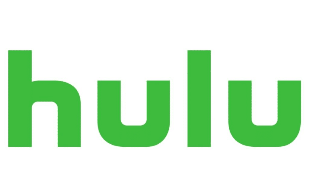
This new logo also featured sharper edges and a more defined font, symbolizing the company’s evolution from a startup to an established player in the entertainment industry.
This change in branding was necessary as Hulu began competing with traditional television networks for original content.
By incorporating elements of its original branding, such as the green color and lowercase letters, Hulu maintained a sense of continuity while also signaling growth and progress.

The Fourth (and Current) Hulu Logo: 2024
Another iteration occurred in 2018, which is the existing logo Hulu uses today. This current version bursts forth with a gradient green, energized, and fluid, signaling Hulu’s breadth of diverse, kinetic content and reflecting the platform’s dynamic role in an ever-evolving streaming universe.
Hulu’s current logo symbolizes the brand’s evolution and commitment to innovation in the streaming landscape. This fluid design reflects the platform’s adaptability and bold role in the constantly changing digital environment. A brighter, more energized green distinguishes Hulu visually and represents the brand’s upward trajectory. It also offers its audience fresh, diverse viewing experiences. Hulu has conveyed a message of vivacity, diversity, and forward momentum through its latest logo.
The Third Hulu Logo: 2017 to 2018
As the streaming landscape continued to evolve, Hulu adapted its branding once again. Introducing a logo characterized by its bright, lime green hue and sleek, minimalist design, Hulu shifted away from its previous static logo. This transition signified a vibrant, interactive entertainment experience. While subtle, the logo update maintained the essence of the brand while emphasizing its forward-thinking aspirations.
The refinement included a richer, more cyan shade of green to symbolize transition and renewal. Slight adjustments to the typography were made, enhancing readability across various devices and media. Additionally, the new logo reintroduced the use of gradients, further underscoring Hulu’s commitment to visual dynamism. Gradients, with their seamless transition between colors, emit contemporary energy and add depth to digital designs. For Hulu, reverting back to its use of gradients enhanced the visual appeal of its interface and promotional materials, making the user experience more dynamic. This juncture in Hulu’s logo evolution reflects the platform’s ongoing mission to remain at the forefront of digital entertainment, sensitive to user experience, and adaptive to the ever-changing landscape of consumption, reinforcing its position as a leading streaming service attuned to viewer preferences and digital trends.
Furthermore, the refreshed logo highlighted Hulu’s dedication to evolving beyond a mere platform for movies and TV shows. By introducing live TV, exclusive original content via Hulu Originals, and by forging partnerships with key sports leagues, Hulu aspired to establish itself as a comprehensive hub for a diverse range of entertainment options.
In 2021, Hulu engaged the UK-based branding agency DixonBai to conduct a design refresh. Without touching the logo, the agency sought to unify Hulu’s visual architecture by focusing on the “u” in Hulu. The single, short horizontal line at the end of the letter “u” is what gave the logo its distinct and memorable visual composition. It subtly hints at the brand’s playful nature while symbolizing a variety of entertainment choices (programming and partner channels) available to viewers. That DixonBai avoided alerting Hulu’s logo in any way while having been asked to rethink the streaming service’s visual identity is a testament to the strength and value the 2018 logo holds.
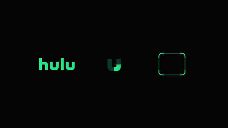
Furthermore, when examining the platform’s 2024 brand guidelines one will notice the emphasis on color, more specifically the “Hulu Green.”
“Color is how we tell stories and turn heads. We’re no wallflower. Our green is strong enough to meet through your screen.”
This vibrant green represents growth, freshness, and innovation, aligning with Hulu’s commitment to evolving and providing original content. The logo’s continued use of lowercase mono-weight sans-serif typography is modern and approachable, reflecting Hulu’s user-friendly interface and accessibility.
A Lasting Impact
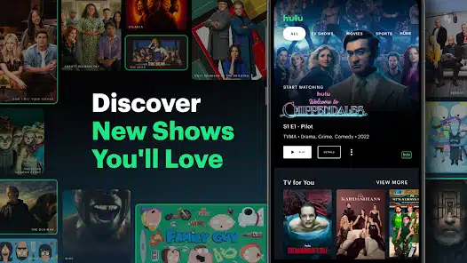
How has Hulu’s branding trajectory affected its industry cachet and viewer relationships? Each rebirth of Hulu’s logo has contributed to an empowered consumer perception.
It speaks to a market influenced by innovation acceptance, where branding isn’t just a static identifier but a living dialog with users who crave empowered streaming experiences.
The intertwined relationship between Hulu’s original programming and its branding is evident.
With a relentless focus on quality and distinction, Hulu’s logo has mirrored its ambition to stand out amidst a competitive crowd, not only through what it offers but also through how it presents itself—a synthesis of strategy and artistry that has sculpted its industry tenure.
What We Can Learn from Hulu’s Logo
Hulu’s brand story, especially the evolution of its logo, is a testament to the power of vision-aligned image crafting in defining and cementing a market position.
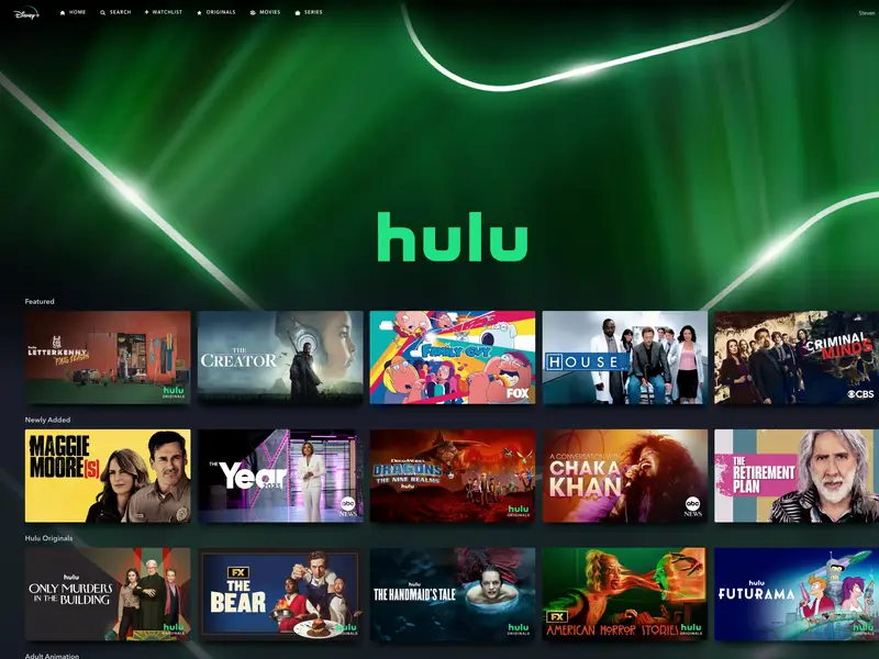
The logo’s development is a graphical narrative of a brand that has grown in tandem with its audience, staying relevant, reflective, and committed to offering the ultimate streaming experience.
From the growth-reflective first logo to today’s vibrant and fluid emblem, Hulu’s brand narrative tells the story of a service that always looks forward, poised for the next act in the grand drama of streaming entertainment.
Check out these awesome Logo Contests run on Hatchwise: