


When it comes to branding, few symbols wield as much influence and recognition as logos. These seemingly simple marks capture the essence of a brand and represent the brand to the world.
Let’s delve into the evolution of one of the most ubiquitous platforms of our digital age – TikTok and its memorable logo.
From its beginnings to its meteoric rise, we trace the steps of the iconic TikTok logo, appreciating how it reflects the brand’s journey and identity in social media and how it is helping to shape contemporary culture and causing controversy at the same time.
All About TikTok
TikTok, initially known as Douyin, was founded by the visionary Zhang Yiming in September 2016 in China. A year later, it was introduced to the international market as TikTok. Zhang’s leadership and innovation have propelled the company, ByteDance, to become one of the most influential tech entities globally since its establishment in 2012.

The app serves a predominantly young audience, with many of its users being teenagers and young adults. It has also helped several small businesses connect with customers around the globe.
The platform engages users with short-form videos, ranging from 15 seconds to three minutes, featuring various content from entertainment and dance to educational material and DIY projects. TikTok has been downloaded over two billion times globally, with the United States being one of its largest markets.
In the United States, TikTok has received a mixed reception. It rapidly gained popularity among American youth for its engaging content and highly interactive nature. The platform has also been praised for its algorithm, which curates a highly personalized feed for each user, making it exceedingly addictive and effective at keeping users engaged for extended periods.
Small and large businesses also jumped on the TikTok bandwagon because if you wanted to reach its audience – you had to have a presence or risk losing to competitors.
However, TikTok has faced criticism and scrutiny from U.S. lawmakers and regulators around issues of privacy, data security, and its ties to China. Concerns have been raised about the possibility of user data being accessed by the Chinese government, prompting calls for strict regulatory measures or even a total ban on the app in the U.S.

The platform has also been criticized for its content moderation policies and the impact of its algorithm on youth culture and mental health. In response, TikTok has increased transparency about its operations and strengthened its data security measures. Despite these challenges, TikTok continues to grow and evolve, remaining a dominant force in social media.
Its ability to adapt to different markets and innovate continually keeps it at the forefront of digital trends despite substantial criticism and regulatory scrutiny.
The TikTok Logo Over Time
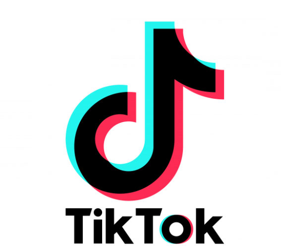
The TikTok logo, known for its distinctive and vibrant design, has become a globally recognized symbol of short-form video entertainment. Since its inception, the logo has undergone subtle yet impactful modifications that reflect its evolving brand identity and user experience.
The Original TikTok Logo
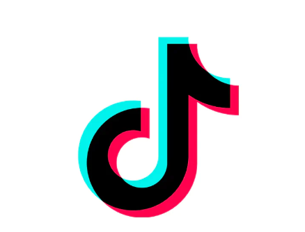
The first logo aimed to capture its platform’s dynamic and creative spirit. The original logo featured the now-iconic “note” symbol, which resembles a musical note or a ‘d’, reflecting TikTok’s origins in the music-focused app Musical.ly, which ByteDance had acquired earlier.
This note was designed to embody the essence of movement and sound, core elements of the platform. The color palette primarily included black and bright cyan, creating a bold and youthful look.
Brand Unification After a Merger
In 2018, as TikTok merged with Musical.ly, it took the opportunity to refine its logo. This version continued to feature the music note but enhanced the design to make it more rounded and symmetric, promoting balance and accessibility.
The color scheme was also adjusted to a brighter teal shade, improving visibility and brand recognition. This change was part of a broader strategy to unify the brand globally and streamline the user experience across diverse markets.
TikTok Logo Variations
As TikTok’s user base expanded, the logo appeared in various creative renditions to match specific campaigns or seasonal promotions. For instance, during Pride month, TikTok adapts its logo to feature rainbow colors, demonstrating support for LGBTQ+ communities.
Similarly, the logo is often customized for special events or collaborations to include patterns or elements that resonate with the particular theme, such as floral motifs for spring campaigns or festive decorations for New Year celebrations.
The TikTok Logo Today
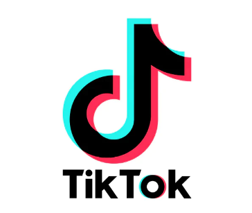
Today, the TikTok logo retains its foundational design but is often presented in a 3D-like gradient, adding depth and a modern twist to its appearance.
This gradient version uses a spectrum of vibrant blues and pinks, symbolizing diversity and creativity. It’s commonly used in app icons, promotional materials, and digital advertisements. This contemporary look reflects TikTok’s position as a cutting-edge platform that continually adapts to the fast-paced trends of the digital age.
Throughout its history, the TikTok logo has maintained its core symbolism while embracing variations that align with cultural moments and marketing needs. This flexibility has helped TikTok remain culturally relevant and visually distinctive in a crowded social media landscape.
The TikTok Logo Design Elements
Font
The font used in the TikTok logo is a customized version of a sans-serif type. It features slightly rounded edges that soften the overall appearance and make the logo more friendly and inviting.
This rounded characteristic suggests a sense of informality and accessibility, resonating well with the platform’s youthful and energetic user base.
The characters in the logo are tightly spaced, enhancing its compactness and ensuring it remains impactful and easily recognizable even at smaller sizes.
Colors

The color scheme of the TikTok logo is a vibrant combination of black and bright neon blue. The black color conveys sophistication and makes the logo versatile across various backgrounds and contexts.
The bright neon blue, often referred to as “TikTok blue,” is used to highlight the “o” in “TikTok,” which not only draws attention but also injects vibrancy and energy into the design.
This particular shade of blue is lively and youthful, which aligns perfectly with the dynamic and creative nature of the content shared on the platform.
Typography and Additional Elements
In terms of typography, the TikTok logo maintains a balance between readability and stylistic flair. The boldness of the typeface ensures that the logo stands out in a crowded media landscape, while its rounded features make it appear less formal and more accessible. Additionally, the emblem occasionally incorporates the iconic musical note symbol, which morphs into a “d” to form the word “Tik.” This element serves as a nod to the app’s origins in the music-focused app Musical.ly, highlighting the importance of music and sound in the platform’s content.
Overall, the TikTok logo’s use of a custom sans-serif font, distinctive color palette, and clever typographic details create a strong visual identity that appeals to a young, vibrant, and globally diverse audience.
Lessons from the TikTok Logo
Brands should note that the TikTok logo is remarkably simple, making it easily recognizable and memorable. The bright, energetic color scheme is both eye-catching and expressive of its brand personality, which is youthful, vibrant, and dynamic. It also allows for versatile usage across various platforms and merchandise.

Its straightforward and uncomplicated design scales well on anything from a giant billboard to a small app icon. The music note within the TikTok logo is symbolic of the core offering of the platform—music and sound. This symbolism helps communicate what the brand is about at a glance.
The dynamic and youthful design of the TikTok logo resonates with its primary audience—Gen Z and millennials. This alignment with its users’ emotions and values helps build a stronger connection.
Check out these awesome Logo Contests run on Hatchwise:


