


In the realm of European sports, Juventus is a widely recognized football team that boasts a significant fan base with a rich history of loyal supporters.
When the team first began in 1897, they had no idea that decades later they would be ranking as one of the top Italian clubs.
The football club has earned millions of fans from around the globe and has quickly gained vast popularity. Where did this team begin, and how has it developed its visual identity over the years?
Let’s take a look at the history of Juventus and its iconic logo, which recently saw a big shift in design.
About Juventus

One of the earliest Italian football teams to be founded, Juventus Football Club has a long-standing history dating back to its establishment in 1897. Based in Turin, the club has a rich history and is known for its impressive track record, having participated in almost every premier club division since 1900, with only one missed season.
The Juventus Stadium serves as the home arena for the club. Interestingly, the club’s inception can be traced back to a few students who decided to start it.
In the fall of 1897, a group of 13 students from Turin’s D’Azeglio Lyceum School came up with the idea of starting a football team while sitting on a bench between two lawns. With no permanent place to meet, they eventually settled on using a bicycle repair shop owned by a 20-year-old named Eugenio Campari. Interestingly, Campari went on to become the inaugural president of the team they named Juventus. On March 11th, 1900, the club played and won their debut game in the Italian Football Championship.
Juventus has been managed almost solely by the Agnelli family 1923, which makes the relationship the oldest in national sports. The Angelli family traces its roots back to the legendary Giovanni Agnelli, who is widely recognized as one of the pioneers of the Fiat motor company. They are known for their investments in Ferrari, Lancia, Alfa Romeo, and Chrysler. The Agnelli family has managed Juventus and has been the majority investor for years. An Italian società per azioni, similar to a public limited company, since 1967, Juventus was presided over by an Agnelli until Andrea Agnelli’s resignation in 2022, during which the entire board stepped down amid fraud investigations.

Maurizio Scanavino and Gianluca Ferrero are the two highest-ranking executives on the board of the innovative professional sports organization known as Juventus. Fioranna Vittoria Negri, Laura Cappiello, and Diego Pistone round out the rest of the current board. Over the years, Juventus has been a trailblazer in Italian sports, starting in the 1930s, and on the confederation level since the mid-1970s. With a rich history and a strong presence in the national and international sports scene, Juventus has been established as a major player in the world of sports.
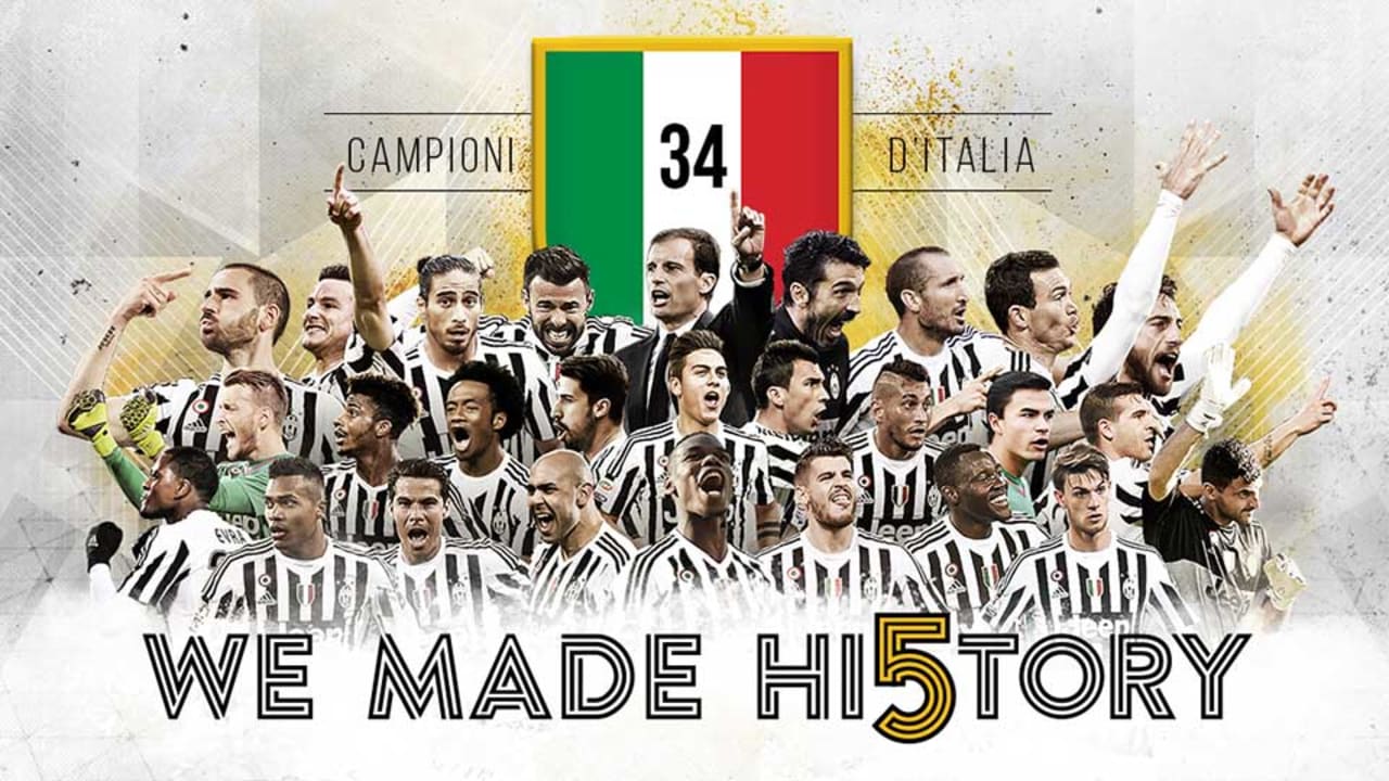
Since the mid-90s, they are consistently in the list of top wealthiest football clubs when it comes to value, revenue, and profit and have earned a spot on the Borsa Italiana list since the early 2000s. During Giovanni Trapattoni’s tenure as manager, Juventus achieved remarkable success in the decade leading up to 1986. The achievements of this team are truly remarkable, having earned a grand total of 13 trophies throughout their existence, consisting of six league titles and five international titles. Their legacy includes being the first team in history to triumph in all three of the seasonal competitions organized by the Union of European Football Associations: the UEFA Cup in 1976-77, the Cup Winners’ Cup in 1983-84, and the European Champions Cup in 1984-85.
Juventus made history by winning all five confederation trophies after their victories in the 1984 and 1985 Cups. Juventus has achieved a remarkable feat in the world of Italian football. They have won every major honor a professional football team can win organized by a national or international organization until 2022. At the turn of the millennium, this sporting team was hailed as one of the top seven organizations worldwide, as determined by FIFA’s renowned historical ranking system. Nearly a decade later, they were awarded the distinction of being the runner-up for the best sports club in Europe during the entire 20th century, which is an incredibly noteworthy accomplishment for an Italian team.

The popularity of this professional sports club extends far beyond its home base, with countless supporters located both within and outside the borders of Italy. It’s widespread national following is unparalleled, drawing in legions of dedicated fans from all corners of the globe. This is unlike other European sports teams whose supporters are usually concentrated in their home city. The players of Juventus have an impressive record, having won eight Ballon d’Or awards, four of which were won consecutively between 1982 to 1985, which is a shared record.
The Italian national team has had a long-standing relationship with the club, which has consistently provided players for nearly a century. Throughout the years, this club has significantly impacted various FIFA World Cup tournaments, especially in 1934, 1982, and 2006 editions, where they played an instrumental role in helping the Azzurri secure their hard-fought victories. Their contributions to the Italian national team’s success in these events are widely recognized and celebrated.
Throughout its history, this professional sports organization has undergone a multitude of logo changes, with one iteration featuring a striking animal that captured the attention of fans. During a certain period, the team became known by a nickname that reflected this animal’s black-and-white stripes. Another nickname that has since become popular is “Old Lady,” which refers to the team’s distinctive appearance, resembling stooped figures. “Ancient Madam” is another well-known moniker with a long and storied history that is associated with this team. Legend has it that this name was given to the team by a rival club’s supporters.
Where did the zebra and the bull nicknames come from?
Examining the evolution of their logos, we can observe the stark contrast between their current designs and those from the past. Let’s look at the logos and the changes they’ve gone through over the years.
Juventus Logo Over Time
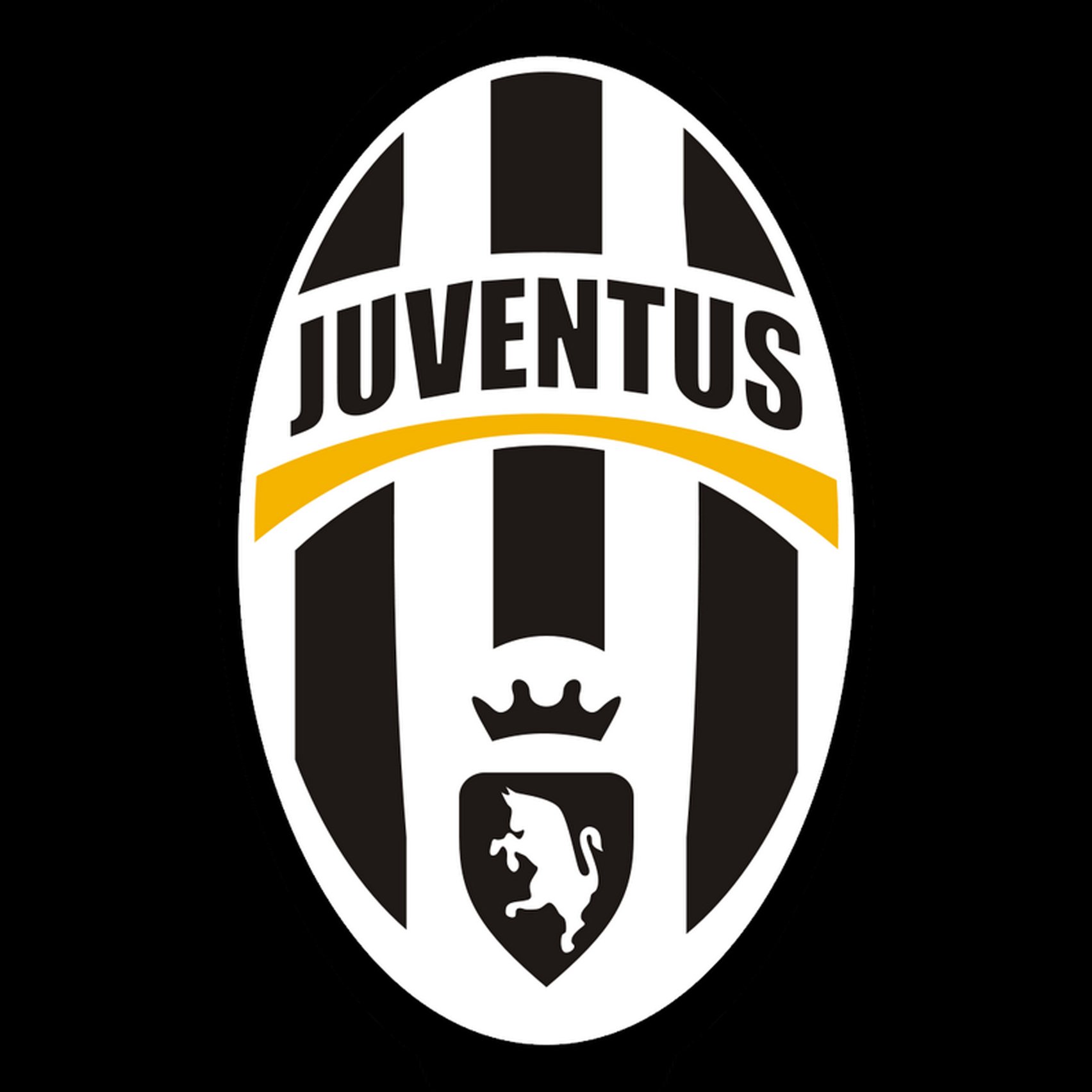
Juventus has undergone six major logo redesigns throughout its long history. From the stylish monochrome badge to the classy crest, the club has experimented with various animalistic symbols, including a horse and a bull. However, the most drastic changes were made in 2017.
It’s fascinating to see how Juventus visual identity has evolved over time. Let’s explore the rich history of the Juventus logo.
Let’s check out the long history of the Juventus logo.

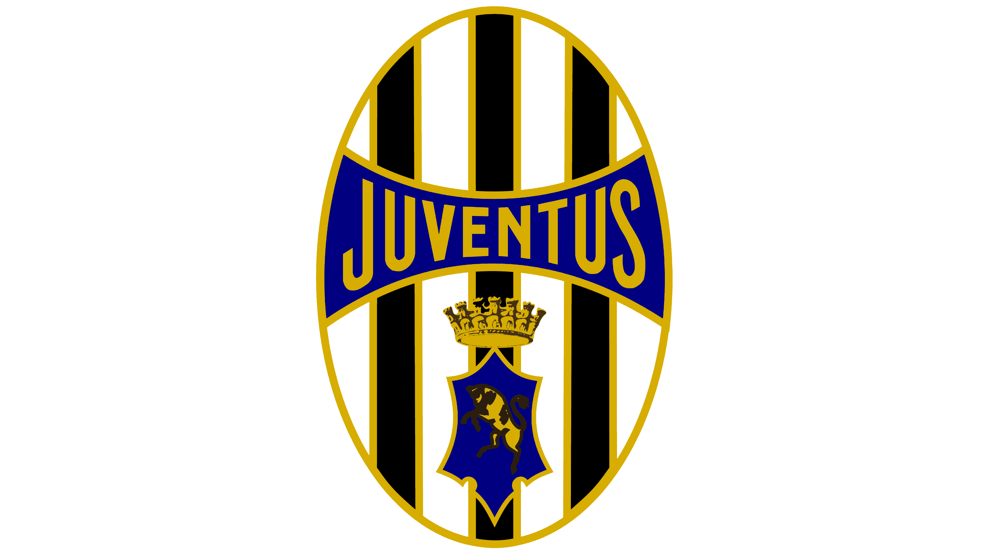
The Original Juventus Logo (1905-1921)
In 1905, Juventus introduced a logo that showcased an oval shape with a vertical stripe pattern. The emblem was surrounded by a frame and had a ribbon above it. The emblem featured a small shield containing a black bull and a white crown positioned between the animal and the nameplate. The nameplate itself was presented on a white banner, with a black wordmark, creating a stark contrast between the two colors. The ribbon also had a Latin phrase in a sans serif font that translated to “Only those who play by the rules will receive the crown.”

Changing Colors From 1921 to 1929
The redesign of 1921 cleaned up the icon and changed the logo from full of ornate elements to a more simple overall shape. It kept the striped oval and main three symbols. The monochromatic color scheme underwent a recent update. The update included integrating two new colors, blue and gold. The black stripes have been outlined in gold, while the nameplate banner and bull-crest have been colored blue with a similar outline.
The bull crest also received gold internal gold coloring, along with the crown and Juventus wordmark. While the color was an appealing addition to the logo, the details of the bull and crown were difficult to pick out in this version.

The Juventus Zebra from 1929 to 1931
The funniest, most playful, and the most short-lived version of the Juventus logo debuted in 1929 and was phased out in 1931. The company’s logo was updated to a more minimalist style. The new design featured a zebra standing upright in the center of the logo, replacing the previous bull crest and gold crown. The colorful elements have been removed, leaving a sleek black-and-white monochrome design.

The Long-Standing Juventus Logo From 1931 to 1977
The funniest, most playful, and the most short-lived version of the Juventus logo debuted in 1929 and was phased out in 1931. The company’s logo was updated to a more minimalist style. The new design featured a zebra standing upright in the center of the logo, replacing the previous bull crest and gold crown. The colorful elements have been removed, leaving a sleek black-and-white monochrome design.

The Juventus Logo From 1977 to 1982
The year 1977 saw some interesting changes to the classic look of the Juventus logo. The Italian football club got a new mascot, a horse, though it resembled a zebra again to a certain extent because of the striped construction.
The symbol displayed a four-sided figure in a pale shade. A star with five points, bordered in dark color, was located at the upper-left edge. The whole pattern was encompassed by a rectangular border, also lined in slender black strokes. A sans-serif black inscription at the bottom read “Juventus F.C.,” and a large “blurred” silhouette of a standing horse appeared in offset black and white stripes. It was a big departure from previous logos, and it’s unclear if the top section of the horse is meant to be its ears or resemble a crown.

A New Attempt at the Blurred Lines From 1982 to 1989
In the latest version of 1982, a few modifications were made to the design. The rectangular frame and star were eliminated, while the blurred icon remained.
The new wordmark was displayed in uppercase letters and formed a semi-circular shape over the horse with stripe pieces. The typeface chosen was a clean and classic sans-serif font.The “F. C.” letters sat to the left and right of the emblem and were in a wider all-caps font.
The animal’s shape also changed, and it was more of a solid black in the center.

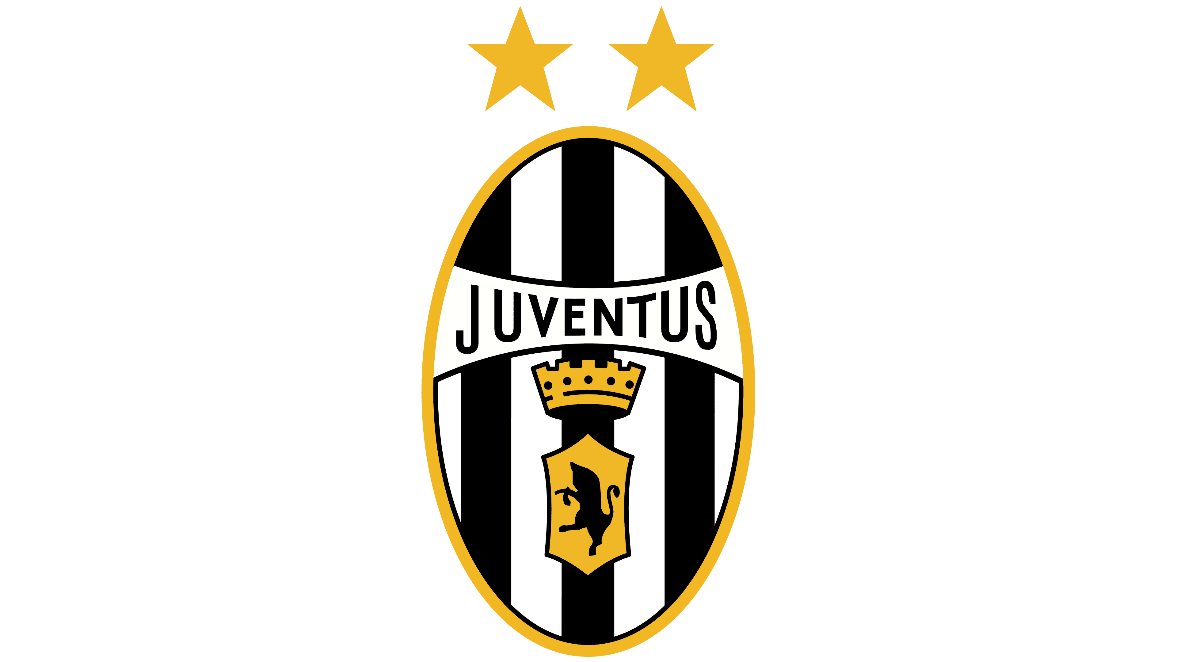
A Return To The 20s- Juventus Logo From 1989 to 2004
In 1989, the team started using a badge similar to the one from the 1920s, with updated contours and colors. The badge was cleaned up and simplified as well.
The central shape was enclosed by a fragile gold frame, with the lettering etched in a slender sans-serif typeface. The backdrop was blank and encompassed by dark lines at the upper and lower edges. The crown and the bull crest were also simplified so that details wouldn’t be lost and there was no blue.
Two gold stars topped the oval crest as well. This would be another long-standing emblem that lasted until the 2000s.

The 3D Juventus Logo from 2004 to 2017
In 2004, Juventus underwent a transformation of its emblem, resulting in a contemporary and 3D appearance. The updated version includes wider gaps between each element, yet maintains all the elements of the previous design.The color scheme became more monochromatic with only one goldish-orange line that arched across the badge just above halfway. It also changed the icon element to be a small triangular black crest with a white bull and a very simplified black crown. The wordmark still arched across above the dividing line and the oval with stripes concept remained. This time with a black outline surrounding the entire thing. They also removed the two stars above the emblem.

A New Approach From 2017 to 2020
As stated above, 2017 saw the biggest departure from the logos of the past.
The previous emblem has been replaced by a new design that features a black line in the shape of the letter “J” along with a symbol that mimics the letter’s contours. The old emblem was known for its oval shape, vertical stripes, heraldic bull, and crown, among other elements. The name of the club was shown over the top of the two simple lines in a narrowed sans-serif font, which had some customized features, notably the curves and angles in the letters v, n, and s. The secondary line near the J is supposed to help the icon create the broad shape of a shield or crest.

This significant change from the previous logos was met with some serious dislike.

The emblem of Juventus received a modernized and simplified update in 2020 through a redesign process.
The removal of the wordmark left only the bold lines that formed a striped shield shape.
Juventus Logo Key Elements
Within the years of the Juventus logo, we’ve seen a few things. The team hailing from Italy is recognized by their name, which is often presented in a sophisticated sans-serif font with elongated letterforms, all in uppercase.
Frequently, the club’s basic colors have been a combination of black and white, blue (featured in the Turin coat of arms),x, and golden yellow, which is often associated with victory and glory.
The design is shown in black and white. But a great deal has changed.

1. The Crest
The crest of Juventus remained largely unchanged for almost seventy years, with only a brief exception during the team’s nickname “The Zebras” period from 1929 to 1931. While a blurred zebra briefly reappeared in the late 1970s, the oval shape with a bull and a crown served as Juventus’s primary symbol throughout its existence until 2017. However, the new J logo, created by design agency Interbrand, generated significant criticism upon its introduction.
2. The New “J”

Juventus’ distinct visual identity is instantly recognizable thanks to its contemporary and daring design.
The emblem showcases a unique “J” letter in a sans-serif font that is exclusive to the club. While the logo’s revamp sparked some controversy among supporters, its uncomplicated and memorable design has played a significant role in its triumph.
Ultimately, the current Juventus logo has demonstrated greater efficacy compared to its earlier versions.
Conclusion

It’s not wrong to say that Juventus is one of the most impressive football clubs in the world.
With record wins, talented players, and a long history of dedication to the sport, Juventus will likely long go down as a top team among soccer aficionados.
With the drastic change to the logo, and the dislike from many, it’s possible that the logo will change again.
However, since its adoption in 2017, little has changed about the current logo. After six years, it appears that this logo is here to stay, at least in one form or another.
Check out these awesome Logo Contests run on Hatchwise:


/cdn.vox-cdn.com/uploads/chorus_asset/file/16254406/Screen_Shot_2019_05_12_at_1.04.28_AM.png)