
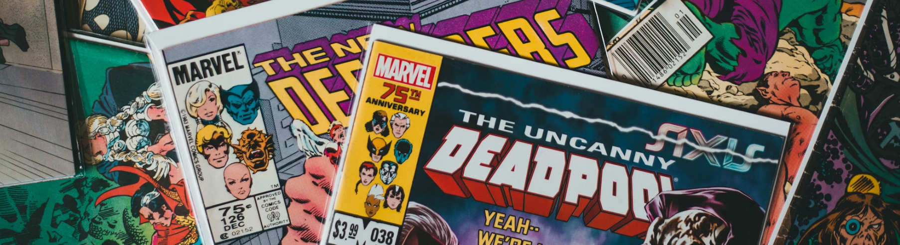

Since his inception in the early 1990s, Deadpool has become one of the most beloved antiheroes in the comic world. Created by artist Rob Liefeld and writer Fabian Nicieza, the Deadpool character is known for his loquaciousness and comedic pessimism.
Many fans also connect with Deadpool’s iconic logo, which has evolved alongside the character. In this article, we trace the key milestones in the evolution of the Deadpool logo and highlight how these changes have impacted the character’s brand identity.
The origin of the Deadpool logo can be traced back to his first comic book appearance in “The New Mutants” #98, released in February 1991. Initially, the logo was simple, mirroring the straightforward design trends of the early ’90s. It featured two essential elements: a stylized “Deadpool” word mark and a small, crudely drawn skull.
This early iteration captured the essence of Deadpool’s character as a mercenary with a penchant for humor. Still, it lacked the distinctive features that would later become synonymous with the antihero.

Deadpool’s creation is often seen through the lens of homage with a twist of parody, particularly regarding the character of Deathstroke from the DC Comics universe. Introduced in “The New Teen Titans” #2 back in 1980, Deathstroke, also known as Slade Wilson, is an assassin possessing enhanced physical powers from a super soldier experiment.
The parallels between him and Wilson, better known as Deadpool, are unmistakable, not just in their skill sets but also in their names and masked personas. Deadpool co-creators Nicieza and Liefeld’s initial designs drew comparisons to Deathstroke, leading to the deliberate decision to name Deadpool “Wade Wilson” as an inside joke about being “related” to Deathstroke (Slade Wilson).

This connection goes beyond mere coincidence, venturing into a playful acknowledgment of each other’s existence within their respective comic book worlds.
While Deadpool was initially conceived as a parody, he evolved into a character with a unique identity, engaging with his audience and his inspirations directly over time. This acknowledgment of Deadpool’s origins reflects a broader trend in comics where characters and ideas often mirror and respond to each other across publishing lines, contributing to a rich tapestry of interconnected stories and themes.

As Deadpool grew in popularity, the logo evolved alongside him. The turning point came with the launch of Deadpool’s series in 1997, where the logo was redesigned to better reflect the character’s personality.
The new logo incorporated a more defined skull symbol, echoing Deadpool’s association with death but with a playful twist that captured his irreverent sense of humor.
The crossed katana swords behind the skull were introduced, symbolizing Deadpool’s combat skills and acting as a nod to his weapon of choice.

The modern incarnation of the Deadpool logo, which solidified its place in popular culture, emerged during Deadpool’s cinematic debut in 2016.

This version refined the previous elements into a sleek and stylized emblem that was visually striking and immediately recognizable.
The logo’s color scheme, predominantly red and black, mirrors Deadpool’s costume, creating a solid visual identity. The skull and crossed swords became more stylized, with an almost cartoonish flair that perfectly encapsulates Deadpool’s unique blend of dark humor and antihero charm.
Throughout its evolution, the Deadpool logo has followed design trends and influenced them, demonstrating how a visual symbol can evolve to meet the changing landscape of its audience’s expectations while staying true to the core attributes of its brand identity.
Today, the Deadpool logo is a testament to how effective branding can capture the essence of a character and turn it into an iconic symbol recognized worldwide.
The Origin and Evolution

The Original Logo (Early 1990s)
Introduced alongside the character, the original Deadpool logo symbolized the era’s comic book aesthetics. The bold lettering and a red and black color scheme immediately tied the logo to Deadpool’s iconic suit. This simple yet effective design laid the foundation for Deadpool’s visual identity.
Despite its eventual iconic status, the original Deadpool logo, conceived in the early 1990s, was initially regarded as a design mistake by some critics and enthusiasts. While distinctive, the logo’s bold lettering and the red and black color scheme were seen as too aggressive and not fully reflective of the intricacies of Deadpool’s character, known for his complex personality and dark humor.

This design was initially perceived as lacking in subtlety and nuance, failing to capture the depth and multi-dimensional aspects of Deadpool’s persona.
Over time, however, what was once considered a design flaw became one of the logo’s most celebrated features, embodying the character’s boldness.
This transformation underscores the idea that perceived design errors can sometimes evolve into defining characteristics, contributing to a brand’s unique identity and appeal.

The 1990s Update
Towards the late 1990s, the Deadpool logo underwent subtle updates, adding depth and detail that echoed the evolution of comic book art. These changes ensured that Deadpool’s branding remained fresh and modern, aligning with the aesthetics of the time.
As Deadpool’s popularity soared, the need for a logo that could evolve with the character and his growing fan base became apparent. The transition from the bold and simplistic design of the 1990s to a more intricate and symbolic representation reflected the character’s development and the broader trends in graphic design. In the late 2000s, the introduction of finer details and a more dynamic composition aimed to capture Deadpool’s complex personality—unpredictability, humor, and depth beneath the surface bravado. This evolution represented a shift in aesthetic preferences and a deeper alignment with the character’s narratives as they unfolded in the comics and later in film adaptations. The logo became more than a symbol; it was a narrative device, encapsulating the essence of Deadpool’s character evolution through visual means.

Mid-2000s Redesign
The mid-2000s saw a significant redesign of the Deadpool logo, which focused on a more aggressive and dynamic typeface. This new font reflected Deadpool’s evolution in the comics from a mere assassin to a complex character with his own unique, albeit chaotic, moral compass.

The redesign was a deliberate shift that mirrored the character’s growing complexity and appeal. This era saw Deadpool transitioning from a straightforward soldier to a multifaceted character with a rich backstory and emotional depth. The logo’s new aggressive font and sharp edges encapsulated Deadpool’s readiness for action and unpredictable nature.
Furthermore, incorporating more pronounced black shadows around the letters reflected the darker undertones of the stories told during this period. This redesign did not just aim for a modernized look; it sought to visually communicate the essence of Deadpool’s character—one that could encompass dark narratives and irreverent humor. This logo variant became a defining emblem for Deadpool, cementing his identity in the comic book culture and beyond and setting a precedent for how character evolution can be mirrored effectively in visual branding.
Each iteration of the Deadpool logo mirrors the character’s growth and the audience’s changing tastes and symbolizes Deadpool’s brand’s adaptability and enduring appeal. From merchandise and apparel to social media icons, the logo is a ubiquitous symbol of Deadpool’s irreverent humor, resilience, and complexity as a character. This evolution underscores the significance of visual identity in maintaining relevance and building a connection with the audience, illustrating how Deadpool’s logo has become an integral part of his storytelling and cultural impact.
Incorporated Humor: “Merc with a Mouth”
An essential development was the adoption of the “Merc with a Mouth” tagline into the logo design. This clever addition emphasized Deadpool’s quick wit and propensity for breaking the fourth wall – aspects that have endeared him to fans worldwide.

The inclusion of Deadpool’s “Merc with a Mouth” tagline into the logo underscores his unique characteristics and resonates deeply with the character’s fanbase. It directly reflects his verbal prowess and self-aware commentary in comics and movies.
By weaving this aspect of Deadpool’s personality into the visual identity, the creators bridged the gap between the character and the audience, fostering a sense of familiarity and affection. This strategy highlights the importance of narrative consistency across different mediums, ensuring that Deadpool remains a visually recognizable figure and emotionally engaging.
The clever integration of text and imagery in the logo fortifies Deadpool’s brand, making it instantly identifiable and capturing the essence of his character in a way that appeals to long-time fans and newcomers alike. This fusion of visual and textual elements in branding illustrates the power of a well-crafted logo to tell a story, encapsulate a character’s spirit, and cement their place in popular culture.
Modernization in the Late 2010s
With Deadpool’s exploding popularity in multimedia, the late 2010s saw a modernization of the logo. This version was sleeker, with digital-friendly elements that catered to the character’s expansion beyond the pages of comic books.

The redesigned logo embraced a minimalist aesthetic while retaining the boldness and irreverence synonymous with Deadpool. This modernization reflects the adaptability of the character’s image to resonate with a digital-first audience, leveraging simplicity to stand out in an increasingly crowded digital space.
The sleek update made the logo more versatile for use across various platforms—from social media avatars to merchandise—and mirrored the evolution of Deadpool’s character in the media landscape.
This strategic visual update ensured Deadpool remained relevant despite shifting consumer behaviors and technological advancements. By simplifying the design, the creators preserved the essence of Deadpool’s identity while making the character more accessible to a broader audience, demonstrating a keen understanding of the balance between tradition and innovation in brand evolution.
Conclusion
The story of the Deadpool logo is a testament to the character’s enduring appeal and the creative team’s ability to adapt and evolve.

From its beginnings in the early 1990s to its modern incarnations, each version of the logo has contributed to building a distinctive brand identity that encapsulates Deadpool’s complexity, humor, and charm.
Like the character, the Deadpool logo symbolizes adaptability and resilience, inviting new and old fans to join the adventure.
In sum, the ongoing saga of the Deadpool logo offers a fascinating glimpse into the multifaceted relationship between a character and his emblem, reflecting the essence of branding within the comic book industry. It underscores how a well-crafted logo can transcend mere visual appeal to capture the spirit and evolution of a beloved character.
The mystery surrounding the artist only enriches the narrative, reminding us that behind every iconic symbol is a story of creativity, transformation, and sometimes, anonymity.
As Deadpool continues to captivate audiences worldwide, his logo marks his identity and is a beacon for storytelling innovation and the unseen artists who shape our cultural landscape.
Check out these awesome Logo Contests run on Hatchwise:
Popular articles
- The History Of The Best Social Media Logos (And What You Can Learn)
- My Honest Review of BuzzCube.io
- My Honest Review: DesignForce
- History Of The Snapchat Logo
- The Benefits of Running a Logo Design Contest
- Flocksy vs Design Force – which is right for you?
- The History of The Philadelphia Eagles Logo
- The Washington Commanders Logo and Team History
- Most Famous Logos with a Castle
- The Uber Logo and Its History
- Most Famous Logos with a Dinosaur
- 14 of the Best Sports Logos of All Time
Browse by category
- Branding and Naming
- Business
- Design
- Entrepreneurship
- How to use Hatchwise
- Logo Design Case Studies and History
- Logo Design Contests
- Website Design Contests
- Company Naming Contests
- Product Naming Contests
- Domain Name Contests
- Slogan Contests
- Shirt Design Contests
- Tagline Contests
- Business Card & Stationery Design Contests
- Custom Graphic Design Contests
- Banner Design Contests
- Brochure Design Contests
- Character & Mascot Design Contests
- Photoshop Contests
- Photo Colorization Contests
- Photo Restoration Contests
- AI Image Prompt Contests
- AI Generated Image Contests