


Liverpool Football Club’s identity is inextricably linked to the Liverbird emblem, which has played a vital role in the team’s history for more than a century. Since its debut on championship medals in 1901, the emblem has become integral to Liverpool’s culture, representing the club’s fighting spirit and resilience.
Throughout time the Liverbird has evolved, shaping the Liverpool logo we recognize today. It first appeared on the club flag in 1922. It has since become an iconic aspect of Liverpool’s visual identity, adorning pre-match programs and training suits at Anfield Stadium since the 1930s.
The team updated the logo in 2012, which not only modernized the logo but also played tribute to the company’s history and its traditions.
Liverpool Football Club has consistently maintained a strong connection to the Liverbird emblem throughout its long and illustrious history. The symbol is now associated with the team’s tenacity and has inspired generations of Liverpool fans. As the team continues to evolve and make progress, the Liverbird will remain a key part of their identity, a symbol of their all accomplishments.
The Club Throughout The Years

Liverpool FC is a professional football team that has been in existence since 1892. The team is based in the United Kingdom and is a member of the Premier League. They play all their home games at the Anfield Stadium. The team is under the leadership of Jurgen Klipsch as their general manager. Liverpool is among the top-tier English football teams and joined the Football League a year after its founding, playing home games at Anfield since then.
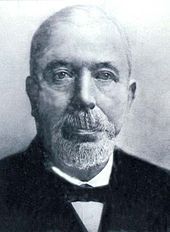
John Houlding founded Liverpool FC in 1892 after a disagreement with Everton’s committee. The team has won numerous trophies, including 19 league championships and various domestic and international titles. Their first pre-season friendly match was a 7-1 victory over Rotherham Town. Tom Watson managed the team to their first league title in 1901, which they repeated in 1906. Liverpool FC has also won a FIFA Club World Cup and several continental titles.
Their most successful period was during the 1970s and 80s, winning with an impressive amount of League titles and cups. Three professional coaches were at the team’s helm during this era. Rafael Benítez and Jürgen Klopp led the team to win two more European Cups at the beginning of the 2000s and more recently. Liverpool Football Club has a passionate fan base and a rich tradition, continually evolving under new managers. The club will undoubtedly continue to make strides and cement its place as a significant football institution.
Liverpool Football Club made history in 2020 by winning their first-ever Premier League title under the leadership of Jurgen Klopp. Liverpool’s influence in the world of football is clear, as demonstrated by its vast following and impressive value. The club has a rich history, including intense rivalries with Everton and Manchester United. In 1964, under the guidance of manager Bill Shankly, Liverpool underwent a significant change by adopting an all-red home kit.
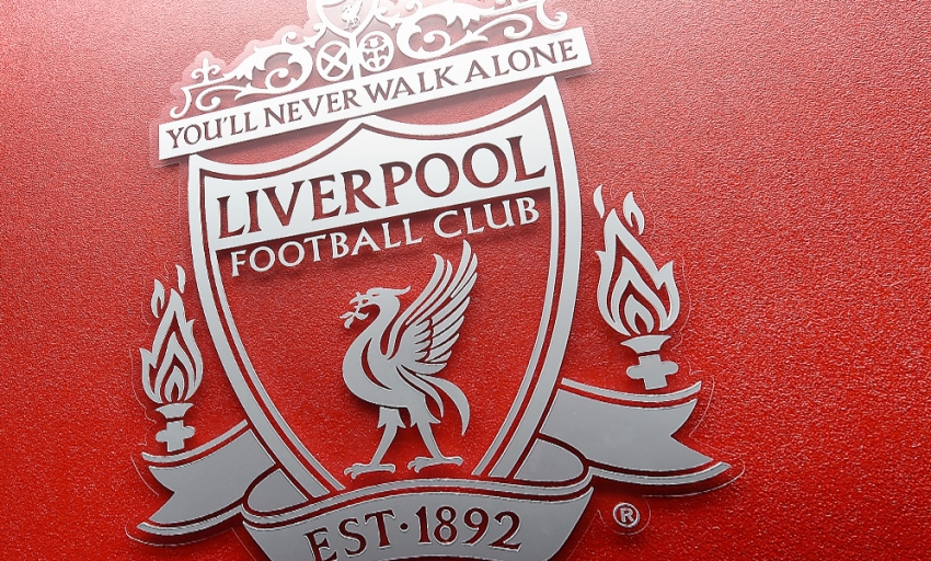
The club’s logo features the words “You’ll Never Walk Alone,” which serves as their anthem and a symbol of their strong bond with supporters. Forbes’ April 2021 valuation of Liverpool FC, under the management of Klopp, places the football club as the fifth most valuable globally with a worth of $4.1 billion.
Here we’ll look at all the logos throughout the years and see what they’ve gone through to become the logo that we associate with the team today.
The Logo Throughout The Years
In 1892, a sports commentator made reference to a flag bearing the letters L.F.A. and crowned with the Liverbird during Liverpool Football Club’s inaugural season.
This was the first appearance of the Liverpool crest. According to the club’s official website, it is mentioned that the original design of the emblem drew inspiration from Liverpool city’s coat of arms. The emblem changed greatly since then and has adapted the Liverbird as its primary icon, but what did it go through to get there?
Below we’ll see the Liverpool logo throughout the years and how it’s changed.

The First Logo (1892-1940s)
The club’s emblem featured the coat of arms of Liverpool, highlighting the city’s strong connection to the sea through various symbolic elements. The center of the emblem was adorned with two liver birds, or cormorants, carrying seaweed in their beaks.
They were very popular heraldic symbols associated with the city. In close proximity were a pair of deities from antiquity- Neptune, the divine ruler of the land in Roman mythology, who is sometimes identified with the Greek god Poseidon, and Triton, the Greek messenger of the sea. The insignia bears a Latin expression that signifies “Divine serenity has been bestowed upon us” and has the words “Liverpool Football Club” written at its foundation.

A Circular Shape 1940s to 1950
Following World War II, Liverpool updated its logo. Directly in the middle was a shield with a cormorant bird, similar to the previous version, but this was all contained
in a circular shape made from the red background and two arching banners that contained the wordmark.
The setting had a distinct pattern of alternating colors in a vertical arrangement, accompanied by ornamental designs that moved in the background. Moreover, two spherical objects associated with the sport of soccer were positioned on opposite ends.

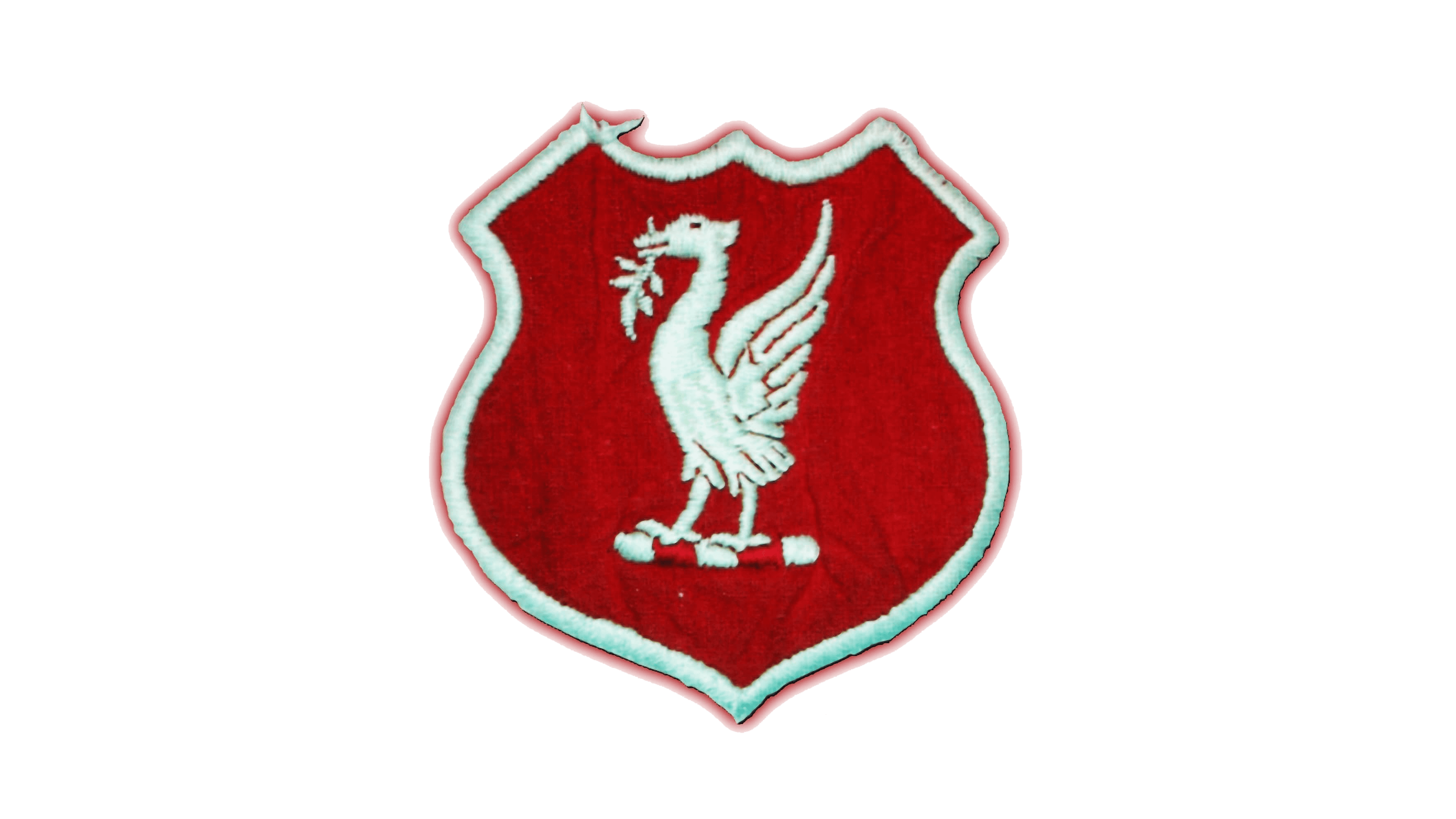
A Simple Badge 1950 to 1955
In 1950, Liverpool FC redesigned its iconic emblem to feature a simpler version of the club’s visual identity. The new emblem was a red crest with a white outline, depicting the Liverbird in white in the middle. The bird sat atop a bar with algae, but there were no additional embellishments. The club retained its classic red and white color palette. The bird’s wings pointed upwards, giving the impression of taking flight, similar to the bird in the original logo.

The Oval Shape & Abbreviations From 1955 to 1968
The logo changed again in 1955 and continued with the simple theme. A crimson-colored bird emblem was perched atop a stand and enclosed by a white oval bordered in scarlet. It held a more stylized branch-like version of the previous algae, and the details of the bird’s wings and body were refined. The initials of the club sat below the bird in a simple serif font.

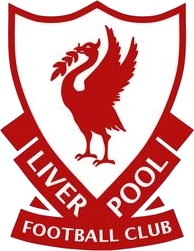
The Stripped Down Logo From 1968 to 1987
With the logo of 1968, the oval and pedestal disappeared, but the color palette remained. The design of the bird was refined a bit by adding clearer talons, a more aggressive or stern-looking eye, and a curved white arch within the body. The initials of the club still sat beneath the bird in a simple font.

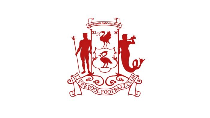
A New Attempt at the Blurred Lines From 1987 to 1992
In 1987, the style of the logo and the Liverbird changed significantly. It now resembled a champions’ cup with a thicker, less detailed bird at the center of the crest. The branch the bird held grew longer and Liverbird itself looked less like a phoenix and slightly more like the original cormorant with its wings up. The center emblem looked like a white shield outlined in red and was flanked by the wordmark, which sat in red geometrical figures and displayed the full team name in an all-caps serif font.

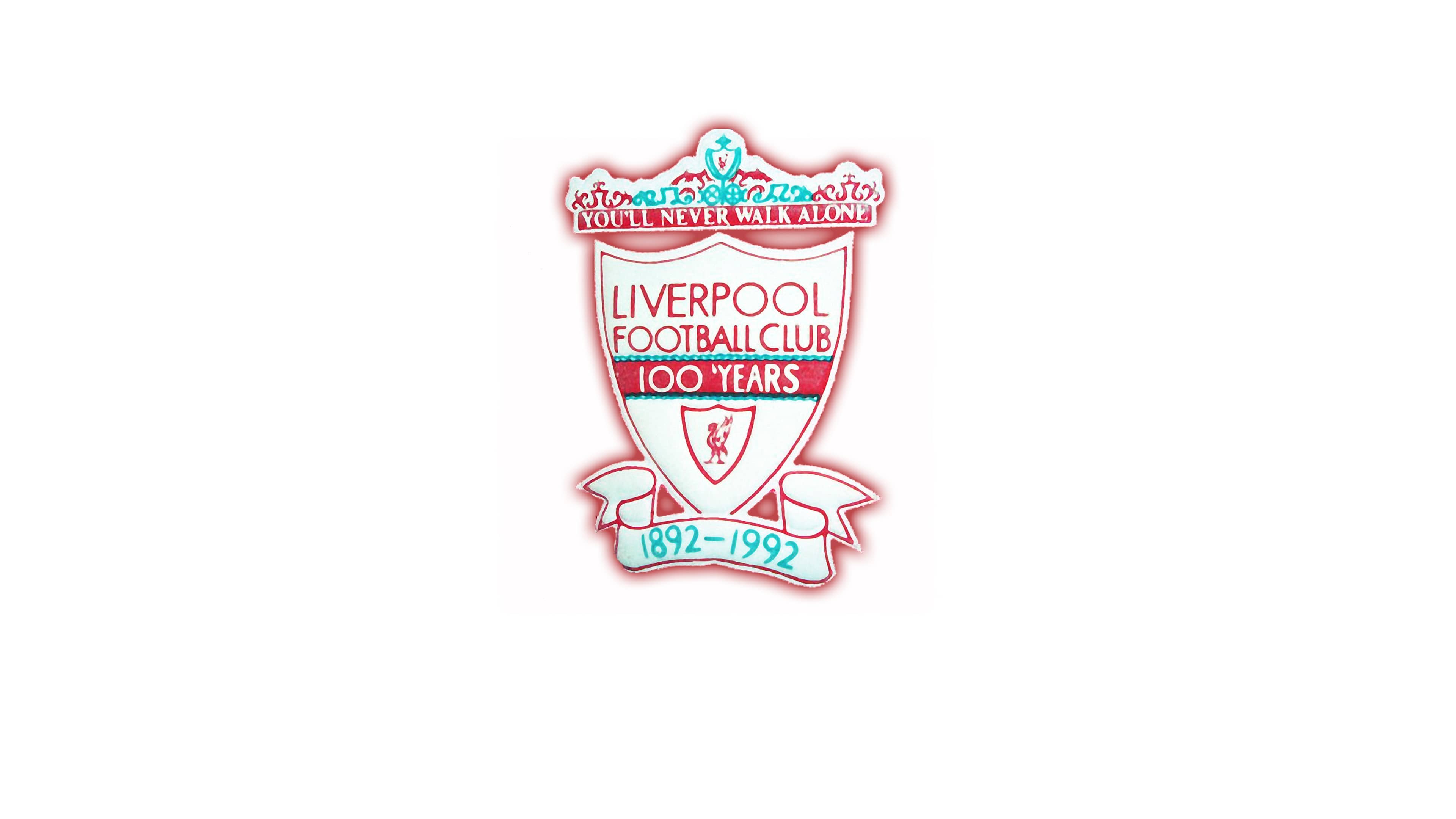
Remember the Origins- Liverpool Logo From 1992 to 1993
Liverpool Football Club celebrated its centenary year in 1992 with a new emblem. The emblem showcased a grand crest that had the club’s name and the number of years they had been in existence inscribed in the center. The badge was designed to reflect the club’s rich history and was very different from their previous emblem. The emblem created in 1992 to celebrate the 100-year anniversary featured a shield with a red bird emblem in the lower section. The top of the emblem was adorned with the Shankly Gates Arch from the Anfield Stadium. The gate and the logo both show the line from the club’s anthem, “You’ll Never Walk Alone,” which was from the musical Carousel and then covered by Gerry and the Pacemakers. The emblem featured a pale strip displaying the duration of the club’s establishment, spanning from 1892 to 1992.

The 1993 to 1999 Logo
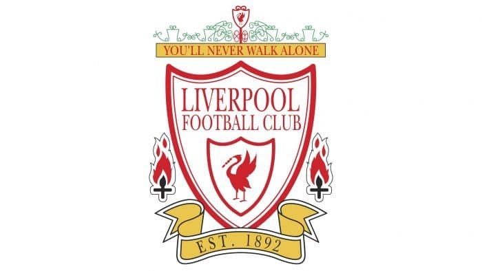
A year after the anniversary emblem, the logo was updated again. This time it reflected that badge from previously but was simplified and modernized.
The new logo included a flame that symbolizes an important occurrence in 1989. This event was a tragic reminder of the loss of 96 Liverpool Football Club supporters due to a crush on the podium at Hillsborough Stadium.
This badge also featured a bird, which now looked much closer to a heron and continued to use the gate above the shield and the ribbon beneath it, with the established year contained within the now yellow feature. The bird also lost its branch, and the all-caps text for the club’s full name was now in a sans-serif font.

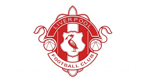
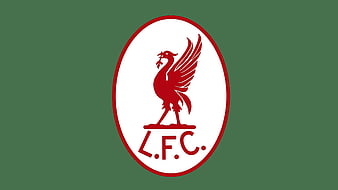
The Logo Used Today (1999 – Today)
Starting off the 2000s, the logo was further modernized and cleaned up. The color scheme became shades of green, shown on the Shankly gate, Est. ribbon, and torches holding the memorial flame. A red gradient was used on the shield and for the updated Liverbird. This Liverbird resembles the one used in 1968, which is objectively one of the best-refined version of the bird and makes for an excellent choice. The fires are both red and yellow stripes while the text within most of the logo is white, except for the “football club” section of the club’s full name. The font used is still in all caps but has stuck with the updated sans-serif version.
The emblematic sash showcases a distinct typography that commemorates the inception of the institution back in 1892. This particular feature has been preserved from the prior rendition.

An Anniversary Logo in 2017
For the 125th anniversary, there was also a brief version of the logo used.
Designers added the 125th-anniversary text in all caps to a version close to the 1968 logo, with the same bird and club initials.
On the sides of the bird, the period of the club’s existence was shown by placing the numbers “1892” and “2017” to the left and right.
Elements of the Logo
There have been several recurring themes throughout the Liverpool logo’s history. It has consistently made use of a familiar Liverbird, and the colors haven’t changed much.
The most significant aspects of the logo, both past and present, are detailed below.
1. The Crest

A crest of some sort has been used in the majority of Liverpool’s logos and is a primary part of the current version. Presently, the shield-like crest is the center of the emblem and calls to the traditional, coat-of-arms-style badge the team has used for a while, particularly the original logo that was pulled from the Liverpool city coat of arms.
2. The Colors

The Liverpool team’s color palette consists of four lively and vibrant colors. The classic white is accompanied by a Persian green hue that resembles the color code #00A398, a bright red tone with the color code #D00027, and a vivid yellow shade named Icterine with the color code #FDF667. These four base colors are the essential elements of the team’s color scheme, while the badge displays a gradient effect.
3. The Font

The logo has its own font created just specifically for their team uses a glyphic serif typeface that stands out amidst the competition. While it may bear some resemblance to other fonts there is currently no exact match available due to the logo’s customized nature.
Conclusion

The Liverpool logo does something interesting compared to many companies, brands, and teams out there- it embraces tradition and classic styles.
Instead of choosing something especially stripped down or simple, the badge remains the classic emblem that so many fans have loved for decades.
While there have been a few alterations to the shape of the badge, it hasn’t changed much since 1992, and the bird being used calls back to 1968.
These strong emblems showcase the team’s and the fans’ dedication to the original Liverpool spirit of teamwork and togetherness.
It’s unlikely that this badge will change and even if it does, it won’t be by much most likely. Wherever Liverpool F.C. goes in the future, they’ll be sure to never walk there alone.
Check out these awesome Logo Contests run on Hatchwise:


