


Long before Ted Lasso first shed light on the inner workings of England’s premier football clubs, football had always been a staple in England – now the rest of the world is finally catching up.
Sure, there are other countries where the sport is referred to as “soccer” and other counties where the sport is equally as popular, but as Ted Lasso exhibited, there is nothing quite like football across the pond.
One of the most notable clubs in the UK is the Chelsea Football Club. Chelsea’s fans are loyal, and Chelsea’s team consists of players that are some of the best athletes in the sport. What goes hand in hand with every great sports team though, is a great, familiar logo – and that is just what Chelsea has.
Whether the logo is printed on a football jersey, a baseball cap, a t-shirt, or a billboard, the club’s logo is recognized by fans near and far. This logo has become the face of this club’s brand and if you’re interested in learning more about how the Club was able to do this, then you’ll want to keep reading. Throughout this article, we’ll explore how the Club was established and how this iconic logo came to be.
Meet Chelsea

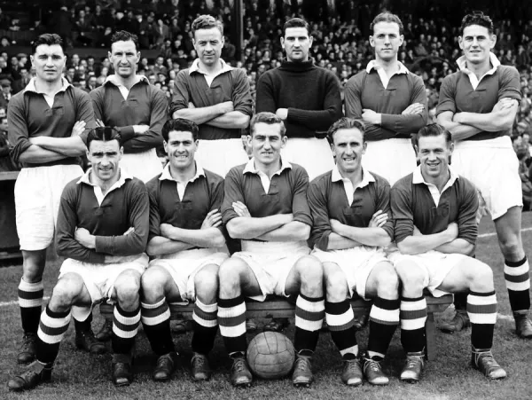
If you didn’t grow up watching football (and no, we aren’t referring to the NFL), then you might not be as familiar with the Chelsea Football Club, so let us introduce you to it. Commonly referred to simply as “Chelsea,” Chelsea was founded over 100 years ago in 1905 by Gus Mears and belongs to the English Premier League. Throughout the next century, Chelsea grew to become one of the most famous British football clubs that has ever existed. Chelsea’s talent speaks for itself, as the team has won several championships, trophies, and crucial matches since its inception and was led by head coach, Frank Lampard for many years, who has his own impressive record of sporting accomplishments.
While Mears may have founded the club, Chelsea was owned and operated by Roman Abramovich, a Russian business executive, since 2003 and its home stadium is Stamford Bridge Stadium. Just last year, in 2022, Chelsea was purchased by Todd Boehly.
Chelsea’s Evolution
While Chelsea’s evolution consisted of various owners, new players being regularly added to the roster, and a wide array of partnerships, below we share a brief history of how the Club’s name and symbolism came to be.

1905: Chelsea Football Club is founded
In 1905, Gus Mears founded Chelsea Football Club. When determining the name of the club one night at a pub, Gus and his fellow founders considered names like “Stamford Bridge,” “Kensington,” and “FC London teams.” The name “Chelsea” was eventually decided on to pay homage to the London district where the Club resided.
To accompany the new team was the first emblem the team ever had. This emblem included an image of British army veterans all wearing medals and this also was the logo of the Royal Hospital of Chelsea. This early emblem provided the Club with its first nickname, “The Pensioners.”

The 1950s: Chelsea Football Club goes through a rebranding
After fans and members of Chelsea’s management team became tired of being referred to as “The Pensioners,” the team went through a rebranding. The manager at the time was Ted Drake and in 1952, he decided that the team’s identity should be more closely aligned with the brand’s new blue lion symbol.

The 1950s – today: Chelsea Football Club becomes the premier team in England
Every decision the Club made was an intentional one that helped Chelsea solidify its spot as the best team in the English Premier League. Players wanted to join the team and fans were as loyal as they come. Over a century after the club was first founded, Chelsea’s status and ranking has not wavered much.
Roadblocks Along the Way
Just like with any sporting team, Chelsea’s roadblocks directly correlate with fans. Fans are loyal to the team they have often grown up with and it’s hard to expand your audience to fans that don’t fall into that category. The only real way to expand an audience is to target new residents who settle down in the Chelsea area, or new markets overseas that have taken an interest in the sport.

For Chelsea though, this hasn’t ever really been much of a problem. The team has maintained popularity all of these years later and that is likely due to a marketing strategy that has worked. Part of this strategy is the brand’s iconic logo which we dive into more below.
The Meaning of Chelsea’s Logo and Chelsea’s Logo History

1905-1952: The first version of the Chelsea logo
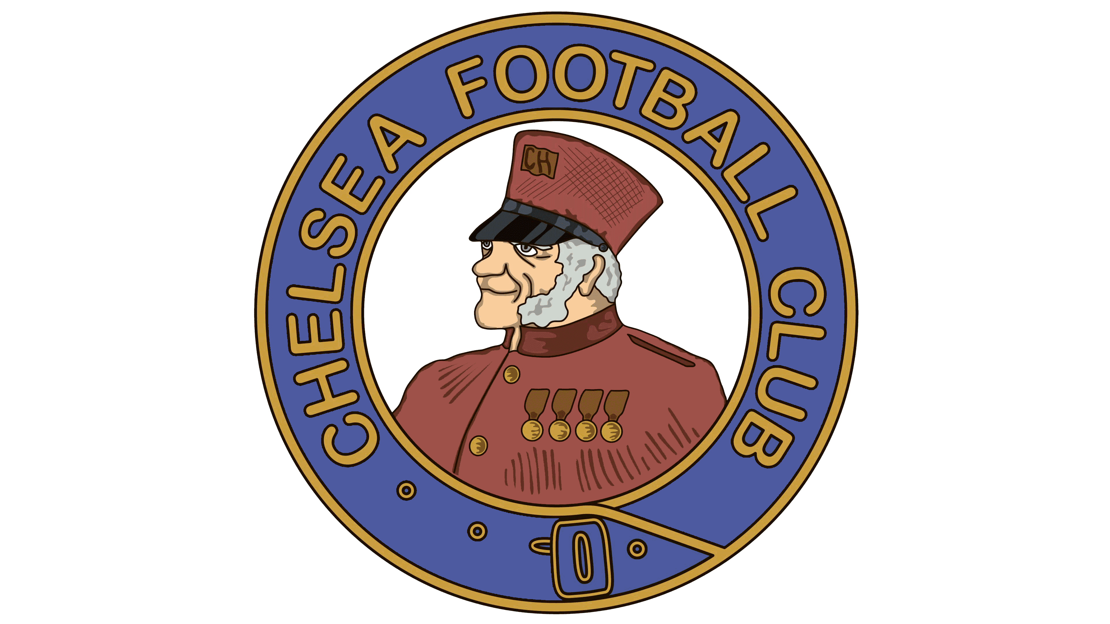
As Gus Mears founded the Chelsea Football Club, the first version of the Chelsea logo was also created. This first iteration included a side-profile image of the pensioner, which also gave the Club its nickname “The Pensioners.” This pensioner sat within a circular emblem with the words “Chelsea Football Club” around the circle. The colors for this first version are some of the colors you’ll still see today, blue and yellow. These colors were chosen to convey stability and professionalism, two pillars of the team.

1952-1953: The second version of the Chelsea logo
Unlike other brands that change logos more frequently early on, Chelsea’s logo didn’t go through a rebranding until 1952, almost 50 years after the first version. This version only lasted for a year though and included a shield with the club’s initials within it. The coloring on this logo remained blue, however, the pensioner figure was removed.

1953–1964: The third version of the Chelsea logo
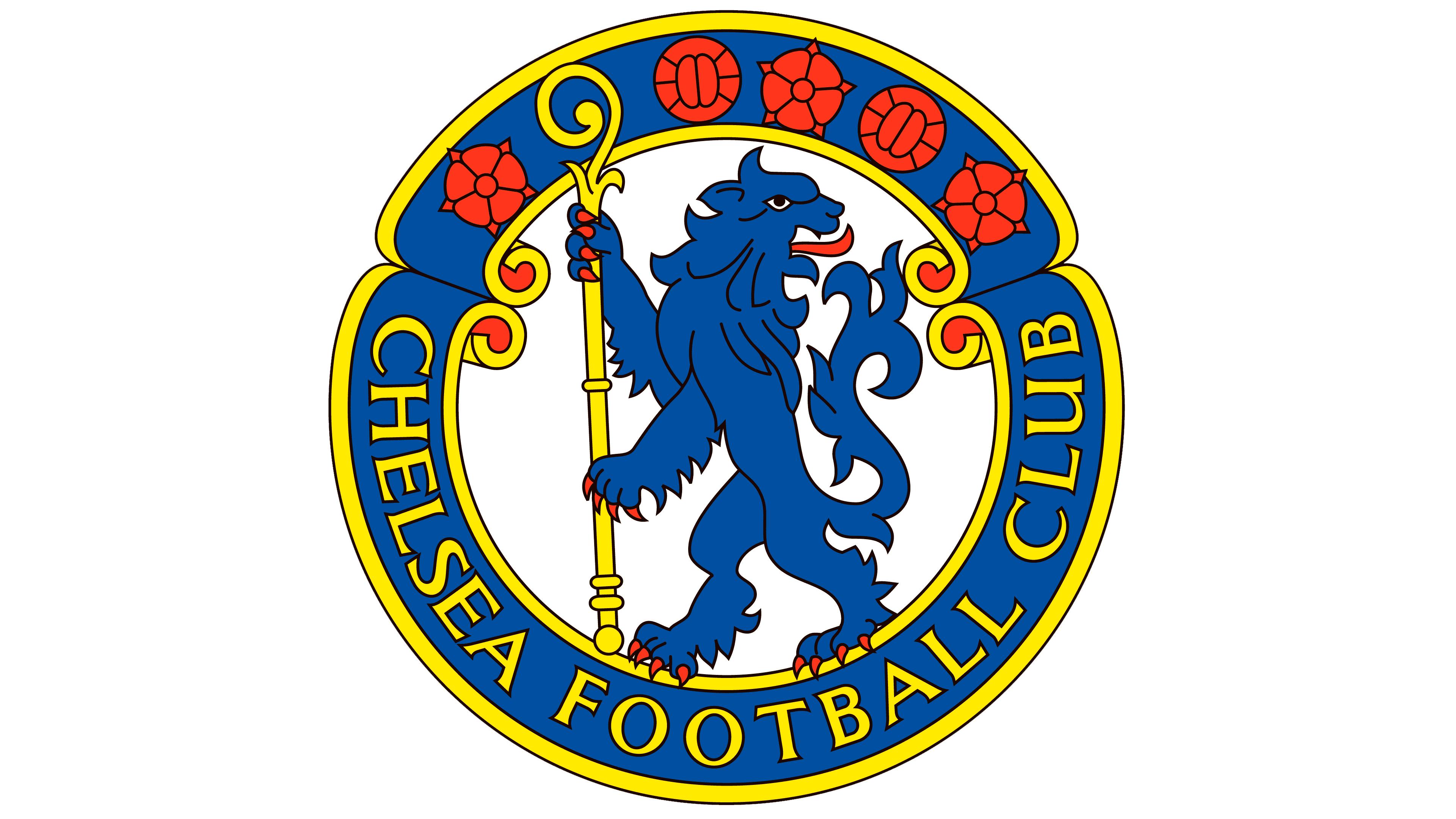
After the shield design, the next logo iteration first introduced fans to the new lion symbol that represented the Club. This logo version was designed by Ted Drake and included a blue lion holding a yellow staff. The logo returned to a circular design and within the circle, the outline included the Club name and five red symbols. This logo featured more colors than previous logos but stayed true to its past yellow and blue coloring.

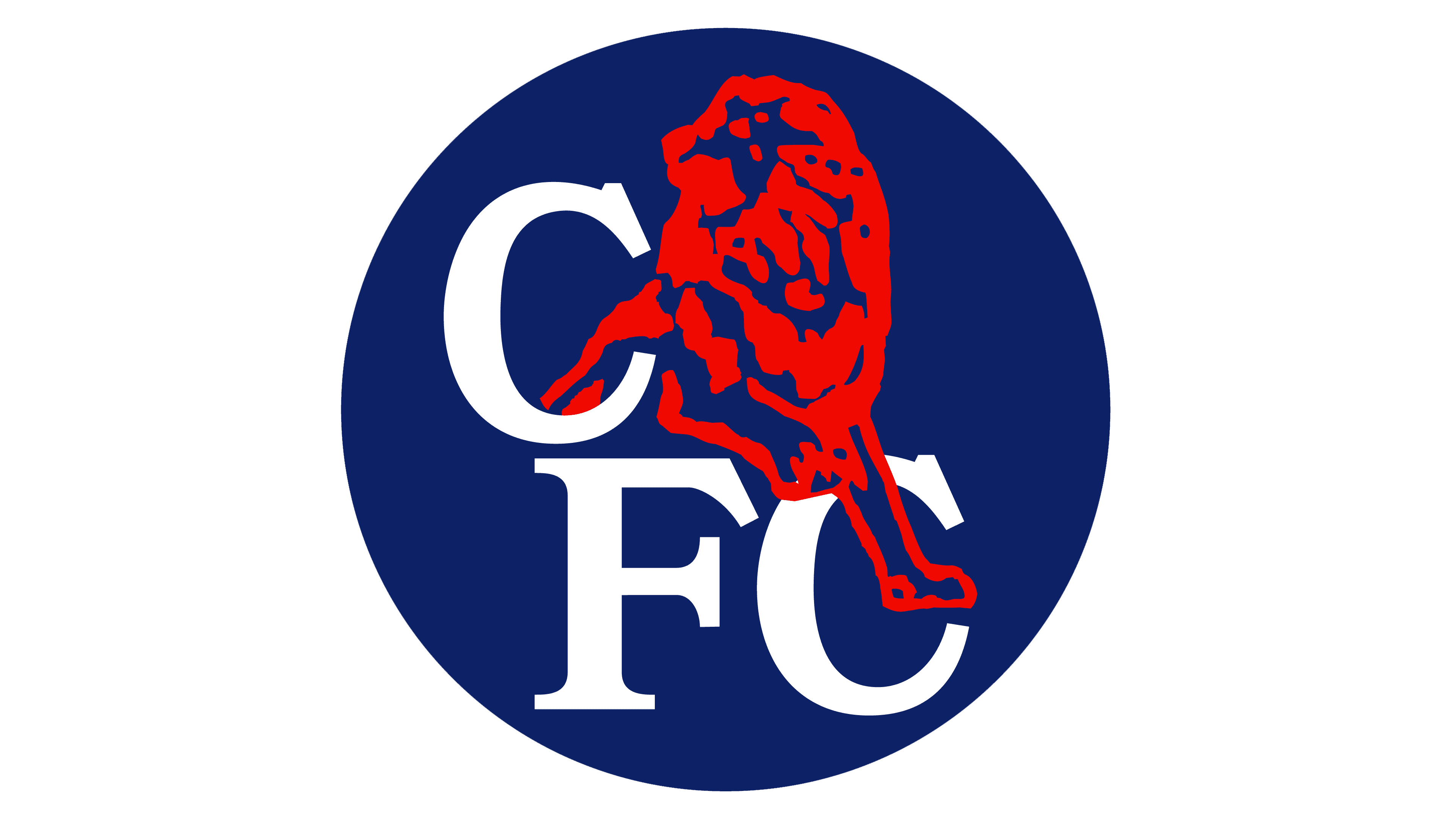
1964-1967: The fourth version of the Chelsea logo
The third iteration of Chelsea’s logo lasted for approximately 11 years, but in 1964, Chelsea decided to forego the lion symbol and instead make the logo simpler. The result was a simple blue square with the Club’s initials written in an intricate font. The lettering was placed diagonally across the box and despite the Club’s efforts to go down the simple path, this logo only lasted three years.

1967-1986: The fifth version of the Chelsea logo
After the Club’s attempt for a simpler logo failed, Chelsea returned to their lion symbol. Instead of a blue lion, this time the lion was white, and instead of yellow staff, this staff was red. The logo still incorporated the blue coloring for the background and Chelsea’s initials were placed below the design. While not a formal redesign, in 1970, this version was updated to include an FA Cup by the lion’s foot, and in 1971, two white stars were added to signify victories of the team.

1986-2005: The sixth version of the Chelsea logo
The sixth iteration of Chelsea’s logo went in a new design direction, designed by Le Coq Sportif. Le Coq Sportif was the brand behind Chelsea’s uniforms, and they wanted a design that complimented both. For this version, the lion was updated to be red, and the symbol was placed on top of the lettering, which was the Club’s initials. Enclosed the emblem was a blue circle. This design stayed with the team for nearly two decades with only small updates being made to it. These updates were mainly around the coloring of the lion, the lettering coloring, and the background color.

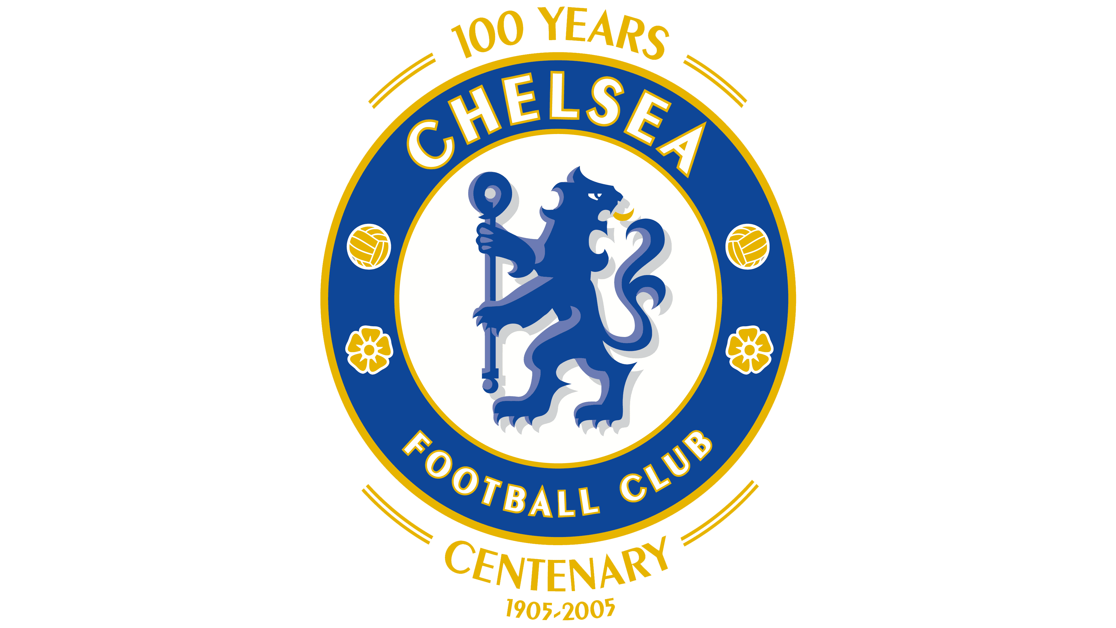
2005-2006: The seventh version of the Chelsea logo
Like many fellow brands, when Chelsea Football Club turned 100, the Club wanted to celebrate this milestone. How the Club did this was by bringing back an earlier version of its lion symbol, with some updated features. The background color was adjusted to light blue and there were more gold details in this version. The other major update for this exciting year was that the logo included lettering that read “100 Years Centenary” around the logo design.

2006–Today: The eighth (and current) version of the Chelsea logo
Once the Club was no longer in its celebratory year, a new logo was designed for Chelsea. This logo removed the wording around the centenary milestone and readded red detailing to the design. This logo switched around the colors of the lion, staff, and background again and the font used was a new font that resembled an elegant and strong sans-serif typography. This logo has been the face of the brand for more than 10 years and that’s likely because it has been able to successfully convey feelings of expertise, authority, and passion for the sport.
Chelsea’s font choice:

Chelsea’s logo hasn’t maintained the same font throughout the years. At some points, the font included ornate details, and at other points, it included stronger bolder lettering. The typeface today is a sans-serif, closely resembling Chong Old Style Pro. This font is confident and powerful, which is a fitting choice for the team.

Chelsea’s logo color:
As noted throughout Chelsea’s logo evolution, the staple colors of the emblem have always been blue, white, yellow, and red. While these colors individually signify different things, collectively they evoke feelings of passion, expertise, elegance, integrity, and loyalty. For a brand that serves as the premier team in England, these are all important feelings to convey through color choices.
Chelsea’s logo symbols:

Even though Chelsea’s logo has changed over the years, there is one symbol we all often associated with the team – the lion rampant. This lion rampant was initially based on the official coat of arms for the Metropolitan Borough of Chelsea. The lion rampant version that you see today, is the same lion rampant that was reintroduced in 2005 and is a revamping of the older lion rampant from 1953. This symbol was immediately accepted by the team and fans of Chelsea, so it was an easy choice to ensure that all logo versions included this widely recognizable symbol.
Chelsea Today

Over 100 years since Chelsea was initially founded, the football team has even more of a presence today. With players regularly competing in World Cups, tournaments, and Olympic Games, it’s no wonder young football enthusiasts dream of playing on this team one day.
Today, Chelsea is led by head coach Graham Potter who signed a five-year contract for the team in 2022. Before joining Chelsea, Graham coached Brighton & Hove Albion and led that team to its highest-ever Premier League finish. Chelsea’s headquarters are in Fulham, London, England, and the team’s home stadium is Stamford Bridge Stadium. And while many of us associate Chelsea with its men’s team, Chelsea is known for a leading women’s football team as well.
On the business front, Chelsea has an outstanding list of corporate sponsors including Trivago, Nike, Cadbury, EA Sports, and many more. Chelsea Football Club is owned by Todd Boehly, an American billionaire, who purchased Chelsea from Roman Abramovich in 2022 for $5.25 billion. This acquisition was the most expensive team purchase in professional sports history.
Lessons Learned From Chelsea
While some logos thrive in their simplistic elements, for Chelsea the intricate details are what makes the team’s logo stand out. For a sporting team, especially football, fans, and team members want a logo that showcases the team’s history and expertise. The biggest lesson you can learn from Chelsea is that not all logos are right for any brand. It’s important to look at the industry of your business and assess what type of logo will perform well in that industry. For tech companies, that’s often simple, modern logos, but for a football team, it’s the exact opposite.
Lucky for you though, you don’t have to worry about all those details. Companies like Hatchwise can handle your entire logo design for you. All you have to do is start a logo contest detailing your industry and vision and then creatives from all around the globe will get started on designing the perfect logo for your brand.
To get started on your logo design, reach out to a member of Hatchwise’s team today!


