


The New Orleans Saints logo is instantly recognizable. It’s modest, chic, and unique! The logo is a French symbol that has been around since the early 17th century.
It’s called “le fleur de lis,” and it simply means “lily flower” in English! The simple but striking design also represents the New Orleans city’s history with France and other European nations.
The original badge unveiled in 1967 was black & white and has changed little ever since. The simple yet elegant black and white mark is a reminder of the fan’s loyalty.
The few changes made to the original logo included the addition of the gold mark, which was introduced by the owners 33 years later. The contrast between the white and the gold highlighted everything brilliantly. Also, the gold color enforced a feeling of nobility and royalty.
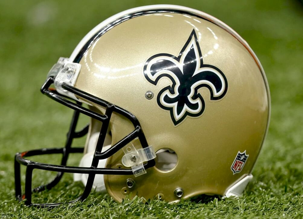
The modern-day rendition of the logo maintains its original simplicity and still conveys an iconic personality, despite changes through time! The current colors are golden and black, contrasting beautifully against white outlines to show off the club’s personality without being too flashy or busy-looking.
Besides the logo, you’ll notice two mascots – Sir Saint (with his hat raised) and Gumbo Dog, who wear official uniforms when cheering on their teams from up high at games!
New Orleans Saints Logo History
There have been significant changes in the New Orleans Saints logos. The logo has seen four iterations since its debut in 2000. The first update was in 2000 when a more contemporary version of the fleur-de-lis was introduced.
Then, from 2002 through 2017, there were a further three changes, with the logo’s personality remaining the same throughout. Take a look at how an expert’s effort is reflected in these updates!

1967—The Original Logo:
The New Orleans Saints debuted their original logo in early 1967. The fleur-de-lis symbol was monochromatic and evocative of dominion and French history.
Thanks to its black outline on a white backdrop, it would become one of the most recognizable sports logos to date.
Also, the style had resonance with the Royal Families of France, notably the House of Bourbon and the United Kingdom. For over three decades, the Saints’ logo functioned as their official brand identity.
2000—The Second Logo:
The flowery symbol ruled with peace and love for almost eleven years. In 2000, they updated the Saints’ initial logo to a more streamlined form.
The designer used triple outlines as well as colors ranging from black and white to golden hues. In comparison to the earlier logo, the outlines were broader and crisper.
These triple boundaries with thick black edges were reminiscent of bygone eras. However, they also contain indications that current society would recognize, such as golden colors.
2012—The Third Logo:
In 2012, the logo for the New Orleans Saints underwent minor modifications. The designer used muted hues to give it an old feel and allude to the French Royal House’s time as rulers of France.
It remained unchanged for over four years, setting the way for the most recent logo.
2017—The Latest Logo:
In 2017, the Saints logo had a subtle makeover that only a few people could notice. Compared to its previous golden tone, the new Saints logo had a slightly different color tone only visible to a trained eye.
Why Does the New Orleans Saints Logo work?

The Saints Logo Is Attractive:
The New Orleans Saints logo is not only aesthetically pleasing, but it also connects with fans at an emotional level. This quality makes the team’s trademark wink-worthy, attracting new followers for their product or service!
The Saints Logo Is Consistent:
The New Orleans Saints logo is a classic. It has been around for decades, and it’s still going strong! This is because its core values have stayed the same throughout its updates, making them easy to recognize and remember.
This consistency is why it has become so influential in the minds of fans.
The Saints Logo Is Simple:
The New Orleans Saints logo stands out as simple in a world with so many intricate and complicated logos. It features minor graphic elements that make it powerful.
This simplicity allows for an instantly relatable feeling with just one glance at its flower-adorned design! The noble lily flower is all that distinguishes it from other teams; it’s simple but also elegant and nostalgic at the same time.
So if you want an instant audience attachment with your company’s logo, then keep things classy and simple!
The Saints Logo Is Scalable:
A logo is a central component in any company’s branding. It’s what sets your brand apart from others.
The Saints have an iconic logo that can be scaled to fit any marketing medium because it’s clean and simple. So, when making a logo, keep in mind you will need to use it across different channels, as it’s the best way to engage your target audience
The Saints Logo Is Memorable:
Logos must be more than simply eye-catching; they must also be unforgettable. A great visual asset is one that people can recall your brand from.
That’s why business owners always strive to improve their company’s branding to keep it profitable and grow.
The Saints have achieved that by keeping their logo current and simple to recall throughout the years, thanks to its unique, beautiful, and clear graphic style.
New Orleans Saints Logo Design Elements
The New Orleans Saints logo has several intriguing and eye-catching features that combine to create a masterpiece.
It incorporates a variety of imagery and symbols, including the flower, which it’s the most well-known for. The three-dimensional floral artwork contains black, gold, and white colors. When compared to the logos of other sports clubs, the color gold stands out.
The fascination of this logo extends well beyond mere aesthetics. The more you learn, the more you’ll find! So let’s dive into each of these emotions one by one.
New Orleans Saints Logo Shape And Symbols
A Lily Flower:
The Saints are known for their legendary logo. It’s linked with the wealthy and powerful in Europe, notably in France. In France, the three-petaled lily flower is a representation of aristocracy and monarchy. It’s commonly referred to as the fleur-de-lis.
The Saints uphold this history with their unique fleur-de-lis logo, which stands for everyone’s integrity, fairness, and prosperity.
New Orleans Logo Colors
1. Black Color:
The colors of the club’s emblem in New Orleans have changed over time. Black was their defining visual ambassador color in the initial design.
Later, they employed a different shade of it for its outlines, and it signified power, authority, mystery, elegance, richness, and seriousness.
2. White Color:
The next official color is white. All of the logos have it as an accent color. White denotes innocence, security, and modesty. It’s no secret that white has long been associated with virtues like purity and faith in numerous civilizations.
Snow is white, which means it also stands for clarity, coolness, and faithfulness.
3. Gold Color:
The primary color of the Saints’ logo is now gold. It’s a warm yellow-brown color with a gold undertone. The color represents wealth, splendor, and prosperity.
Apart from wealth, gold represents courage, energy, and majesty. The gold of the aristocracy is lovely.
What Font Is the New Orleans Saints Using?
The Saints have a rare all-caps wordmark, which is very bold and readable. Fantastic as it may sound, many people have not seen it because the Saints no longer use it with its lily mark as other teams do.
Instead, they only use it on their domain name. But if you fancy a similar custom typeface, Solemnity or Simeon AS Typefaces come pretty close to these designs!
New Orleans Saints Logo: What Does It Represent?
The New Orleans Saints logo is made in the shape of a lily flower as the primary element. The fleur-de-lis is the French name for it. It used to be considered a part of the French identity.
During the early times, fleur-de-lis represented punishment, suffering, hostility, and other negative emotions. Nowadays, it is the symbol of a recognized brand. It conveys good energy, wealth, nobility, and loyalty.
Is fleur-de-lis offensive?
Fleur-de-lis is an ancient symbol that has roots in French history. The fleur-de-lis is a symbol of punishment for slaves in Louisiana. It was adopted during the French Revolution against the non-whites.
Therefore, most people with black ancestral blood wouldn’t appreciate this symbol. Then, a mark on the neck “code Noir” (black code) meant punishment.
This was done to keep slaves from escaping, and unfortunately, it included using the fleur-de-lis sign to identify those who had managed to escape.
Today, New Orleans has grown to love the fleur-de-lis as a symbol of the city. Some believe it’s a symbol of togetherness; thus, they see no need to replace it.
Where Does the New Orleans Saints Logo Come From?
The emblem for the New Orleans Saints is French in origin, but sports teams have adopted it all around Europe. The Fleur-de-lis, as it’s popularly known, has long had ties to the French aristocracy. It served as a status symbol for those who wore it, especially aristocrats and the rich.
What Is the Mascot for the New Orleans Saints?

Two mascots represent the New Orleans Saints. One is Gumbo the Dog, and the other one is Sir Saint Bernard! A dog named “Gumbo” donned their suit when he went onto the field; this was before any human representation of a team member had ever done so in history.
Sir Saint is a six-foot-two white man with tiny eyes, crooked toes, and protruding chin. It’s dressed in the team’s uniform except for one thing; it wears a helmet.
Sir Saint resembles both humans (wearing human clothes) & animals (it has a dog head like other dogs). However, its most defining feature would be gold shoes which make him stand out from other New Orleans Saints mascots.
A Brief History Of Saints Logo

The club has had the best and worst experiences on the field. The most magical moment for the club began in 1985 when Tom Benson bought the franchise. He immediately appointed Jim Mora as the general manager and head coach, which changed the club altogether.
One such change is the improvement in results. The most important score in the club’s history was on November 1, 1987, when the Saints beat Atlanta 38-0 and made history. The saints finished that season on a high by beating Green Bay 33-24, giving them a 12-3 record and coming close to winning the first division title.
The club made tremendous improvements under the outstanding leadership of Tom Benson. On December 16, 1991, the team triumphed 27-0 against the LA Raiders, ending a long four-game losing streak and qualifying for a playoff spot. In the same year, December 22, the Saints won 27-3 against the Cardinals and lifted their first NFC West Title.
Fast forward, 19 years later, on January 24, 2010, the Saints came top in a tightly contested game against Minnesota, where they registered a 31-28 win. This game was hosted at the Superdome, which qualified them for their first-ever Super Bowl contest. On February 7, the Saints won their first-ever Super Bowl Title, triumphing 31-17 against the Indianapolis Colts.
March 15, 2018, was a dark day in the history of the Saints, as their successful owner, Tom Benson, passed on aged 90. Being a vibrant leader, the Saints will idolize him for many years to come.
Why Is It Called New Orleans Saints?
For most traditions, a club is usually named after the cities’ name to show respect and loyalty in the sports industry. These names also depend on the historical events that have happened in the past, hence the name.
With that said, you should not be surprised by the 32 American National Football League teams that are all named after the cities. Let’s now look at how the word “Saint” got incorporated into the club’s name. Here are the three inspirations:
1. Catholic Impact
The largest population in New Orleans is made up of Catholics. A sports entrepreneur by the name, Dave Dixon persuaded Pete Rozelle, the NFL commissioner at the time to include the name.
On November 1, Catholics celebrate an event called “All Saints Day.” The announcement was made on November 1, 1966, in honor of all catholic saints.
2. Jazz Heritage
It is said that New Orleans is the birthplace of Jazz and other unique music. The city is known for a unique anthem known as “When the Saints Come Marching in.” The anthem has all aspects of jazz music, which makes it unique and lively.
This song was also an inspiration to the name of the club. Additionally, AI Hirt, a known jazz trumpeter, became a club shareholder and made a rendition of the song, which later became the club’s anthem.
3. Archbishop Approval
At the time, Philip Hannan was the archbishop. Shareholders and the owners approached him with the idea of incorporating the word saint in the club’s name. They were hesitant to approach the archbishop because they thought it would be considered blasphemy or offensive. Still, Hannan was happy with the idea and wrote the first official prayer for the club.
Final Remarks
Although the New Orleans Saints logo has undergone changes, it is still almost the same five decades later. The logo has three shades: gold represents royalty, white shows cleanness, while black signifies wealth.
Just like any other club, the New Orleans Saints have their ups and downs. However, they try as much as they can to meet their fans’ expectations while achieving their goals. The club’s leadership, particularly from Tom Benson, made tremendous improvements, and he is still remembered today. Tom Benson passed on in 2018.


