If you’re gearing up for a pizza night, you usually settle on one of two options: either your local pizza shop or a chain. Local pizza shops are great, but if you want a tried-and-true pizza shop that delivers the same quality slice every time, a chain may sound appealing to you.
Depending on where you live, you may have a Pizza Hut, Papa John’s, or Domino’s close by – and if you’re lucky, maybe you have all three and more. The latter pizza chain, Domino’s, is a chain that has become a delivery, late-night, and/or family pizza night staple. With special deals, unlimited topping options, and a variety of sides (and sauces) available, we understand why the brand has a loyal following!
Whether or not Domino’s is a household name for you, chances are you know the brand’s logo. Domino’s has done a terrific job at developing brand recognition since its inception in 1960, and below we explore all of that and more.
Meet Domino’s
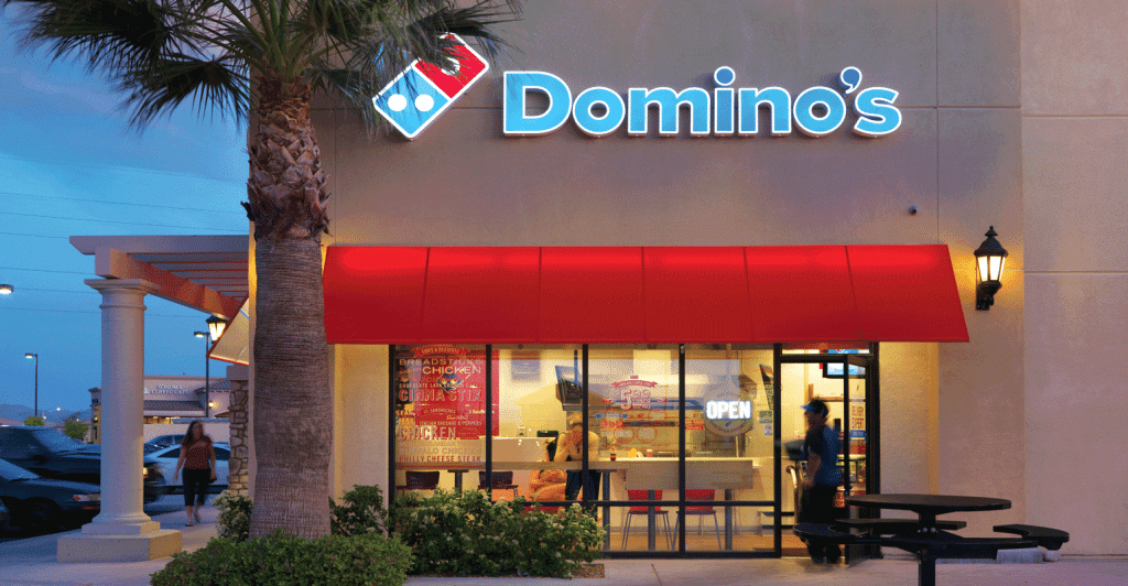
For many of us, Domino’s is a brand that doesn’t need much of an introduction. What you might not know though, is how the pizza chain was founded. To look at the early days of Domino’s, you’ll need to first look at the state of Michigan.
Founded by two brothers, Tom and James Monaghan, Domino’s started as DomiNick’s Pizza in a small town in this state. The two brothers purchased this local pizza shop, and after James gave up his ownership to Tom, and Tom purchased two other pizza spots in 1965, DomiNick’s became Domino’s, and a franchise was born.
When reimagining the future of DomiNick’s, the first thing that was updated was the shop’s name. This new name helped the brand keep the customers that were loyal to DomiNick’s around (since it sounded similar) while also laying the groundwork to build a new customer base with a new brand.
What started as a simple, local acquisition grew to be the highest revenue-generating pizza chain in the world in 2018. The United States remains the top market for the brand, followed by India, the United Kingdom, and Ireland. Today, Domino’s has grown to encompass almost 19,000 locations in nearly 90 countries. Now that you have a brief introduction to the Domino’s brand let’s look at the brand’s evolution a little more closely.
The Evolution of Domino’s
1960: The Domino’s brand is born
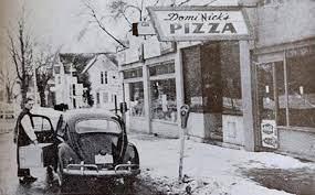
The Domino’s pizza brand was born in 1960 in Ypsilanti, Michigan. The credit behind this pizza chain belongs to Tom Monaghan and James Monaghan, two brothers who together helped launch this pizza concept. James, however, only maintained ownership of the brand for eight months. After that, he transferred his ownership to Tom, and Tom because of the sole owner.
1983-1995: Domino’s expands globally
After spending more than two decades focusing on national growth, Domino’s took its first step towards expanding internationally by opening a location in Winnipeg, Canada, and Queensland, Australia, both in 1983. Just because the chain was focusing on international growth doesn’t mean that Domino’s slowed down its domestic growth. As Domino’s navigated this new international growth, the brand opened its 5,000th location. Fast forward to 1995, and you’ll find that Domino’s opened its 1,000th location abroad and that the brand had locations in 40 different markets overseas.
1990s: Domino’s begins to offer more than just pizza
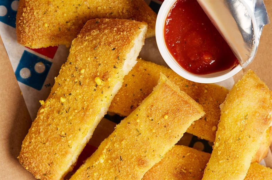
In the early 1990s, Domino’s expanded its menu beyond pizza. The first item up were breadsticks in 1992, followed by buffalo wings in 1994. Both were positively received by customers and can still be found on menus today.
1998-2004: Domino’s reimagines its future
After the founder of Domino’s, Tom Monaghan moved forward with retirement, the ownership of Domino’s went to Bain Capital Inc. This new ownership positioned Domino’s to enter the New York Stock Exchange under DPZ in 2004.
2007-2013: Domino’s adapts with technology
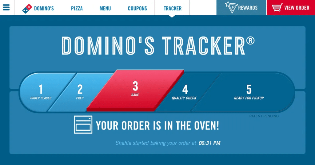
As technology evolved, so did the Domino’s brand. In 2007, Domino’s was one of the first pizza chains to integrate online and mobile ordering into its website and platforms for customers. This allowed customers to order with ease instead of having to drive, or call, Domino’s to place an order. In 2008, Domino’s was the first in the food industry to release a real-time tracker. This meant that customers could see when their order was received, when it was being assembled, when it was cooking in the oven, and when it was out for delivery (or ready for pick-up).
A few years later, in 2013, Domino’s allowed customers to save their information and favorite Domino’s orders, making the ordering experience even easier and more seamless.
2009-2011: Domino’s revamps its recipe (for the better)
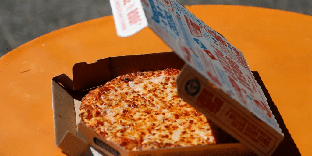
After keeping the same pizza recipe for nearly 50 years, Domino’s reinvented its pizza featuring a new crust, sauce, and cheese mixture. This new recipe was for the better and Domino’s began to receive accolades once again.
2015-2022: Domino’s focuses on delivery
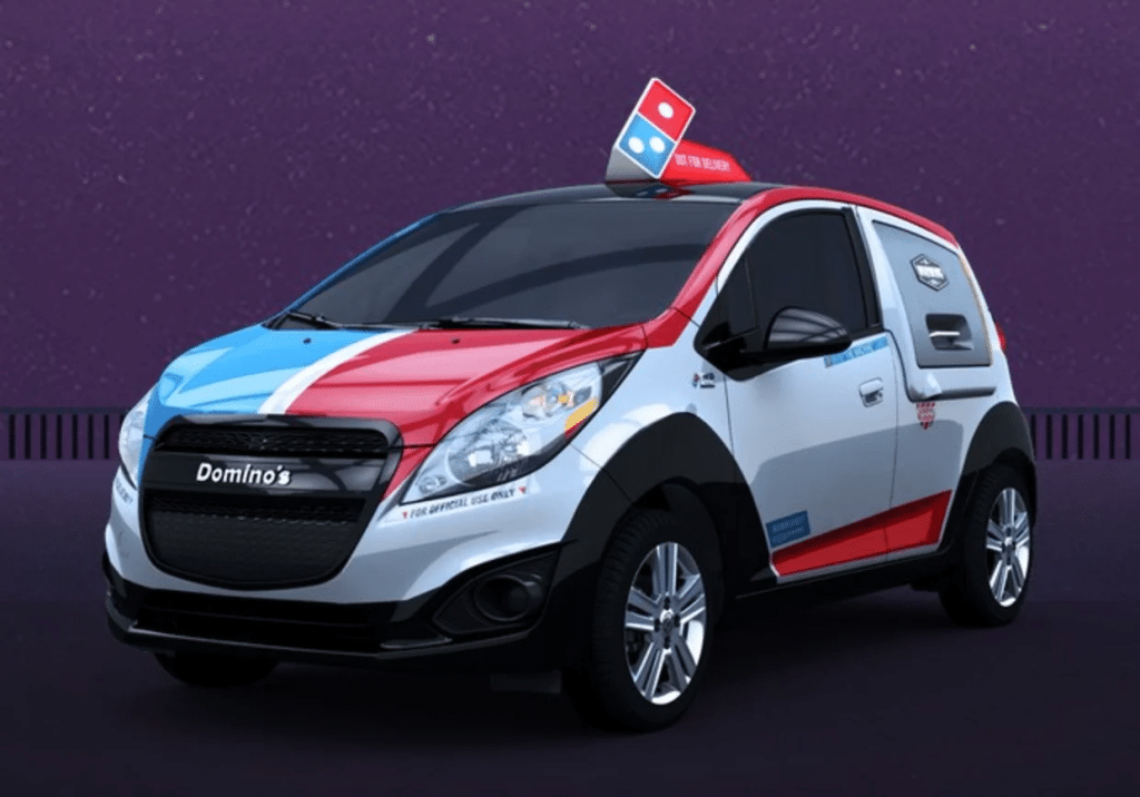
Now that Domino’s had a new recipe that the public loved, the brand began to focus on its delivery speed in 2015. In 2015 Domino’s introduced us to Domino’s DXP. This special car allowed for delivery drivers to transport many more pizzas at once, without having to go back and forth to locations.
The delivery drivers never had to worry about the pizzas getting too cold because Domino’s was one step ahead with innovation and every DXP had a warming oven inside.
Two years later, in 2017, Domino’s began to test out using self-driving vehicles for delivery in collaboration with Ford. While this hasn’t officially been launched yet, it shows that innovation and technology around delivery have always been on Domino’s mind.
As the pandemic unfolded in 2020, Domino’s adapted yet again, allowing car-side delivery where customers could stay in their vehicles to pick up orders. With this option, customers were still able to enjoy their beloved Domino’s in a safe, socially distanced way.
After the pandemic, delivery times were still on Domino’s mind. In 2021, Domino’s rolled out a 2-minute guarantee, promising your pizza would be brought out to you in that window of time. A final step toward improving delivery took place in 2022 when Domino’s partnered with Chevy. Chevy created 800+ Domino’s branded Chevy Bolt electric cars, which would improve the carbon imprint, as well as streamline delivery at select locations.
Roadblocks Along the Way
The biggest roadblock Domino’s has had to navigate is the brand’s passionate customers. The brand had a reputation for flavorless pizza and cardboard-like crust. Customers still chose this pizza repeatedly, but the reputation that existed before 2008 was hard to shake. That was until the brand decided to refresh its nearly 50-year-old recipe.
To revamp this recipe, Domino’s updated the recipe not only for the pizza’s crust but also for the sauce and cheese. The most talked about addition was the garlic-herb seasoning that was added to the pizza’s crust, the red pepper added to the sauce, and the new shredded cheese consisting of provolone and mozzarella. Customers immediately took a liking to this reimagined recipe, and by spending time on the pizza’s recipe, Domino’s was able to turn its reputation around.
The Evolution of Domino’s Logo (and the Components of Domino’s Logo)

1960-1965: The first version of the Domino’s logo
In the early days of the brand, Domino’s was called DomiNick’s Pizza. This logo does not feature a domino and instead is a simple wordmark displaying the pizza shop’s name in black ink. This logo features two different fonts. The first is a cursive-inspired font for “DomiNick’s” and the second is a bold, capital letter font for “Pizza.”
1965-1969: The second version of the Domino’s logo
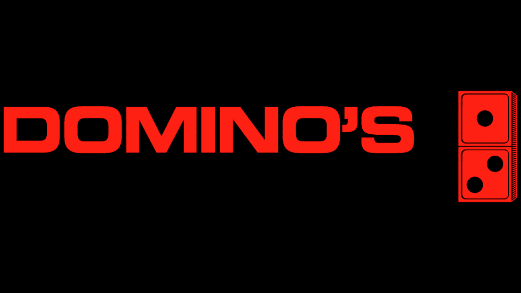
Once the brand was renamed, a new logo was needed. This new design added color to the logo and gave us our first taste of the brand’s symbol. Red was not only a color that stood out but was also the color of a key ingredient for pizza, the sauce. The final significant update to this design was with the font. The previous cursive font was removed, and instead, Domino’s opted to use a sans-serif block script. Each word in the wordmark used a different sans-serif script in a different color. Despite the different fonts and colors, the two words complimented each color.

1969-1975: The third version of the Domino’s logo
The first official Domino’s logo only lasted for about four years. In 1969, another color was added to the design, blue. The addition of blue made the color scheme of the logo officially red, white, and blue, which would stay with the brand even today. Beyond that, the wordmark became consistent with one font being used, a bold, sans-serif, accentuating Domino’s name. Also, instead of the domino being on the right-hand side, the domino was switched over to the left-hand side.
1975-1996: The fourth version of the Domino’s logo
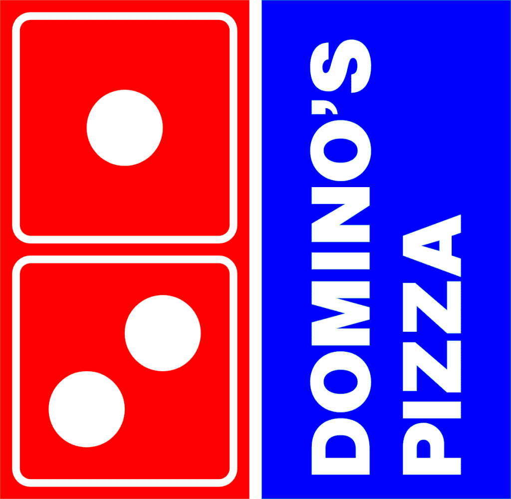
In 1975, Domino’s revamped its logo yet again. This time the designers played around with the placement and shape of the logo. The color scheme stayed the same. However, the red and blue colors were made brighter. The “Domino’s Pizza” wordmark was placed on a vertical plane that sat in a rectangle box. This rectangle sat alongside the domino, which together formed a square. The lettering was refreshed to include lighter, thinner letters that were placed closer together, creating a cleaner logo.
1996-2012: The fifth version of the Domino’s logo
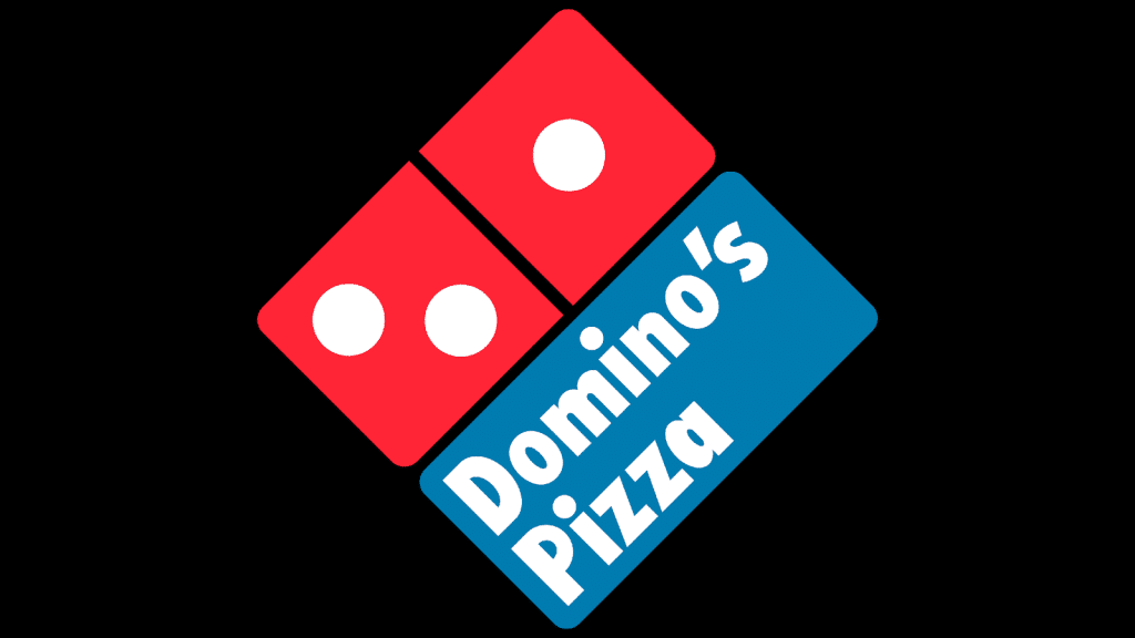
The fourth version of the logo lasted for more than twenty years, and customers responded well to the square emblem. Because of that, when it became time to update the logo again, Domino’s stuck with the square shape and instead played around with other features. This logo iteration included a tilted square and the corners were rounded, making the logo softer. The colors were also muted, making the logo more approachable to the masses. The font was also updated to a font that resembled an Arial or Calibri font. Rather than sticking to capital letters, the wordmark only capitalized the first letter.

2012-Today: The sixth (and current) version of the Domino’s logo
This logo is the version you’ll see with the brand today. For this rebranding, Domino’s returned to a horizontal wordmark and removed the square emblem. The Domino’s name reads boldly in a similar font to the prior version, except the word “Pizza” has permanently been removed. The signature domino is still incorporated; however, it is placed to the left of the wordmark and is tilted toward the right slightly.
Domino’s logo font:
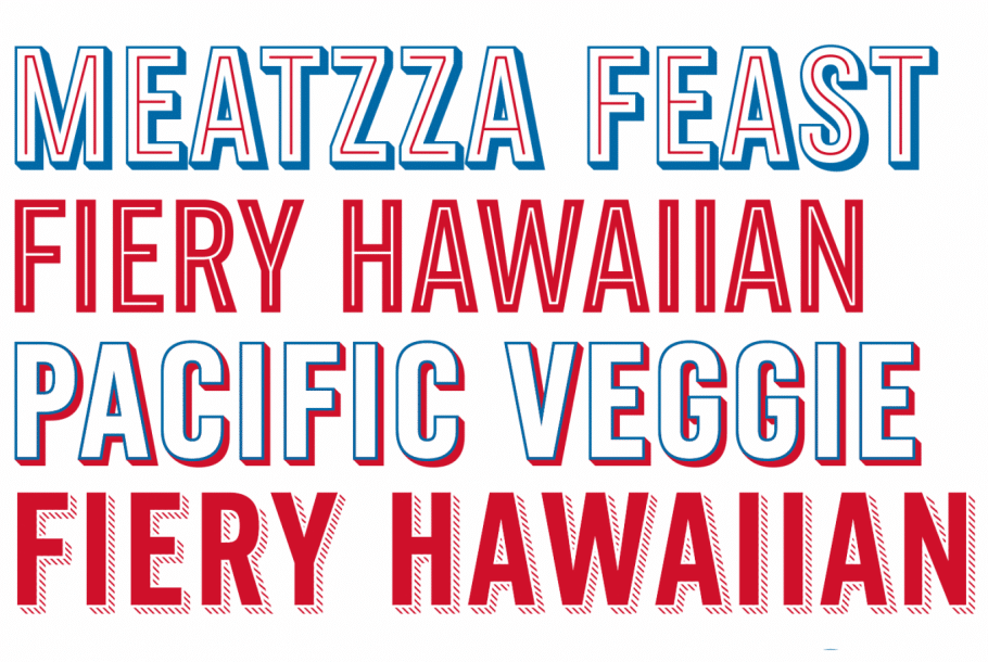
While the font Domino’s used for its logo is a customized font crafted by designer Hannes von Dohren, we can assume what fonts it is based on, or at least similar to.
The font today is like the Pluto Sans Heavy font you can find across applications. The common denominator between the different fonts that Domino’s has used is that its font must always be bold.
Domino’s logo color:
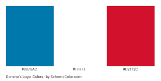
The pizza chain started with white, then red, and then blue, making red, white, and blue the official colors of the brand today. These colors stand out from fellow pizza competitors and are eye-catching colors.
The three colors were chosen for a variety of reasons. They stand out, they convey trust and loyalty (by using the same colors as the American flag), they tie back to the product Domino’s sells (with red symbolizing the pizza sauce), and they are friendly colors (implying that once you step into a Domino’s, you become part of the brand’s family).
Domino’s logo symbols:

In addition to the wordmark used over the years, the pizza shop also used the symbol of a single domino. The number on the domino piece is significant. Each dot symbolizes the first Domino’s locations.
After three locations, Domino’s never added to the domino though. The chain grew far too quickly, though, and so the domino has only ever included three dots.
Domino’s Today
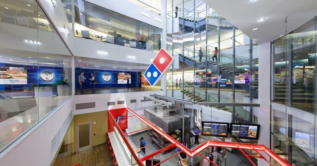
What started as a small pizza shop, DomiNick’s, has grown into a full-fledged pizza chain today. Domino’s headquarters is in Ann Arbor, Michigan, and today, the chain has more than 19,880 locations across the globe (as of 2022). Nearly 6,500 of those locations were in the United States, highlighting the strength of the United States market for this chain. Across the 19,000+ locations, Domino’s has a presence in more than 90 markets across the world. In 2022, the brand topped $17.5 billion in global sales, with more than $8.5 billion of those sales happening in the United States. Domino’s has also adapted to the changing technology that has popped up and has introduced various ordering platforms, from Facebook Messenger, to Google, to Amazon, to more.
Lessons Learned from Domino’s
It’s not always the case for a brand’s logo to grow as fast as the brand itself, but for Domino’s, that was the case. The signature Domino’s logo caught on fast and is widely recognizable universally across the world. Given the popularity of the brand’s logo, it’s evident we can all learn a thing or two from the chain.
The first lesson centers on consistency. Even as the brand revamped its logo, Domino’s maintained some of its key logo characteristics, so customers would always associate any new logos with the same brand they know and love. Domino’s also responded to the feedback of its customers. If they responded well to a certain font or stylistic feature, instead of ditching that logo component, the brand built upon it, highlighting how adaptable the brand is.
Another lesson not to be overlooked is the power of simplicity. Rather than overcomplicating the logo with various symbols and colors and pizza toppings, the logo only ever displayed the wordmark and the signature domino. This helped build brand recognition and helped distinguish the Domino’s brand from competitors.
As you begin to think through your company’s logo, you may begin to follow some of these lessons Domino’s teaches us – and if that sounds like you, we say to go for it! If you want to test out a reimagined logo design for your company that still incorporates your signature logo features, head over to Hatchwise. With Hatchwise, designers will take these lessons and deliver you a logo that brings your vision to life.
We know that trying something new can also leave you with many questions. Get all your Hatchwise questions answered by reaching out to a member of the Hatchwise team!
Check out these awesome Logo Contests run on Hatchwise:


