
The iconic Pizza Hut logo has certainly made its mark and is now one of the most recognized logos in the world. The logo has been around for decades, being first introduced in 1958 and having a few different changes to finally arrive at the result that we’re familiar with today. The US-based fast-food chain and the international franchise are famous for not only their pizza but also their desserts, pasta, breadsticks, buffalo wings, and side dishes. Pizza Hut has quickly become the world’s largest catering structure and is now recognized by people all around the world.
Few people can see a red roof without thinking about the world’s largest pizza chain. The franchise has over 18,700 locations and after being founded 60 years ago, they’ve worked hard to keep a consistent brand throughout time. The shade of red that we’ve come to associate with the brand is shown not only in their logo but in their restaurants around the globe. There’s no denying that the franchise has come a long way since they were first founded and they’ve grown to where we see them today.
Let’s take a look at the history of Pizza Hut and the history of the iconic logo that we now associate with the franchise.

1958 – 1973: The First Logo
The first logo for the franchise was created in 1958 and was different then what we see used for it today. This first logo was a wordmark, showing scarlet red letters in all capitals to create a modern and classy wordmark for the company logo. The letters of the logo appeared to be jumping, making the logo fun and creative. This logo was simple, clear and the red made it stand out with boldness.

1973 – 1974: A Color Change
The first logo stayed with the company for over a decade before the brand decided that it was time for a redesign. However, there was no drastic redesign for this logo and instead, the franchise opted to merely change the color palette. They removed the red and white color palette and instead replaced it with black and white. The colors were changed to black on a white background instead of red letters. The words were now stacked on top of each other, although the letters were still tilted to add personality and fun to the logo. This logo only stayed with the franchise for a year before they decided that it was time for another change.

1974 – 1999: A Redesign
A year later and San Moyers was assigned the task of redesigning the Pizza Hut logo. 1974 marked the first time that we saw the iconic red hat that to this day is still the symbol that’s associated with the franchise. This red hat made its first appearance and then later was used in other versions of the logo. The logo still included the company name, showing it below the red hat in sleek black letters. The letters had long and waved lines this time around and the font was classy and modern. The hat was shown with sharp angles and straight lines that kept it clean.

1999 – 2008: More Changes
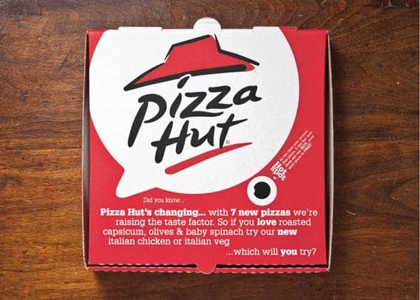
The previous logo was such a hit when it first came out that Pizza Hut decided they could embellish the logo to make it even better than before. 1999 marked the year when the Pizza hut emblem that we’ve grown to love for the brand first came out. Now the lettering was redrawn so that it appeared modern and fancy, now slightly diagonal below the hat. A yellow touch was added below it and the ‘I’ was dotted with a green dot. The hat also saw some changes, receiving a thick black outline and the contours were modified. This new design was created by designer Landor Associates.

2008 – 2017: Another Redesign
The logo stayed with the brand for almost a decade before a complete redesign was made. This time the brand opted to include two more shades of red and use white for the letters. The original red hat was shown against a darker red background and below that showed a darker red was shown in a rectangle with the company name in white letters. Although they kept the same font for the letters, the changes made to the logo overall were shocking. The dark square that the design was placed inside of was bold behind the white inscription and it gave the franchise a new personality.

2010 – 2014: A New and Glossy Change
In 2010 the company opted to go back to the previous color palette that they had used in 1999. But they didn’t completely convert back to their original design that was used in 1999, instead, they opted to make the logo new and glossy. The logo now looked more modern, with the contours redrawn and the hat appearing more vivid. Now the name was below it in white letters with red accents, shown on a small black background. The shape of the hat slightly changed, now extended a little. With the gradient touch included in the design and the letters changed, the logo was now glossy and more stylish than it had been previously.

2014 – 2019: The Red and White Logo
That logo stayed with the company for four years before the logo was changed again, this time simplified and the red and white color palette was brought back. This time a solid red circle was shown and inside was the white hat and white letters. The circle had uneven contours and mimicked the shape of a pizza with a unique circle. The logo looked cleaner with the simple palette and the name stood out while still being minimalistic.
2019 – Present: The Logo Today
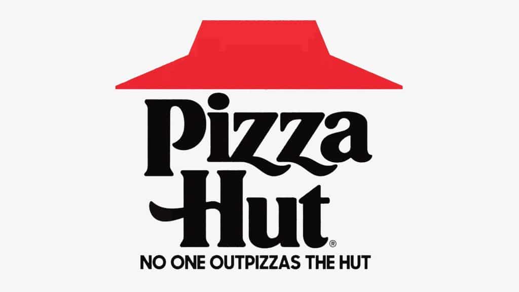
The last update made to the Pizza Hut logo was in 2019 and hasn’t been touched again, not even for small updates or redesigns to the concept. This time the brand opted to revert to the logo that had been used in 1974 that used the classic black lettering and the traditional red hat. This logo is still used today and shows the traditional aspect of Pizza Hut that people can instantly recognize. The only difference with this logo versus the one that we saw used in 1974 is that the red color was changed to a darker shade. This logo is the one that’s now associated with the franchise and that you’ll see used on their marketing material.
The History Of Pizza Hut
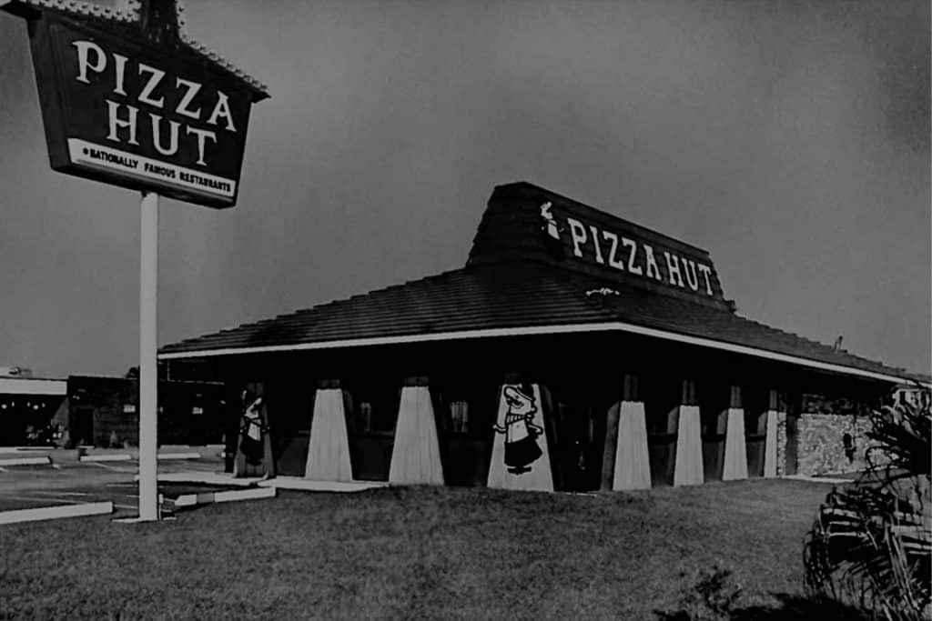

Did you know that the famous fast-food pizza restaurant started with only two brothers? We now know the success of the chain and where it’s at today, but the pizzeria didn’t start with the massive success that we see at the present. The fast-food chain’s beginnings are humble and started with two boys and a plan. Pizza Hut was founded in 1958 by Dan and Frank Carney. These two brothers had an entrepreneurial mindset and were first prompted to start the franchise as poor college students when a friend suggested opening a pizza parlor.
To get started they borrowed $600 from their mother to start their first restaurant. They decided to name the restaurant Pizza Hut since there was only room for eight letters on the restaurant sign. On the first night that they opened the restaurant, they gave away pizza that had been made with second-hand equipment to encourage interest in the community. Needless to say, the restaurant was an instant success and the company quickly took off. Its first franchise opened in Topeka six months later and that was what kicked the company off to the start of a successful franchise. Even with the brother’s lack of experience, they quickly adapted to the industry and there were six more locations opened in North America.
Over a decade later in 1977, the brothers sold the business to PepsiCo and the franchise continued to meet success. Throughout the years’ new items were added to the menu and, with locations quickly opening worldwide and becoming more popular, more spinoffs of the original restaurant were launched. Some locations offered carryout and delivery options while others offered lunch buffets. Pizza Hut kept expanding and now there’s a variety of locations that offer different menus.
Is Pizza Hut Going Out Of Business?

Although we know Pizza Hut as a successful franchise, within the past few years there’s been talk of Pizza Hut rapidly closing locations and some even going as far as thinking the franchise is going out of business. There have been many articles about Pizza Hut going bankrupt and people have started to wonder if Pizza Hut may be disappearing for good shortly. This YouTube video takes a look at The Decline of Pizza Hut and attempts to understand what happened to the franchise and why it’s lost so many loyal customers.
Although it doesn’t seem that the franchise will be going out of business at the moment, they have been closing locations, and Pizza Hut did see a decline in sales in 2020.

In 2019, Pizza Hut announced that they were planning to close around 500 stores, starting that year. According to the franchise’s president and CFO David W. Gibbs at the time they said that although they expected to see their store count decrease, they also planned to make a comeback and reopen stores. The reason for Pizza Hut needing to close this number of stores is complicated. As with anything in the industry, Pizza Hut has some pretty stiff competition out there.
Back in the day, Pizza Hut relied heavily on their dine-in customers, and with the times changing they weren’t getting that business as often. People are less apt to want to dine in for their pizza and far more apt to want the ease of take-out or delivery. Pizza Hut had difficulty shifting its focus from dine-in to what people currently want from their franchise. There was a more recent update about the franchise in 2020, during the pandemic that affected businesses around the globe.
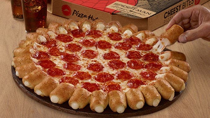
Pizza Hut announced that they would be closing up to 300 locations following the bankruptcy of NPC International. NPC International is a franchisee that operates more than 1,225 Pizza Hut locations in the U.S. During 2020, the franchise’s overall year-over-year sales fell 2.2% 2020. The pandemic had a large part to do with the lack of sales and closing their doors to 300 locations and putting another 927 locations for sale took its toll on the company.
Although the company has been through turmoil within the last couple of years, we’ll have to see if time will see the franchise coming back stronger than before or eventually going out of business.
Summing Up The History Of The Pizza Hut Logo

Pizza Hut is one of the most well-known fast-food pizzeria chains around the globe and we can contribute the iconic logo to the franchise’s success. The logo has had changes throughout its time and full-on redesigns that have given the brand a complete refresh. The red hat is an iconic part of the brand that has been with them from the beginning and has become a beloved part of the franchise.
Above we reviewed the history of the famous logo and the history of the franchise itself, taking a look at where the brand started compared to where it is now. What many people are surprised to learn is that the franchise started with two brothers, $600, and a goal to make a pizzeria. The franchise has been successful throughout its time, but recently there’s been talk about if the brand is going out of business.
Although the franchise has seen turmoil throughout the last few years between closing locations, they aren’t going out of business just yet. We believe that the franchise still has a bright future and that the franchise may reopen locations stronger than before. Only time will tell what’s in store for the future of the Pizza Hut franchise.


