The Raiders are a professional football team that originated from Oakland, California, and was founded in 1960. Since then the team has grown and is now a charter member of the American Football League.
They’ve built quite the fanbase and are feared by their opponents when they’re on the field. The team has always had the one mascot that they seek for inspiration, the mascot appearing on the logo that’s only had a few changes made to it in the years that it’s represented the team.
To some, the Raiders are better known as the Oakland Raiders, which is what they were first named when they were founded in 1960. Later they relocated to Los Angeles where they rebranded to Las Angeles Raiders. They changed their name again when they relocated to Las Vegas to Las Vegas Raiders. Although they may have worked their way through a few different name changes, their mascot remained steadily consistent throughout the years.
The visual identity has been very similar despite its modifications throughout its six decades. Whether a football fan or not we’re sure that this mascot will leave you impressed and make sure that you don’t forget the iconic team anytime soon. Let’s take a closer look at this mascot, what makes it iconic, and the small changes that have been made to the logo since it first was created in 1960.
The History Of The Raiders Logo

The First Logo: 1960 – 1962
The first logo, although similar to the logo that we associate with the team, was unique and creative. As with the following logo designs, it featured a pirate. Two crossed sabers were in the background, with a yellow football that was placed vertically above them. The pirate had character, with an eye patch over his right and he was sporting a leather black helmet. The color scheme was simply yellow for the football, black and white. The handles of the sabers were also shown in the same yellow color as the football.

A Change: 1963 – 1964
The first change came just three years after the first logo when the team decided to remove the yellow color from the logo. They kept the mascot that had been introduced in their first logo, still showing the same pirate as in the previous logo in the center of the logo. The color palette was now changed to silver-gray and black. Now a wordmark was also included in the logo, with the team’s name shown. The logo featured a badge and at the top, it was colored black with the letters shown in grey. While the words “The Oakland” was shown in a small arch at the top, “Raiders” was shown below it in bolder and larger letters. Overall the logo appeared cleaner and more serious, the wordmark adding emphasis to the name.

The Raiders Relocated: 1982 – 1994
1982 and the team decided that they were ready for both a name change and a location change. They decided to move to Los Angeles and they changed their name to Los Angeles Raiders. Although they changed both their location and adopted a new name, they didn’t change the logo. Instead, they kept the same logo that they had used previously, staying both consistent and making sure that they remained recognizable to their fanbase. The familiar black and grey shield with the modern pirate stayed a part of the team for another decade. They played 12 seasons while based in Los Angeles before the Raiders returned to Oakland.
Moving Back To Oakland: 1995 – 2019
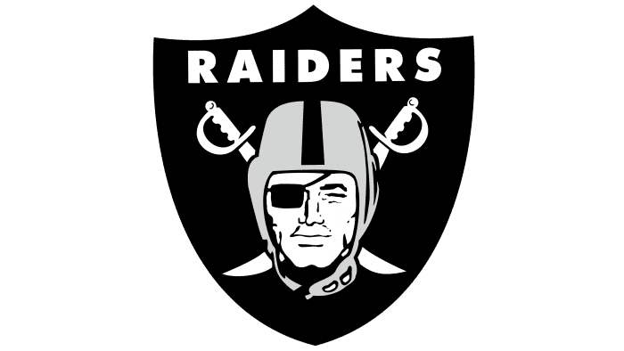
In 1995 the team made another location change, heading back home to Oakland. Despite their move, the team still didn’t think that it was necessary to change the logo that had not been with them for decades. The visual identity that represented their team was quickly becoming not only memorable and recognizable, but it was also becoming known worldwide. People around the globe were now quick to associate the iconic logo with the team and what they did. The simple black, white, and grey logo was doing its job and doing it very well for the team.

The Logo Today: 2020 – Present
At the end of 2019, the team moved to Las Vegas and changed their name to Las Vegas Raiders. They kept the logo almost identical to how it had appeared before, only making a few slight changes. The color palette was the slight change, only adding a darker shade of gray to the pirate’s helmet. In 2020 a thick white frame was added to the Raider’s crest, but these were the only changes.
It’s one thing to have a good logo, but it’s another to have a logo that is iconic enough to have withstood multiple locations and name changes, only to stay consistent throughout it all. The logo has become famous, a symbol that has grown with the team and gone through only minor changes since it was first created in 1960.
Elements Of The Logo
What elements have made this logo so famous? When you’re thinking about a logo that has become as iconic as the Raiders logo and why it’s made such an impact, it’s most important to break it down visually. How a logo appears, regardless of the material it’s on and what it’s used for, is critical. When it comes to a logo for a football team, the logo must be able to work anywhere that it’s shown. It’s going to be shown on merchandise, uniforms, helmets, advertising, and a variety of other places.
Let’s look at why the font, color choices, and symbol that the Raiders chose work so well for their team.
The Colors
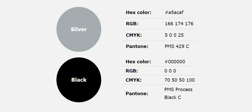
When we think about why the logo works, the colors are important. The team chose to use simple but classic and bold colors that would leave an impression. The basic color scheme does the team justice while making sure that it can be used on a variety of materials. The color scheme consists of just three colors; light grey, black, and white.
The Font
Although the current logo uses only one word for the wordmark, it’s still bold and makes an impression. It uses a bold sans serif font, the letters in all caps. This font is easy to read and boldly expresses the team while still being humble. It’s part of what makes the logo simple while still making sure it has character.
The Symbol
Then there’s the symbol itself, the iconic pirate that has been with the team from the start. This symbol carries weight in the team for a few reasons, one being that it’s been around as long as the team has. It’s rare to see a logo that has been almost untouched since the beginning, but it’s also rare to see the mascot remain untouched as well. This symbol has personality and represents the team. The pirate has finer details while still appearing simple overall and adds to the logo. This symbol is the heart of the logo and the element that makes it the masterpiece we see today.
The History Behind The Team

Although the AFL was officially formed on August 14,1959, it wasn’t until 1960 that the Raiders became the eighth member of the new league. At the time they joined as a replacement for the Minneapolis franchise.
The team wasn’t off to a strong start and the record for their first few years playing wasn’t promising. Then, three years after they joined the league, the team hired a new head coach. Al Davis took over the job as the Radier’s head coach and the team was transformed quickly.


The team improved to a 10 – 4 mark in 1963 due to the instruction of the new head coach. The team was on the right path and their new head coach was such as success that he was named AFL Coach of the Year. Starting in 1965, the Raiders were meant with drastic success and were scoring winning records for nearly two decades. The team had Super Bowl wins, divisional championships, and many other successes. They were quickly rising as one of the most successful teams of all time.
We can say without a doubt that Al Davis as the new head coach was what made the team meet quick success and turn their luck around. He only left the team briefly in 1966 as AFL commissioner.

Davis may have been behind these wins, but it was also greatly due to individual players and coaches that gave their all to the game. As we know, a football team relies on every individual participating to do their best every time they step out on the field. Davis was certainly the mastermind that helped to get the team going towards success, but the team did their part in showing up and performing outstanding plays. Many players from the team have to the Pro Football Hall of Fame and many coaches from the team have been named the AFL or NFL Coach of the Year.
This is a team that fought together to create one of the best sports teams of all time and left every decade with more wins than they had seen the previous one. They embraced both team spirit and broke many records.

Summing Up The History Of The Raiders

Las Vegas Raiders are one of the most brilliant and famous football teams to ever step foot on the field. The professional US football team has become well known in the NFL and plays its home matches in Nevada at Allegiant Stadium. The Raiders have been through a few changes in their history, including starting in Oakland and eventually moving to Los Angeles. Currently, the Raiders are located in Las Vegas, Nevada.
Three Super Bowl wins are only a small part of the Raider’s successes throughout their time. The team has become famous for its championships and has held a long winning streak. Their team is not strong only due to the coaches that make their wins possible, but each individual who contributes to the team. We watch as players pour their hearts out every time that they step onto the field, giving it their all.

Although we’re certain that the Raider’s success has to do with the players and coaches that form the team, we also know that the team’s iconic logo has been a large part of why they’re so successful. The team has a visual identity that has stuck with them from the start, with only small changes being made. The pirate that stands for the team’s mascot has been around as long as the team has and is still recognizable today.
When we’re thinking about how the team has risen and what they’ve been through, we can say without a doubt that the visual identity that has stayed consistent from the start has helped in creating an iconic and recognizable mascot for the team. Next time that you see the time rushing to the field for their next glory, make sure to take notice of their famous logo that represents the team.


