Arby’s fast-food chain may not be quite as famous as franchises like McDonald’s, Wendy’s, or Burger King but that doesn’t mean they haven’t built a legendary brand. Arby’s made its mark by offering the world an option other than burgers and chicken sandwiches by beginning to sell their famous roast beast sandwiches. When Arby’s was first launching we first saw their signature dish, originally their roast beast sandwiches, reflected in their very first logo. Although we’re now familiar with the fast-food chain’s light red logo that’s been with it for nearly a decade, the logo wasn’t always that way.
The logo has only had four changes since it was first created and although similar to the first logo there are noticeable differences from the first logo to the one that’s being used today. The fast-food chain has grown in amazing ways since it was first founded in 1964, but the franchise’s logo has grown in marvelous ways as well.
Let’s take a look at not only how the logo has grown and changed throughout time, but how the company has as well.
The Complete History Of The Arby’s Logo

1964 – 1969: The First Logo
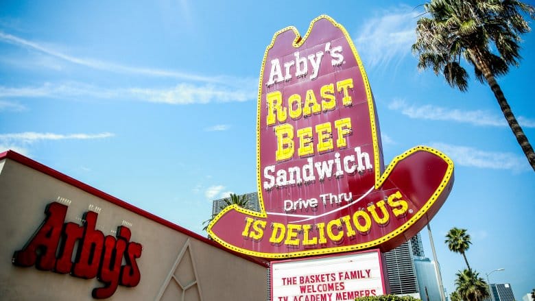
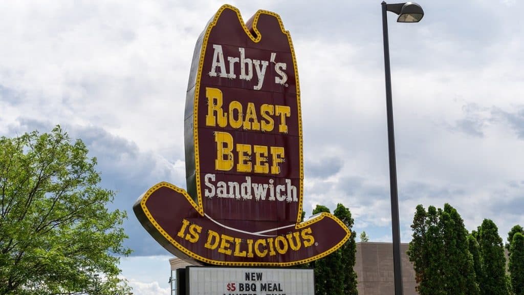
The very first logo for the franchise resembled a cowboy hat and emphasized what the restaurant was known for selling. This logo isn’t very well known and not many people know that the iconic red Arby’s logo used to be a brown western hat. The logo showed a dark brown hat with the words, “Arby’s Roast Beef Sandwich” on it. At the bottom of the hat the text “Is Delicious” was included.
The reason for the iconic hat used as a part of the logo? As far as we’re aware, the hat shape didn’t have a deeper meaning. In 1964, when the restaurant was first established, westerns were incredibly popular and the brand thought it was a good idea to incorporate it into their logo. The cowboy hat served as the base of the design and ended up carrying over into their redesigns.

1969 – 2012: The First Change Made To The Logo
The first logo stayed with the brand for five years before they thought that it was time for a change. This time it was changed to the famous red hat that we’re familiar with today and that has become the iconic and signature emblem of the franchise. This logo was a simplified version of the first logo, now cleaner and including less text. The logo redesigned opted to remove all text from the logo except for their name. The hand-drawn lettering gave the logo a look that they needed, giving the logo a personal touch. This logo was warm and embraced the restaurant as a comfortable brand that cared about customers.

2012 – 2013: Another Update
The previous logo stayed with the company for decades before they decided that it was time that the logo got another chance. This time the brand kept the basic concept for the new logo but now opted to make it a glossy and 3D version. Although the outline of the logo was kept the same, the finer details were changed to be more modern and unique. Now the outline of the top was slightly longer, the logo used a lowercase ‘a’ for the name and the brand adopted a new type. This was also the year that the brand earned their new slogan, “Slicing Up Freshness”. While the letters remained flat, the hat was designed in 3D which contrasted the two.

2013 – Present: The Logo Today
The previous logo barely stayed with the company for a year before it was time for another change. This time the logo went back to being 2D and went back to appearing more like the logo from 1969 that had become a classic for the franchise. The main change was that instead of the older elements that it had used from the late 60s, the logo was now modernized to fitting into the current design trends. The shape was a little wider than it was before, a little shorter, and was now made to adapt to social media platforms. The speech bubble apostrophe that we saw used in the previous logo also made an appearance again.
The Colors and Font In The Logo

As with any visual identity, the font and colors choices that are used play a key part in whether or not the logo is successful. These two parts of the logo decide what will catch people’s gaze and what will make them remember the logo. The font that’s chosen will make sure that people can read the text and that it’s easy to distinguish. Arby’s logo is largely successful due to the colors and font that the brand uses.
The Colors

The Arby’s logo only relies on two colors; red and white. The colors are clean and crisp, simplifying the logo and setting a strong base by tying the two in. We see the color red incorporated into food industry logos constantly and there’s a good reason why. The color evokes people’s desire for food and Arby’s, similar to many other food brands, opted to include it in their logo to catch people’s attention. The color boldly stands out as well as encourages people to use their brand. The second color used is white, creating a clean and crisp logo with curvy white letters. It complements the red in the logo well and makes the logo look professional and stylish.

The Font
The second part of the logo that makes it a successful visual identity is the font that’s used. Arby’s has changed its font a few times throughout its existence, but the one that’s used to this date is their best yet. The font that the logo uses is rounded and thick, giving the logo personality and a fun look. The logo adds character and is one of the biggest attributes of the visual identity.
What Makes The Arby’s Logo Different?

It’s only natural to wonder what makes Arby’s logo different than the millions of others that we see around the globe. After all, with all the logos that we see daily and especially all the fast food logos, it’s natural to be curious why this logo is different. The short answer is the elements of the logo. Some elements make the logo stand out and ultimately pull together the one-of-a-kind logo that has made its mark. Here are a few of these elements that make the logo iconic and unique.
It’s Modest
One essential part of any truly great logo is that it’s modest. What makes the logo modest? It includes fewer design elements that keep it simplistic and iconic. The simple elements make sure that the logo can be used on a variety of materials and that it can be instantly recognized.
It’s Classic
The logo is truly a classic one that’s earned its title well. The logo has done an excellent job of combining the brand’s personality and the aspects of the restaurant to create a timeless logo. The main reason for the logo becoming a classic is that the brand has kept the elements more or less the same over the years. It’s easy to identify because the brand has kept the colors and the basic design consistent since the beginning. It’s become a classic by keeping the branding consistent and keeping the logo elements the same throughout time.
It’s Simple
Amazing logos don’t give customers too much to look at because they want the logo recognizable and clear. It’s important that there’s not too much text included and that the design is simple and to the point. The Arby’s logo is exactly that, using only their name in the logo and the simple symbol. Because they’ve kept their graphic features the same thought time for over five decades. The simplistic logo and the fact that it’s kept consistent throughout time is what has earned the franchise loyalty.
4 Things You Didn’t Know About Arby’s
1. It Wasn’t Named After A Person
Many people assume that the restaurant Arby’s was named after a person that was named Arby. Although this might be a rational assumption, the restaurant was named after its two founders. Leroy and Forrest Raffel, two brothers, founded Arby’s in the 1960s. Since the original name that they wanted to use for the restaurant, “Big Tex”, was already taken, they decided on a different name. They chose “RB” which abbreviated Raffel brothers.
2. They Ran A 13 Hour Commercial

The restaurant wanted to prove that their Smokehouse Brisket sandwich was smoked for a full 13 hours, so they ran a commercial that showed it. They filmed the process and then aired it so that viewers could see for themselves that the brisket went for the full 13 hours.

3. Arby’s Only Had Potato Cakes
You may find yourself ordering a large order of curly fires next time you place an order at Arby’s, but there was a time when you could only order their potato cakes. Until 1970 the restaurant offered potato cakes instead of French fries as their main side dish. Later in 1988, they introduced the curly fries that we’re familiar with today and that’s the go-to side dish for Arby meals.

4. Arby’s Is In Five Countries
Arby’s isn’t only available in almost all of the US, but it also exists in four other countries. Rhode Island and Vermont are the only two states which don’t offer Arby’s. But if you’re traveling abroad then you can treat yourself to some Arby’s in Canada, Qatar, United Arab Emirates, and Turkey.
Summing Up The History Of The Arby’s Logo

The Arby’s logo is one of the most iconic of its time, a logo that truly emphasizes the fast food industry and makes an impression. Although Arby’s may not be as famous as its competition, the famous fast-food chain has made its mark with its legendary roast beef sandwiches. The restaurant has become rapidly successful since they were first founded in 1964 and we’ve seen them not only grow as a company, but we’ve also seen their logo advance throughout the years.
The brand’s visual identity plays a key part in the success of the restaurant and has evolved into an iconic masterpiece. Fans of the franchise may be surprised to learn that the brand’s first logo looked very different than the one they’re familiar with today. The first logo used a different color palette, but the basic concept was incorporated into today’s logo. Despite having a few big changes in its time, the logo has evolved into the iconic masterpiece that we associate with the restaurant to this day.
Next time that you stop by the restaurant for an order of curly fries and a roast beef sandwich, remember the journey that their logo has been through to give you a one-of-a-kind experience.


