When you go down the snack aisle at a grocery store, you’re greeted with the branding of a bunch of competing cookies. From Pepperidge Farm to Chips Ahoy! to Oreos, the cookie options you encounter are endless.
For many of us, though, Oreos are a favorite, and for good reason.
There aren’t many other cookies on the market that are the same quality and have the same taste as the iconic Oreo cookie.
When it comes to the Oreo logo, the logo stands out almost as much as the Cookie itself. Below we will take a closer look at the logo of this Cookie and how the Oreo cookie came to be.
Meet Oreo
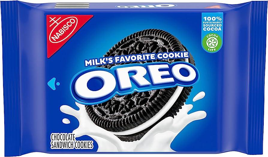
The Oreo cookie has been around for more than 100 years, and since its early inception, the taste and uniqueness of the Cookie caught on quickly.
While the Oreo may not be the first Cookie that used two biscuits to form a sandwich stuffed with cream, it’s the chocolate-stuffed cookie that customers prefer. Originally developed by Nabisco, today, Oreos are owned and manufactured by Kraft Foods.
In the next section, we’ll take a closer look at the Cookie’s evolution since 1912.
The Evolution of Oreo
1912-1913: Oreos are created
Before Oreos, Nabisco introduced us to other cookies we know and love, like biscuits and Barnum’s Animal Crackers. In 1912, in Chelsea, Manhattan, Nabisco was inspired by a cookie from a competing company, Sunshine Biscuits company. This Cookie was called Hydrox and featured a cream filling between two chocolate biscuits.
This inspiration led Nabisco to create the Oreo, which was like the Hydrox cookies, except with a Nabisco cream and Nabisco biscuits. The following year, in 1913, Nabisco filed and received a trademark for its Oreo cookie and unique Oreo recipe.
1912-1974: Oreo goes through a series of name changes
When the Oreo cookie was introduced to the public, it was called the Oreo Biscuit. That name was fitting, given Nabisco’s strong ties to the biscuit industry and the fact that that name accurately described the Cookie.
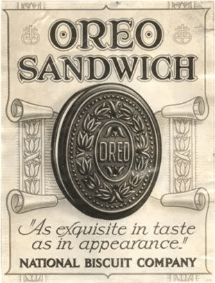
Nearly ten years later, in 1931, Oreo renamed its Cookie to the Oreo Sandwich before finetuning that name to the Oreo Crème Sandwich in 1937. In 1974, Nabisco finalized a name for its Cookie, and since then, Oreo’s full name has been the Oreo Chocolate Sandwich Cookie. The full name can be a mouth full, though, which is why many of us refer to the Cookie as simply “Oreos.”
1975-1995: Oreo first begins to play around with different flavors
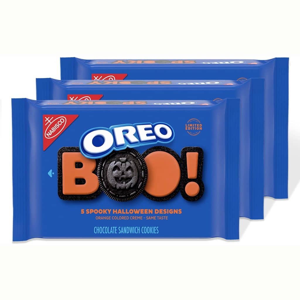
In 1975 after the Oreo name and recipe were finalized and the Cookie grew a loyal following, Nabisco began to release different variations of the Cookie.
First up was the Double Stuff Oreos, which still can be found today. In 1987 fudge covered Oreos followed, and in the early 90s (1991 and 1995, respectively), Halloween-colored and holiday-colored Oreos were first introduced. While the filling colors and look of the Cookie have changed for limited periods, the flavor of the chocolate biscuit and filling hasn’t altered.
2019: Oreo’s sales continue to be strong
Oreos are a staple cookie found in the snack aisle even today, and the company’s sales show this. At the same time, some shoppers may be loyal to Chips Ahoy!, Oreos are a unique cookie for even those customers because the Cookie is different than any Chips Ahoy! product, or any other cookie. Since the Cookie was founded back in 1912, approximately 450 billion Oreos have been sold.
Roadblocks Along the Way
The biggest roadblock for Oreos is the biggest roadblock many food brands also must navigate, competition.
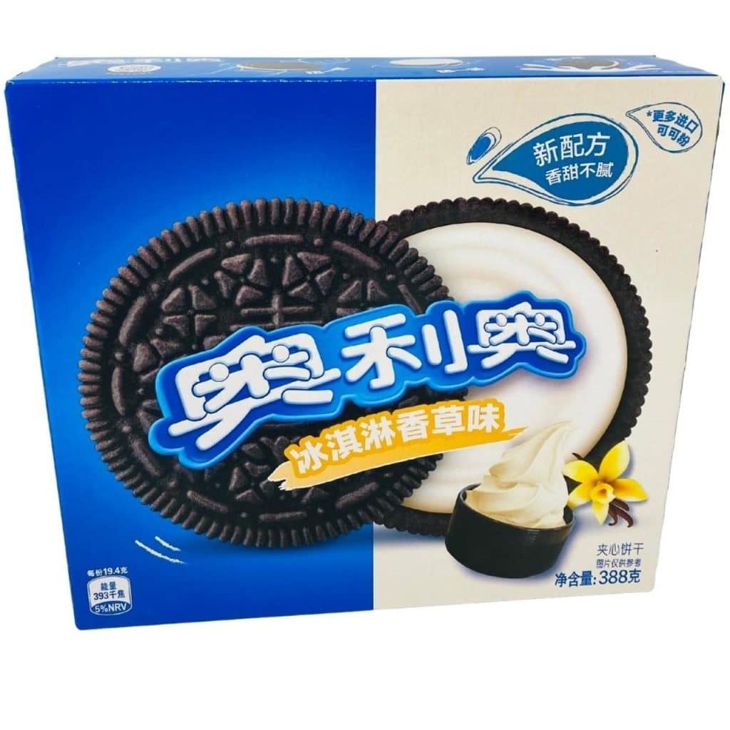
The United States has an abundance of cookie companies to choose from, but that is even more so the case overseas. This was especially true in the Chinese market, where the Cookie had a tough time generating a loyal following when it was introduced to the Chinese market in 1996.
This led Kraft to rethink the flavor profiles of the Oreo overseas and reimagine the Cookie for this market. As the Cookie began to enter additional markets, Oreo took the lessons learned from China and implemented this into future strategies to eliminate any future potential global roadblocks.
The Meaning of Oreo’s Logo and Oreo’s Logo History
While the design of the Cookie hasn’t altered over the years (outside of its limited-edition varietals), the logo for the Cookie has. Below we look at each of the Oreo logos over the years more closely.
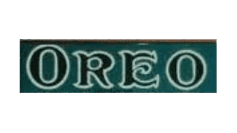
1912-1923: The first version of the Oreo logo
This logo design features the Oreo wordmark written in black letters with a white/cream outline. The brand name sits in a green-blue rectangle box. The font resembles the “Old English” font and is written in capital letters. The white outline and dark-colored letters may signify the Cookie itself, where a cream filling sits between two chocolate biscuits.
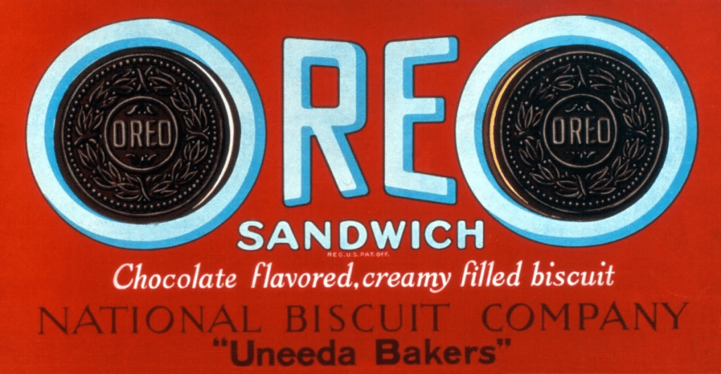
1923-1931: The second version of the Oreo logo
Nearly ten years after the initial logo was released, Oreo unveiled a new design. This design was more intricate, featuring two Oreo cookies serving as each “O.” The background color was updated to red, helping the logo stand out. This background color is also like one of the primary colors used on Nabisco’s other popular cookie, Barnum’s Animal Crackers, so it helped customers associate Oreos with this brand. Another feature of this iteration was the abundance of text that was included. Beyond the Oreo wordmark, the logo also included the word “Sandwich” and the phrases “Chocolate flavored, creamy filled biscuit,” “National Biscuit Company,” And “Uneeda Bakers.” A variety of fonts were used for this logo design, each complimenting one another though.
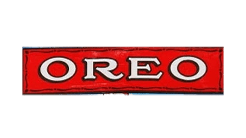
1931-1936: The third version of the Oreo logo
For this third iteration, Oreo kept the red rectangle but removed many of the added features. The only text that was displayed was the Oreo wordmark. The Oreo cookies were removed, and the font was cleaner and more legible using a customized font. The wordmark was written in white, which helped the Oreo name stand out in this design.
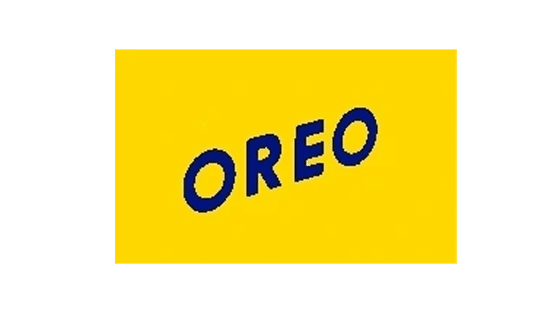
1936-1940: The fourth version of the Oreo logo
With this design, Oreo went in an entirely new color direction. Rather than red, this logo was printed in a yellow rectangle and featured a blue, uppercase font. This was also the first time the designers tried placing the logo on a diagonal line versus a horizontal line. The bright colors of this logo helped the Cookie stand out from competitor cookies.
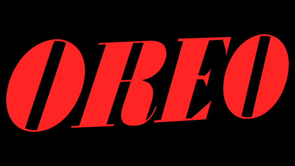
1940-1949: The fifth version of the Oreo logo
Four years later, Oreo updated its logo again. The design returned to red, using this color for the wordmark. The wordmark also returned to being horizontally placed. This was the first design where the background color was removed, truly focusing on the text itself. This font was a new font the designers tested out with fewer angular features, less negative space, and wider lines.
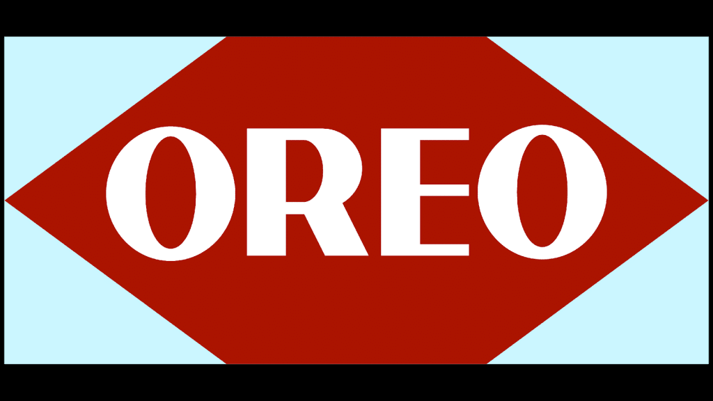
1949-1952: The sixth version of the Oreo logo
As you’ve likely started to pick up on, Oreo went back and forth between components of different logos. For this version, the brand brought back the use of background colors featuring a red shape that sat in a light blue rectangle. The font was updated to a bolder font than the prior iteration, with slightly thinner lines, letting more of the red shine through each letter.
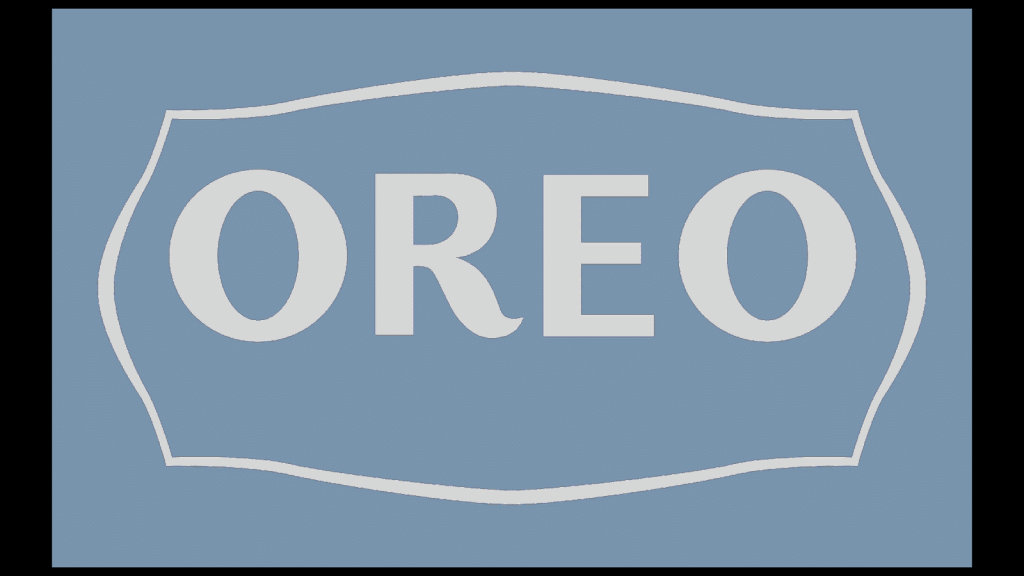
1952-1960: The seventh version of the Oreo logo
While past logo versions used blue as an accent color, 1952 was the first time Oreo used blue as a primary color. For this version, surrounding the Oreo wordmark was a thin border reminiscent of an antique frame. The font was updated yet again, making the “R” more stylized with its curved features and minimally updating the shape of the “O” and “E.”
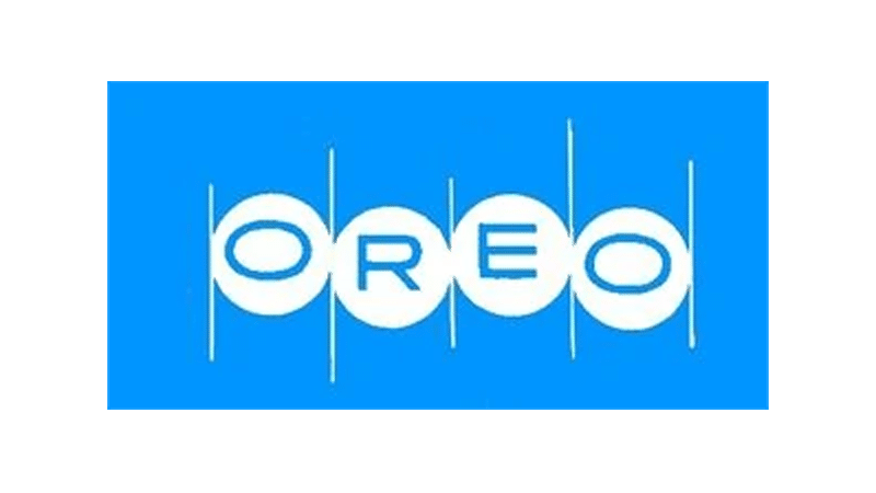
1960-1972: The eighth version of the Oreo logo
This iteration kept blue as the primary color but updated the shade of blue to a lighter hue. The text was reimagined again, this time flattening out the “O’s” more and making the other letters sharper and more angular. Each letter sat in a white circle, symbolizing the cookie shape and a series of vertical white lines were incorporated into the design, separating each letter.
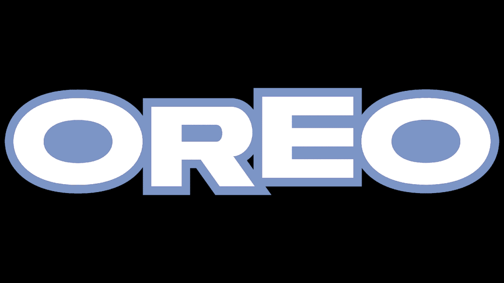
1972-1990: The ninth version of the Oreo logo
This ninth logo iteration lasted with the brand for almost twenty years. This logo design focused on the wordmark itself and made this text the focal point. The font was bolder and bigger, accentuating the Oreo name. The font was printed in white, with a dark blue border outlining each letter and this same dark blue filling in any negative space, like in the openings of the “Os” and “R.” While this logo looks simple, the “O’s” represent the Oreo cookie with its cream filling.
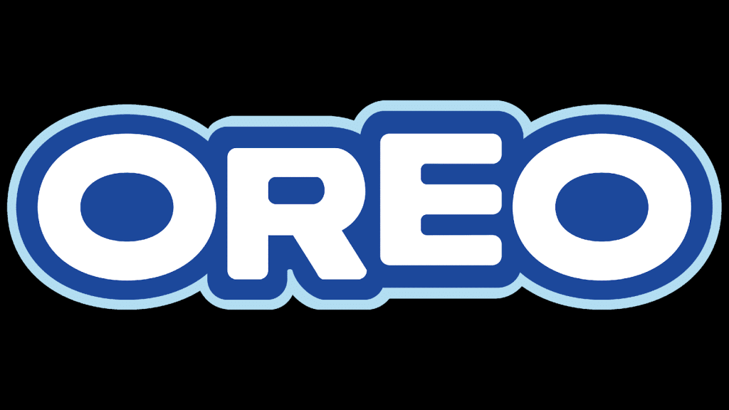
1990-1995: The tenth version of the Oreo logo
In 1990, Oreo decided to maintain many of the features of the prior logo and simply updated the design a bit in subtle ways. The font had slightly more rounded features, and surrounding the dark blue border was a lighter blue bolder.

1995-2001: The eleventh version of the Oreo logo
Five years after the brand fine-tuned its design, Oreo decided to finetune it even more. For this iteration, the only update was a redesigned font. The easiest place to notice this new font is with the “R” and the middle of the “E.”

2001-today: The twelfth and current version of the Oreo logo
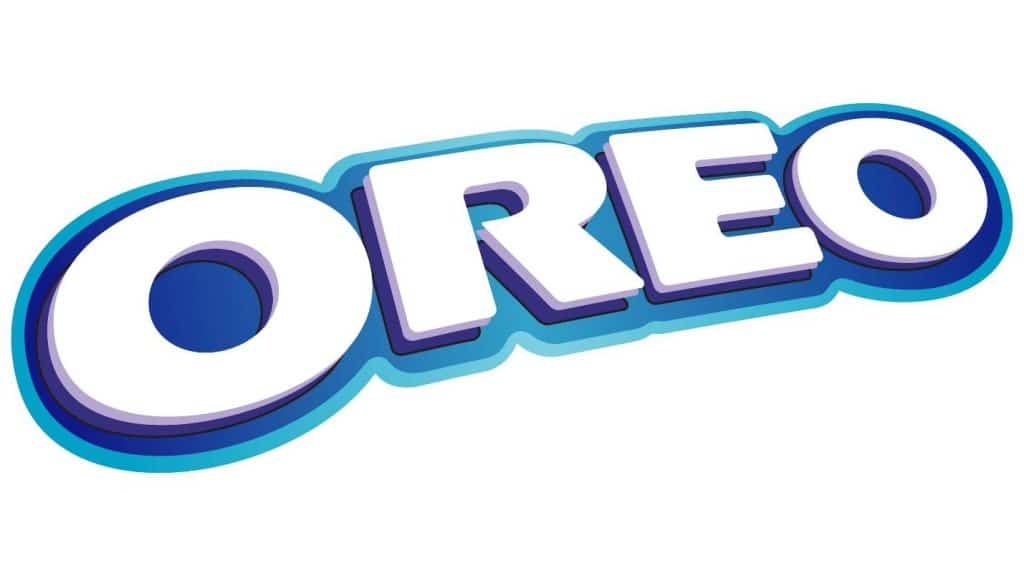
After the Oreo brand was purchased by Kraft Foods, the brand introduced a new logo. Even though the Cookie was owned by a new company, the logo kept a similar color scheme to the past version. This design featured the Oreo wordmark printed on a diagonal plane, and the color featured a blue gradient, making the logo look 3D.
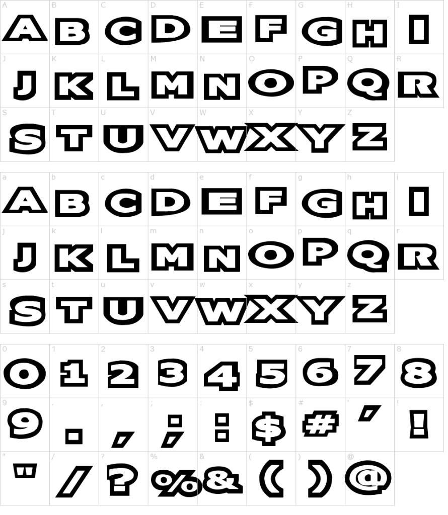
Oreo’s logo font:
Over the years, the Oreo logo went through several different fonts, but the most recent font has been with the brand since 2001.
This font is unique to the brand, crafted by designer Dennis Ludlow. This font features bold lettering with stylized features to each letter.
Oreo’s logo color:
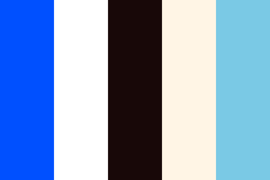
Since 1972, the primary color of the Oreo logo has been different shades of blue and white. Blue is a common color used to represent friendliness.
An Oreo cookie is easily shareable by twisting the cookie top off and dividing the signature biscuit into two. The blue coloring is complimented by white which is used to represent the simplicity of the Cookie.
Oreo’s logo symbols:

While the Oreo logo doesn’t feature a symbol as part of the design, the wordmark has become a symbol of the brand.
This wordmark symbol can be found on packaging, branding, advertising, and more. The rounded features of the letters help to symbolize the fluffiness of the cream filling.
Oreo Today

Today, Oreos are sold in more than 100 countries, and while the China market was originally a roadblock for the Cookie, today, China is its second top-performing market.
Recently, Oreo has explored collaborations with celebrities to help build hype around the Cookie. A recent collaboration was with Lady Gaga in 2020 that featured the iconic Cookie in pink, gold, and green colors, inspired by Lady Gaga’s new album at the time.
While Kraft Foods officially owns the Oreo cookie brand, the Cookie is part of Mondelēz International, with its global headquarters in Chicago, Illinois. Today, it’s believed that nearly every year, 3 billion people buy this iconic Cookie.
Lessons Learned from Oreo
When it comes to the Oreo logo, the biggest lesson we can take away is to let your logo speak for itself. Oreo’s logo did that. With a simple wordmark, the designers played up the font choice and used the “O” letters to represent the cookie shape.
Beyond that, Oreo chose intentional colors to evoke and represent the aspects of the brand that were most important to Oreo. These components together formed this logo that is recognizable by customers across the globe and has produced a logo that isn’t too complicated to scale up or down, no matter what marketing medium it is printed on.
If you’re in the market for a new logo, you can take these lessons from Oreo and run with them for your design. With Hatchwise, though, you won’t have to worry about executing these lessons or visions. All you need to do is come up with your ideal design, and Hatchwise’s designers will handle the rest.
Or are you looking for your own “devilishly” good branding? Flocksy can turn your logo design into a brand guide in no time!
Check out these awesome Logo Contests run on Hatchwise:


