


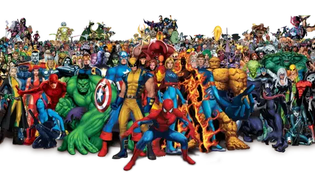
Now that we’re well into Phase 5 of the Marvel Cinematic Universe, with two dozen movies and an ever-increasing number of streaming TV shows, you have to try pretty hard to avoid seeing superhero-themed and comic-book-inspired content.
That means more people than ever are enjoying comic book characters and forming opinions about the best characters, storylines, and logos. And while every comics fan is entitled to their opinion, some logos are simply iconic.
We’ll cover a brief history of comic books, how we got here, the top 10 best comic logos of all time, and how they’ve evolved over the years. Let us know if we missed any contenders for the best comic book or comic character logo ever!
A Very Abridged History of Comics

According to the Arizona State University library guide on comics, sequential art goes all the way back to cave paintings and hieroglyphics, and editorial cartoons in newspapers played a significant part in American politics from the beginning.
The guide separates comics history into five eras: The golden, silver, bronze, and dark ages of comics and the present day.
The first known comic in the United States was printed in a New York magazine called Brother Johnathan, according to an article by the Frankfort, Indiana, Community Public Library. By Swiss artist Rodolphe Topffer, it was called “The Adventures of Obadiah Oldbuck” and featured in the September 14, 1842, issue.

The first publication to call itself a comic book was “The Yellow Kid in McFadden’s Flats” in 1897.
In the 1930s, interest in comic books skyrocketed. Popular genres were those featuring detectives and superheroes.
The “Big Two” comic book companies, Marvel and DC, still going to this day, began publishing their first issues in the 30s.
Comics flourished in the 30s and 40s before being attacked by legislators in the 1950s for encouraging delinquency.

The first teen- and adult-aimed comic books and graphic novels began being produced in the 1970s, attracting more readers who had thought comics were strictly for kids.
Graphic novels cover many personal and sensitive issues, from homelessness to the Holocaust.
Almost as soon as comic books became popular, they hopped mediums and began inspiring movies. Marvel made comics-based movies starting in the 40s.
The first independent comic book movie was The Crow, and The Incredible Hulk kicked off the still-going Marvel Cinematic Universe.
Archie Comics inspired the supernatural TV show Riverdale, streaming on various websites, and billions of dollars have gone into putting Superman, Batman, Spider-Man, the Avengers, and many more heroes on the Silver Screen.
Today, comic books, graphic novels, TV shows, and movies continue to be produced with superheroes and anti-heroes as the main characters.
You can see comic book logos on clothing, accessories, and bumper stickers. It’s now a point of pride to be a comics fan rather than one of embarrassment or shame.
The Best Comic Logos of All Time
1. Superman

Superman, the first hero in the first edition of Action Comics in 1938, may well be the first superhero ever. It’s only logical, thus, that the Superman logo has become absolutely iconic, representing justice and heroism.
Interestingly, Superman’s first logo appeared on the comic cover but not in the comic itself.
The logo that introduced Superman into the cultural lexicon featured a crest-like yellow shield with a red S and a thick black outline. While the logo has gone through many changes over the years, it almost always features these elements: a shield shape, a yellow background, a red S, and a black outline.

The Superman logo went through many changes and alterations over the years, going from an upside-down triangle shape to the more recognizable badge shape by the 1950s.
In 1944, Action Comics aimed to copyright the logo. To achieve a copyrightable logo, the main comic artist at the time, Wayne Boring, tweaked the image to have a distinctive serif on the top of the S and a bump on the bottom left of the S. This logo remained the same throughout the rest of the Golden Age of Comics.
Curt Swan’s iconic emblem for Superman first debuted on the cover of Superman (Vol 1) #211, which he also illustrated. The shield is quite similar to the one designed by Boring, except that the bottom is now triangular rather than rounded (perhaps owing to the limited area available for the logo). It wasn’t until Adventures of Superman #437’s cover that the emblem appeared in a comic for the first time in nearly 20 years.

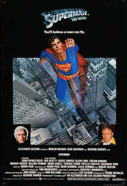
However, since the 1970s, it has been utilized for commercial reasons, most notably on T-shirts (it also appeared in the film’s opening sequence in 1978). The shield’s appearance has changed somewhat throughout the years in response to the artistic preferences of various artists, but its basic outline has remained the same. The emblem that now appears on Supergirl’s chest is based on the same design.
While different comics, TV series, and movies featured different takes on the emblem for everyone’s favorite Kryptonian, the above image remains the most recognizable and often used for Superman.
2. Batman

The first Batman logo was extremely simple in comparison to the logo enthusiasts are used to.
In the 1939 issue, the logo was much smaller on Bruce Wayne’s costume than in more recent iterations, and it doesn’t include elements like the bat head or outline.

While the details of the Batman logo have been played with and customized more than 2 dozen times, it has remained consistent enough to be quite recognizable.
The most recognized Batman logo first entered Batman comics in 1969, featuring a yellow background and curvy batwings that fill the entire ellipse.
This logo isn’t used in every medium, but it’s the one we most often see on merchandise and fan products.
3. Wonder Woman

Unlike our two aforementioned superhero gentlemen, Wonder Woman’s emblem has changed drastically since the hero was introduced in 1941.
Diana soared onto the scene with her iconic costume and a red script logo of her name. The iconic WW logo didn’t enter the scene until Diana’s 40th anniversary in 1982.
The logo was designed by Milton Glaser, a graphic designer who also designed the “I Heart New York” logo. The combination of the eagle’s spread wings and the letters “WW” was both simple and beautiful. Because of this, despite the radical alterations, the emblem is still easily recognized. The logo was yellow, and the typeface was designed specifically for it.

Over the course of many decades, this emblem has undergone minor updates, but it has been a constant companion of Wonder Woman. In the 2000s, for instance, the eagle characteristics were restored to the symbol.
In 2006, they modified it by giving it a beak and giving it more defined wings. The wings had a color shift and a curvier shape in 2011. In the 2017 film starring Gal Gadot, the emblem took on a more natural, wooden look but maintained its distinctive shape.
4. Captain America

Captain America first appeared in a comic book in 1940; a patriotic but sickly man who receives an experimental treatment that makes him supernaturally strong.
Jack Kirby and Joe Simon created the character for Timely Comics, which later became a part of Marvel.
As seen above, Cap’s shield started out as a more traditional shield or crest shape, with decor nodding to the American flag.
However, by issue No. 3, his shield had transformed into a circular shield with a white star on a blue background in the center and alternating red, white, and blue stripes.

The comic book illustrators did this in part because of gripes from a competitor comic book company that Steve Rogers’ look was too similar to their character, The Shield.
Captain America faced wavering popularity post-war, briefly transforming into a “commie smasher” in response to McCarthyism in the 1950s.

His shield didn’t change until the 1960s when the character began to regain some of its lost popularity.
It kept its circular shape and American feel but switched up some of the stripes’ coloring for the iconic shield that today is emblazoned across t-shirts, movie screens, and comic book covers.
5. Green Lantern

As fans of this DC comic may know, Green Lantern is not one character but several. The origin story of Green Lantern also received changes between its origins in the 40s and the Silver Age of Comics around the 1960s.
The Green Lantern didn’t actually have a logo for many years: the superhero was known by his green-and-black costume, instead.
Elements of this design have appeared in a wide variety of comics and media throughout the years. Still, the most definitive representation was unveiled in 1969, with Hal Jordan’s iteration of Green Lantern.

The current Green Lantern emblem is the one most people think of when they hear the name. The picture shows a stylized green lantern, like several others before it.
However, many see hidden significance in this picture. The circle, to some, appears to be pushing against the two straight lines, perhaps representing the significance of willpower to the Green Lantern character.
6. Spider-Man

Your Friendly Neighborhood Spider-Man is another comic book, animated series, and movie character whose logo has seen dozens of iterations over the years. The first logo was a simple wordmark that simply said “Spider-Man” in all capital letters. When the spider symbol first appeared, it was a simple, round, and stubby spider shape.
Spider-Man’s iconic spider logo was designed by Steve Ditko, the man credited with creating the character. It has been employed in every film and comic book adaptation since 1962, with minor tweaks here and there. Toys, T-shirts, and lunch boxes are just a few of the items that feature it.

In the late 1970s, comic book artist Jim Starlin made the image that you see on almost all of Spider-Man’s stuff. The Avengers, Captain Marvel, Iron Man, and Warlock are just a few of the comics that have included Jim Starlin’s artwork or writing.
Thanos (Avengers: Infinity War), Gamora (Guardians of the Galaxy), Drax the Destroyer (Guardians of the Galaxy), and most recently, Thane Kyrell (Rogue One: A Star Wars Story) are all characters he has developed for Marvel Comics. In addition to the iconic Spider-Man logo, he also designed iconic emblems for other superheroes, such as Thor’s hammer Mjolnir.
The modern Spider-Man logo is significantly more stylized, with long, spiky legs and a more realistic spider body with fangs. It has little chance of fading into obscurity, with both animated and live-action movie series ongoing.
7. X-Men
The X-Men are a superhero team from Marvel Comics. Stan Lee and Jack Kirby first developed the characters. After being terminated in 1970 due to poor sales, the comics had a remarkable resurgence in 1975.

The X-Men franchise has grown into one of Marvel Comics’ most lucrative offshoots.
The X-Men’s cast of characters has been featured in several media throughout the years.
The wordmarks on the comic books that debuted for the series in the 1960s were the first appearances of the X-Men emblem. The X-Men comics’ first 20 issues featured a variety of logo designs for the team. An angular “X” and a blocky, sans-serif “-Men” were the first logo’s identifying features.
Many further iterations of the design made the typography seem three-dimensional and placed the wordmark so that it appeared to be seen from the side.

The X-Men comic book logo has undergone a period of refinement and modernization in recent years. Its design is reminiscent of that of the X-Men logo, which has come to represent superheroes in general. X-Men is generally written in a sleek, geometric script over the top of the picture.
In most instances, the text is enclosed in a circle, and the “X” is significantly bigger than the rest of the alphabet, giving the impression that it is a shield or insignia.
8. The Flash
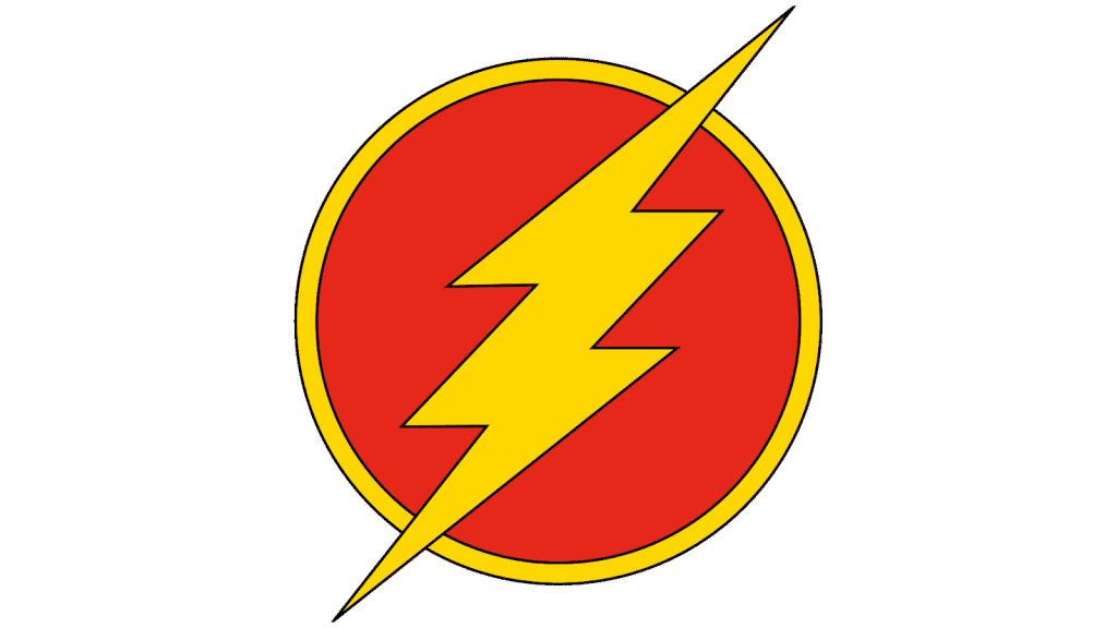
In the canon of DC Comics, the superhero known simply as “Flash” has a unique insignia known as the Flash symbol.
There have been many individuals throughout the years who have been given the “Flash” moniker, and it’s interesting to see the Flash logo on each of them.
In Flash Comics #1 from 1940, we meet Jason Peter “Jay” Garrick, the original Flash. Jason showed us the Flash sign, which is a representation of the speed of the hero.
The lightning bolt highlights the character’s lightning field and enhanced reflexes.

The Flash symbol, in its current form, is often used in DC Universe advertisements for the Justice League. The new Flash logo is a much more textured and metallic feeling than the old ones.
9. The Punisher
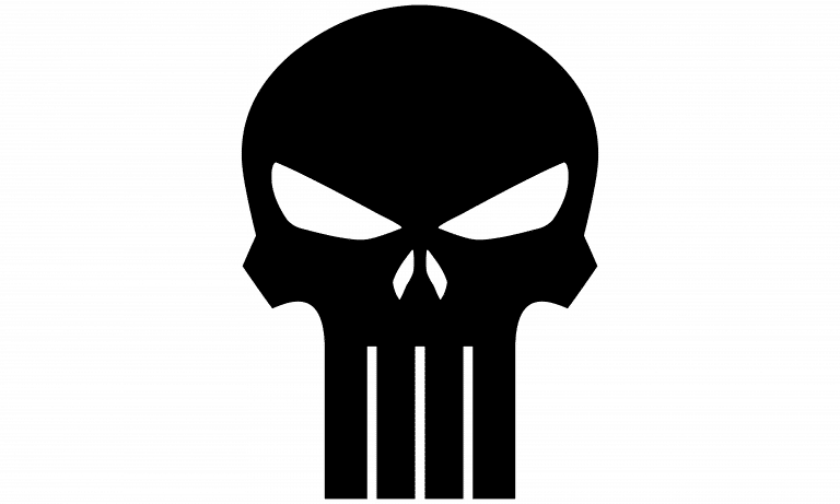
Despite being more violent than the typical hero logo, The Punisher’s emblem has gained significant cultural currency. It’s a hit both in the US armed forces and among comic book readers elsewhere. In the Marvel world, The Punisher is represented by a white skull on a black backdrop.
A former US Marine named Frank Castle, better known as the “Punisher” went from being a regular guy to a vigilante after witnessing the murder of his wife and kids. The Punisher wears his skull as a symbol of danger to his adversaries.

The Punisher logo, an extended white skull on a black backdrop, has changed very little throughout the years. The four protruding fangs helped distinguish the skull from previous depictions of skulls.
It is a bold, striking depiction that has gained popularity as a bumper sticker supporting police, similar to “thin blue line” imagery.
However, a new Punisher logo was unveiled at the start of 2022. Soon later, this likeness started showing up in Daredevil comics.
10. S.H.I.E.L.D.
Unlike the rest of these logos, the S.H.I.E.L.D. logo represents not an individual superhero or a group of superheroes but a (fictional) covert government organization.

S.H.I.E.L.D. stands for “Strategic Homeland Intervention Enforcement Logistics Division” in the Marvel Cinematic Universe, but it has had several other origins throughout the years. The shadowy organization first appeared in a Marvel comic in 1965.
The original logo is a bold, black-and-white stylized image of an eagle. Stan Lee, one of the creators of the series, said S.H.I.E.L.D. was inspired by other espionage-related media like “The Man from U.N.C.L.E.”
S.H.I.E.L.D. got an early start in the MCU, featuring in the Iron Man movies. Agent Phil Coulson tries to speak with Tony Stark after he returns from Afghanistan, but Tony is a little busy fighting Iron Monger at the time.

The organization also has its own TV show as part of the MCU, “Agents of S.H.I.E.L.D.” The MCU uses a fancier version of the logo.
Conclusion
Whether you’re a DC devotee or your loyalty lies with Marvel, it’s not hard to admit these logos are iconic and recognizable throughout time.
Did we miss any? Let us know in the comments.
Check out these awesome Logo Contests run on Hatchwise:


