7UP is one of the most enduring lemon-lime soda drinks of all time, rising through a crowded market in the 1920s to become, if not your favorite, lemon-lime carbonated beverage, an acceptable alternative to Sprite or Starry.
The brand has tried many different logos, slogans, mascots, and ad campaigns throughout the years to differentiate itself from other lemon-lime fizzy drinks.
In this article, we’ll cover the history of 7UP from its creator to the present day, some of the most famous ad campaigns, slogans, and mascots, and the timeline of the logo from the ill-conceived original name to the branding and logo consumers are familiar with today.
The Healing Purpose of Soft Drinks
People who drink Coca-Cola might know it originally contained cocaine, but did you know 7UP was originally meant to be an anti-depressant and contained medicine?
In the 1700s, it was commonly believed that carbonated water contained healing powers. Pharmacies mixed plain carbonated water with medicines and flavorings.
Dr Pepper was the first soft drink to be created in the United States, hitting the pharmacy in Waco, Texas, in 1886. It claimed to be a brain tonic with a unique flavor. Hundreds of different soft drinks were produced with various health claims in the 19th and 20th centuries.
As the medical substances were phased out of soft drinks, soda fountains became a place where people met to enjoy sweet, bubbly beverages without the supposed health effects.
The Howdy Corporation
7UP was created by the entrepreneur Charles Leiper Grigg. A St. Louis-based businessman, Grigg had earlier launched an orange-flavored soda called Howdy Orange. It did well, according to an article from the Waco Tribune, but Grigg grew disgusted after orange growers tried to get legislation passed requiring orange sodas to contain real orange juice or pulp.
He named the corporation he started in 1920 after his orange soda, but he had ambitions of finding a novel formulation that would earn the devotion of American consumers. Grigg spent almost two years experimenting with eleven distinct versions of lemon-flavored beverages.
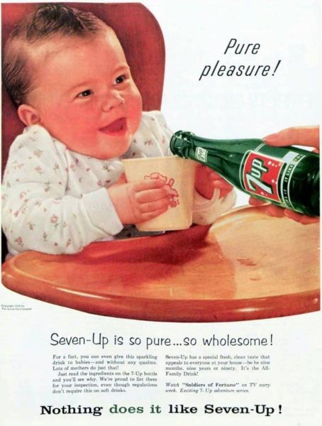
He finally decided on one that had the two most important qualities—refreshingness and thirst-quenching power. In 1929, a scant few weeks before the stock market crash that launched the Great Depression, Grigg introduced his new medicated lemon-lime soft drink. He called it Bib-Label Lithiated Lemon-Lime Soda, a mouthful that got shortened to 7-Up by 1936.
The citrusy drink contained lithium citrate, a substance popularly used to treat a variety of mental health disorders in the 19th and 20th centuries. It is actually still used today to treat some patients with bipolar disorder.
20-Century travelers seeking this effect often visited lithium-rich springs like those in Ashland, Oregon, and Lithia Springs, Georgia.
Some have speculated that the term “7UP” was chosen since lithium is one of the seven atomic-number elements. Grigg never explained the name, but he did advertise the mood-boosting properties of 7UP.
Its release coincided with the Great Depression’s beginning in the wake of the 1929 stock market crash, which helped boost its popularity as something to raise consumers’ spirits. Its name included a reference to lithium until 1936.
The medication remained an ingredient in the beverage until 1948 when the FDA banned lithium from being used in beer or soda.
The brand did so well that they renamed the corporation after it in 1937. National advertising campaigns for 7UP began to hit magazines, newspapers, and the airwaves in the 1940s.
Company Ownership Hot Potato – Who Owns 7UP Today?
- Western Electric bought 7UP in 1969. After that, it was sold to Philip Morris in 1978, then bought by Hicks & Haas in 1986.
- In 1988, 7UP and Dr. Pepper combined. It was bought by Cadbury Schweppes in 1995, making it a combined business.
- In 2008, that business split off from the Dr. Pepper Snapple Group. Today, the company is called Keurig Dr Pepper, and PepsiCo internationally distributes the beverage itself.
Seven-Up Ad Campaigns
“Take the ouch out of grouch”: This slogan promoted Seven-Up when it had its medicinal ingredient, lithium citrate, which the brand suggested was a mood booster.
Post-Prohibition: Savvy 7UP marketers took advantage of the end of prohibition, hinting strongly that the citrus soda mixed well with hard liquor. People still order a “7&7” today – 7UP and Seagrams 7 Whiskey.
You like it … it likes you!: This slogan was seen in print advertising in the 30s and 40s, attempting to stir up fond feelings for the brand from consumers who enjoyed the drink.
The Uncola: Starting in 1967, 7UP’s marketing team coined the phrase “The Uncola” to describe the drink and set it apart from cola drinks.
“Make 7UP Yours”: This risque ad campaign featured commercials with comedian and actor Orlando Jones. The ad ran from 1999-2005 and spawned wide T-shirt sales of the star’s shirt.
The Cool Spot
Cool Spot: Spot, or “Cool Spot” as he was more commonly known, was the American mascot for 7UP. He personifies the red dot from the 7 Up logo. His debut occurred in 1987. In the 1990s, he was featured in a number of advergames and had his own series of 7-Up commercials that aired on television.
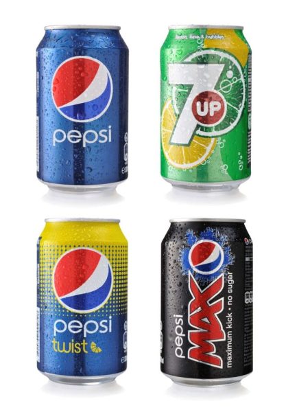
In the early 1990s, the dot from the 7UP logo would come to life as Spot in television commercials. Spot, like Fido Dido, was unable to speak but could express himself by squeals and other loud noises. Multiple Spots, all of which looked the same, would appear in some commercials. During this period, 7 Up continued to use the term “The Uncola” from its earlier advertising campaigns. The name of the mascot was included in the slogan “The Cool Spot” for some advertisements.
Spot starred in at least three different video games on the Sega Genesis, the Game Boy, and NES. As a pseudo-3D platformer, the last Spot ‘advergame’ is Cool Spot’s sequel. Spot has gotten himself stuck inside a movie projector in the game.
The game’s stages are based on various cinema genres that he encounters as he travels from film to film in search of his buddies. You can find a lot of hidden extra movies. The game came out between 1995 and 1997 for the Sega Mega Drive, Sega Saturn, and the PlayStation. There were also planned Sega 32X and Super Nintendo Entertainment System versions, but they were scrapped.
Clearly, the 7UP marketing team fully embraced cross-channel marketing techniques, with ads and advergames appearing on many different channels, platforms, and publications across the globe.
History of the 7 Up Logo
It’s clear, retrospectively, that the logo has been refined and perfected over the years. Bubbles and effervescence are common themes from the earliest years. The bubbles on the 1943 label are depicted in a distinctive style (we see this concept in various forms in many subsequent editions of the label). This updated version retains the 3D style but does away with the wings and skateboard motif. In a red box delineated by two black lines, the letters (white with a black tint) stand out.
The 1972 release is the most stripped-down of the bunch. The “7-UP” letters are white on a red background, and the box has rounded corners.
There has been some experimentation with different bubble sizes, colors, textures, and 3D effects during the past 40 years.
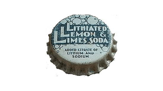
Original 7UP Logo
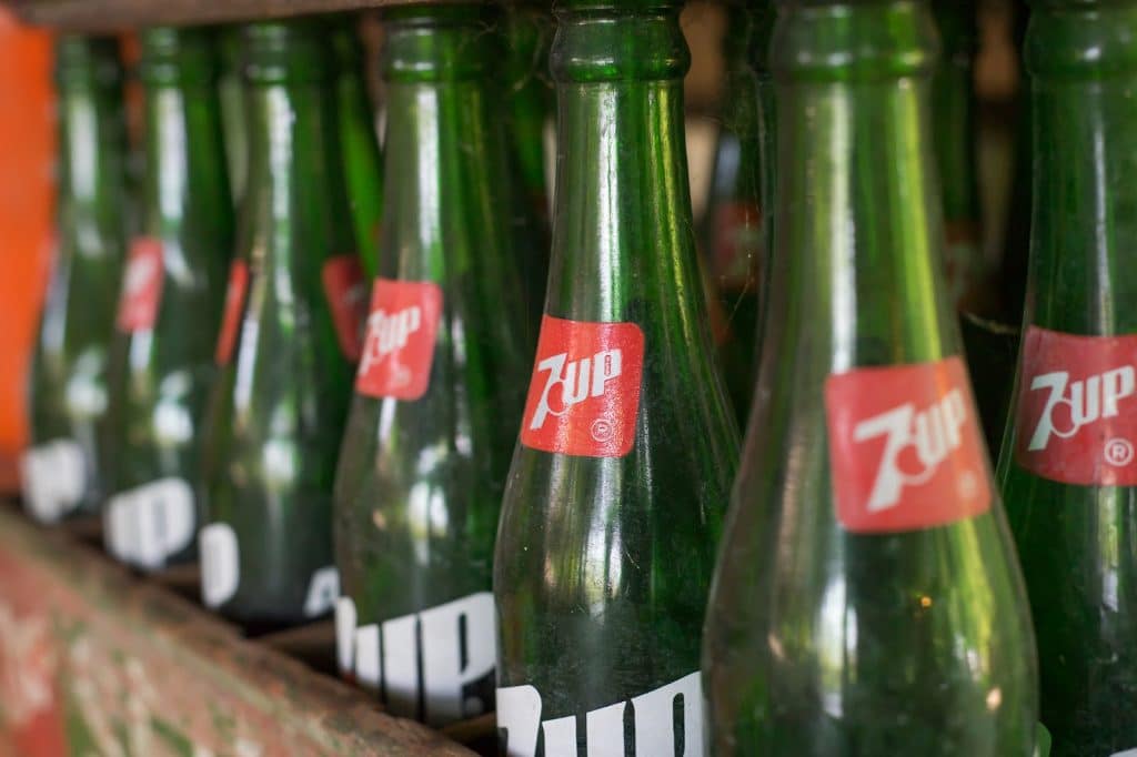
The bottle cap for the original soda stacked the three Ls found in its mouthful of a name, “Bib-Label Lithiated Lemon Lime Soda.” It featured a citrusy green color from the very beginning. The bottle cap was adorned with differently-sized bubbles, highlighting the carbonated nature of the beverage.

1930s 7UP Logos
The new 7UP logo debuted later in 1929, the same year the soda hit the shelves. A stylish “7” with tiny wings was drawn in bold black contours, followed by an uppercase, underlined “UP.” The logo’s design was boosted by the use of a sassy, angled rendering of all its individual parts, giving it the impression of lift or speed.
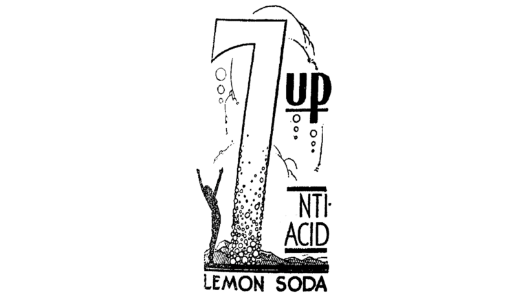
In 1930, the 7UP logo was given a complete makeover, giving it an Art Deco feel. It was a large, sophisticated “7” with a plethora of bubbles of varying sizes underlined in black. A black silhouette of a man with his arms raised was created on the left side of the numeral, and the word “UP” was set in a sleek sans-serif font on the right side.
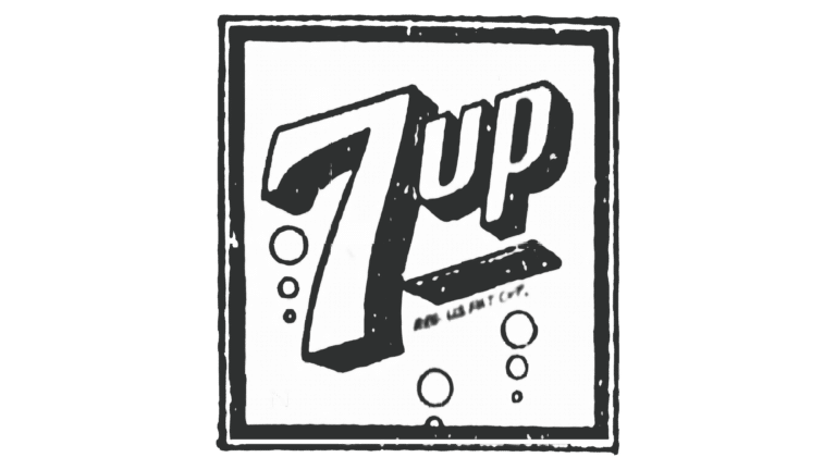
The modern version of the 7UP logo debuted that same year (1931). The now-familiar emblem has its origins in this symbol. The volumetric writing, which was oriented on the diagonal, was encased in a square white frame. Several bubbles were added to the bottom of the image for effect. The emblem was used for a decade.
1939-1969
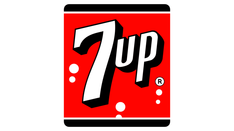
In 1943, 7UP debuted its initial logo, a square badge with rounded corners. The emblem was mostly red and white, with black accents along its thicker upper and lower edges.
The wordmark, rendered in white with a thick black outline, was centered on the badge to create visual harmony. To symbolize the bubbles in the beverage, seven white circles were drawn around the inscription.

1966-1975
The 7UP logo was updated in 1966. The numeral was set off from the letters by a tiny solid red circle, and the larger uppercase text was rendered flat in dark green against a plain white backdrop. The insignia has a lot of visual impact despite its spare design.

1970s
In 1968, it was decided to streamline and improve the logo. The previous visuals had been removed, leaving only the white wordmark on a red background. A very simple and contemporary aesthetic.
In the 1970s, 7UP utilized a logo in which the numerals and letters were produced by a series of solid green circles of varying sizes connected by lines. Formerly, the badge’s upper and lower halves were split by a slanted red square bearing the white “7UP” logotype.

1980s
The wordmark’s typeface was improved in 1980 to make it crisper and more aesthetically pleasing. A big red dot with a white outline emerged between the numerical and text components of the trademark name. The modern 7UP logo had its beginnings at this point.
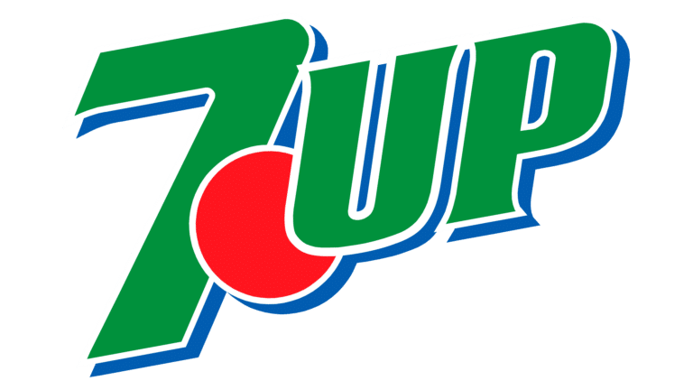
In 1987, a new logo was developed with a strikingly different color scheme: a solid red dot and green lettering within a double blue and white outline. The logo appeared to have three layers since the “7” was overlapping the dot, and the “UP” sections were overlapping the dot.
1990s
In 1989, the font was reworked to make the inscription easier to read by eliminating blue shadows and bringing out the brighter green and red hues. The company stuck with this logo design for over five years.

In 1995, the 7UP logo underwent yet another revision; the brand’s signature colors stayed the same, and no new components or details were introduced into the overall design; however, the logo’s characters and a digit were stretched, making the “7” extremely tall, and the entire logo was placed diagonally, in the upright orientation. Both the size and density of the red circle changed.

In 1993, the green was changed to white. The logotype’s typography was also updated to be more refined and italicized. The thin, pointed serifs of the letters gave the symbol a sophisticated air.
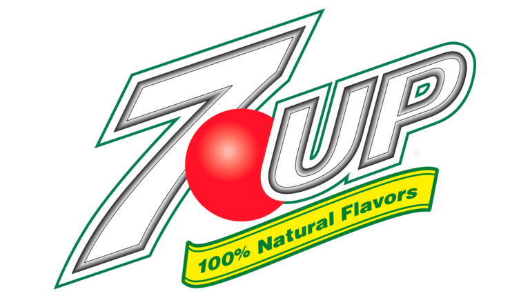
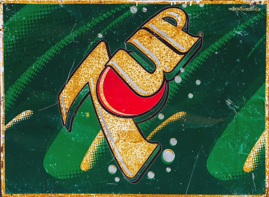
A new three-dimensional logo with a glossy red dot and a sleek “UP” with slightly curved serifs was released in 2007. It featured a white “7” with a green and black outline at its base. In spite of its short tenure with the company, this logo is widely recognized as one of 7UP’s most iconic symbols.

Today
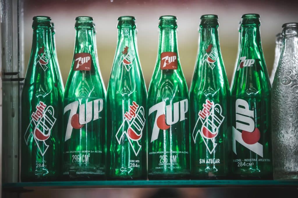
As of 2015, the 7UP logo has its edges smoothed out, and its green tones simplified and darkened, giving it a more polished and sophisticated appearance. The red sphere is still shown in three dimensions, but it now features darker shading and a glossier finish than it did in the previous badge.
Conclusion
Though St. Louisian entrepreneur C.L. Grigg never revealed in his lifetime where the origins of the Seven-Up name came from, today, the name stands for a refreshing, enjoyable soda experience and some enduring and memorable advertising campaigns and strategies.
The logo and branding from the beginning highlighted the bubbly, effervescent, lifting feelings that the citrusy soda provided, perhaps literally back when it contained lithium citrate, a drug used today for treating bipolar disorder in some patients.
From its unwieldy original name to its streamlined and instantly recognizable logo, Seven-Up has come a long way since it first hit the shelves on the edge of the Great Depression.
It may not contain any juice, and nowadays, it doesn’t contain any lithiated ingredients for a medicated mood boost. Still, when you pick up a bottle of Seven-Up, you can trust you’re drinking a piece of American beverage and advertising history.
Check out these awesome Logo Contests run on Hatchwise:


