


When you hear someone talking about fashion dolls, no doubt the first image that comes to your mind is the iconic Barbie doll that’s been adored by so many generations of girls. Barbie’s full name is Barabara Millicent Roberts and was developed in the United States in 1959. The Barbie Doll was created by the founders of Mattel Creations, Ruth and Elliot Handler.
Originally Ruth Handler decided to create the doll after she had seen her daughter Barbara playing with paper dolls and the process took many ideas and a few different versions before it was created into the dolls that we’re familiar with today.
Barbie dolls have made such an impact in the toy industry, with not only young children today using them but their mothers and even their mothers before them.
It was a rapid success after the product was launched and it’s still loved by children and their families around the globe. The popularity of the doll has grown rapidly since it was first introduced, but there’s no denying that there’s a specific part of the brand that has aided in its success.
The Barbie logo is iconic and the part of the brand that has made a huge impact on its success. The brand has grown greatly and without the famous pink logo and creative font, it wouldn’t have made it this far. Regardless of the competition that arises and what the industry goes through, the Barbie visual identity is known for representing the iconic brand.
Although it’s gone through a few changes in time the logo has also kept specific elements that have maintained consistency and kept the signature brand relevant. If you’re curious to see how the logo has changed throughout the years and how it’s managed to be successful and aid the brand, then continue reading to see the evolution of the Barbie logo and how it became the logo that we’re familiar with today.
The Barbie Logo and Its History

1959 – 1975: The First Logo
You might be surprised to find that the very first Barbie logo was nearly identical to the Barbie logo that we associate with the brand today. This original logo shows a simple calligraphy written name in bright pink. This was written in a custom cursive font that appears slightly childish. While the first letter of the name is uppercase the remaining letters are in lowercase. There are a few different things that stand out about this logo, including the jumping letters that add character to the logo.
The second thing that stands out is the bright pink used for the color palette. This is the only color choice used in the design on a white background and it makes the pink stand out. Overall this first logo appeared playful, fun, and creative. Although the logo is simplistic with merely pink letters on a white background, it’s still classy and is what helped the brand when it was first getting established with a brand identity. This logo brought personality to the brand and was the first step to establishing what would become known as the iconic Barbie logo.
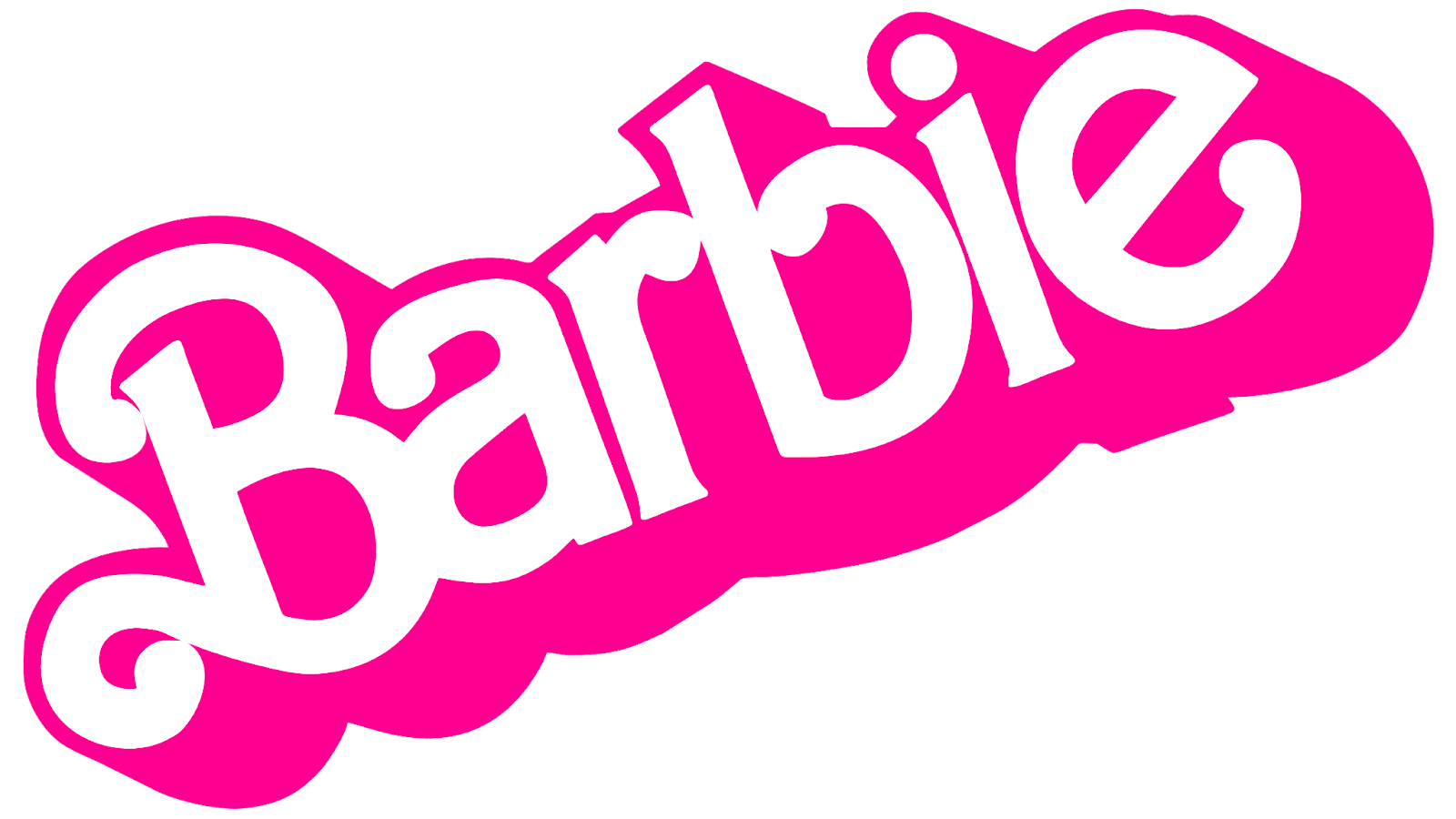
1975 – 1991: A Redesign
The first Barbie logo stayed with the brand for roughly sixteen years before it was time for a redesign, the first one that the logo got. This redesign was done to modernize the logo so they opted to use a 3D name appearance. Not only did the font and color change with this redesign but the direction of the logo also changed.
The visual identity was now shown diagonally and used a white bold san-serif that was outlined in bright pink. The logo had pink white shadows and the letters were rounded with curly ends. All of these letters were lowercase excluding only the capital ‘B’ at the beginning of the word. The logo is creative and keeps the fun spirit while also appearing graceful and optimistic.
1991 – 1999: Another Change
The logo stayed with the brand for over a decade before the designers thought it was time to bring back the children’s ease that the brand had before. They defined the logo by opting to remove large chunks of the design and simplify it again. For the most part, the previous concept stayed the same except that the design became a little more restrained. The designers opted to reign in some of the bright enthusiasm that they had used before. Although the shape of the letters and the direction of the logo stayed the same there were a few changes that gave the logo a new look.
The letters themselves were simplified and the font was less curly than before, now the ‘B’ was simple and clean. At the time this logo appeared more interesting and brought back a fresh look to the brand. The lowercase letters now appear on the same level and the color was also toned down a little as well. Instead of the bright candy pink that was previously used now, it was a muted, nude pink on a white background. The design was intriguing and used a creative style that brought back a fun style for the brand.

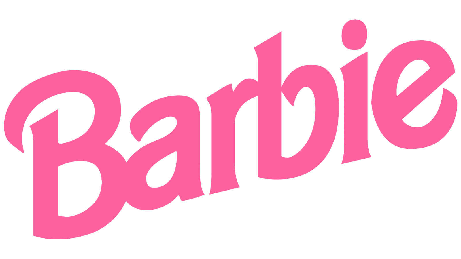
1999 – 2004: Cursive Letters
the band decided that it was time for another change. This time the logo was given a slight tilt to the right but the biggest change in the logo was the designers opted to use cursive for the letters. The entire word ‘Barbie’ was written in a single line without interrupting the connection between the letters at all. This time the logo appeared trendy and confident, boldly displaying a brand with a character. Instead of taking up space with bright colors and bold letters, this logo is elegant and classy in a modest way. The visual identity kept on brand while establishing a new logo that had evolved.
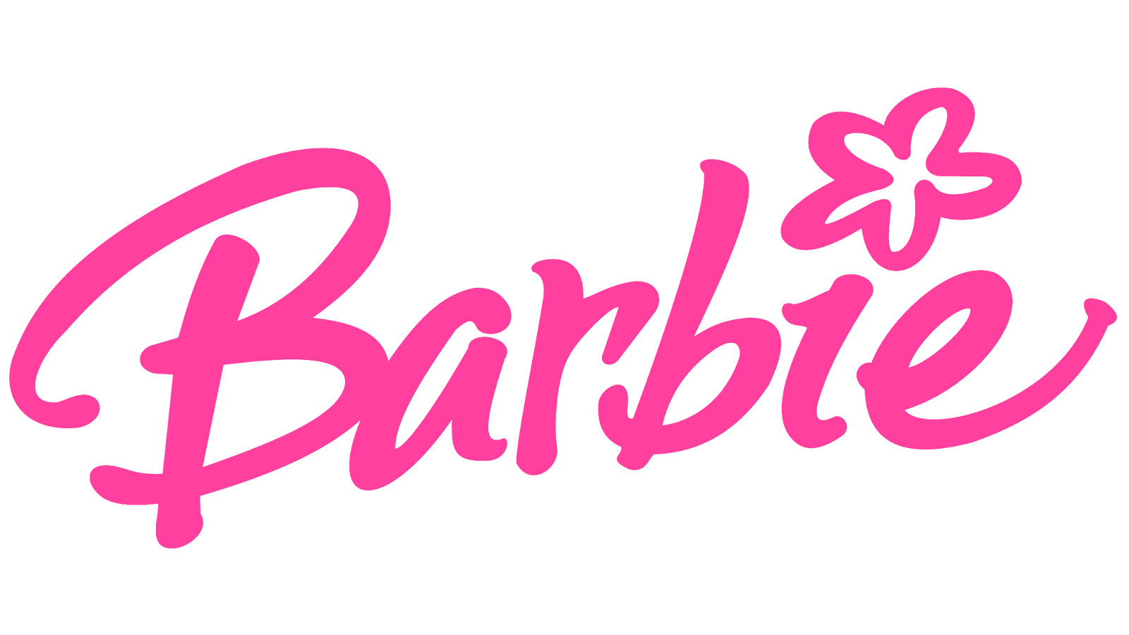
2004 – 2005: Another Redesign
The previous logo lasted with the brand for roughly five years before the logo was adjusted again. This redesign had a few things changed so that the overall appearance was a stark difference from the previous logo. This time a flower was added to dot the ‘i’ in the word and the capitalized ‘B’ got some swirly ends. This redesign was to see how childish the designers could make the logo and to put emphasis on it being a brand for children. Each letter appeared to be jumping and they were staggered unevenly, giving the logo a young and carefree look.

2005 – 2009: A Change
A year later and the brand decided to remove the flower that had previously dotted the ‘i’ and instead just replaced it with a classic dot. The letters remained the same except for the flower being removed, with the familiar pink letters on a white background. The logo was friendly, creative, and girly while keeping the same vibe as the previous logos. This change wasn’t seen as a huge one since it was merely the flower getting removed, instead, it was simply a small improvement to what the brand thought was an already excellent logo.
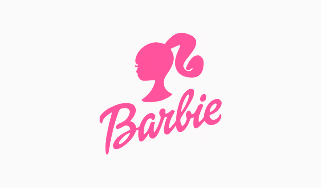
2009 – Present: The Logo Today
In 2009 Barbie decided that it was time to bring back the original Barbie logo that was used when the brand first came around. They decided to bring back the iconic logo and keep the brand unchanged from what it initially was. All the features of the original logo stayed the same and in a way it brought the logo back to basics. Today’s logo features a Barbie head over the original 1959 script underneath in the pink on a white background color scheme. Despite having gone through all the modifications throughout the years they still opted to go with the old Barbie logo that held so much history for the brand and was the first visual identity used.
The Barbie Movie and Movie Logo
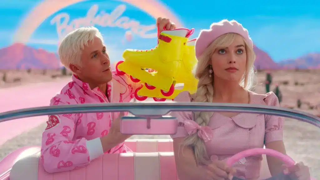
In 2023, Warner Bros. Pictures released The Barbie Movie. The screenplay of the movie was written by Greta Gerwig and Noah Baumbach. The movie, which stars Margot Robie, Ryan Gosling, America Ferrera, Issa Rae, Will Ferrel, and Rhea Perlman, is a live-action film that takes place in Barbieland, where everyone is either a Ken or a Barbie.
The plot of the movie follows Robie’s Barbie on a journey after she discovers that everyone in Barbieland is a toy.
Barbie, who is followed by Gosling’s Ken, leaves Barbieland looking for her human owner. Unlike the toy, The Barbie Movie was made for an older audience.

There are two main logos for The Barbie Movie, which are located on movie posters and merchandise.
One logo is simply the italic-looking font with a very loopy capital B at the front.
The letters are in white with a pink background. “She’s everything. He’s just Ken,” is written above the name on movie posters.
The other logo is simply the loopy B in white with a pink background. In this logo, Barbie is sitting and posing in the top circle of the B, while Ken is lounging on the slope of the B’s bottom.
The History Of Barbie
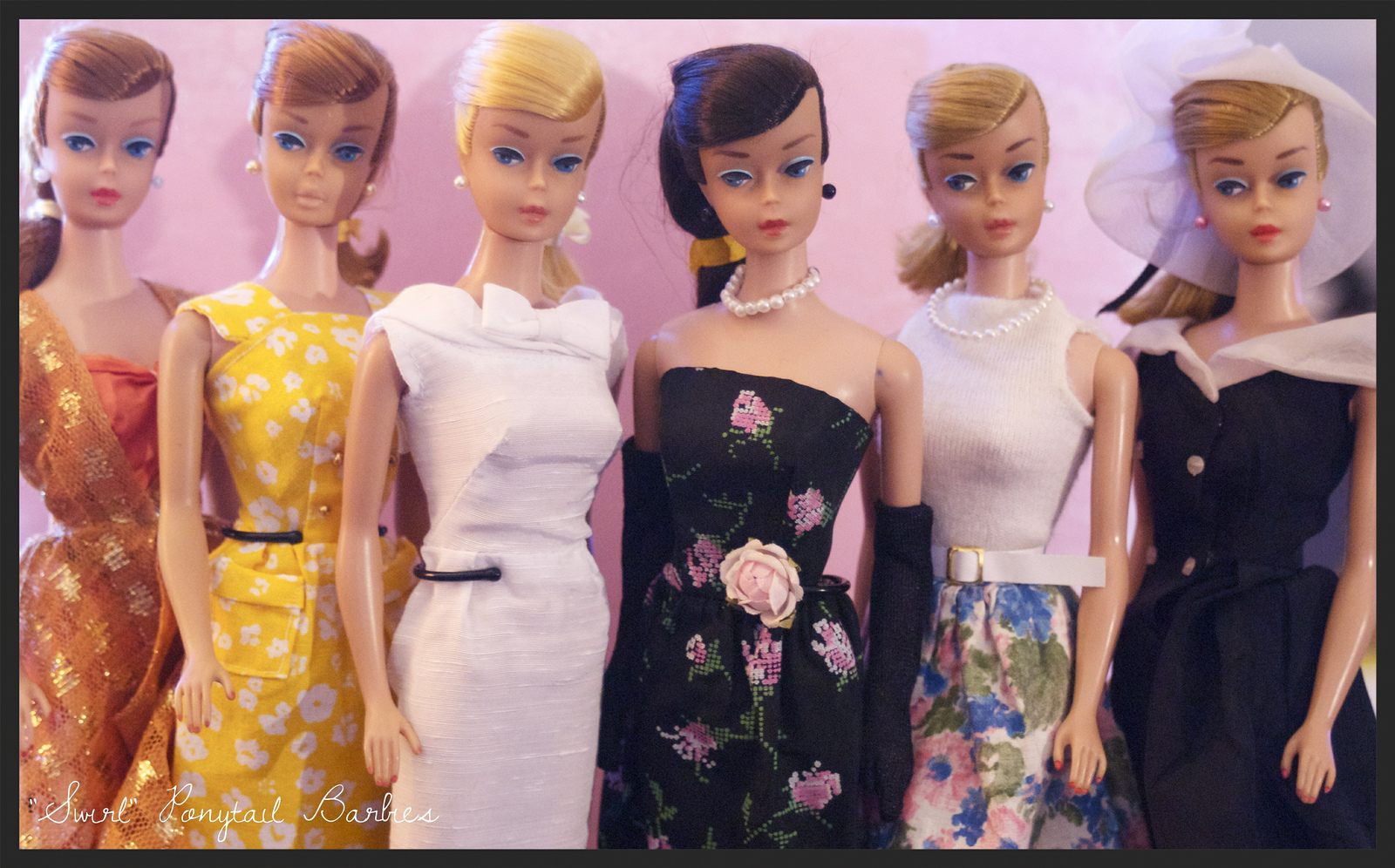
Although the iconic logo has an intriguing history behind it and has gone through a few changes, the Barbie brand itself also has a unique history. On March 9, 1959, the iconic doll that has made such a stamp in the toy industry was created by businesswoman Ruth Handler.
Barbie was officially launched at the American International Toy Fair and was created to show little girls that they could do anything and become anything that they wanted. This toy was initially made to show that a woman has choices and quickly after the launch she become globally famous.

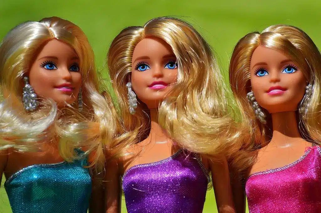
Although we may not have seen Barbie age throughout the last few years we have seen her reinvent herself in a few different ways. The part of Barbie that makes the doll so iconic and truly stands out in the industry is great because she adapts to the latest fashions.
To many Barbie is seen as a sign of creativity and an example of high fashion and careers that those who grow up owning the doll can visualize themselves as. To others, the doll isn’t seen as such a statement piece.
Many believe that Barbie, with her blonde hair and thin body, sends the wrong message to young girls and forces them to believe that society can only see them as acceptable in one way.
Perhaps this seems like a lot placed on what appears to many as merely a children’s toy, but when we say that Barbie has made an impact on the world we mean it. With over five decades of being around the doll has played a huge part in cultures and become an iconic doll adored not only by children but by adults as well. Although the doll may have started with a certain look and target audience intended today she is much more diverse than when she was created.

Now we see that the dolls are more diverse, appearing in different body shapes, hairstyles, and skin tones. The brand has also made a point of showing that they don’t only offer toys for girls and that Barbie is for everyone.
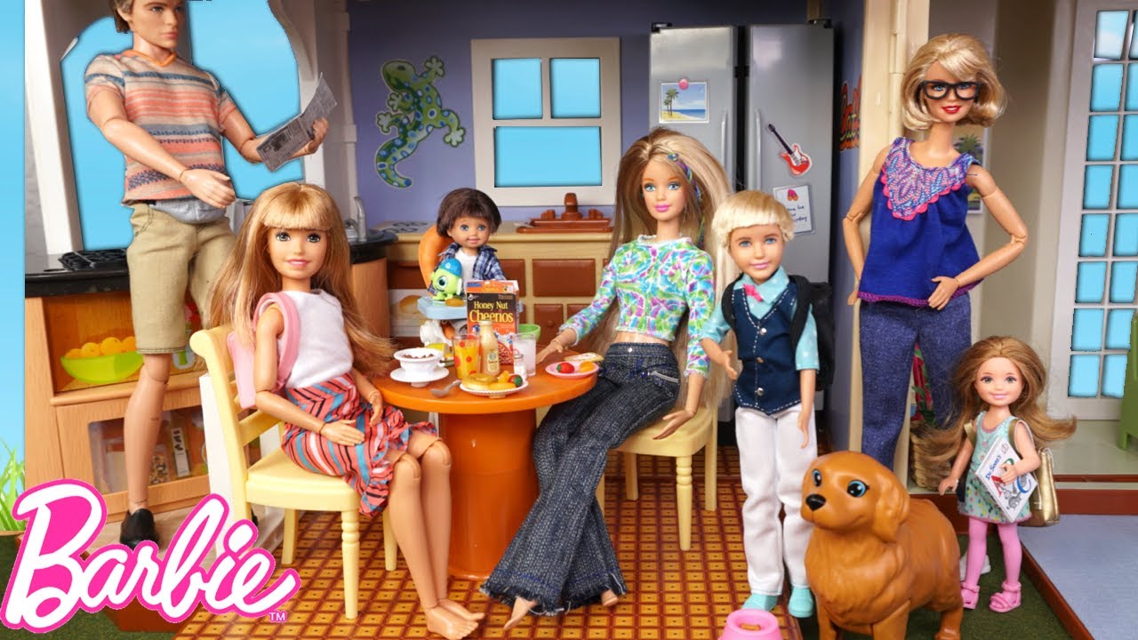
The brand has even made the Ken doll more diverse as well, representing more diverse cultures and body types to young children. The brand wanted to make Barbie more than just a doll and change society’s view of the bring an ultra-thin image for young girls.
I think we can all agree that, when viewing Barbie, she’s become a style icon that has changed with the times. You only have to look at the timeline of Barbie dolls to see that they’ve gone through a lot and had many different styles and appearances. From outfits to hairstyles the
doll has changed throughout the years and now it’s more advanced than ever before.
The Barbie doll has advanced to include her ultimate accessory, Barbie’s boyfriend “Ken”, her best friend and little sister. Today there are Barbie tv shows, movies, and many more accessories that come with the doll.
Summing it Up
Overall, we’re all familiar with the iconic Barbie doll that’s become a regular item in many households. Barbie doll is a fashion doll that was created in 1959 by toy manufacturer Mattel, Inc. Since it was first created the Barbie doll has become an iconic symbol and there’s no denying that the fashion doll has become a global children’s toy that’s made an impression in the toy industry.
Although many things have made the fashion doll as popular as it is today, we can say without a doubt that the iconic visual identity used as their logo is what stands out. The logo has gone through many changes but in the end, the brand opted to just return to the original logo.
By doing so they kept the logo clean and simple while embracing the original appearance of the brand and staying true to their history.
Check out these awesome Logo Contests run on Hatchwise:


