


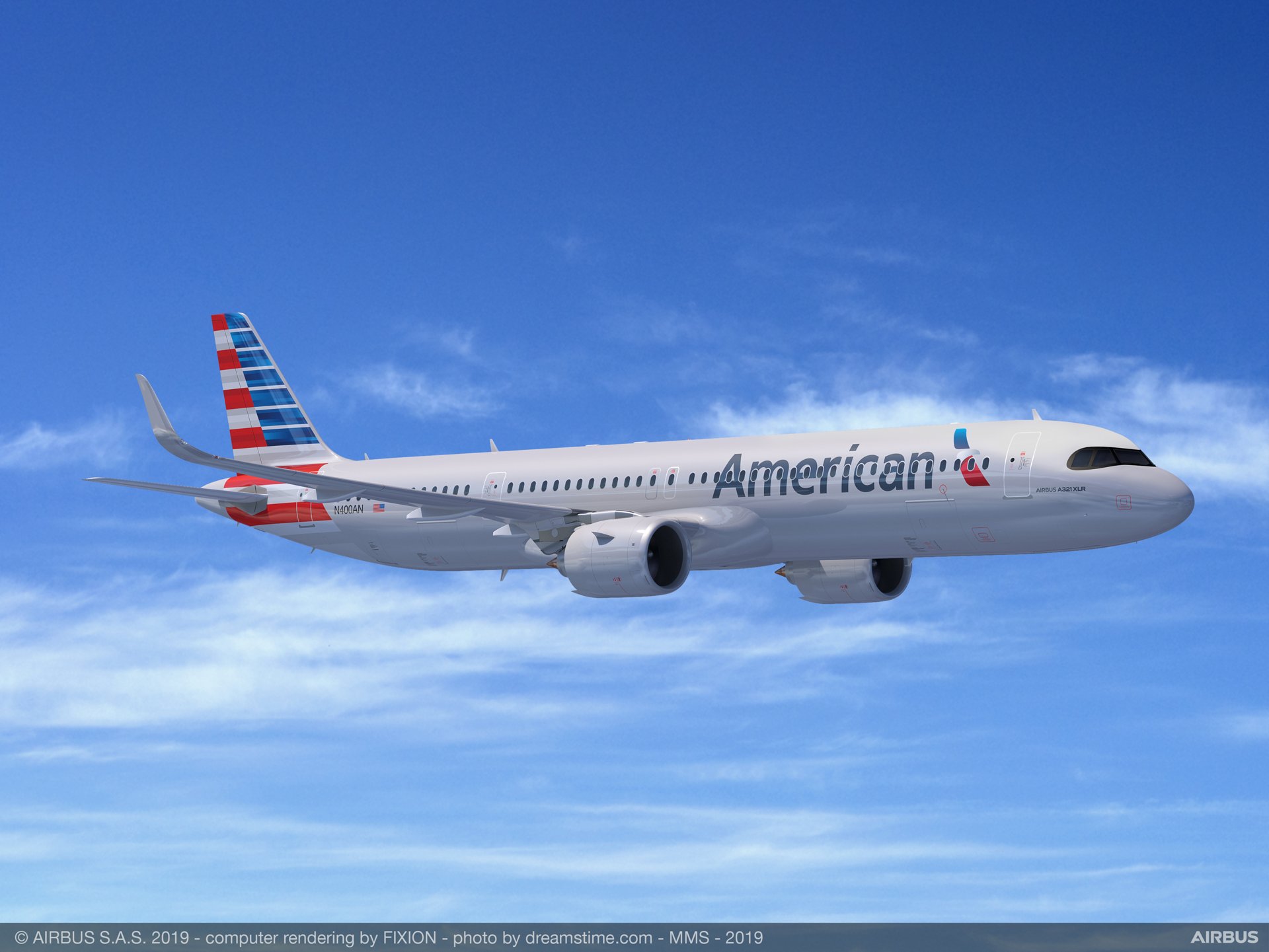
American Airlines is an airline with one of the strongest visual identities of all time. Their logo is a classic one, a prime example of a logo with a strong history of greatness and standing for an airline that’s used by millions. They have a fresh and modern logo that has become a signature part of not only their brand but their history and where they come from. Their logo is how the airlines are identified and, with it being printed on planes flying across the globe, it was more important than ever that they had a logo that made an impression.
The new logo that the brand received attempted to give the brand a new look that would liven it up and give it something fresh. Something different. Something that traditional airlines wouldn’t have and that would be known for the rest of history and easily identified by the public. The symbol is called “The Flight Symbol” and completed its goal with a beautiful and strong logo that stands out amongst the crowd of logos in the world.
Although we see this logo now, it isn’t where the airline began or the logo they initially used to identify themselves. Since the early days, the brand has kept its look consistent with always using the eagle symbol. The current logo also features the eagle as a part of their logo, but it’s less obvious than it has been in past logos.
To get where we see it today the logo has had quite a few changes throughout time and it’s shown us a few different styles.
To get where we see it today the logo has had quite a few changes throughout time and it’s shown us a few different styles.
If you haven’t explored the history of the American Airlines logo and seen where it started compared to where it’s at today, we’ll take a look at it in this article. We’ll see the journey from the first logo that American Airlines had created to the logo that we see now on their branding and marketing material.

1934 – 1945: The First Logo
1934 marked the time when American Airlines first began, starting with over 80 airlines merging to create the airline. Initially, the airline was named American Airways, which was quickly switched to American Airlines and has stayed the same since. This original logo featured a white eagle with its wings spread against a blue background inside a red circle.
Inside the circle on either side of the eagle, two bold red ‘A’s were shown. The eagle was shown standing on top of a globe, showing the possibilities of the company and how its power stretches across the world. This logo was designed by Goodrich Murphy who was an employee of American Airlines at the time. It was his idea and his logo design that identified the start of American Airlines. The color choices that we see used here are red, white, and blue, which are not only a direct tribute to the US but they’re also a strong combination.

1945 – 1962: A Cleaner Look
In 1945 the brand decided that they would give the logo a simpler look than it originally had. They removed all the elements that were originally included and instead they decided to keep it simple with the eagle in blue and a different style. The logo had been switched to face right instead of left and was placed inside of two blue ‘A’s. The eagle was shown in clouds on a white background. This logo was simpler, less cluttered, and was seen as cleaner and more modern than the original logo had been.
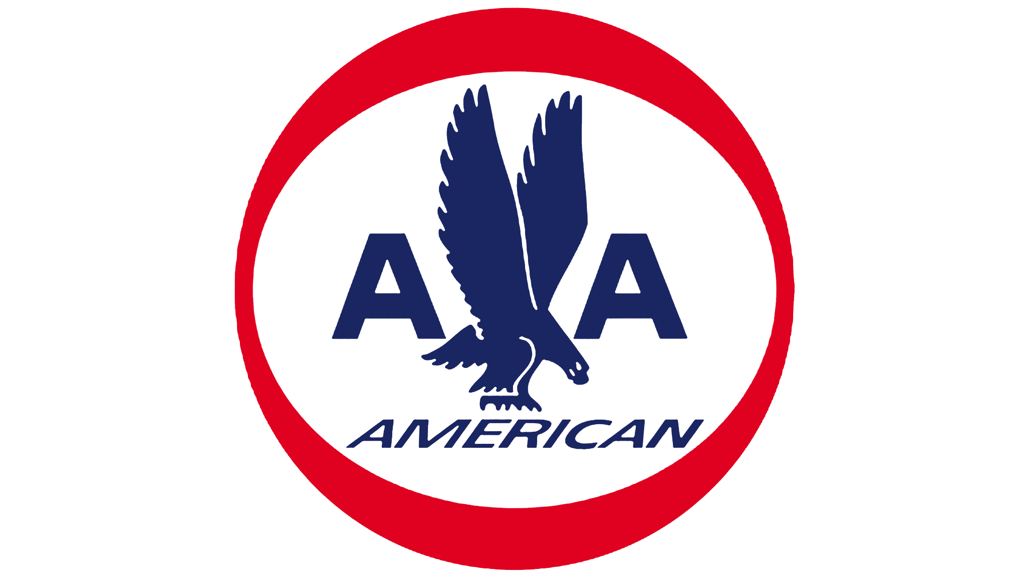
1962 – 1967: A Logo Reimagined
In 1962 the logo was reimagined, bringing back the colors and concept of the brand’s first logo. However, the entire design wasn’t brought back; instead, a red circle was shown with the eagle, two ‘A’s, and the word American inside of it. This used a combination of the brand’s first and second logos to create this new and third logo for the brand. It showed the essence of the previous logos and kept it minimalistic and clean. It took the second logo and put it inside a red circle, a unique concept and design.
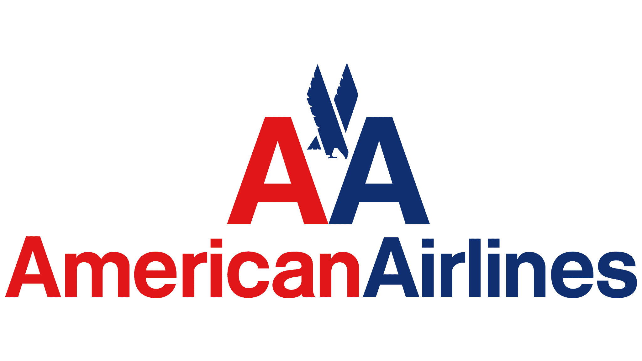
1967 – 2013: A New Look
The 1960s marked the time where American Airlines knew that they needed a new look and character for their brand. Massimo Vignelli was commissioned to create a new symbol that gives the brand a new look and yet still keeps it close to its origin. Vignelli created a logo that focused on the wordmark, making it the center of attention and keeping the eagle in the back.
It used blue and red on a white background for the color palette and showed a different logo than the versions before. It showed the company name with two ‘A’s above it and an eagle in between them. This new version was minimalistic while still keeping enough characters in it to give the logo personality. This logo stayed with the brand for 40 years and was easily identifiable to people around the world.

2013 – Present: The Logo Today
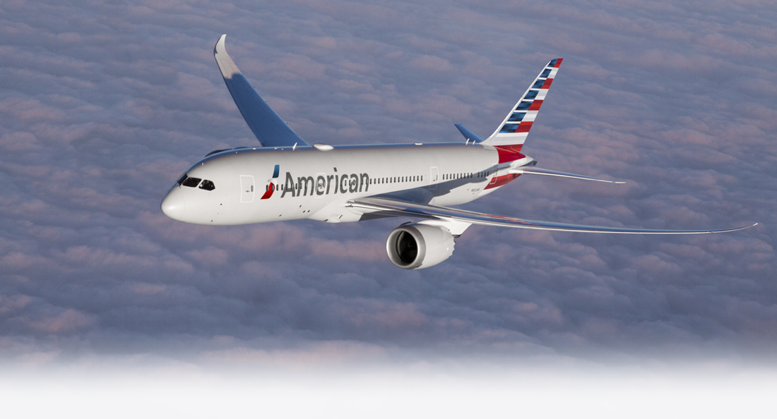
In early 2013 the logo got a redesign that made it nearly unrecognizable. FutureBrand gave the logo a new, modern, and minimalist look that shocked the public when it was revealed. This graphic symbol, known as “The Flight Symbol”, was different than the past logos. Although it kept the red, white, and blue color palette nearly everything else was changed.
Why Does The Logo Work?
The American Airlines logo works for many reasons, has created a visual identity so strong that it’s known around the world, and is boldly expressed on the side of the airline’s planes.
A lot goes into creating something memorable and iconic, especially to the extent that this airline has gone to. Although there are many reasons why this logo is as well known and as iconic as it is today, here are a few of the top reasons why the American Airlines logo works.
The Color
One element of the American Airlines logo that stands out is the color palette that the logo uses. The logo uses a distinctive three-color palette that’s associated with the American flag; red, white, and blue. This palette is a critical part of what makes the logo work and one of the most significant elements included. Not only does it make the logo iconic, but it makes it recognizable and memorable. People have come to associate the three colors not only with America and its flag but also with the iconic logo that we see for the airlines today.
The Font Used
Another significant element of the logo that defines it and makes it as memorable as it is today is the font that’s used. When we’re thinking about logos and what makes them stand out amidst the thousands in the world, fonts play a key part in defining them. The name of the airlines is to the left in the current logo, written in a sans-serif typeface, and is the true star of the logo. Not only does it display the company name and stands out boldly, but it also is the main element of the logo. While the design is large, the letters are the largest area of the logo.
The Design
Of course, the main star of the show is the design itself. The design is shown to the right of the company name, an element that expresses the business fully. The symbol is an element that truly defines the logo and tells people what the company does. The design successfully incorporates the three colors while also showing a plane and it depicts an eagle head. The design itself is subtle, allowing the elements to come together to form an iconic emblem for the airlines.
When looking closely at the logo, viewers will see that there are other elements included that you can notice hidden inside the logo. It’s complex while still being simple enough at first glance that you can take it in and understand it fully.
The History Of American Airlines
By fleet size. American Airlines is the world’s largest airline. They serve nearly 50 countries across the world and there are many people, whether having been a passenger on an American Airlines flight or not, who can easily identify the familiar airline and know what they offer. Although we’re familiar with the airline how we know it today and what it has to offer, it didn’t start this way.
The airline has a history behind it that has worked to mold it into the strong brand that it is today with a loyal following behind them and passengers that trust them. If you’re wondering how the airlines got to where it is today and where it began, let’s see as we take a step back in time and review the start of American Airlines.

American Airlines first began with Colonial Air Transport and Robertson Aircraft Corporation merging in 1929 to form a holding company that was then known as The Aviation Corporation.
1930 marked the time when American Airways was formed and it went from 80 individual airlines to one airline; American Airways. The name was changed from Aviation Corporation to American Airways and it started the journey of becoming a strong airline.

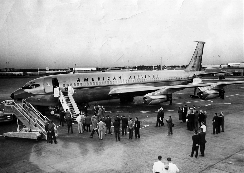
This name was quickly changed to American Airlines and the airline expanded rapidly from the 1970s to the 1990s. They went from a domestic American airline to an international carrier.
Despite a bumpy road in the early 21st century and financial difficulty, the airline came back stronger than ever in 2008.
The airlines had many first in the industry, including being the first airline that offered full in-flight internet access in the US. To this day the airline is still thriving and used by millions around the globe.
American Airlines: A Logo To Be Remembered
As we conclude American Airlines and its iconic logo and history, we know one thing; this logo is one to be remembered. The airline is one with a strong history and a memorable symbol behind it that supports it. It’s identified with a strong logo that holds a history and has gone through many changes to get to where it is today.
One thing is certain though, it has always kept elements that make it easy to identify and creates a strong brand identity. Certain elements, such as the color and font choices, have kept a signature look that makes it easy to identify and stands for the airline.
We can learn a lot from looking at not only American Airlines’ logo, but their history as well. Although now we all identify the airlines easily when flying, they didn’t start with such a strong and signature brand. The airline came from a small start in the 1930s to the amazing airlines that it is today.
Every brand, regardless of its industry, can learn a great deal from this brand and its history. Their logo and elements of their brand have made an impact not only for their airlines but for the world as well.


