


A very effective strategy in creating a logo is using a hidden symbol or meaning. Creating an allusion to what your business does or the name of your business within the logo will help customers to keep the logo in their minds.
Here are 15 of the most well-known logos that all have a secret, hidden easter egg in their design. See if you can find it.

Wendy’s
The Wendy’s brand is all about a home-cooked feel for your fast food. So, they hid a little reference to mom’s home-cooked meals right on Wendy’s collar. Look closely and you’ll see the word “Mom” in the design of Wendy’s collar. Stocklogos.com wrote, “This is something you may not notice consciously for years, but unconsciously it will leave an imprint on your brain and you will associate it with the brand.”

Hershey’s Kisses
What greater joy is there in life than a sweet kiss or some delicious chocolate? Hershey’s capitalizes on this by adding a bonus kiss in their logo. Turn your head to the left and look at the brown area between the “K” and the “I.” You’ll see the bonus kiss, keeping their product firmly in the consumer’s mind, even without the silver-foiled treat behind it.

Formula One
Taking advantage of the negative space between the black “F” and the red lines, Formula One calls to mind their “F1” abbreviation in the logo, along with hinting at their need for speed with the red dash lines.

Toyota
With characteristic ovals and the simple structure, the Toyota logo is timeless. According to Toyota, the overlapping ovals in the design “symbolize the unification of the hearts of our customers and the heart of Toyota products.” Going one step further, Toyota hides its name in those overlapping ovals.

Continental
Being a producer of car tires, it makes sense that Continental would hide the impression of a car tire in their first two letters. As the letter “C” wraps around the “o,” the viewer calls to mind how a tire wraps around the rim.
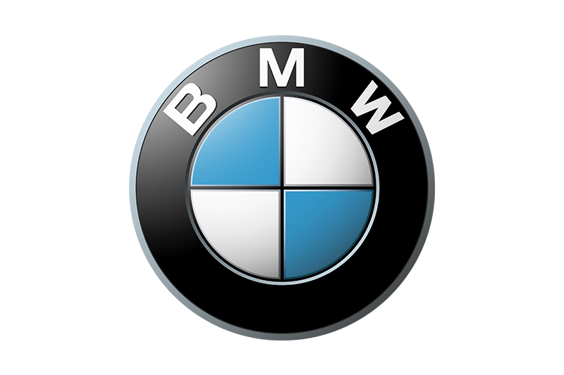
BMW
BMW uses their long history to create their iconic logo. In their early years, BMW was on the forefront of aviation technology. Within their modern logo, they’ve nestled the impression of an airplane’s rotating blades by using the four pieces of a circle and different colors. It’s also part of the Bavarian flag, the area of Germany where BMW originated.

FedEx
This is a well-known logo with a well-known hidden meaning within the letters. They use the negative space between the “E” and the “X” to form an arrow, alluding to the fact that they are a leader in shipping. The logo’s designer, Lindon Leader, said, “The arrow could connote forward direction, speed and precision, and if it remained hidden, there might be an element of surprise, that aha moment.”

Hope for African Children Initiative (HACI)
A lesser known logo that packs a punch is that of the Hope for African Children Initiative (HACI). Using bright orange and red to create the outline of a child and an adult, they also lean on the negative space between the figures to create the outline of the African continent. The two-part logo easily and comfortably shows the intention of the organization.

The Bronx Zoo
A favorite of many and one of the largest zoos in North America, it makes sense that the Bronx Zoo would also include the iconic New York skyline between the legs of the giraffes. Metropolitan cities aren’t where you would first expect to enjoy wild animals, so adding in the skyline adds a subtle element of surprise and pride in their city.

Hyundai
A stylized form of the first letter of their name, the Hyundai logo on its face seems simple and straight to the point. However, it’s original meaning is to symbolize two people – a client and a representative of the company – shaking hands. This calls to mind great customer service and a dedication to closing deals.
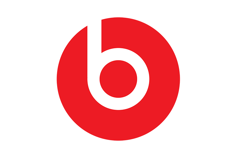
Beats
The bright red logo of Beats seems simple and obvious. It’s a lowercase letter “b” in the bright red circle. But, if you give it a moment of thought, the letter also looks like a person wearing the headphones. This makes the viewer know immediately what they are all about – great over-the-ear audio equipment.

Evernote
A legendary ability of elephants is their memory. They supposedly remember faces and even events in their life. Thus, it makes sense that Evernote would choose an elephant as their mascot. If you notice the corner of the elephant’s ear, it’s folded, like the page of a notebook. Both of the attributes of the logo helps the viewer know the note-taking application will help them remember things they might otherwise forget in an easy-to-use way.


