


If you have children, they likely have at least one transformer toy, or if you grew up any time after 1984, you likely remember at least one transformer from your childhood. So, even if you aren’t a fan of the Transformers franchise yourself, you will likely still recognize the logo and the brand.
But how can a company someone isn’t even interested in become so recognizable? Well, the answer lies with a great logo. And that’s exactly how the Transformers brand found universal success.
To learn more about the history of this iconic brand, and how the Autobots logo (within the brand) has transformed over the years, read on below.

Meet Autobots
Autobots are a core part of the Transformers brand, which was started in 1984 by both the American toymaker, Hasbro, and the Japanese toy brand, Takara Tomy. Hasbro and Takara Tomy wanted to create a franchise that would depict the battles of autonomous robots. At that time, no other companies were creating an entire franchise line around this.
By the early 1990s, the Transformers fanbase expanded and the brand developed a strong following. These fans wanted to be able to come together to discuss everything and anything Transformers-related, so they formed an online community of fandom so that no matter where a fan lived, they could connect with fellow fans. The Transformers franchise didn’t just create characters, though; they created an entire, impressive, brand that encompasses all media and products from Hasbro, Marvel, and Griffin Bacal. Within the brand, you’ll find cartoon series, video games, films, comic books, and toy line after toy line.
Transformers and Autobots are often interchangeable. Because of that, the Autobots logo has been featured throughout the entire Transformers series. Beyond this, the logo has been used to differentiate the Autobots from the Decepticons, two robot armies in the Transformers universe that have been a part of an ongoing civil war. If you aren’t familiar with the franchise, you are likely feeling very lost right now, so below you’ll find a quick overview of what the Autobots are and what the Decepticons are.
Within the Transformers franchise, Autobots hail from the fictional planet of Cybertron and are led by Optimus Prime. Autobots are the protagonists in the Transformers storylines, while the antagonists are Decepticons. But both Autobots and Decepticons are robots that can change their form to mimic machines, automobiles, and other mechanical objects. Given the good nature of Autobots, you’ll notice that they often transform into common vehicles like cars and trucks, but sometimes they surprise us by changing into military and aircraft vehicles, weapons, and animals.

Regarding a logo, both the Autobots and Decepticons have an emblem that is representative of their group, and each resembles the head of a transformer.
Autobots’ Evolution
Through the years, the biggest changes with the Autobots logo are using the emblem and how the name “Transformers” is displayed. Even though the designers often played around with different features, lines, and colors, they always kept these components intact, building off them to grow the brand to what it is today.

1984 – 1989: The first Transformers logo
The first iteration of the Transformers logo was created in 1984. It took five years before the brand decided to give it a redesign. Just like later logos, this original logo had a three-dimensional feel due to its metallic features, and it also included an inscription in red and gradient blue.
For the lettering, the words were placed strategically on two levels, with “Trans” being above, and “Formers” below. In addition to the words, the Autobots signature emblem was scaled to match the size and colors of the letting.

1989 – 1991: The second Transformers logo
For this second design, the Transformers brand eliminated their three-dimensional components and opted for a simpler, flat style. To make the logo flatter, “Trans” and “Formers” were combined to form one word: Transformers. That wasn’t the only change, though. For this version, the color scheme changed as well, moving to white lettering with a double black outline. The font that the brand selected was an italicized sans-serif, to add a special effect.

1991 – 1993: The third Transformers logo
As the 1990s kicked off, so did a new version of the Transformers logo. For this, the brand made the lettering lighter and thicker. Beyond this, they also updated the logo’s colors, switching the outline to a lighter blue, which served as a contrast to the other blue and white shadowing of the letters. With these revisions, the designers also removed the blue stripe that was in the 1984 version wordmark’s body to focus on the other design’s components.

1993-1999: The fourth Transformers logo
After two versions that didn’t include the signature Transformers emblem, for this iteration, the brand brought this feature back, as well as their prominent red coloring. The designers chose to make the typeface red and chose to make the emblem yellow and red. The emblem was placed to the right of the words, and with the lettering being a new, square, italicized, and capitalized square font, the logo was bolder than previous versions and stood out more due to its shadowy, three-dimensional effect.

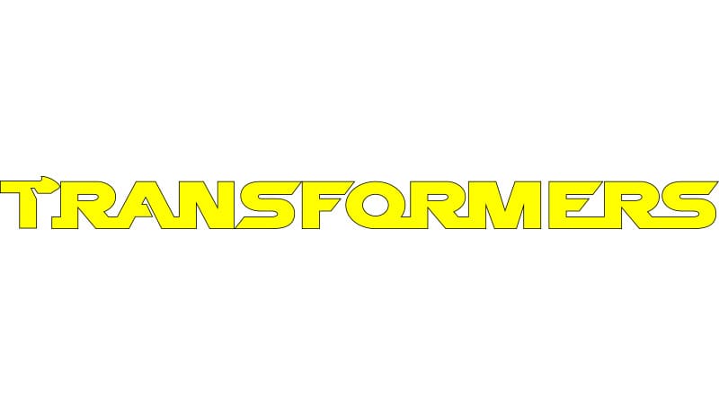
1999-2001: The fifth Transformers logo
In 1999 it became clear that the designers were going back and forth on whether to keep the emblem in the logo because for this version, they removed it again. The lettering was also changed again to be a new sans-serif font. This was the first time the brand chose to make the lettering yellow, encompassed in a black outline. The new typeface added energy, but still maintained its bold elements from the past with its sharp features and rounded edges. It was unique and robotic, like the brand.

2001-2007: The sixth Transformers logo
2001 was the first time that the brand started from scratch entirely by eliminating all its past design features. This completely new logo featured shiny black and blue lettering, two colors that haven’t been included before in past versions. To complement this color scheme, the wordmark was in a gradient of blue and black, and this lettering was outlined in a thick black border. This design felt neon in nature and conveyed the creative focus of the brand, meaning that the Transformers brand is constantly adding new characters, new storylines, and new, creative products, just like its logo.

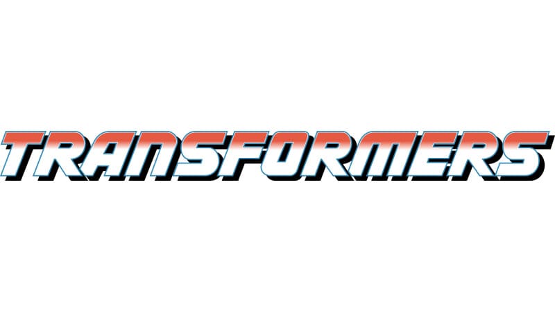
2007 – 2014: The seventh Transformers logo
In 2007, the Transformers brand went back to its roots. The brand reintroduced the two-level design, and metallic components by using lettering (again in a sans-serif bold font), that was metallic and had a thick black outline. This design looked more minimalistic and modern than past versions, and the logo embodied the features of the Transformers characters.

2014 – Today: The current Transformers logo
The latest version of the logo that you’ll find today was first introduced in 2014. This logo ditched the classic metallic elements from the last version and instead opted for more flashy components. To make the logo flashier, the designers used yet another font, this time a new, bold, narrow sans-serif font that was created just for the Transformers brand, and they returned to the red coloring (this time a darker shade). This new font featured diagonal cuts that were not symmetrical, with some lines longer than others.
With these recent updates, the logo has become the logo we know and love today.
Roadblocks Along the Way:
The biggest hurdle that the Transformers brand and Autobots have had to overcome is keeping their fan base engaged. It hasn’t been a simple journey to do this, and Autobots have suffered dips in popularity from time to time. How the Transformers brand and Autobots have overcome this is by updating their logo and constantly creating new content to push out to their fans.
The Meaning of the Autobots’ Logo and Autobots’ Logo History:

Just like every emblem and character in the Transformers brand, the Autobots logo has also evolved. As the logos have evolved though, they all tend to be similar in stylistic components (like using shapes and metallic features), but they differ in colors and how the designers choose to use these shapes and lines.
The Autobot logo consists of a red mask that is representative of the Autobot army.
Just like with the overall Transformers logo, the Autobots logo has also not always remained the same. Despite the changes, on a visual level, the Autobots logo always conveys a mask. The logo is believed to be inspired by the head of the Prowl’s toy, which is called “Autobrand” in Marvel Comics. Other sources claim that the Autobots logo was to suggest the face of the Last Autobot.
Below is a deeper dive into the components of this (and the Transformers brand) logo.
The Autobots (and the Transformers) Logo Font
Throughout the years, the font has featured some form of a sans-serif font, sometimes italicized, sometimes capitalized, and almost always bolded. Often the font features sharp cuts, with the angles smoothly rounded to add energy and dynamism. Whatever sans-serif font the brand has used through the years, the font has still managed to always be clean and legible with design features that make it one-of-a-kind. The brand’s signature fonts give them terrific brand recognition, and the Autobots “A” is the most recognizable part of the Transformers brand. Even in recent days, the Transformers brand sometimes chooses to only use the “A” in some of its marketing.
The Autobots (and the Transformers) Logo Color

In 1984, the Transformers logo started as a red and blue color scheme, before moving to white with double black lettering. Throughout the years, the logo always was some combination of red, white, gray, black, and/or blue.
There have been certain instances where, in addition to this color scheme, the designers have also incorporated metallic tones to evoke 3D elements as well as gradient features to make the logos feel different than versions from the past.
The Autobots (and the Transformers) Logo Meaning
The Transformers and Autobots logos were inspired by the toys that were first developed during the first year that the Transformers franchise released a line of toys. There are two variations of the emblems featured on the logo; one that is the face of the character, Prowl for the Autobots, and one that is based on the character, Soundwave for the Decepticon. Both are often depicted as colored metallic emblems and when on toy packages, they are often slanted or part of a scene depiction, which ties into the cartoon nature of where this logo was first developed.
Autobots Today
In recent years, the Transformers brand has used a more straightforward approach with their logo, using just the letter, “A,” in the same sans-serif font used in past logos. And as new Transformers movies are released, the Autobots logo has evolved to give a glimpse of the purpose and theme of each film.
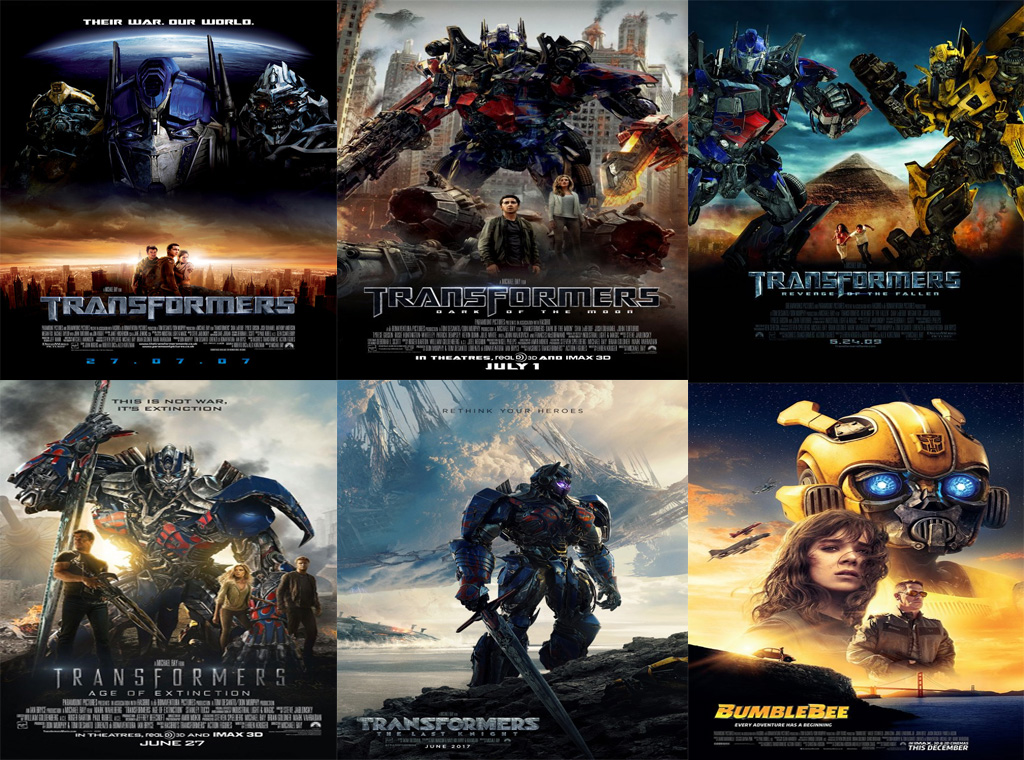
When a franchise has been around for over three decades, it’s hard to make it still feel relevant and it’s hard to keep your fans engaged. But the Transformers brand has been able to do this. With the Transformers movies, sequel after sequel continues to release to much hype and anticipation. They continuously sell out only to be blockbuster successes. Some of these successes were Michael Bay’s film adaptation of the Transformers series in 2007, followed by various sequels between 2009 to 2017. Following this was the release of the Transformers BumbleBee film in 2018. Each film release has helped to give the Transformers film franchise momentum.
The franchise hasn’t stopped after BumbleBee, though. There are plans for a new Transformers Cyberverse film and recently the brand has evolved to include a cartoon series, online fan groups, an annual Transformers convention, and so much more.

The Transformers franchise is one of the highest-grossing media franchises in history, having earned more than $709 million just from films alone! Back in 2011, the franchise grossed over $25 billion in revenue, and this revenue doesn’t seem to be stopping anytime soon.
Lessons Learned from Autobots
When you take a deeper dive into the Autobots logo, it doesn’t take long to see that the logos vary extensively and that the designers go back and forth between components through the years. While other brands stick to the same logo design and just edit the text or color scheme, Autobots has done the opposite.
Even though Autobots do the opposite, it works for them. That’s because with Autobots, no matter what logo design they pursue, they make sure that it always conveys nostalgia with their customer base and ensure that the Transformers brand is always evident.
With your business, you can do the same. If your logo isn’t working, don’t be scared to make a big change; just keep some of the same components to keep your brand recognizable. That means if your company has been branded in light blue, maybe don’t switch to yellow. Implement changes on a smaller, rolling basis to arrive at a finished product that is a logo that works for YOUR audience the best.


)
)