Whether it was building your first LEGO tower, stepping foot into your first LEGO store, walking by the first life-size LEGO statue you encountered, or bringing your children to the LEGO movie – everyone has a LEGO memory. These simple, colorful building blocks have been a part of so many of our lives, one way or another.

These LEGO bricks stand for unlimited creative possibilities and just like the unlimited possibilities that the blocks bring, the LEGO brand had no limits to its imagination when it came to growing this iconic brand.
Beyond the building blocks though, the LEGO logo has evolved to be one of the most recognizable logos in the toy industry.
Whatever your story and relationship with LEGOs are, we guarantee you’ll leave this article with a newfound knowledge of not only the brand’s evolution but also the LEGO logo. Keep reading for a deeper dive into all of this and more.
Meet LEGO
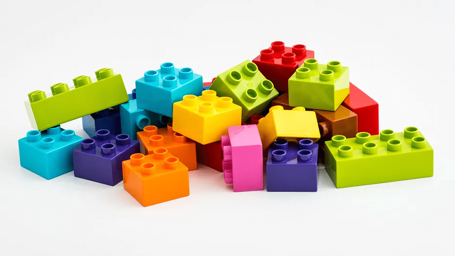
You likely already know the LEGO brand – LEGOs are a sense of nostalgia for so many of us and a pivotal part of our childhood. LEGOs are the symbol of innovation and creativity, pushing our imaginations to their limits with little plastic blocks.
Founded as a toy company in 1932 by Ole Kirk Kristiansen, the first LEGO block was created a few years later in 1936. The name LEGO directly translates to “to play well” in Danish implying the pillars that the LEGO company was founded on – to play.
Over the years, LEGO has grown to expand its product, the colors of its blocks, partnerships with organizations, and multimedia opportunities. LEGOs have won many awards over the years, including “the best toy” by various publications – and for good reason! LEGOs are a staple childhood toy and with so many different LEGOs to choose from, it’s impossible to get bored with the toy.
While this is only a brief introduction to the LEGO brand, below we take you on a deeper dive into the evolution of the LEGO toy.
The Evolution of LEGO
1932-1936: LEGO is founded
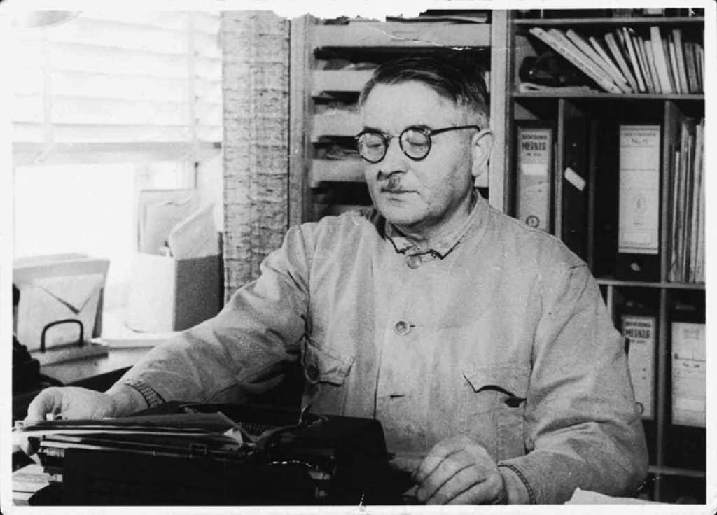
Ole Kirk Kristiansen founded LEGO about 90 years ago in 1932. Ole was a carpenter who was skilled at making different toys in his workshop in Denmark.
A few years later, in 1936, Ole named his company “LEGO,” which translated to “to play well” in Danish.
1946-1949: Ole creates Lego blocks
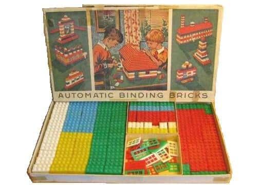
After purchasing a plastic injection molding machine, Ole played around with molding different shapes from plastic. In 1949, Ole created the first LEGO brick, like the LEGO bricks we know today.
While LEGOs have a following today, that following didn’t exist in 1949. Other toys outshined Ole’s plastic brick, but that didn’t stop him.
1955-1958: Ole’s son doesn’t give up on the LEGO block idea
Ole had a vision for LEGO, and his son, Godtfred was determined to see this dream through. To make the blocks more of a “toy” versus a novelty item, Godtfred created the LEGO “System in Play.” This was developed on the idea of putting the bricks together to build more things.
The motto for this system was “The more bricks you have, the more you can build.” This helped propel LEGO to file and receive a patent for its brick design allowing for unlimited building opportunities.
1962: 1978: LEGO expands its product lines
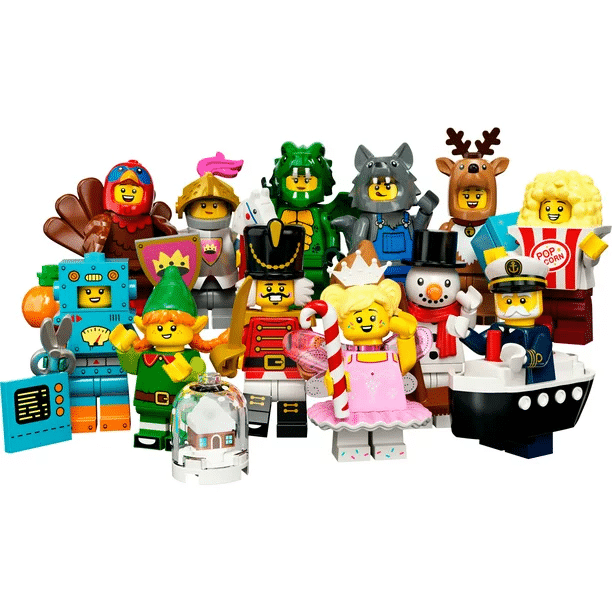
After receiving its patent, LEGO began to develop new products. From LEGO wheels to toddler LEGOS, to LEGO Minifigures, LEGO continued to expand. Each expansion was focused on a different customer base, expanding the brand’s reach.
Also, during this time, LEGO opened its first LEGOLAND park in Denmark drawing visitors from all over.
1978: LEGO plays around with design themes
Over 30 years since the first LEGO was created, the brand got into a rhythm of unveiling new products that consumers loved. In 1978, the brand began to think about how these bricks could build entire communities. With that, LEGO released castle, space, and town-themed LEGOs, allowing people to build entire themed communities.
1995: LEGO expands to multimedia
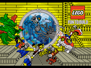
Before 1995, LEGO was focused primarily on its product line as a brand. In 1995 though, LEGO first broke into the multimedia industry, releasing its first video game in Japan. This video game was entitled “LEGO Fun to Build.”
1998-2008: LEGO focuses on social good
As the brand expanded into multimedia, LEGO expanded into several important initiatives and nonprofits. In 1998, LEGO introduced LEGO MINDSTORMS, which focused on helping children be introduced to robotics at a young age.
The next year, The LEGO Foundation was established by Ole’s family. The foundation’s mission was (and still is) to help children around the world access play and learning through LEGOs. Later, in 2008, LEGO celebrated its avid fans by turning their ideas into physical LEGOs.
2014: Lego hits the big screen
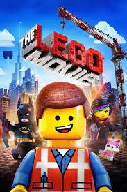
In 2014, LEGO expanded to another multimedia platform, this time a motion picture. This year, The LEGO Movie premiered across the world to critical acclaim.
2017 – Today: LEGO shows no signs of slowing down
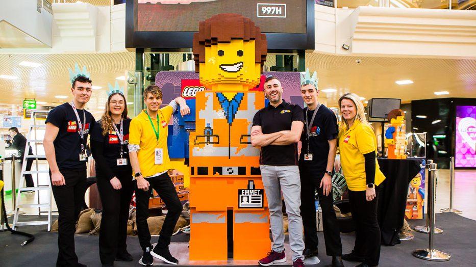
LEGO continues to push the envelope with big ideas. Since 2017, the brand has created an online, safe community for children under 13, has unveiled a Master Builders competition, created an entire LEGO house in Denmark, and has continued to grow the LEGO Foundation.
As LEGO celebrated its 90th anniversary, the brand maintained its focus on producing quality toys to ensure children are stimulated and can play well.
Roadblocks Along the Way
There was a brief period when LEGO almost had to file for bankruptcy. Anyone that has had to purchase a toy in the last 10 years has likely realized that there are so many toys to choose from.
LEGO wasn’t the premier go-to toy it once was with so much increased competition in this space. To combat competition, and return to being a profitable business, LEGO focused on innovation, a streamlined product line, and distribution to larger retailers.
This strategy worked and LEGO is still flourishing as a brand today.
The Meaning of LEGO’s Logo and LEGO’s Logo History
When looking at the LEGO logo over the years, you’ll notice that one component always existed – the LEGO wordmark. What the designers opted to play around with instead of entirely new designs, was the coloring and font of the wordmark.
As you look at the LEGO logo’s evolution below, notice the playful features of each design that tie back to the mission of the brand – to play well.

1934 – 1936: The first version of the LEGO logo
This first logo iteration featured the LEGO name in a bold, antique font. The letters were printed in black and bold. These features were prevalent in other logos during the early 1900s, so the logo made sense for this time. While the logo stood out, it wasn’t clear that this logo was for a company focused on making toys.
1936 – 1946: The second version of the LEGO logo
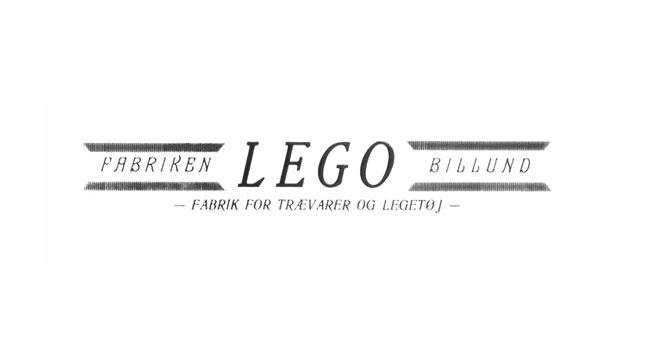
A few years after the first LEGO logo was unveiled, the company decided to update the logo design. The first iteration was bold, while this iteration was softer, featuring thinner lines. Making the logo thinner allowed the brand to print this logo on a wide range of toys as well.
1946-1950: The third version(s) of the LEGO logo
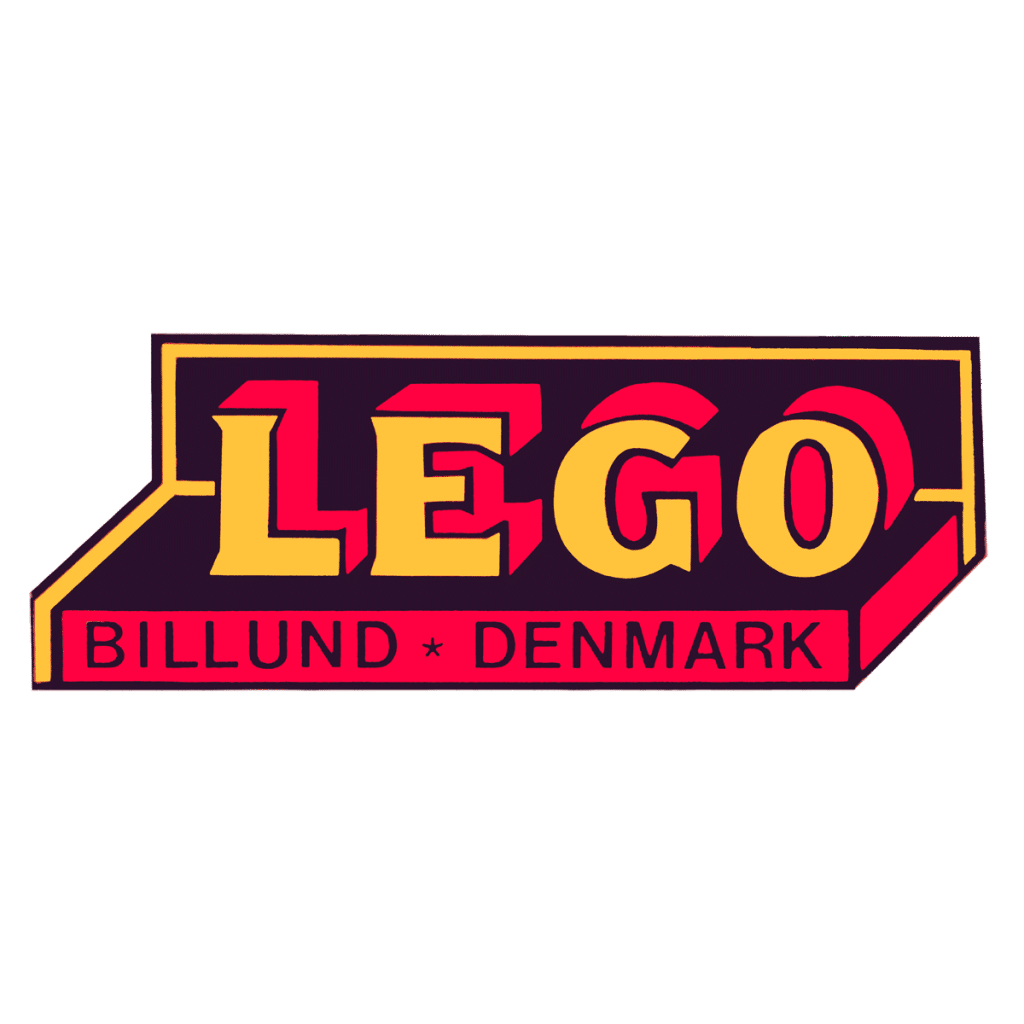
The third iteration of LEGO’s logo came after the prior iteration lasted for 10 years. This version was the first time LEGO introduced color into its logo design. The two chosen colors were orange and black, two colors that boldly stood out. The logo also included where the company was founded, Billund, Denmark, into the design. The lettering is not only bold, reintroducing thicker lines, but they also have a shadow behind them, further accentuating the brand name. The final important component of this logo is that the wordmark sits in a box, representative of a toy box.
It’s important to note that while that version was the official third version of the LEGO logo, two other logos were also introduced during this time. From 1946 to 1948, LEGO introduced a specialized logo that was exclusively used for wooden toys. This logo also incorporated orange and used thinner lettering, unlike the bolder lettering used in the primary logo.
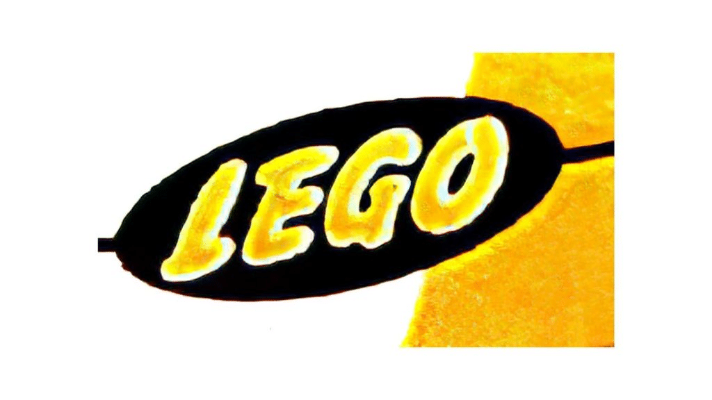
From 1948 to 1950 another logo was introduced. This one looked entirely different than any of the previous versions. This logo included a black oval that had the LEGO wordmark printed inside of that oval in yellow, rather than orange. This logo was used alongside the primary logo of this time.
1950-1953: The fourth version of the LEGO logo
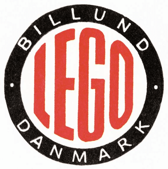
For this design, LEGO ditched the bold block lettering and toy box design and utilized a different symbol, a circle. This circle resembled a stamp with the LEGO wordmark in the center, outlined by a black circle displaying “BILLUND DANMARK.” The colors of this logo were again updated, this time to be black, white, and red.
1953 – 1955: The fifth version of the LEGO logo
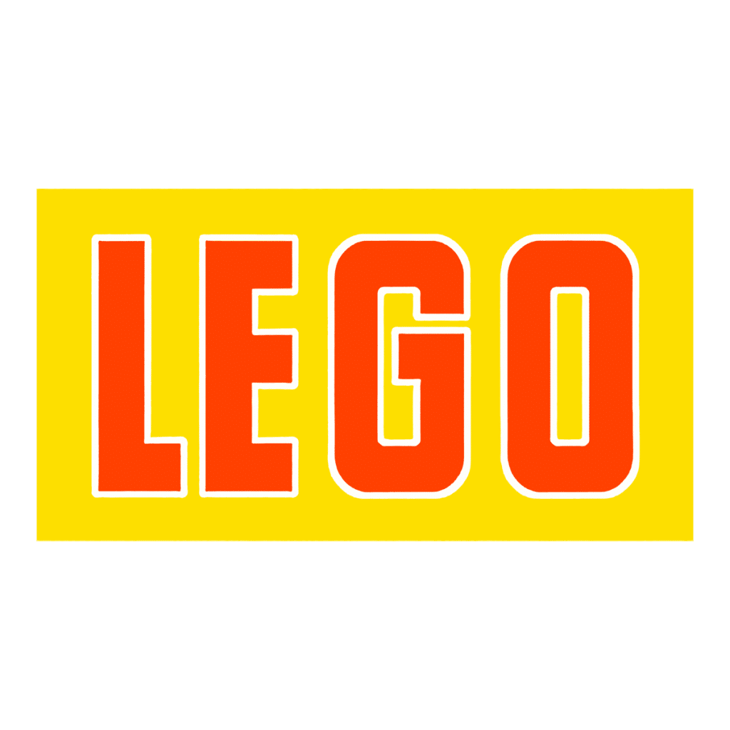
Even though the last iteration only lasted a few months, the designers incorporated some of those features into this logo design that lasted for nearly two years. This wordmark was like the prior iteration, except the red letters were now outlined in white. The wordmark sat on a yellow block, reminiscent of a LEGO block, and the yellow coloring conveyed the friendliness and youthfulness of the brand.
1955-1959: The sixth version of the LEGO logo
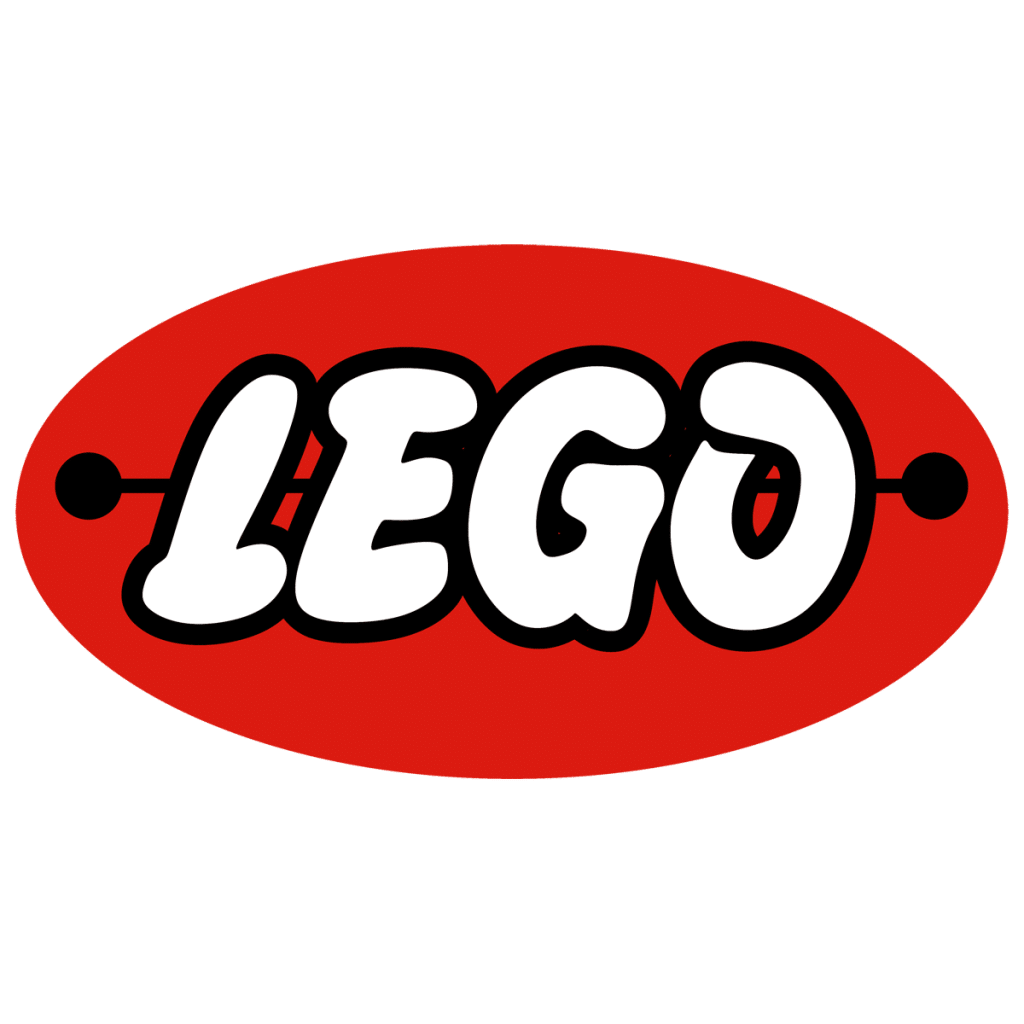
From 1953 to 1955, LEGO played around with a new logo design while the prior version was the face of the brand. These designs all utilized a red oval that the LEGO brand name sat in. The lettering was white and bold, yet the corners were rounded and bubble-like. The font choice represented the spirit of the brand. In 1955, LEGO created a version of this design that they loved enough to become the brand’s identity. This version was playful and would stand out on packages and against competitors.
1959-1960: The seventh version of the LEGO logo
For this iteration, the design team simply enhanced the prior version. The word “System” was added to the bottom of the logo and the lettering was cleaner and tighter than the prior iteration.
1960-1964: The eighth version of the LEGO logo
In 1960, the LEGO team decided to remove the oval background and instead replace it with a red rectangle, like the prior yellow rectangle. The font for “System” was updated to cursive, yellow lettering. This logo included four colors for the brand’s identity – red, white, black, and yellow.
1964-1972: The ninth version of the LEGO logo
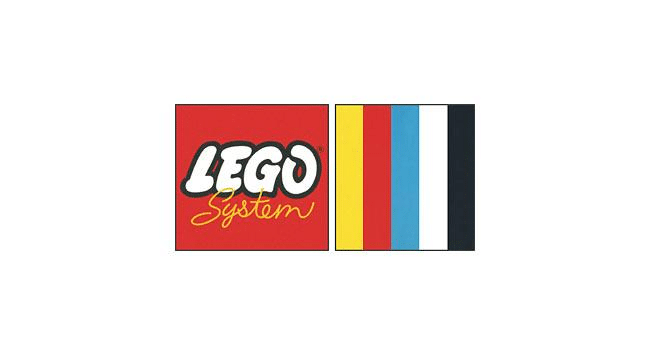
This update is so minimal that you might miss it if you don’t look closely enough. For this iteration, the rectangle was simply updated to become a square. There was a second part of this logo, that you might not even have known was part of the official design. In a second square are five colored vertical lines (yellow, red, blue, white, and black) which represent the wide range of LEGO block colors. This represents the world of possibility and innovation consumers have with LEGOs.
1972-1998: The tenth version of the LEGO logo
This version of the logo lasted for more than 20 years. This version removed the second square that included the 5 stripes of colors and instead focused on the red square with the LEGO wordmark. The word “System” was removed, and the colors were enhanced to brighter hues. The font remained consistent with the fonts formally used, except they were slightly more rounded.
1998-Today: The eleventh (and current) version of the LEGO logo
The logo you find today with LEGO is a logo that doesn’t look drastically different from the logo you likely grew up with. The only enhancements to this design are the spacing between the letters (the letters were moved closer together) and that the colors were slightly darkened.
Beyond that, the other design elements were virtually untouched, still conveying the same playful message as the prior iterations did.
LEGO’s logo font:
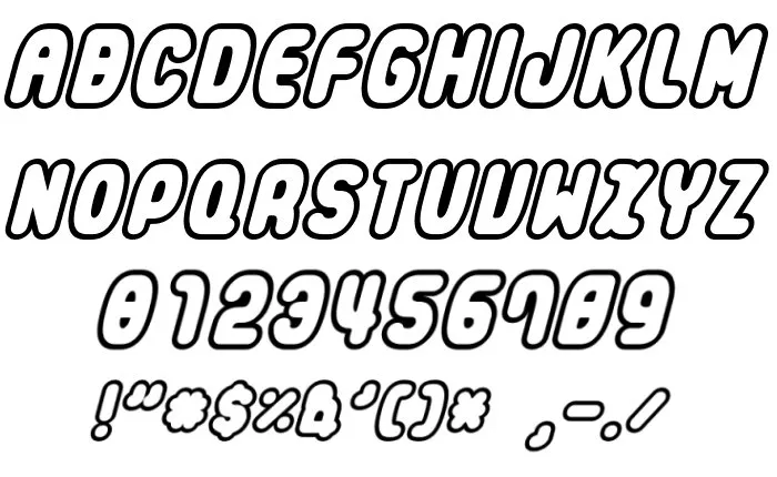
While the font hasn’t been consistent over the years, one consistent design feature is the thick, rounded, capital lettering. This logo is unique to the brand and the bubble, rounded lettering helps to represent the playfulness and youthful nature of LEGO.
LEGO’s logo color:
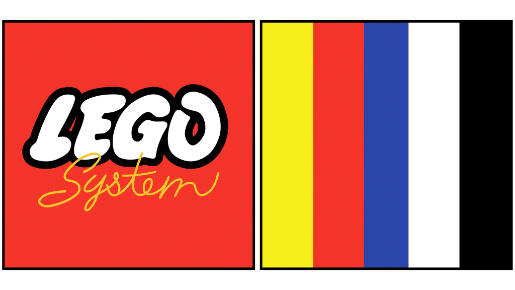
In looking at LEGO’s logo, four colors have stood out over the years in the design – white, yellow, red, and black. Not only does this highlight some of the colors of the LEGO blocks, but it highlights the world of possibility that comes with the LEGO brand. The colors are playful and friendly, inviting us to be creative with LEGO’s products.
LEGO’s logo symbols:
LEGO is a company that never relied on a symbol to convey the message of its brand in its design. Instead, the brand focused on the LEGO wordmark and name itself.
At times, the brand introduced different shapes that represented the LEGO blocks, or a toy box, but for the most part, the brand focused on the LEGO name for its logo.
LEGO Today
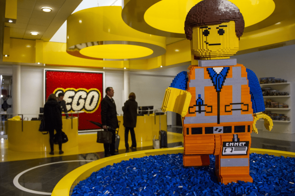
Looking at the LEGO brand today, the brand doesn’t look drastically different than the brand it started as. The only difference is that the brand now has far more revenue than it had decades ago. LEGO generated its highest revenue in 2016, with more than $5 billion.
What has helped LEGO reach this milestone is its diversified approach. Beyond LEGO blocks and LEGO products, LEGO branched into partnerships, motion pictures, video games, amusement parks, and more.
LEGO today is overseen by Ole’s great-grandson, Thomas, keeping the leadership in the family. Its headquarters remain in Billund, Denmark but LEGO has expanded its operations overseas to 5 other corporate offices, almost 40 sales offices, 5 manufacturing sites, and more than 500 stores across the world.
Lessons Learned from LEGO
The biggest lesson we can all learn from LEGO is around LEGO’s branding. LEGO showcases a universal, cohesive brand strategy. Its logo always stayed consistent with the brand, with vibrant colors, playful lettering, and features that tied back to the toy. While the logo evolved over the years, the changes were often minimal. As the brand evolved, it kept the elements of the logo that worked for the brand and ditched the elements that didn’t.
The current version of the logo has been around since 1998 and once the brand found a logo that worked, LEGO took this logo everywhere. From its products to its website, to marketing materials, the logo was versatile, no matter the medium.
Check out these awesome Logo Contests run on Hatchwise:

