


Even if you are a die-hard iPhone user, Samsung is a company that you likely know of. Whether a friend has a Galaxy phone, you wash your dishes in a Samsung dishwasher, or watch your late-night shows on your Samsung television, chances are that you’ve encountered the brand before. And if we had to guess, if you simply saw the Samsung logo, you wouldn’t think twice about it – you would immediately know what brand it is.
With a great company, often comes a great logo, and Samsung is a prime example of that. If you are debating between a Samsung appliance, and a no-name brand one, most buyers would choose the brand with the symbol they recognize. That’s because in most cases, a recognizable symbol means that it is a brand you can trust.
So, even if you are an iPhone user through and through, Samsung is a company that is worth looking closely at. Sure, everyone knows the tale of Apple and Google, but Samsung’s story is right up there with the other tech giants.
To get a better understanding of Samsung’s brand and the company’s iconic logo, keep reading below.
Meet Samsung

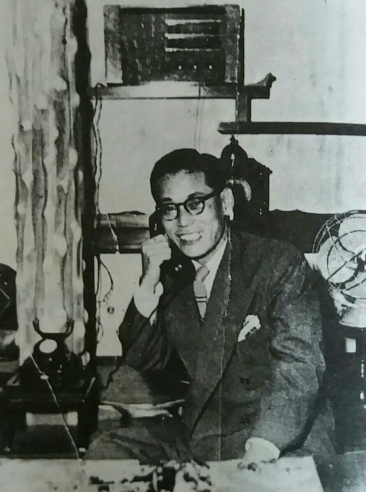
Samsung is a company that likely needs no introduction. Samsung is based in South Korea, where it was first founded by Lee Byung-Chull. Today, the company still operates on a global scale and has grown to dominate the electronics market. As the largest producer of electronic devices in the world, if you are looking for an electronic item, appliance, digital media device, memory chip, or integrated system, you can find all of that at Samsung.
And just like its name, Samsung’s logo is also one of the most recognizable logos in technology which makes sense, given that Samsung produces almost a fifth of South Korea’s exports.
Samsung’s Evolution

1938: Samsung is founded
The Samsung we know today is not the Samsung that existed when the company was founded. On March 1, 1938, a grocery trading store called, Samsung, was founded by Lee Byung-Chull in Taegu, Korea. This store was focused on trading noodles and other grocery goods that were produced locally, and then Samsung would export these goods to China.
The 1950s: Samsung expands

Once the Korean War ended in 1953, Byung-Chull expanded Samsung’s offerings. He grew the business to be a textile operation and opened the largest mill at the time in Korea. His focus was mission-driven, as he wanted to help Korea redevelop itself after the war.
During this time, Samsung also acquired three of Korea’s largest commercial banks to expand its business portfolio. In addition to these banks, Samsung also purchased insurance companies and a cement and fertilizer manufacturer.
The 1960s-1970s: Samsung continues to expand

After Samsung’s initial acquisitions, Samsung continued to acquire insurance companies. In addition to these acquisitions, Samsung also purchased an oil refinery, a nylon company, and a department store. Additionally, Samsung revisited its textile-manufacturing process and decided to cover the full line of production. That meant that Samsung brought the entire operations in-house from taking the raw materials and making them into the final product.
Around this same time, Samsung invested in other industries, like the chemical industry, and established new subsidiaries like Samsung Heavy Industries, Samsung Shipbuilding, and Samsung Precision Company.
The 1970s-1980s: Samsung enters the electronic space

While we all associate Samsung with electronics now, it wasn’t until 1969 that Samsung first broke into this industry. The first products that Samsung produced were black-and-white televisions. By the start of this decade, Samsung was distributing these products overseas. With this shift to focus on electronics, Samsung established itself as a competitor and acquired a 50% stake in Korea Semiconductor. To continue dominating the electronics industry, Samsung established an aerospace division in 1979, and in 1985, Samsung Data Systems (which we know today as Samsung SDS) was created.

Today: Samsung maintains its market share
While it may seem like we skipped over some years, that’s simply because the company kept growing (and kept increasing its market share). Today, their success has been incomparable with any competitor because they cast such a wide net with their services and offerings.
Roadblocks Along the Way
Throughout the years, Samsung has experienced some bouts of bad publicity and corporate scandals. For starters, Lee Kun-Hee was involved with several patent-infringement lawsuits and bribery cases. One of these cases included claims that Kun-Hee bribed former Samsung President, Roh Tae-Woo, which he was found guilty of in 1996. As a result, Kun-Hee was sentenced to two years in prison but was pardoned in 1997. After this, Kun-Hee was again indicted, this time on charges of breach of trust and tax evasion in 2008. This led him to resign from his role as Chairman. Kun-Hee was convicted of his tax evasion charge and was required to pay an $80 million fine and serve a three-year prison sentence. Like his prior run-in with the law, Kun-Hee was pardoned again, this time so he could continue serving on the International Olympic Committee and so he could help bid for the 2018 Winter Olympics to take place in South Korea.
Eventually, Kun-Hee served again as the head of Samsung Electronics, and later Chair of Samsung Group in 2010, but he suffered a heart attack and eventually passed away in 2020. His son, Lee Jae-Yong, served as the Chairman but like his father, he was sentenced to prison in 2017 for bribing a different former president, Park Geun-Hye, and was later indicted on other charges as well. While Jae-Yong was serving his prison sentence, Samsung was led by three Co-Chief Executive Officers.
The Meaning of Samsung’s Logo and Samsung’s Logo History
As you read through Samsung’s logo history below, you’ll notice that every detail on every logo version was intentionally included by Samsung’s design team. Each update experienced only mild changes, but every change was implemented to make the logo more dynamic and show how Samsung, as a company, is at the forefront of innovation.

1938: The first version of the Samsung logo
This first logo iteration was loud, with many elements displayed, and it resembled a postage stamp. This version of the logo had a case of “trying to incorporate too much at once,” with the stars, stripes, and wheat plants. Overall, this logo feels cluttered.
This logo was so small that Samsung didn’t print it on their packaging or products initially. It wasn’t until 1958 that Samsung began to do this, only because their business took off.

1969: The second version of the Samsung logo
For Samsung’s first logo update, the company kept its star symbols on the logo but instead made the logo more refined. How the design team did this was by making the logo look more abstract. One other prominent feature that was added to this version was the addition of the “Samsung” brand name.

1979: The third version of the Samsung logo
10 years after the second reiteration, the design team decided to reinvent the logo yet again. This time, the framing around the stars disappeared and the logo was much simpler. All the logo featured now were the stars and the “Samsung” wordmark.
1980: The fourth version of the Samsung logo
The third logo iteration only lasted one year. In 1980 the logo was redesigned yet again, but this redesign only went through some minor updates. The design team focused on the wordmark and made the “Samsung” brand name bolder and shorter, causing the brand name to stand out more.
This was also around the time that the world was transitioning from black and white televisions to color ones. As a result of this shift in technology, Samsung began to take the steps to update its logo to reflect this colorful future of technology.

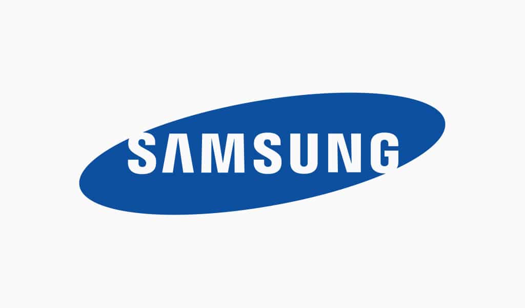
1993: The fifth version of the Samsung logo
1993 was a pivotal year for Samsung’s logo design. This was the year that the logo we know, and love today was first introduced. This iteration includes updated typography placed within a blue ellipse. Looking at the wordmark, the “A” does not include the horizontal bar, which has helped make this logo unique (and has made the logo iconic as a result) The final logo update for this version is the change in the three stars’ appearance.
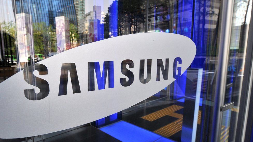
2005: The sixth (and current) version of the Samsung logo
Even though we associate Samsung with their logo version from 1993, the brand still went through a rebranding in 2005. Instead of keeping the blue ellipse, the design team decided to remove this blue oval. However, instead of dismissing the fifth logo version altogether, that fifth version is often used as a “secondary” logo, whereas this iteration is used as the primary version.
Samsung’s Galaxy logo
Similarly, to brands like Google, Samsung’s products under their umbrella have slightly different logos. The Galaxy’s logo has gone through some rebranding, just like the Galaxy itself, but today, the logo includes the words “Samsung” and “Galaxy.” Both words are written in the same font family as Samsung’s logo, yet “Galaxy” is written in a slightly different font than the font used for “Samsung’s wordmark.”
Samsung’s logo font:
Looking at Samsung’s logo, the wordmark is simply the company’s name. The “S” and “G’ are purposefully left open to signify open-mindedness and communication with their community. The original Samsung logo was written in Korean characters, but when Samsung broke into the United States market, the font was updated to a typeface that Americans would be able to read. The decision was a san-serif Helvetic-inspired font written in all capital letters. The font varied between including thicker and thinner lines but the removal of the horizontal line on the “A’ was one font feature that made the logo stand out.
Samsung’s logo color:
Looking at Samsung’s logo, there aren’t many colors to comment on. The initial colors of the logo were black, white, and grey. These colors were chosen because this was before color printing on a mass scale was introduced. The band felt that they could easily print their logo symbol on various marketing mediums in these three colors.
Once color televisions were introduced, Samsung introduced red, and later, blue. Samsung cared less about what each color signified and cared more about what colors would stand out and how the use of colors reflected a change in innovation within technology.
Samsung’s logo symbols:
Throughout the years, there is one prominent symbol on the Samsung logo – three stars. These three stars tie back to the founder’s Korean roots and represent the “three stars of success and prosperity.”
Samsung Today

Samsung Group is a privately owned group, which is led by Lee Jae-Yong, who serves as Samsung Group’s Chairman. This shift in leadership first began in 1987 after the founder, Byung-Chull passed away. His son, Lee Kun-Hee, took over ownership and during this time, Samsung was split up into five different companies. Electronics was the largest company, which Kun-Hee ran, and the other four companies were run by Byung-Chull’s other children.
Kun-Hee’s new management style shook up the culture that Samsung employees were used to. He was known to encourage subordinates to point out errors to their supervisors, promoted women to senior executive roles, discouraged bureaucratic practices, and believed in quality over quantity.

Today, Samsung Group includes smartphones, microprocessors, televisions, tablets, smartwatches, and more. And today, Samsung Group is led by three Co-Chief Executive Officers. Samsung is the 12th largest company in the world, with its global headquarters in South Korea and with more than 320,000 employees worldwide across all their officers. Samsung generates billions of dollars in revenue each year and was voted the 6th most valuable global brand in 2019.
Lessons Learned from Samsung
Samsung is a company that took one idea and grew that small idea to a global scale. Samsung has maintained its place as a leader in the electronics space and as one of the world’s largest companies, that’s no surprise.
Samsung’s logo has helped build brand awareness and it’s safe to say that if it didn’t have a logo that resonated with its customers, it wouldn’t be a tech giant. So, with that, perhaps as you think about your own logo’s design you can also think about following some of the strategies Samsung followed. For instance, if technology is changing, maybe make your logo reflective of these changes. Or, if there is something that is a small detail, yet true to your brand (i.e., Samsung’s three stars), maybe keep that throughout each of your redesigns. And if your logo doesn’t resemble any of your competitors’ logos, maybe embrace that and see that as a win.
Samsung’s logo is simple and scalable and that’s all your logo needs to be too. To get started on a logo for your business, take a look at Hatchwise.


