


Netflix’s iconic logo is recognized nearly everywhere on the globe. Its current iteration, Netflix in flat red text, despite being so simple, is so recognizable— to the point that even just showing the letter N already alerts the viewer that “yes, this is a Netflix production”.

But did you know that this famous logo hasn’t always been part of Netflix’s identity?
Let’s take a deep dive into Netflix’s logo history, and all that surrounds it.
What is Netflix?
Netflix is a streaming platform for various media, movies and TV series being prime examples of this content.
Netflix can be accessed via web on a computer, on mobile, or on an Android or iOS device. It can even be accessed on Smart TVs, or on media adapters such as Chromecast or Apple TV.
Netflix runs on monthly subscription plans, providing varying video quality and device counts depending on the tier you choose to avail.
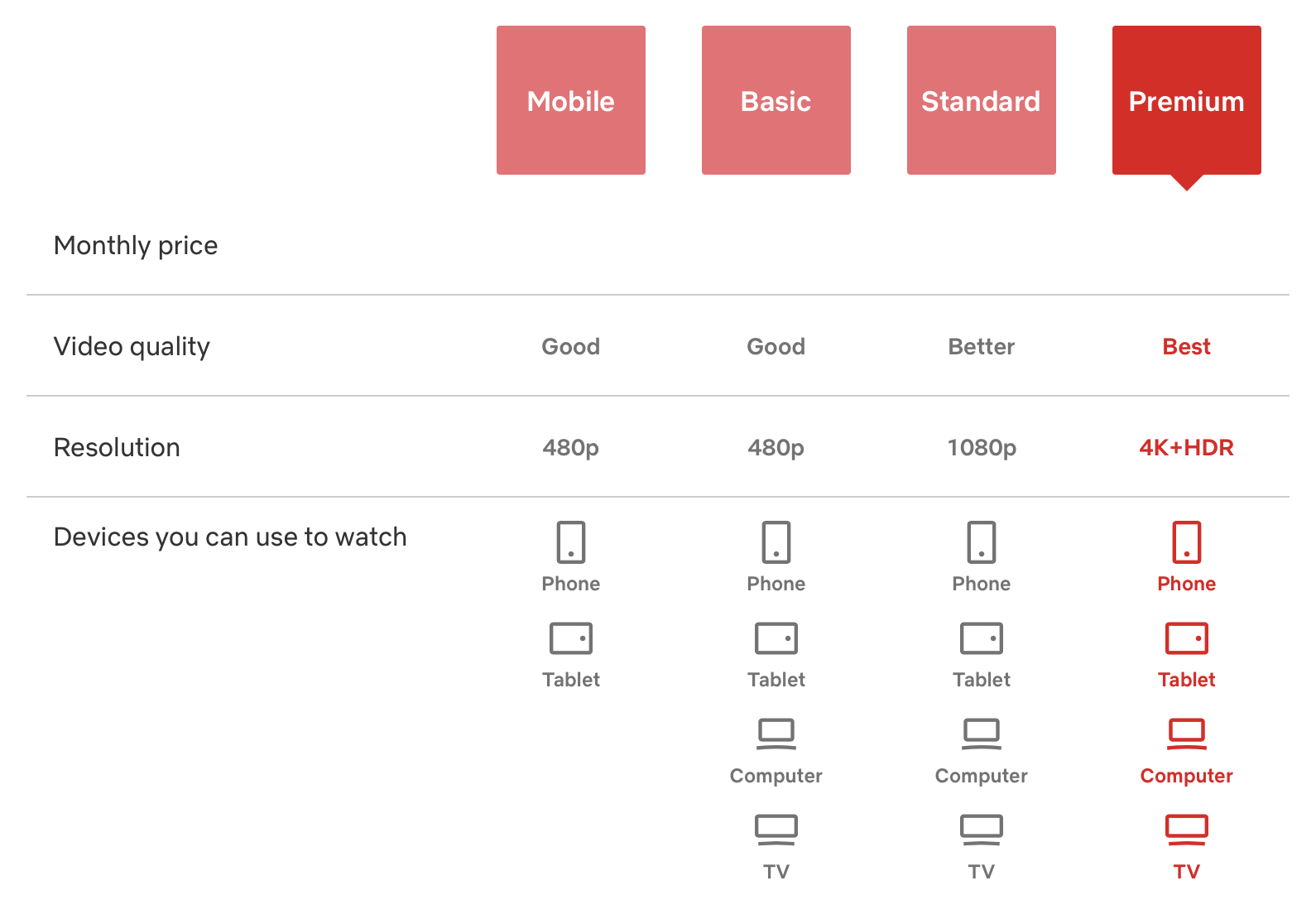
(Prices taken out in case of increase/decrease in price from the time of writing)
Once you’ve subscribed to Netflix, you can then utilize all its perks and benefits— the utmost being watching movies and shows on-demand, anywhere, with almost any available device.
Users can also create profiles for a better user experience. Profiles allow users to save media to watch later, or to rate shows.
Netflix also suggests new media to users based on their preferences, while also presenting new series or movies whenever they’re available.
Multiple genres are listed on Netflix’s front page, making for hours and hours of endless scrolling, watching, and even binging.
Searching for content is also made extremely easy by the system.
Overall, Netflix provides a seamless experience that can be enjoyed by people of all ages, anywhere, any time, with new releases dropping by as frequently as every week.
It’s become the first of many subscription-based streaming service providers, with even the likes of Disney following suit.
Netflix: A Brief Backgrounder
Before uncovering the previous iterations of Netflix’s logo, let’s cover a bit of background information about the media streaming giant.

The popular subscription streaming service, Netflix, has reached approximately 223 million paid subscribers worldwide, projected to gain more as the months progress.
This giant service provider has become so popular that it is responsible for 15% of the world’s online traffic.
Its name, is derived from the combination of the words “net” and “flix”, presumably derived from the words “internet” and “flicks” (films or movies).
Netflix, originally known as Kibble, was founded by former marketing director Marc Randolph and computer scientist and mathematician Reed Hastings back in the year 1997, making the company technically older than Google itself.
Both had their fair share of experience with Silicon Valley and tech companies, with the most notable experience being from their shared journey with Pure Atria.

While its current popularity rose from its media streaming service, not everyone knows that Netflix is a company and a solution that has been around since the year 1997, where it used to be a mail-based DVD rental business, introducing a monthly subscription model— with no late fees— in 1999.
It was the first online rental DVD company in the world, with the idea starting from a simple trial done by founders Randolph and Hastings to check if DVDs can make it through the mail.
At this point in time, Netflix already had around 925 rentable titles, initially renting each DVD out for around $6 each, with the eventual unlimited monthly rental subscription service reaching up to $15.95.
It then beat Blockbuster as a leading online DVD rental service, being the first to develop a video-recommendation algorithm, Cinematch.
Netflix then transitioned into streaming back in 2007, especially after they observed Youtube’s booming popularity with its own version of video streaming.
They launched a streaming service called Watch Now, which was able to stream over 1000 titles. This also attracted many independent movie producers to start streaming their content on Netflix.
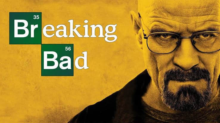
The show Breaking Bad was then acquired by Netflix in 2010, allowing it to push out more seasons despite the possibility of cancellation.
House of Cards, on the other hand, was released in 2013, which is notable since it was the company’s very first original series. House of Cards set the stage for Netflix’s capabilities.

These and a lot of other important moves (such as deals with the likes of Epix and Disney) brought about the beginnings of Netflix creating its own productions and expanding farther internationally.
In fact, by 2018, Netflix has produced around 240 original shows and movies, increasing this number up to 371 in the next year.
Today, Netflix is seeking to venture into producing games, experiences, and maybe VR, as these markets are where tech, in general, is headed. They even onboard former executive of Electronic Arts and Facebook, Mike Verdu, as a step towards this direction. A game based on their hit show, Stranger Things, is the first of its kind to be tested by Netflix subscribers.
Oh, but before anything else, did you know that over the years, it was almost bought by Amazon (back in the early 2000s) and by Blockbuster (during the time they were head-to-head competitors)?
Thankfully, the decision not to sell reigned supreme over both instances, and we are left with the Netflix we know and love today.
Netflix has definitely gone a long way since its humble beginnings, and as with every brand that goes through a lot of drastic changes, its logo has gone through its own overhauls too.
Netflix’s Logo Evolution
Since we’ve already talked about Netflix’s rich history, we can now dive into the evolution of its logo.

Neflix’s First Logo (1997-2000)
The first logo Netflix pushed for actually had an icon attached to it, compared to its current clean and red “Netflix” wordmark logo.
The first logo used a serif font to spell out the company’s name, with a black-to-purple film reel curling out from between “Net” and “Flix”.
The text is in all-caps, however the letters “N” and “F” are still distinguished from the rest by being made slightly taller.
This logo was only used for three years before swapping to a vastly different logo altogether.

Netflix’s Second Logo (2000-2001)
Netflix’s second logo shifts from its black and purple gradient to flat colors of yellow and black, making it a drastic change from its predecessor. The font changes from serif to a more “hip” font which makes it utilize both angles and curves. The text is colored white. All letters seem to be of the same height, all seemingly in lowercase, with some letters (like the letters T and F) looking like how they would in uppercase. The dot on the letter “i” is a yellow-stroked box with rounded corners, and the whole text is over a black oval, enclosed by yellow parentheses.
This logo marked Netflix’s transition into unlimited rentals from its per-rental payment model. The round shapes are also reminiscent of DVDs.

Netflix’s Third Logo (2001-2014)
Its third logo is more familiar to many of us. It has the text Netflix in a subtle convex arch, with clear sans serif letters. Netflix is in white, with a solid black drop shadow, along with contours and strokes, making the text look 3D and embossed from the bolder all-red background. The intent behind this logo is pretty simple: to capture its viewer’s attention. Certainly, the stark contrast in color, plus its movie-like font already embodies what the company is all about while grabbing all the attention it needs. This was Netflix’s logo when they started exploring streaming options and capabilities, especially with Youtube’s boom in the early to mid-2000s.
It is important to note that Netflix’s DVD service has not died down at this point— even up to today.

Netflix’s Fourth Logo (2014-present)
Finally, Netflix decided to rebrand for the international market, dropping the striking red background and the black drop shadows and contours to reveal a simple “Netflix” in red font (called Netflix Red). The font face is based on Gotham Book and Gotham Bold.
The result? A visually lightweight and instantly recognizable logo known worldwide.
The decision to transition to this logo was pushed by a need for minimalistic design, thanks to the trend that sprouted in this era. Apart from that, simplicity allowed for the logo to be easily incorporated into dark backgrounds and light backgrounds alike.

Netflix’s Emblem
Apart from its logos, Netflix also has another graphic visualization: its icon.
It is simply the letter N, with shades of red per line, signifying depth— as with a folded ribbon.
This N is usually seen animated at the beginning of a Netflix trailer, or as the app is loaded. It rarely ever stands alone, but when it does, it still strikes that instant recognition.
Logo Specifics

Netflix’s logo has the following color codes:
Hex: #e50914
RGB: 229, 9, 20
CMYK: 0, 96, 91, 10
Pantone: PMS Bright, Red C
Colors that go along with Netflix Red are most commonly black (#000000) or white (#FFFFFF).
What can we learn from these logo transformations?
As we now know, Netflix has gone through a lot of changes over the course of its inception.
From mailed DVDs, to streaming subscriptions, down to international partnerships and in-house productions, Netflix continues to evolve— and its logo evolves along with it.
That is one key thing we’ve learned: your branding will not stay the same. Certainly, today, your brand might be as strong as ever. But with the future that’s to come, who’s to say that your company will stay the same and provide the same services and products it does today?
Change is inevitable, as they say— and your brand guides and logo designs are no exception to this.
As with Netflix, they started with DVDs— with the idea rooting from possible VHS rentals. Adding a film strip to the logo made sense.
They then fully embraced their mailed DVDs, adopting the circular logo of the year 2000.
Finally, the bolder reds came with online subscription, as the internet and the similarly-colored red Youtube was slowly gaining traction in the eyes of many.
And when minimalism came into the picture, Netflix followed suit.
All these changes means that Netflix paid attention to the following:
- Their Business – once their offerings or their direction changed, they took the extra step of switching up their branding
- Their Target Audience – they try to cater to their audience and make their logo as recognizable as possible, while also following current trends, which, in this case, is minimalism
- Ease of Use – their logo goes beyond form and dabbles into good function as well, as it can be used on light or dark backgrounds without any hassle

Since Netflix has been making moves towards the game industry (you can see them releasing games in mobile app stores), perhaps, in a few years’ time, Netflix will be expected to shift its logo yet again.


.svg)
.svg)