


The Hot Wheels brand is synonymous with hot rods! And this isn’t just for kids. The brand began, and has continued to use, a logo that was all about excitement, speed, and fun! But its design has always been flawless. It’s legible and just the sight of it brings adults all over back to their childhood.

Founded in 1968, the brand began with a symbol in red, orange, white, and black that seemed to be on fire, and right in the center was the popular toy car brand name. It only lasted a year before it was revamped, but it always maintained the same spirit in its design. Here, we travel back in time, reviewing all the successful logos and bring you up to date with the latest design.
Facts About the History of Hot Wheels

- The Hot Wheels logo was created by Otto Kuhni, a Mattel graphic designer. His work, including designs for Lockheed, Tyco, and more, was awarded when he landed the Diecast Designers Award and a spot in the Diecast Hall of Fame.
- Mattel’s President Elliot Handler, upon seeing the prototype of the first Hot Wheel exclaimed, “Those are some hot wheels!” The name took off from there!
- The first Hot Wheels Car was Custom Camaro and launched with The Sweet 16 series which featured cars with a spectra flame and red pinstripe.
- The idea of Hot Wheels cars came from Handler’s son’s love of Matchbox cars. He felt it was time that Mattel got into the game.
- The tagline “Go with the winner” was introduced in the ’70s. In 2018, a new catchphrase “It’s not the same without the flame” was launched.
The Inspiration Behind the Hot Wheels Logo
Hot Wheels has stayed committed to its fire emblem representing fire, wheels, and speed. Red displays speed and yellow represents the fun of the brand. The font is a custom sans-serif font typeface. It also remains modest and clean and looks great when it’s scaled larger or smaller.
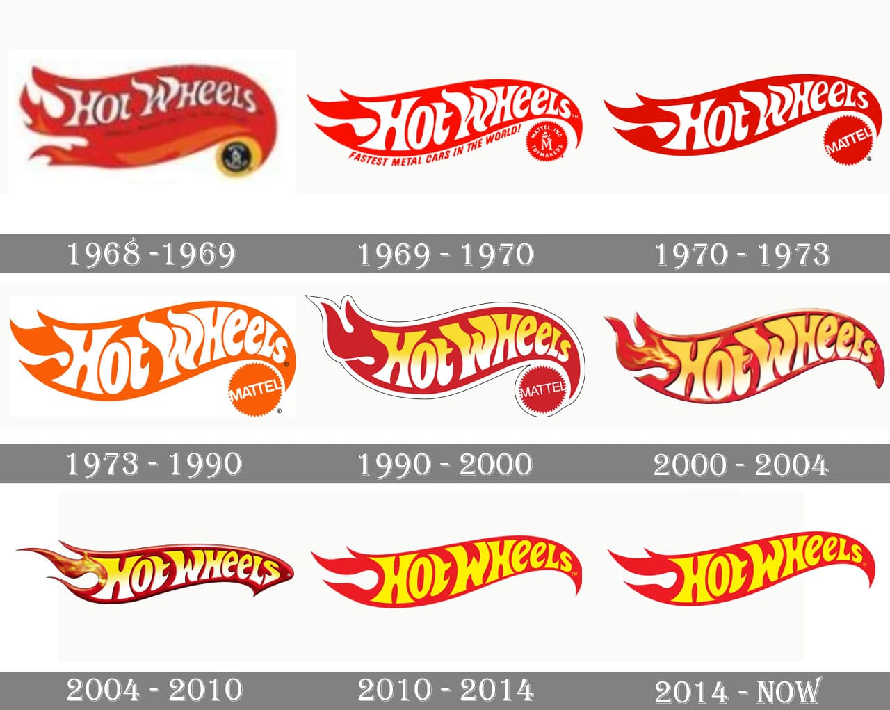
The Hot Wheel Logo Through the Years


Where it all Began
The Original Hot Wheels Logo in 1968 featured a fire symbol in red, orange, white, and black. The slogan “Hottest metal cars in the world” was emblazoned on each car.

A New Look
In 1969 Hot Wheels toned down the logo and stuck with just red and white. The brand name was larger taking on a bolder position. The flaming ends were reduced to just three and the Mattel logo was separated as if to punctuate the design. Along with the redesign of the logo, a new slogan was launched – “Fastest metal cars in the world”.

More Changes
A simpler logo came along in 1970, eliminating the wordy slogan and the Mattel brand name written out. The color was richer, and it became a more modern and cleaner logo. Although there was a tagline for the successful brand, it wasn’t incorporated into the logo.

Orange Made a Comeback
The 1973 revamp leaned more towards burnt orange than red and the brand’s name was larger. Someone must have felt they had finally hit the right tone as this one lasted for almost two decades.

The ’90s Brought Another Look
The 1990 redesign incorporated yellow and white in gradient shading in the brand name and the flame returned to its red hue. The entire logo was also outlined in black and white. During this time the company bought out Matchbox and there were also marked changes within the brand with collector numbers and First Editions being introduced.

The Third Millennium
2000 saw Hot Wheels ditching the outline and the Mattel logo. Right before the H, a yellow-orange flame was added.

On to the 6th Version
The 2004 update was slimmer and streamlined with darker colors. The right tip end of the flame took on an almost arrow-like look.

A Lighter Look
In 2010 the small flame on the left of the logo was eliminated. The Hot Wheels name was simply one color – yellow. The bright design lasted for four years.

Bringing it Current
The 8th revamp in 2014 of the Hot Wheels logo didn’t change except for its overall size.
Celebrating 50 Years

In 2018 the brand introduced a brand new classic blue and white color combination and kept it simple except for the 50 to signify the anniversary of the iconic brand.
Hot Wheels is a showcase of what inspiration we can find in simple things. From that day a businessman’s son was playing with Matchbox cars a successful die cast car toy company was born. The company has continued to innovate in branding and product design throughout the years, never allowing either to grow stale. This hero to many generations is still going strong and there is no telling what is on the horizon for the brand.


