The food delivery service GrubHub operates in the US and since it was founded has quickly become one of the most popular online and mobile prepared food ordering and delivery services. The company has made a new level of ease for people ordering takeout from their favorite restaurants and having it delivered directly to their homes within hours. When it comes to all businesses, a logo is one of the most critical aspects of a company and what they do. But for a business like GrubHub that relies on its visual identity and its presence on the internet, its logo is a critical part of its business and one that they’ve managed to turn into a successful part of the company.

For a logo to be successful and to stand out, it needs to be one of a kind as well as stay true to the values of the company and explain what they do. A logo needs to be instantly recognizable to the public and needs to not only be relatable to the brand but also has to show what the brand does and the industry that it’s in. GrubHub managed to create a logo that marked all the boxes for what was needed for a great logo and, although having gone through a few changes since it was first founded, the brand has always kept a strong visual identity.
Besides its iconic emblem, the brand has a strong history behind them that has formed them into one of the most famous food delivery services in the country. Although the brand’s strong marketing material has contributed towards it, it isn’t the only part of the brand that has made it so iconic throughout time. Since first founded in 2004 the brand has since then become reliable, strong, and famous around the country. Let’s take a look at the brand’s iconic logo, its history, and the history of the brand itself.
The History Of The GrubHub Logo
2004 – 2011: The First Logo
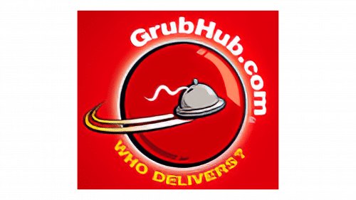
The first logo made its appearance when the company was founded in 2004. This visual identity stayed with the company for nearly seven years before they opted to go in a different direction. This first logo was unique, detailed and gave the brand personality to start it out with. It showed a solid red square and inside there was a red circle with a thin glossy circle outlining it.
This circle represented the planet and around it we see a plate flying in grey. The logo featured ‘GrubHub.com’ above the circle and below it featured the company’s tagline, “Who Delivers?” in yellow. The logo had a few different elements included and made the company colors clear; red, white, grey, and yellow. This design was an excellent first logo for the business and helped to establish the brand and first start making a name for it.

2011 – 2016: The First Redesign For The Brand
Nearly seven years later the brand thought that it was time for a complete redesign of their logo, opting to remove all elements of the previous logo. Instead, they opted to simplify the logo and make it a wordmark. The early 2010s marked a time when the platform owners thought that it was necessary to adopt a new and decluttered look for the brand. At this point, they knew that the brand no longer needed the advertising that they had when they first started in 2004.
This is why they chose to only use the name for the logo instead of any design elements or including the company tagline. This is why they opted to only include the name for the emblem and nothing else. All letters in the name were lowercase except for the ‘H’ towards the end. The font was the part of this logo that truly stood out, using rounded letters and a clear geometric sans serif typeface. The emblem was friendly, welcoming, and a warm invitation to those that hadn’t tried the service before.
2016 – 2021: An Update To The Design
The most iconic redesign that the logo had and the one that you’re probably the most familiar with is the one that was made in 2016. This rebranding was handled by the advertising agency Wolff Olins and they opted to keep the idea of a wordmark for the design. This wordmark kept the consistent look of red letters on a white background, only making small changes to the font itself. This logo for GrubHub consisted of a wordmark in the Barlow Semi Condensed font. These letters were low in contrast and were a little more rounded than the previous version had been.
This redesign was created by Jeremy Tribby and turned out to be one of the company’s best logos of all time. With this, the styling of the logo was slightly changed, with the company name horizontal and inspired by California street typography. The red color choice on the white background makes a presence and helps the logo to boldly stand out in comparison to the white background. The brand opted to keep the red color for the logo since it’s often associated with hunger and appetite, making it the perfect option for the food delivery service company.

2021 – Today: The Logo Now
The second logo stayed with the company for roughly seven years before it was time for another change. This redesign came when the company became a part of the Dutch company Just Eat Takeaway.com N.V. The company sells food online and GrubHub became a part of the brand in 2021. This time the logo was updated to be different than many of the previous logos, changing the color as well as the design. This time the logo was orange on a white background and used both a wordmark and a symbol to the left of the letters.
It shows a house and the outline of a knife and fork inside it. The house is orange while the utensils inside are white. The house is the simplest version, showing simply a triangle on top for the roof with a chimney coming out of the right side of the roof. This house is the base for the utensils and makes the logo unique and has character. As for the wordmark, the concept stays the same as the previous logo, just this time using orange instead of red for the letter colors.
This is the exact logo that’s associated with the brand to this day and the one that has made its mark with those that use the platform. It does an excellent job of not only displaying what the company does and the brand’s personality but also incorporates a wordmark and a symbol into the design concept. By keeping certain elements like the wordmark the same, the brand makes sure that its visual identity stays consistent and is easily recognizable to those that use the platform. This is the logo that’s with the company today and that we see used for all their branding and advertising.
Elements Of The Logo

When it comes to logos, the elements that make it work are what makes a logo stand out amidst its competitors. We know that to make a mark a logo has to be certain to have specific design elements that are not only tailored to their brand and what they do, but that are stylish and modern. The design concept has to be complete and visually stunning, catching people’s eyes instantly. The logo that is with the company to this day is legendary and iconic because it incorporates all the important elements of a visual identity.

It’s simple, classic, friendly, and warm. For this type of platform, it’s important to have a visual identity that resonates with customers and makes sure that they feel welcome to use it. GrubHub made sure to use both the font and colors to make an impression with viewers and make sure that they felt welcome. They use a soft orange on a white background and they use a warm, rounded font. These elements are what make this logo stand out and different than others, both easy to identify and embrace the spirit of the company.
The Impact That the Logo Has

Although the logo may have had quite a few visual changes since the company was first founded we can be certain that there are a few particular elements that have stayed the same. When creating a logo, it’s critical that it stays consistent with the brand and that it’s easy for customers to recognize. GrubHub knows what they’re doing when it comes to keeping the logo modern and unique even with their most extreme redesigns. One aspect of the logo that has been consistent from the start is the font that’s used.

Even at the very beginning of the logo’s history when the brand only used a small wordmark, the font was still very similar to the logo that’s used today. The second logo that the company used kept the color red and, although changing the main elements of the logo, it still used red to keep the two logos similar and recognizable. The third logo that we see used kept both the font and the colors the same, keeping the two logos even more similar.
Then in the last redesign, we still see the logo kept consistent with the same font. The letters are still rounded and the font stays consistent with the first one that we saw used. Overall the logo is unique and an excellent representation of a reliable logo that has made itself known and branded itself well throughout the years.
The History Of GrubHub

GrubHub has a history that is almost as strong as the history of its logo. The Chicago-based company has been around since 2004 and was originally founded by Mike Evans and Matt Maloney. These two founders had a goal to create an alternative to paper menus that was easy to use, modern, and appealing to the public. Mike Evans and Matt Maloney initially worked together at Apartments.com and their job often required them to work late into the night. As they became aware of the difficulty in finding local delivery options this was where the initial idea for GrubHub emerged from.

Once it was on its feet and running, the business became more popular quicker than anyone could have expected. It quickly expanded and the platform was being improved daily and started to attract investor funding in 2007. The business kept breaking records and getting more acknowledgment as the years went on, becoming a powerful platform in their industry. 2019 and the company had 115,000 affiliated restaurants in 50 states and over 19 million active customers. Now owned by the parent company Just Eat Takeaway the brand has become one of the strongest and most recognized in the world of food ordering apps.
Is GrubHub Winning The Food Delivery War?

Although this article is about GrubHub, it’s no secret that there’s a war going on when it comes to food delivery services. At this time there’s a sea of options when you go to order food online and have it delivered and GrubHub could easily be one of the many. However, despite the growing competition GrubHub has continued to remain the dominant force in the raging war of food delivery services. In the first quarter of 2017 GrubHub (after merging with Seamless in 2013), was responsible for delivering food to 8.75 million people.

It’s no surprise that as more services like Postmates and UberEats have opened up it’s been more difficult for GrubHub to continue being the best in their industry. The reason that GrubHub has remained at the top despite their fierce competition is that they eliminate the hassle of ordering food online. Customers can simply order food and have it delivered without the hassle of calling or worrying about the platform charging them additional fees.
Food delivery has become a critical part of our country and something that many people have started to rely on. It’s no surprise that the platform has become an addiction for many and something that they use weekly. Since we can assume that food will continue being the most popular product on earth, we don’t think that GrubHub is in danger of losing its business anytime soon. As far as we’re concerned, GrubHub has earned its title as one of the top food delivery services and will continue to be at the top.
Summing Up The History Of The GrubHub Logo
As we reflect on the history of the GrubHub logo we can acknowledge that the visual identity has become an important part of the food delivery community. Now with more and more companies offering the same platform, GrubHub must continue to stand out from the competition. The brand has worked hard to establish itself in a competing and ever-growing community. We know without a doubt that a company’s visual identity is what has helped the brand to stand out and keep its loyal customers throughout the years.

When it comes to the history of the brand itself, we can see that the company has stayed consistently strong since the beginning. Although starting from the minds of two partners, the brand has now grown to a point where they’ve acquired a few food ordering and delivery platforms. They’ve grown to a point where they’re widely known around the world and have become a platform that many instantly turn to when they’re looking for easy and quick ordering and delivery. Next time that you go to order from the platform, make sure that you remember the history of the visual identity and the brand that brought it to what we know it as today.


