


The brand Calvin Klein has made such an impression on our world that it’s nearly impossible to not recognize the iconic brand and know when you see one of their products. Calvin Klein has become one of the world’s most beloved brands as well as being the number one choice when it comes to fashion. This high-profile brand has expanded further than the country, known both overseas and in the states. Although many attributes have led Calvin Klein to be one of the best brands in the industry, their logo has been the biggest part of the brand becoming so iconic.
The company logo made quite a splash in the industry, being one of the first to appear both bold and majestic. The logo stands for something more than just the company name, really embracing what the brand is and the heritage behind it. Although the logo has had a few changes, they haven’t been large enough to count as a true redesign of the logo. The essence of the logo has stayed the same, constantly keeping up with the modern looks and making sure that the logo stands out in the sea of logos.
In this article, we’ll take a look at the history of the Calvin Klein logo as well as the history of the brand itself. You’ll learn everything about the logo and how it’s changed throughout the years to adapt to the latest trends and grow into the logo that we’re familiar with today.
The History Of The Calvin Klein Logo
1968 – 1975: The Brand’s First Logo
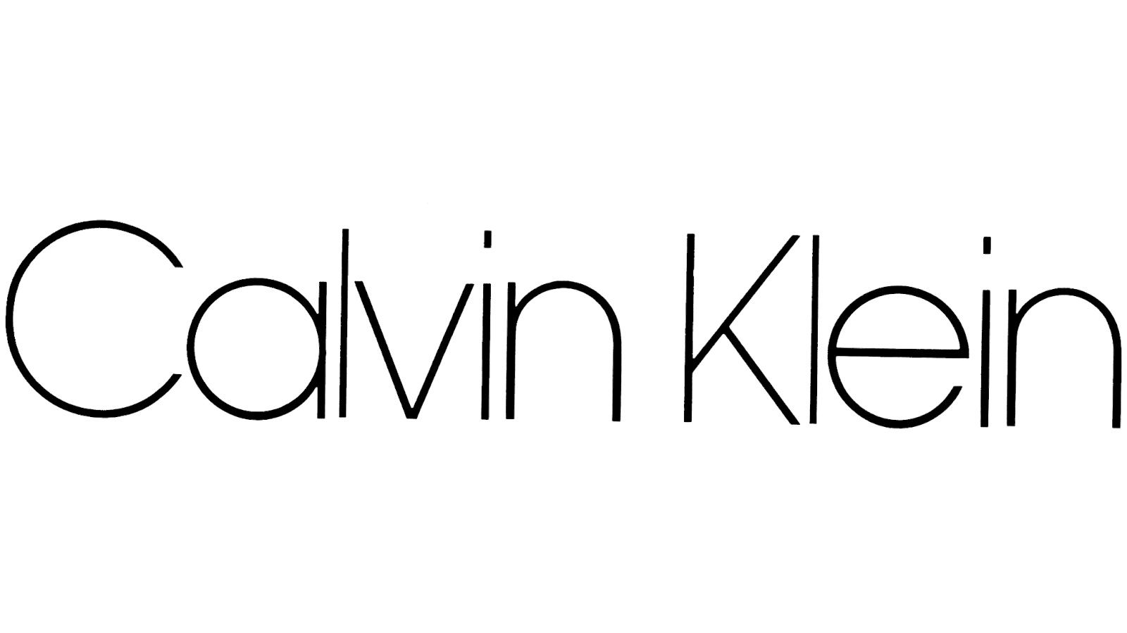
The first logo ever created for Calvin Klein was in 1968 and was what set the base for the brand itself. This logo started the brand off in a positive way, with elegant and thin letters that stood out against a white background. The logo was everything that the brand needed, both elegant and having personality. By choosing an elegant font and opting to use the black letters the brand made sure they were off to a strong start with their logo.

1975 – 1992: An Update To The Logo
Seven years later and the logo received its first update, making changes to the logotype. The font became a little bolder but remained as stylish as it had been in the first version. This second version made the letters a little thicker than they had been before and a little bolder. Although still elegant, the letters now made more of a statement and seemed stronger. The letters appeared practical and were professional in their own way.

1992 – 2017: Another Change
The previous logo update stayed with the company for even longer than the first before it was time for another change. This time the letters were still in bold but they were a little thinner, yet still not as thin as the first version was. The style may have changed, but the font remained consistent with how it had appeared before. Another change made to the logo was that now the ‘i’s in the logo were dotted instead of the rectangles that had been used in the previous design. The letters were pronounced and the design overall was aesthetically appealing and creative.
2017 – 2020: Bold Letters
2017 came and the brand thought it was time for another update to be made to the logo, this time using bolder letters than they had in any of their previous designs. Now the letters were capitalized and they used a font from one of their previous logos. These letters were fairly close to each other in comparison to how they appeared in the logos before. This logo stayed consistent with the previous designs and the changes were subtle enough that, although making a difference in the overall appearance, didn’t steer away from the main concept of the wordmark and black letters.

2020 – Present: The Logo Today 2020
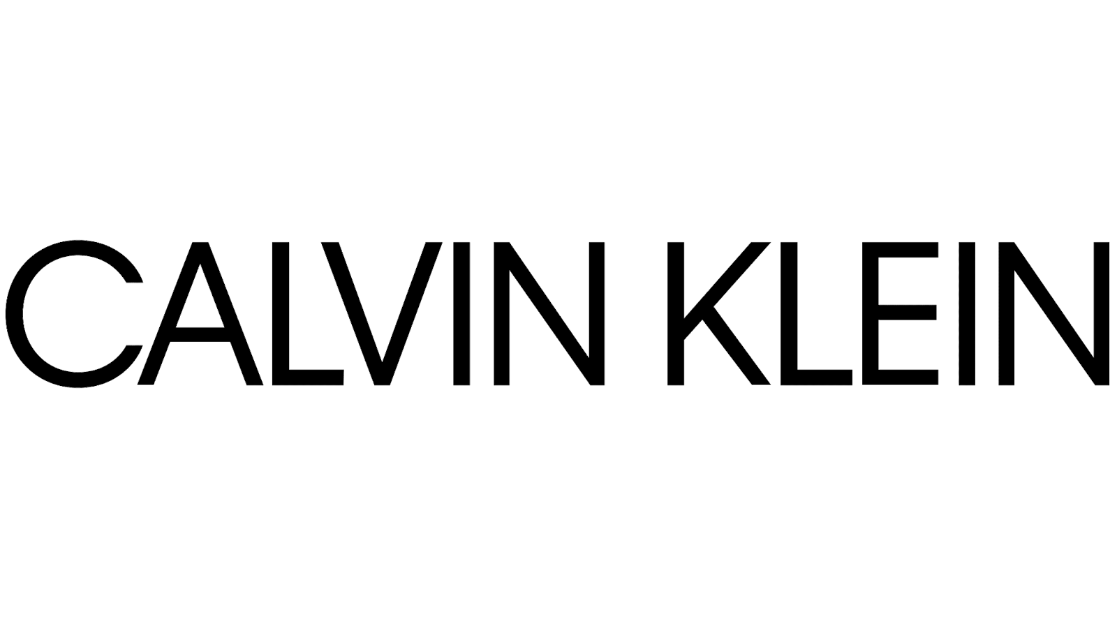
The most recent logo and the one that you’re probably the most familiar with is today’s logo. This logo is the one that the brand uses to this day and the one that’s currently displayed on the marketing material for the brand. This logo didn’t differ too much from the previous logos and was very similar to the logo that had been used directly before it. The same font was used for the logo, the only main change being that the letters are both upper and lowercase. This logo is clean, simple, and stays consistent with the same logo that the brand has had since the beginning when they were first founded.
What Makes The Logo Different?
It’s only natural to wonder what makes this logo different than the millions that we see in the world and what makes it stand apart. After all, this logo has become a legendary part of the industry as well as one of the best that accurately displays the company. The wordmark is a perfect definition of a logo that’s strong, distinct, and displays the brand well with only two colors.
It’s Simple

Perhaps the most noticeable aspect of the brand and the one that makes the logo different then others is that it’s about as minimalistic as possible. The logo only shows letters on a white background. This forces customers to pay attention to the brand instead of distracting them with design elements. It also shows that the brand is modest and classy, only having to use its name to show customers it’s their brand.
The Colors
As with any logo, the colors that are used for the visual identity make a difference. Instead of complicating the logo with too many colors and elements they just chose to include two colors for the logo. This logo is typically seen in three colors; white, black, and grey. While the black version is most commonly seen, the white is generally seen on sportswear and the grey one on the brand’s other apparel. The colors play a key part in making such a sophisticated, stylish and classic logo that has made the brand as important as it is today.
The Font Used

Since the visual identity is a wordmark, it relies heavily on the font to make an impression and do the talking when it comes to the design. The fonts that have been used for the logo throughout the years, although having changed, have all been similar and kept the same look and feel for the brand. The font that’s used on the current logo is stylish, classy, and perfect. It’s a huge part of what makes the logo so iconic and sophisticated in appearance.
The Style

There’s no denying that the logo has a specific style that stands apart from other similar logos. The brand chooses to embrace a certain vibe with its marketing material to display a strong logo. They show this by how they opt to include their logo on advertisements and their products. Being a high fashion brand, they knew that their logo had to be versatile and have a shape and style that could easily be suited for all their purposes. The logo makes sure that the letters appear in a rectangle and are thing enough to be used in multiple ways.
The History Of Calvin Klein

The brand has a history behind it that is almost as strong as the history of the logo. The history of the brand is both iconic and is what has molded the brand into the famous brand that we’re familiar with today. The history of Calvin Klein starts when we think about Calvin Klein himself joining the Fashion Institute of Technology. When it comes to Calvin Klein, most people recognize the logo on the brand’s products and the familiar fragrance but when it comes to knowing how the brand got to the point that they’re at now not many people know the history.

The company was first launched in 1968, six years after Calvin Klein graduated from the Fashion Institute of Technology in New York City. Opening his own company was a big step since it was a depressing period for fashion. During a time when the fashion industry was mostly made up of mini skirts and hippie style clothing, Klein took it upon himself to create clothing that was simple and didn’t have too many attributes. In the beginning, Klein was most well known for his suits but he slowly started to branch out the more that the company grew and he experimented with different fashion statements.

Slowly the company began to produce more sportswear and the company was receiving more attention. Klein continued to produce simple clothes that were comfortable while still being stylish and making a statement in the New York City fashion industry. Klein’s company aimed to sell clothing that was classic, stylish, relatively expensive, and convenient for people to wear. Klein’s clothing became well known around the United States and was advancing the American fashion industry quickly.

We’re sure that’s it’s no surprise when you hear that, although famous for the clothing they offered, the advertisements are what made Calvin Klein stand apart. Calvin Klein is one of the top brands that are most commonly known for its rather adventurous advertisements, some might even say on the verge of being classified as scandalous. Calvin Klein has been known to run some controversial ad campaigns which included campaigns for the company’s Obsession fragrance.

In December of 2002, the brand was sold to Philips Van Heusen Corp. The company sold for about $400 million cash and $30 million in stock. The licensing rights and royalties linked to revenues over the following 15 years were also sold to PVH. Although Calvin Klein may have started as a fashion brand that was known for its clothing, they’re now world-famous for perfume and cologne lines. The brand is legendary and is loved by many, having made a strong impact around the globe.
Summing Up The History Of Calvin Klein

When we think of Calvin Klein we think of a strong brand with a variety of products and a proud and strong visual identity. The brand is one of a kind and has drawn in a strong customer base that is loyal to the company. If the name doesn’t make it obvious, the brand was created and developed by Calvin Klein himself and is now owned by PVH Corp. PVH Corp is a large fashion brand that’s well known and has Calvin Klein headquarters located in Manhatten, New York.

Calvin Klein is a special brand because, although selling clothing items that make a statement and stand out, their advertising is what makes them stand out as a brand. Calvin Klein has managed to leverage their advertising in a way that highlights the qualities of the brand and has made a mark on the world. They’ve used both design and copy marketing tactics to create a brand that people trust, recognize, and remain loyal to even amidst the hardest times.
When it came to the brand’s advertising, there’s no doubt that the logo has played one of the largest parts in the brand becoming so iconic. Few in the world don’t instantly recognize the Calvin Klein logo and associate it with the brand that they offer. Their logo is well known for having made a statement by creating a simplistic logo, relying on and only using two words. The logo uses only two colors; black letters on a white background.
With the logo, the brand has managed to become famous and the visual identity has become essential. Next time that you see this classic logo featured on the product from Calvin Klein or used for the company’s advertising, remember the strong history behind both the logo and the company itself.


