Caterpillar Inc. is a major player in the field of heavy machinery and a company that may be even better known today by its abbreviation “CAT.”
CAT is an American manufacturer of heavy-duty equipment that is used globally, and the influence of the company’s equipment and brand is far-reaching. CAT equipment that is used in several industries includes:
- diesel and natural gas engines
- construction and mining equipment
- industrial gas turbines
- diesel-electric locomotives
The company’s logo has evolved over the years, reflecting its growth, changes in branding strategy, and its commitment to innovation. Caterpillar, or CAT, is a name that has since become synonymous with heavy machinery and reliability.
The founders of the company built the brand, and the brand inspired the evolution of the CAT logo over nearly a century. Let’s learn a bit more about the men behind the brand …
Early History of Caterpillar
The Caterpillar company was started in the early 20th century when two passionate innovators, Benjamin Holt and C. L. Best, planted the seed that grew into today’s global CAT powerhouse. Holt and Best were heavy machinery pioneers, starting out when gas-powered engines and vehicles were still relatively new.
Each man had a mutually compatible vision for progress and technological advancement that led to the merger of the Holt Manufacturing Company and the C.L. Best Tractor Company to form the Caterpillar Tractor Co. in 1925.
Caterpillar has since expanded its operations and diversified its product range to build a brand that evokes ideas of durability, reliability, and innovation. Holt and Best were more than just businessmen. They were also visionaries who did the work of innovation in engineering that, figuratively and even literally, paved the way for modern construction and the development of infrastructure.
Company Founder: Benjamin Holt
In the late 1800s, Benjamin Holt saw farmers doing incredibly hard work in the fields and he wanted to improve transportation and increase their productivity.
His first step in revolutionizing farm equipment was invention of a steam tractor in 1890. That tractor allowed farmers to work more efficiently for extended periods of time, which led to reduced cost of labor.
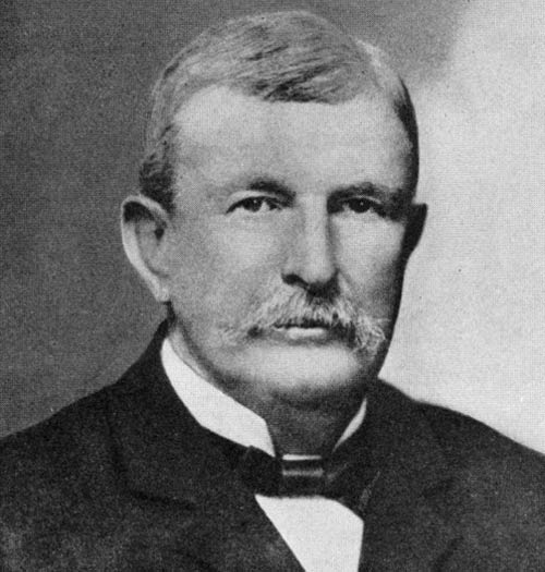
Holt’s most recognizable engineering innovation came later with his development of the first commercially successful continuous tracks for tractors. The tracks were both a significant improvement in the performance and function of heavy machinery and a feature that inspired the Caterpillar name.
The tracks were an important advancement that ensured heavy equipment could be used in rough, rocky, or debris-littered terrains. Tracks also proved better on hills, steep slopes, and soft or sandy terrain.
The development of continuous tracks for heavy equipment showed Holt’s commitment to problem-solving to meet the needs of farmers, miners, and construction workers of the time.
Company Founder: C. L. Best
In parallel to Holt’s innovations, C. L. Best was focused on enhancing the early gasoline and undercarriage technologies to increase equipment reliability.
In the early days of tractor manufacturing, it wasn’t just about creating powerful machines. Those machines had to be reliable for continuous use in rough terrain and for demanding agricultural tasks.
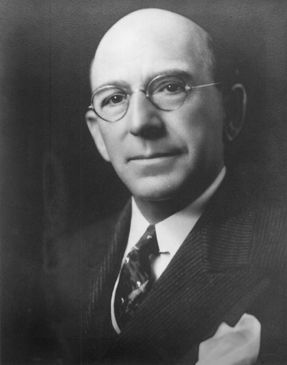
Best’s attention to improving gasoline technology was game-changing. Traditional steam-powered tractors were bulkier and more complicated to operate.
Best focused on gasoline as a fuel source and worked to develop technology that would allow tractors to start quickly, operate longer, and be more fuel-efficient. This transition was a turning point that began the move away from steam and set the standard for future tractor designs.
Undercarriage technology was another focal point for Best. Traditional tractors had simple wheel designs and were prone to getting stuck or being unstable in
muddy or uneven terrain. Best improved undercarriage technology to give heavy equipment better traction, weight distribution, and overall stability so they could be used in a wider range of landscapes with more flexibility.
As with Holt, Best’s dedication to these technological advancements happened along with a fast-growing need for automation and streamlining in agriculture. As a result, his commitment to both power and dependability in tractors resonated deeply with the needs of the time.
Best’s focus on improving gasoline and undercarriage technologies allowed development of tractors that were both robust in power and incredibly reliable, setting high standards in the tractor manufacturing industry.
The Pivotal Merger
Even though Holt and Best had their individual companies, they shared the idea of creating groundbreaking machinery (again, literally!) for a fast-changing world.
This shared vision eventually brought them together. The merger of the C. L. Best Tractor Co. and the Holt Manufacturing Company in 1925 was pivotal in the history of construction and agricultural machinery. This merger of companies became the Caterpillar Tractor Co. and was the beginning of an era dominated by technological advancements and industry-leading solutions.

Over the following decades, Caterpillar’s growth was dramatic. The company’s reputation was built on providing innovative solutions through machines that were durable and reliable.
To this day, Caterpillar is characterized by its tireless pursuit of excellence and willingness to evolve and adjust with the ever-changing needs of the world.
The essence of what Holt and Best intended for the company nearly a century ago remains deeply rooted in Caterpillar’s philosophy today. The legacies of Holt and Best live on in the machines that bear the CAT logo, of course, but also in the company’s commitment to its customers and its appetite for innovation.
It’s a testament to the visionary leadership of Holt and Best that Caterpillar stands today as a global force and 100-year brand in the realm of heavy machinery.
The Caterpillar Logos
The Caterpillar company’s iconic logo has had an evolution that mirrors its growth and transformation over the years. The Caterpillar (CAT) logo has a long and colorful history, reflecting the progress and shifts in its business orientation and corporate image. Caterpillar has been able to communicate its core values and identity through its branding and logo design.
The company’s earliest focus was on tractors and heavy agricultural machinery. Because of that focus, the logo’s design elements in the early days more closely resembled an actual caterpillar. The logo was then changed as the company branched out and the product line became more diverse. At that point, the creature-like caterpillar logo was replaced with a more abstract representation. This evolution in logo design indicates Caterpillar’s ambition to be more than just a machinery company, but rather a brand that embodies innovation, resilience, and global reach.
Another logo design innovation came as the company’s abbreviation, “CAT,” grew in popular use and was widely recognized. The abbreviation was then incorporated in the company’s branding and logo design. Even more recently, Caterpillar had a significant shift in branding design of the trade dress for heavy machinery to include a red hexagon. This move was more than just a cosmetic change. The logo update was both a throwback to the first graphics used on crawler tractors in 1925 and a signal indicating the company’s emphasis on modernization, premium quality, and commitment to being at the forefront of technology and innovation.
Like the company it represents, the Caterpillar logo has undergone various evolutions since the company was founded in 1925. The brand’s identity and logo has reflected its growth, commitment to innovation, and the evolving needs of customers across the globe.
Let’s take a closer look at Caterpillar logo design through the years …
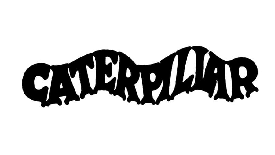
Original Logo Design (1925-1931)
The wavy design is also thought to symbolize tractor tracks, which signifies the company’s early focus on heavy machinery and tractors. The text style was likely based on a traditional serif or sans-serif typeface and the design was produced in two color variations — black on a white background or red on gray. The design was simple and focused on the brand name, implying a straightforward approach to branding and an emphasis on brand recognition.

Rapid Revision (1931-1939)
The undulating caterpillar logo soon morphed into a redesigned wordmark of the company name. In 1931, the typeface style was changed to a rounded serif in red with detail below (patent registration, manufacturer location) in grey below.
This more traditional design reflects the depression era aesthetic while the red-on-white color scheme symbolizes the energy and ambition of a new and growing business dedicated to providing quality products. In 1932, the color of the wordmark and detail was changed to black, and this version remained until 1939.
Minor Revisions (1939-1941)
Subtle changes to the shape of the lettering of Caterpillar were introduced in 1939, along with the abbreviation of the location of the manufacturer to “U.S.A.” in the detail below the wordmark.

Added Space (1941-1957)
The most prominent change in 1941 was a narrowing of the typeface within the same width used for prior logo designs. This resulted in greater space between letters in the company name.

A New Look (1957-1967)
The Caterpillar logo underwent significant transformation in 1957. The company needed a new logo as it adapted to the times and the brand’s evolving identity. The all-caps inscription in extra-bold sans-serif was robust and commanding and demonstrated growth and modernization.
The adoption of an extra-bold font can be seen as a reflection of the company’s expanding footprint in its industry.
The shift from the logos of prior eras signified a company that was becoming more confident in its market position and aimed to convey a message of strength and reliability.

Stylized “C” (1967-1989)
At this point in the brand’s history there was the introduction of an emblem to the left of the Caterpillar wordmark as part of the logo.
The wordmark remained all-caps but was changed to a thinner, but still bold, sans-serif typeface. The new emblem was a monochrome square with intersecting lines that divided a white circle in a way that created a stylized “C.” The added emblem was a visual representation of this period of prosperity and growth of the company.
Yellow Triangle (1989-present)
Modern iterations of the Caterpillar logo incorporated a yellow triangle that is primarily decorative but adds a distinctive and vibrant flair to the logo.
The wordmark is again set in all-caps, but this time in a taller and rounder sans-serif typeface. The yellow triangle sits in front of the word “CAT” and further emphasizes the brand’s identity.
Abbreviated CAT Logo
The company’s abbreviation, “CAT,” is now commonly associated with the brand and has been incorporated in the logo design as well.
This iteration features the first three letters of the brand in a strong bold typeface behind the eye-catching yellow triangle. The yellow triangle can be seen as a symbol of stability and upward movement, reflecting the company’s commitment to progress and its stable foundation in the industry, while the abbreviation ‘CAT’ makes the brand more approachable and easily recognizable.
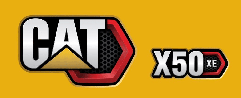
New Trade Dress
Most recently, Caterpillar has moved from the “Power Edge” trade dress that included the Cat trademark on a black background and a diagonal red bar on the right edge to a new design. As in the prior trade dress, the new “Cat Modern Hex” design includes the Cat trademark and product model name.
What is different is inclusion of a bold red hexagon and grille pattern all in 3D. The new design and color pays homage to the graphics used on Caterpillar’s earliest crawler tractors produced in 1925.
A Brand Built for the Long Haul
The evolution of the Caterpillar logo is a tribute to the company’s adaptability, growth, and deep understanding of the importance of branding.
Each iteration of the logo design mirrored the time during which it was developed and reflected both the company’s internal progress and external changes in design trends and customer expectations.

Caterpillar’s legacy is built on nearly a century of experience and innovation. The company has come a long way from its earliest days with Holt and Best.
Each decade brought new challenges and Caterpillar has risen to the occasion each time through adapting, evolving, and setting new standards in the industry. This adaptability is not just seen in their machinery but is also clear in their branding and logo design.
The logo’s evolution is evidence of Caterpillar’s ability to stay relevant and resonate with its customers for decades.
Caterpillar’s journey from its inception to its current position in the global market is a story of commitment, innovation, and strategic development. The company’s logo, which has undergone several transformations, serves as a visual account of this journey.
From the realistic caterpillar of its early days to the modern red hexagon of its latest trade dress, the logo tells a story of a brand that is ever-evolving yet rooted in its core values and legacy.
Check out these awesome Logo Contests run on Hatchwise:


