


When you aren’t sure how to get somewhere, where is the first place you go for directions? If you’re like most of the population, chances are you head over to Google Maps.
Most of us click on the icon on our phones without even giving it any thought. We know what to look for and that’s due to a terrific branding strategy by Google and the reputation of the brand. Google Maps has grown to have over a billion users and with both a desktop and mobile version of the application, whenever you need Google Maps, it is available to you.
Many of us haven’t explored the history of Google Maps specifically, as a separate part of the Google brand. If you’re interested in learning more about one of the most recognizable logos within the mapping industry and this subsidy of the Google family, you’ve come to the right place. Read on below to learn more about this iconic brand.
Meet Google Maps
In case you aren’t familiar with Google Maps, simply put, Google Maps is a digital mapping desktop and mobile application released by Google, Inc. When you use Google Maps, you can view satellite imagery, street maps, and real-time traffic details. The most common usage of Google Maps is for driving directions. The application has billions of users and that’s because it provides the best real-time mapping and navigation, in two and three-dimensional satellite views.

The application was developed by Lars and Jens Rasmussen, who created the platform as a C++ desktop application first. The app may look different today than it did when it was first launched, but Google Maps has always stayed true to its core mission and purpose of providing digital map capabilities.
On the business front, businesses can easily update and include the information they want to include on the application. Businesses often opt to regulate this information because they want users to have an easy time searching for them.
One thing that goes hand in hand with this application is its logo. The logo was chosen due to its minimalist features, and the logo kept these features even when it was updated throughout the years. The pin symbol that is featured on the logo is the face of this iconic application and is likely what you associate with the brand.
Google Maps’ Evolution
2004: Google Maps is developed

While Google Maps is part of Google’s family, its story of creation is slightly different. In 2004, Google was already a large-scale technology company and so Google acquired a C++ desktop application in October of that year. The application they purchased was created by two Danish brothers, Lars and Jens Rasmussen. After purchasing this application, Google turned it into a digital application and with their other purchases of ZipDash and Keyhole, Google released the digital mapping app.
2005: Google Maps is launched (and Google Earth is released)
On February 8, 2005, Google Maps was officially launched after Google added geospatial data visualization and real-time traffic analyzers to the original C++ software. Google Maps operated using JavaScript, XML, and Ajax on its front end.

Right after it was released, later that year, Google updated its satellite imaging software and released Google Earth. With this update, users were able to see the flooding in New Orleans that took place that year. Google Earth allowed people to view the world in three-dimensional views right on their desktops. Today, Google Earth includes more than 36 million square miles of high-definition satellite images which allow people to view real-world images of places all over the globe.

2005: Transit Trip Planner is released
While Google Maps already released a few updates in its first year of launching, Google Maps continued to expand its offerings with Transit Trip Planner in December 2005. This feature helped commuters plan their travel by viewing different public transportation schedules and routes across several metropolitan cities.

2007: Google Maps released “Street View” and “My Location”
On May 29, 2007, Google Maps released “Street View,” where users could look at how a location would appear on the street. Later that year, on November 28, 2007, the mobile version of this feature was released as well as the beta version of “My Location.” This additional feature uses the GPS on people’s mobile devices to determine their current location, providing a more accurate route and recommendations for each user.

2008-2012: Google Maps is added to mobile operating systems
Google Maps was first added to the android operating system on September 23, 2008. The app was not added to iOS’s operating system until 2012.
2011: Google Maps adds the “Map Maker” feature

With “Map Maker,” users can update the map in real-time without having to wait for a third-party approval. This feature was released on April 19, 2011. That following year, in June 2012, Google Maps expanded its mapping in partnership with the Canal and River Trust and began mapping Great Britain’s rivers and canals.
2016: Updated satellite imagery is released
After Google Maps acquired Landsat 8, which came with 700 trillion pixels of new data, Google released new satellite imagery capabilities on June 27, 2016. Later that year, the company also purchased Urban Engines, another mapping analytics company, which helped the company to have even more market domination.
2017: Google updates its mapping offerings
While Google Maps was already leading the digital map industry, Google Maps still wanted to expand. In October of 2017, Google released images of planets and moons. The following year, in 2018, the company released a three-dimension world viewing.
2019-Today: Google Maps’ latest offerings

In 2019, Google Maps released an incognito mode, much like Google’s incognito browser. This allowed users to access various map locations without saving, or remembering, their entries on their Google accounts. Then, in celebration of its 15th birthday, Google Maps released a new logo icon which is the icon many of us know and identify with today.
Roadblocks Along the Way
What drives Google Maps’ success and growth is its users. While it seems they have steadily grown, it is safe to say that this has been a constant roadblock that the company has had to navigate. Google Maps has needed to be attentive to its user base, user acquisition, and its competition, like Waze. While from the outside, it may not look like Google Maps has had much to worry about, behind the scenes there is a team devoted to looking at the user base and who are focused on determining how to grow the brand.
The Meaning of Google Maps’ Logo and Google Maps’ Logo History
The Google Maps logo follows some of the stylistic components of Google’s logo, yet it still has its own identity. Since the application was launched in 2005, the logo has gone through several updates and transitions, going back and forth between wordmarks, color choices, and symbol additions. Every choice within the logo is intentional and ultimately the logo conveys exactly what it was set out to convey and gives its users the same positive feelings that they get from any other Google logo. Below, we look at the different versions of the logo and its components more in-depth.

2005 The first version of the Google Maps logo
The original Google Maps logo was released in 2005. This first iteration featured a simple wordmark that utilized many of the same features of the Google logo at that time. This logo included the words “Maps” written in blue, and “Beta” written in gray, underneath the Google name. This symbolized that Google Maps is part of the Google brand.

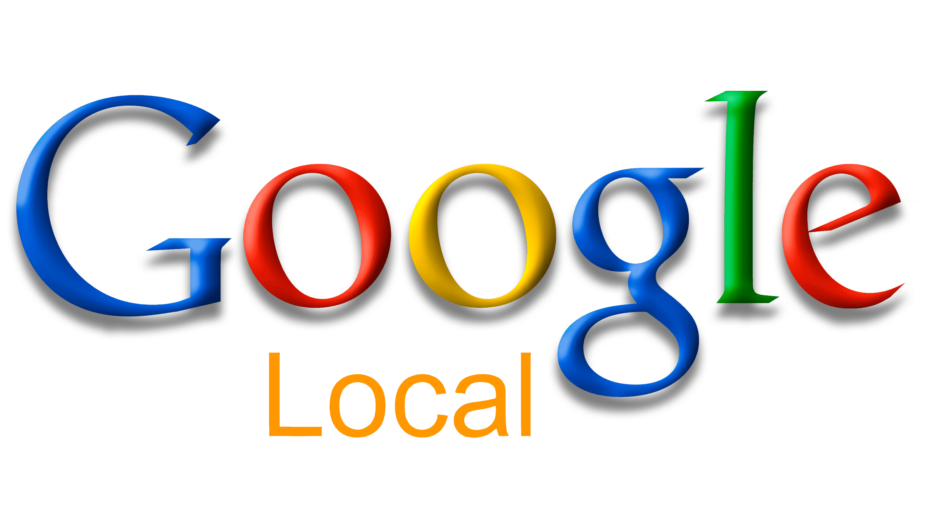
2005-2006: The second version of the Google Maps logo
The first iteration of Google Maps’ logo didn’t last a full year. During the same year that the application and first logo were launched, Google released an updated logo. This one simply removed the words “Maps” and “Beta,” and instead added the word, “Local.”

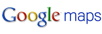
2006-2009: The third version of the Google Maps logo
Google decided to update the logo again in 2009. For this third iteration, Google Maps decided to transition back from the word, “Local,” to “Maps,” without the addition of the word, “Beta.” The other features of the logo, such as the wordmark, stayed the same.

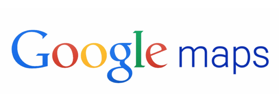
2009-2010: The fourth version of the Google Maps logo
This version kept the same wordmark as the previous logo; however, Google began to play around with the word placement in this logo iteration. For this, the word, “maps” was moved to the right-hand side of the Google brand name. The “maps” portion of the logo was written in blue and was written in all lowercase letters.

2010-2015: The fifth version of the Google Maps logo
The previous logo iteration only lasted a year. In 2010, the logo was updated again and was updated to look brighter, flatter, and cleaner with the removal of the font’s gradient lettering. This version of the logo lasted five years which was the longest a logo had lasted to date.

2015-2020: The sixth version of the Google Maps logo
In this sixth iteration, Google Maps released new font typography, that went along with the Google brand. This new font was still a sans-serif style but had elements that made it appear more modern and bolder. The word, “Maps,” was written where the “M” was capitalized, and the color returned to gray.
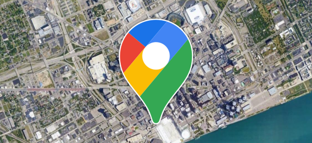
2020-Present: The seventh (and current) version of the Google Maps logo

As Google Maps turned 15, the brand gifted itself an updated logo. This is the first version that included not only a wordmark but also an icon. The colorful emblem identifies what the logo is, a location finder. The wordmark is written in gray and together the logo is simple, memorable, and unique, and it stands out from its competition.
Google Maps’ logo font:
The logo font of the Google Maps logo follows the same approved typography of the greater Google brand. As the Google brand developed its font, so did Google Maps. Google uses a product-sans, geometric sans-serif font, which is the same font that you’ll find on Google Maps.
Google Maps’ logo color:
Google Maps’ logo does not shy away from color. With a diverse color scheme, each color was chosen intentionally to make up the logo. Below, we look at each color choice.
White does not make up the icon, but it does take up the negative space around the icon, at the center of the symbol, and around the symbol. White typically conveys illumination, goodness, purity, safety, perfection, humility, innocence, cleanliness, and softness, making it a logical color choice for the logo.
Within the logo icon, you’ll find four different colors. All four of these colors were chosen because they are four of Google’s primary, favorite colors that make up the greater “Google” logo. Blue is at the top of the symbol and was chosen because it embodies the positive emotions of intuition, loyalty, stability, freedom, and serenity. Another favorite Google color that shows up on the Google Maps logo is red. Unlike blue, red often conveys harsher emotions like anger, danger, lust, and violence and is often a color used to represent blood and energy. Red was chosen because it is an action-driven color and the other side of red, is that it can embody romance, joy, strength, and longing. The third color on the icon is yellow. Yellow is a positive, attention-grabbing color and conveys happiness, hope, honor, freshness, and intellect. The final color you will find on the Google Maps logo is green. Related to the logo, green represents the outdoors, entertainment, and leisure but green also symbolizes healing, growth, harmony, and renewal.
Google Maps’ logo symbols:

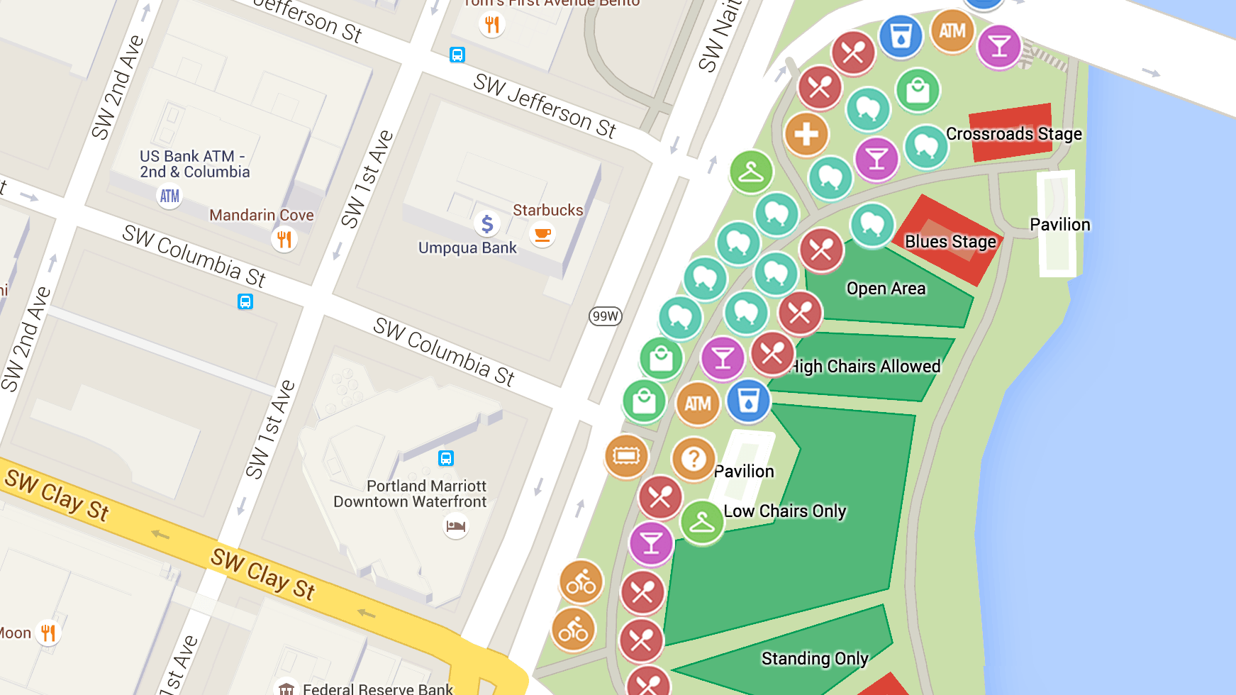
Google Maps’ icon represents what the application focuses on, being an intuitive location finder. Within the app, several symbols are used. These are used to identify landmarks like schools, roads, hospitals, libraries, and even stop signs. When you use the app, you’ll also find many other symbols on the map – for instance, you might find a (+) which allows you to zoom into a location and a (-) which allows you to zoom out of a location, a compass which shows your location on the map, a magnifying glass which allows you to search for a specific location, an exclamation point that identifies any traffic accidents, and even a shovel to note where there is road construction.
Symbols are common within the Google Maps app, so it makes sense the logo symbol would also be a symbol. The symbol on the logo is the same symbol that you’ll find within the app when you mark your destination – a simple destination marker.
Google Maps Today

Just like when Google Maps launched, Google Maps remains part of the Google brand and celebrates Google’s success. As part of Google’s brand, Google Maps has the resources and talent to constantly develop and improve the application. That is often witnessed firsthand with the regular updates that are released through the app, such as letting users search for the cheapest gas prices, offering fuel-efficient routes, and showing users where traffic lights and intersections are (which makes navigating your route even easier).
While it’s hard to know how much of Google’s revenue is generated from Google Maps, many financial and business experts believe that with about 1 billion active users each month, Google Maps is a multi-billion-dollar enterprise.
Lessons Learned from Google Maps
Unlike some other logos, Google Maps regularly updated and rebranded its logo. For Google Maps though, rebranding worked. One reason why this rebranding worked is likely because the app is part of the Google family, but Google Maps deserves credit too for its rebranding success!
For starters, Google Maps never underwent a drastic rebranding – the company kept the logo updates simple. At no point were there too many graphics or features and it always focused on delivering the app’s mission to its users. Additionally, the designers focused on making their logo memorable. What makes a logo memorable is making it stand out and easy to understand and interpret. If users can recall a logo easily, they are going to keep returning to that brand. Along the same lines, the designers also focused on making the logo relevant to the service the app offers. All the features like the color choices, font, and symbol tie into the company’s offering. Finally, why Google Maps deserves credit for its rebranding choices is because they were behind making the logo versatile on various marketing channels and platforms and behind making the logo highly legible no matter how big or small the logo was scaled to.


)
/cdn.vox-cdn.com/uploads/chorus_asset/file/19700731/googlemaps.png)
)