

If you ask anyone born in the ‘90s what toys were pivotal during their childhood, chances are that Beanie Babies, a Furby, a Tamagotchi, and Pokémon would all be listed. That’s because all those things came onto the ‘90s toy scene fast and fierce, causing parents to run to every toy store imaginable to grab their child the latest Beanie Baby collectible, or the Pokémon card their child couldn’t live without.
While most of those toys were simply fads that faded out, Pokémon did the exact opposite. Instead of fading out, Pokémon grew. The brand developed more products and expanded into more markets, and even today the franchise has still been able to remain relevant.
For a toy brand to remain popular more than 25 years after it was first introduced, the brand must be doing something right. For Pokémon, there are many reasons why people all over the globe are still drawn to the brand, but one of the most prominent reasons is because of its logo.
Keep reading below to find out more about how this iconic brand came to be and how its logo has been able to remain relevant all these years later.
Meet Pokémon
If you look back at 1996, you’d find a new video game that was more than a video game – Pokémon. Pokémon was developed by the well-known Japanese video game developer, Satoshi Tajiri. Satoshi came up with the idea of Pokémon after he thought back to one of his childhood hobbies. As a kid, he enjoyed catching tadpoles and insects around his childhood home in Tokyo.

He used this as inspiration and partnered with Ken Sugimori and other designers to develop Game Freak in hopes that this would give children the same joy he experienced catching those things. Beyond his childhood hobby, Satoshi was also inspired by a television show called Ultra Seven. On this show, Ultraman partnered with large monsters to help fight evil. Satoshi first named his original game “Capsule Monsters”, but Nintendo turned down this concept.
Nintendo finally agreed to finance the game’s development with Shigeru Miyamoto’s partnership, even though they struggled to understand the game’s purpose. Shigeru was someone Nintendo worked with before, and he was the creator of The Legend of Zelda and Mario. Nintendo gave Satoshi 6 years to develop the first game and what started as Capsule Monsters became Pokémon by the end of the game’s development. Pokémon was chosen as the name because Nintendo had some trademark and copyright concerns with the original name Satoshi came up with. After the video game finally took off, Pokémon expanded the franchise to also include trading cards, toys, books, comics, and anime. Today, the franchise’s collective sales have surpassed $1 billion.
Since Pokémon was founded in 1996, the brand has been able to create a fictional universe for its users. Each user can choose a character who is a “Pokémon trainer.” This character is based on their personality, and this character is specific to them. The trainer will then enter the universe to try to catch all the Pokémon characters. As they catch different Pokémon, the character/trainer grows their army to fight other Pokémon characters.
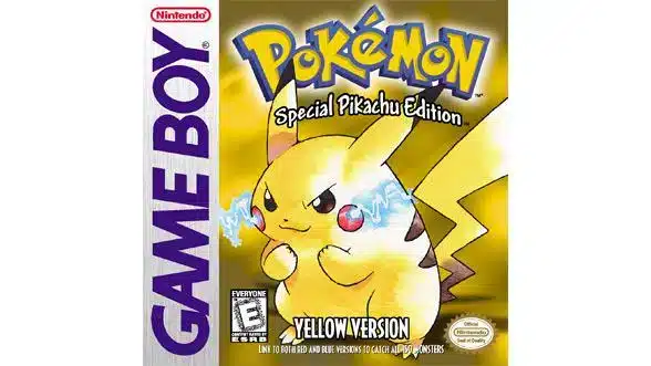
The game was first developed and designed for Nintendo’s Game Boy consoles, but once the hype grew, the game expanded to more offerings and more platforms so it could be available to the largest number of people.
What is special about Pokémon is that its logo and characters have become pop culture icons. If you look at movies, newspapers, magazine covers, or amusement parks, you’ll often see the brand featured on these media channels. While the characters have become a part of the brand, one timeless media element that is always featured is the yellow and blue Pokémon logo. Pokémon is still considered one of the most popular video games ever created, with only Nintendo’s Super Mario Bros ever surpassing Pokémon.
Pokémon’s Evolution

1982: Game Freak is created
Satoshi Tajiri launched the gaming magazine, Game Freak, with his friends. After writing about video games, Satoshi realized that instead of writing about them, he wanted to design and develop them. Game Freak shifted its focus to becoming a gaming firm, and some of the games they first introduced included Yoshi, Mario and Wario, and Pulseman.
1996-1998: Pokémon is developed (and first released)


In 1996, Pokémon was developed. Pokémon started as a video game franchise that was named “Pokémon Red” and “Pokémon Green” in Japan. Satoshi was inspired after thinking back to his childhood when he collected tadpoles and insects by a pond, close to his childhood home in Tokyo. The original game was created for handheld consoles and was created as a cartridge. If users wanted to trade Pokémon with a friend, they just needed to connect their Game Boys with a cable. The game became popular in the U.S. after it was released in 1998. For the U.S. version, the game was released as “Red” and “Blue.” After millions of games were sold in the U.S., Pokémon was introduced in the United Kingdom.
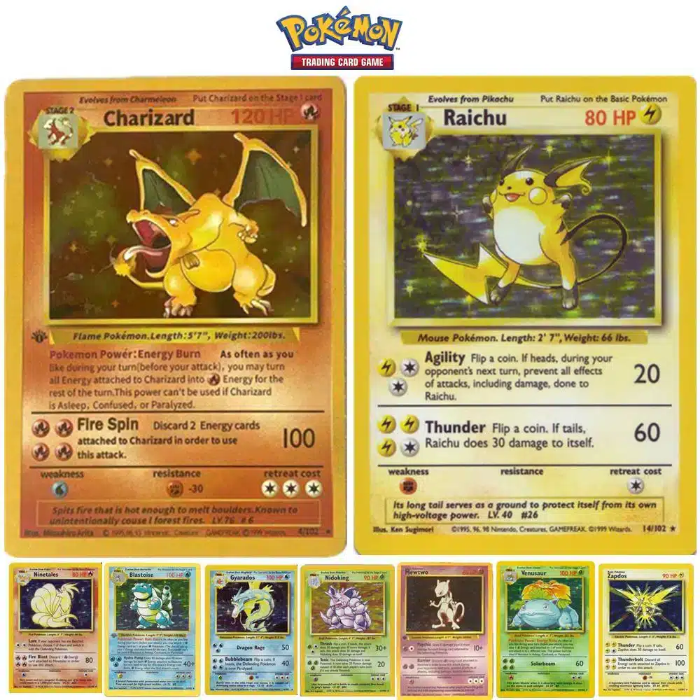
1996-1999: Pokémon cards are first introduced
After the Pokémon video games took off, Media Factory developed Pokémon Trading Cards. These were first produced in October 1996 and when they were first introduced, there were 102 cards in circulation. These cards featured illustrations of Pokémon characters created by Ken Sugimori, Keiji Kinebuchi, and Mitsuhiro Arita.
Just like the video games, these cards were first released overseas but they were brought over to the U.S. in 1999, and just like with the game, these cards grew in popularity fast. Fans began seeking out certain cards, trading cards, and participating in Pokémon card tournaments.


1997: Pokémon (the television series) is launched
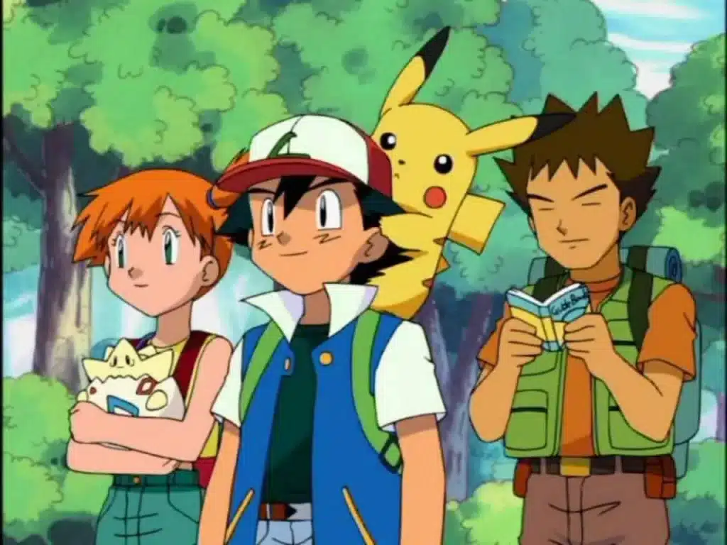
With the growing Pokémon hype, the franchise expanded to include a television series launched in 1997, called Pokémon. This show brought the game to life and followed the life of a boy named after the founder, Satoshi. Satoshi’s mission on the show was to become a Pokémon Guru alongside his character friend, Pikachu. Satoshi’s name was later changed to Ash Ketchum. In total, the series has released more than 1,000 episodes.
1998: The first Pokémon movie is released
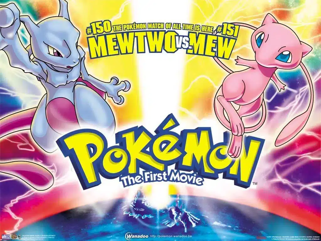
After the television series created a loyal television following, the brand decided to explore another media outlet – film. The first film’s title was Pokémon: Mewtwo Strikes Back and was first released in Japan. This movie focused on the character Ash, who was invited to a secret island where he met a new Pokémon, Mewtwo. This movie was later released across the globe in 1999, and since the first film, there have been 23 Pokémon films total.
2016: Pokémon expands into the mobile market
While it may seem like Pokémon didn’t evolve for 15+ years at first glance with this timeline, that was not the case. The franchise continued to focus on its games, cards, television series, and movies. In 2016, though, Pokémon tackled a new market – smartphones.
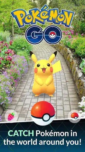
For this, Pokémon introduced a mobile game titled Pokémon GO. This mobile game used new, augmented reality technology that allowed users to explore their local surroundings to catch Pokémon. When the game was first released, it shattered the previous download records, and today, it has been downloaded more than 1 billion times.
2018: Pokémon goes through a rebranding
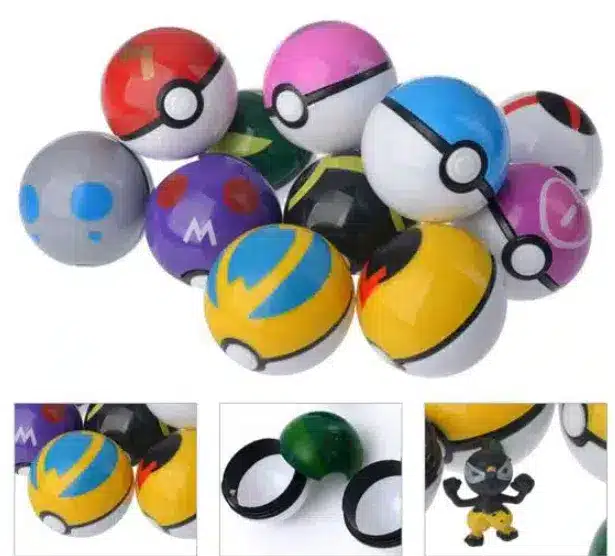
Instead of rebranding its logo, Pokémon rebranded and reinvented its original games in 2018. The franchise introduced new versions of their Pokémon Yellow, Red, and Blue games. This new game was in the shape of Pikachu and Let’s Go Eevee. With these new games, users could throw Pokéballs with their Nintendo Switch controllers. Pokémon took this one step further and allowed users to take their Pokéballs out for a walk if they had a special controller. Pokémon’s rebranding inspired other companies to do the same and rebrand.
Roadblocks Along the Way
The biggest roadblock that Pokémon had to navigate was staying relevant. At the start of this article, we listed some of the biggest fads of the ‘90s. All the other fads that were listed all phased out in popularity, but Pokémon worked hard to ensure they remained relevant and popular. With any popular toy, it’s important to constantly evolve and look at what your consumers want, which is exactly what Pokémon did to ensure they did not fall victim to the same phasing out that its fellow ‘90s toys fell victim to.
The Meaning of Pokémon’s Logo and Pokémon’s Logo History
At first glance, the Pokémon logo appears to be a simple, playful mark; bright yellow lettering outlined in blue. Unlike many entertainment brands that routinely refresh their visual identities, the Pokémon logo has remained almost entirely unchanged since its release in North America in 1998. While the Japanese franchise debuted earlier under the title Pocket Monsters, it was during localization for Western markets that the iconic “Pokémon” wordmark was born.
The logo cannot be reproduced or used without permission from The Pokémon Company International, and Nintendo maintains control of its licensing and trademark protection.
The version of the logo recognized worldwide was created by designer Chris Maple in 1998–1999. Maple was commissioned by Minoru Arakawa, then-president of Nintendo of America, to adapt the brand for its Western debut. His challenge was to create a logo that would work across packaging, advertising, merchandise, trading cards, and, importantly, the limited resolution of the Game Boy screen.
Pokémon logo 1998

The globally recognized Pokémon logo was developed in two major stages between early 1998 and 1999. Maple was tasked with designing a new identity that captured the energy and appeal of the expanding Pokémon universe while being suitable for Western audiences. Working with early toy samples, concept art, and limited visual references, Maple hand-sketched dozens of letterforms on a light table before arriving at the version that Nintendo ultimately approved.
The first finalized version was presented at E3 1998, with a refined version delivered in 1999 after minor adjustments were requested. This 1999 revision is essentially the same logo still used today.
Unlike many game franchises that periodically revise their branding to match new eras or artistic shifts, Pokémon’s core experience and emotional appeal, discovery, adventure, and collecting have remained consistent. Pokémon’s leadership has described the franchise as something closer to a cultural sport than a passing trend. Because of that, the logo serves as a constant, anchoring presence across generations of fans.
Pokémon’s logo font
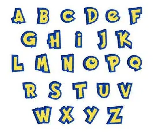
The Pokémon logo is constructed entirely from custom hand-drawn typography, not from any existing font. Maple designed each letter shape manually to create a sense of motion, bounce, and approachability.
The curved and oversized forms give the logo a feeling of friendliness, while the exaggerated arc over the word contributes to its energetic, almost spring-loaded personality. The lettering was shaped intentionally to appeal to children and to visually match the lively tone of the characters and world.
Because the typography itself carries so much expressive character, no additional mascot or symbol was required for recognition.
Pokémon’s logo color
Pokémon’s logo uses two key colors:
- Yellow for the interior letterforms
- Blue for the bold outline
These colors were selected during the design exploration phase while Maple tested multiple palettes. Although the franchise’s Western launch titles happened to be Pokémon Blue and later Pokémon Yellow, Maple has explained that the final colors were not chosen to mirror the game versions directly; they simply felt right for the tone of the brand.
Yellow conveys excitement, imagination, and friendliness, while blue provides contrast, structure, and clarity. Together, the pairing results in a wordmark that is both playful and authoritative, and easy to identify at any size.

Pokémon’s logo symbols
The universal Pokémon logo is purely typographic, consisting only of the word “Pokémon” with its distinctive accent over the “e.”
No separate symbol or character is required to identify the brand. The strength of the identity comes from:
- The custom lettering
- The dynamic arc and proportions
- The instantly recognizable color combination
In various marketing and packaging scenarios, the logo may appear alongside characters (especially Pikachu), but the core logo itself is always presented as the hand-designed wordmark created during the 1998–1999 production process.
Pokémon Today
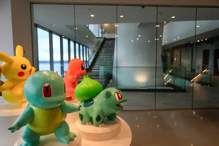
Over 25 years since Pokémon was first introduced to the world, the brand is still growing in popularity. 6 years ago, when Pokémon celebrated its 20th anniversary, the brand released Pokémon GO. This mobile game made a splash, so the brand took that as a sign that now was not a time to slow down. That same year, they also released Sun and Moon.
What drives Pokémon’s growth is the nostalgia it brings to old fans and the excitement it brings to new players. Since Pokémon’s first released game, seven other Pokémon titles have been released, with the latest version being titled Sword and Shield, and over 30 billion trading cards have been released. And if you are playing Pokémon today, you’ll be tasked with catching about 898 Pokémon! Looking at the brand’s lifetime sales, Pokémon has sold over 279 million games, and The Pokémon Company earns $1.5 billion in revenue each year.
Lessons Learned from Pokémon
The biggest lesson we all can learn from Pokémon’s logo is that a logo always has the potential to be timeless. What Pokémon did was create a logo based on what would appeal to their target audience. As the brand created more products and offerings, the logo always brought players back to the game they first loved.
When it comes to your brand’s logo, do your due diligence with your target demographic. Look at what appeals to them and what elements of the logos of companies they love stand out. Once you do that research, you can start a contest with Hatchwise to bring your logo vision to life.
Check out these awesome Logo Contests run on Hatchwise:
Popular articles
- My Honest Review of BuzzCube.io
- My Honest Review: DesignForce
- History Of The Snapchat Logo
- The History of The Philadelphia Eagles Logo
- The Washington Commanders Logo and Team History
- The Uber Logo and Its History
- Most Famous Logos with a Dinosaur
- The Complete History Of The Baltimore Ravens Logo and The Team
- Rolls-Royce Logo Evolution and Brand History: From Founders to Global Luxury Icon
- The History Of The Wikipedia Logo
- The Complete History of The GEICO Logo
- The History Of The Gulf Oil Logo
Browse by category
- Branding and Naming
- Business
- Design
- Entrepreneurship
- How to use Hatchwise
- Logo Design Case Studies and History
- Logo Design Contests
- Website Design Contests
- Company Naming Contests
- Product Naming Contests
- Domain Name Contests
- Slogan Contests
- Shirt Design Contests
- Tagline Contests
- Business Card & Stationery Design Contests
- Custom Graphic Design Contests
- Banner Design Contests
- Brochure Design Contests
- Character & Mascot Design Contests
- Photoshop Contests
- Photo Colorization Contests
- Photo Restoration Contests
- AI Image Prompt Contests
- AI Generated Image Contests