


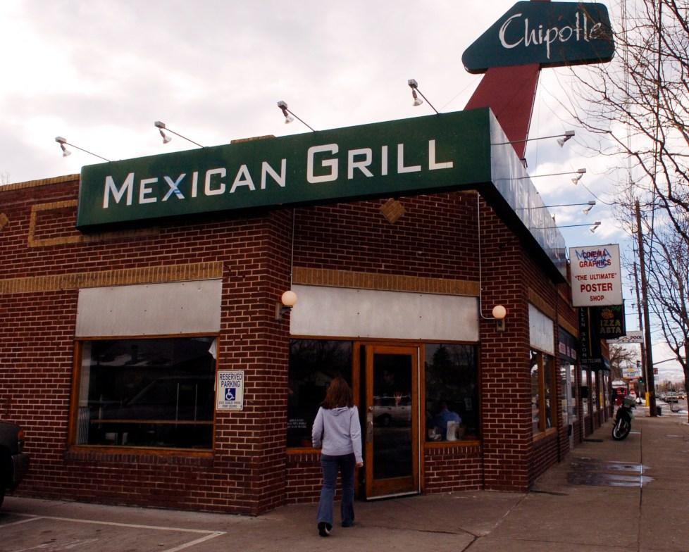
Everyone loves Mexican food, and it’s even better when it comes from Chipotle, the fast food chain representing Mexican fast food in America. Millions of Americans enjoy the flavors illuminating their tastebuds when they take a bite from a dish from delicious Mexican restaurant. Chipotle Mexican Grill Restaurant is home to some of the most delicious Mexican dishes, from burritos to tacos and everything in between.
Chipotle hardly ever disappoints customers, which has built a foundation of loyal fans who continually choose the Mexican restaurant. Although the food from the brand speaks for itself and has kept the customers continually returning, the branding initially gained customers’ attention and has become a national phenomenon within the industry. The logo is representative of the most famous Mexican fast-food chains in the United States and represents the brand’s evolution throughout the years and all the changes it’s gone through.
The icon throughout the years has changed according to the company as it has gone through changes. Although many associate the brand with the current logo for the company, they don’t know the history behind the famous logo and how it got to be where it is today. Let’s look at the history of the Chipotle logo, the company itself, and a few interesting facts about it.
1993–2009: The First Logo
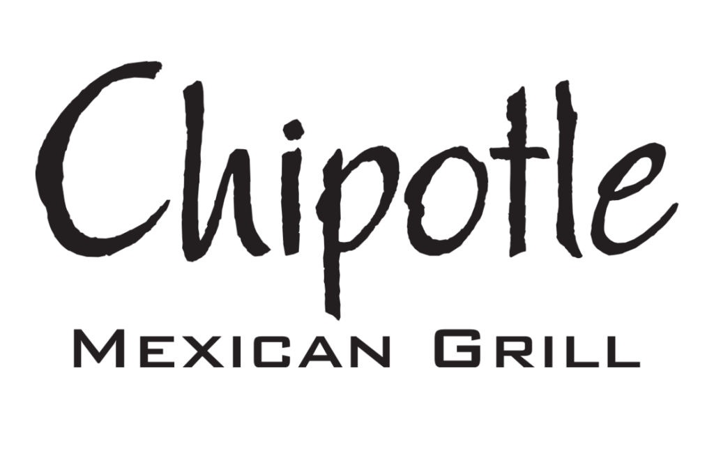
The first logo for Chipotle featured all text without any visual elements. It was purely a wordmark. However, it made an impact. It was in all black on a white background in a Papyrus-like font. Chipotle was in large letters in the unique font, and below it, “Mexican Grill” was written in a simple font and smaller letters. The main priority for this logo was to establish the company’s name in consumers’ brains and create a memorable association. There wasn’t social media at this point, so companies had to count on consumers to remember their names after merely seeing them once. The logo looked professional, almost like fine dining, with a fine line between the two fonts and the level of sophistication. This Chipotle logo successfully imprinted in consumers’ minds and stayed with the company for fifteen years while the brand grew to success.
2009: The Red Logo
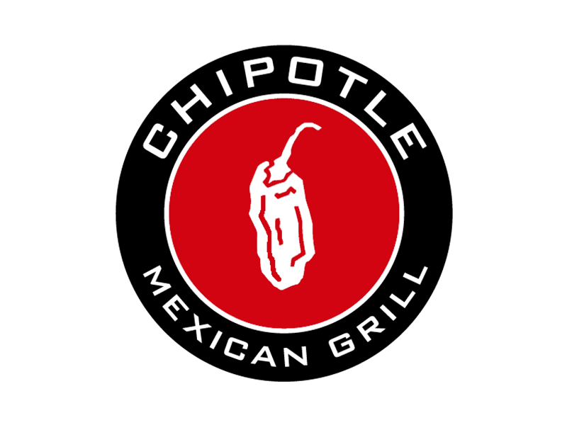
In 2009, Chipotle decided that it was time for a major redesign. The brand opted to change from the wordmark that they had previously used and instead decided to use concentric circles to represent themselves. The logo featured two circles of black and red, with the smaller red circle inside the larger black one.
The red circle had a white pepper in the middle and a thin, smaller white circle around it. The company name was also white, with “Chipotle” on top of the circle and “Mexican Grill” on the bottom. The logo is comprehensive and stands out with the red and white; it all combines to create a memorable symbol for the company.
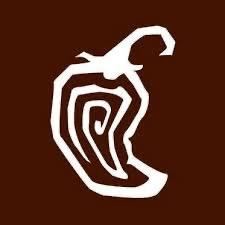
2009-Today: The Brown Logo We See Today
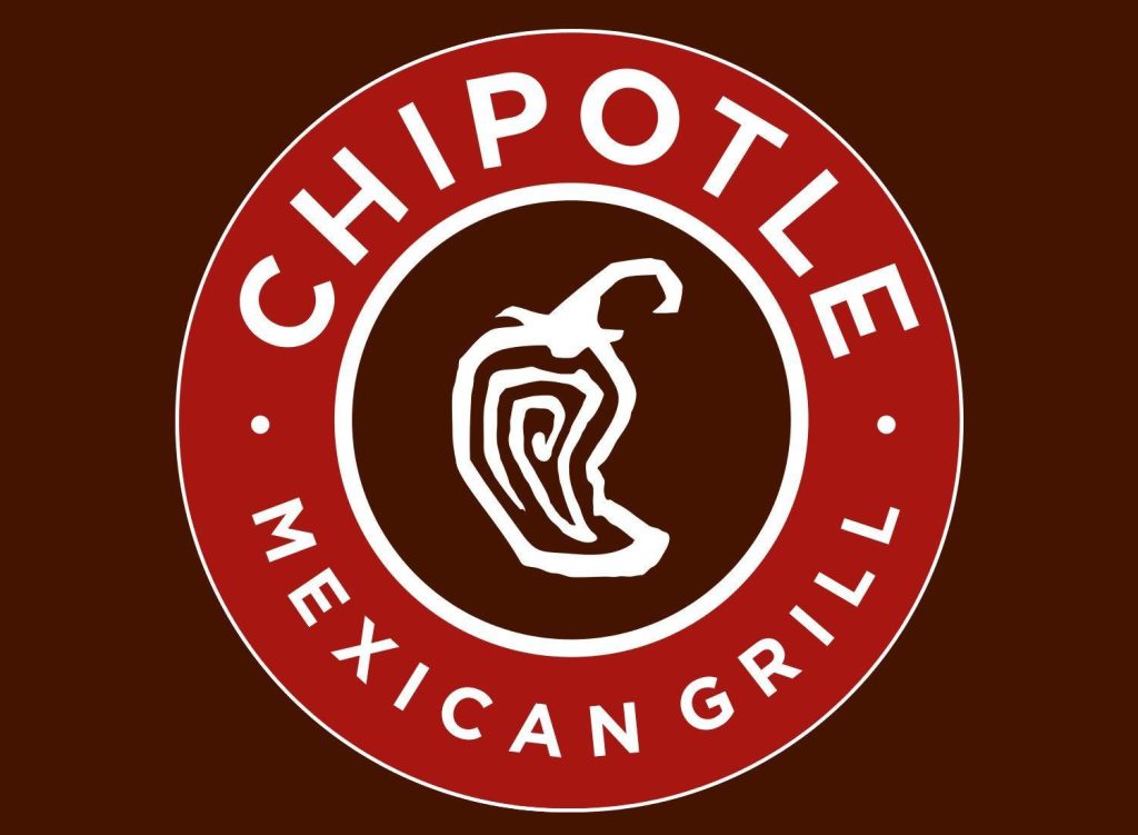
The brand experimented with the logo in the same year and created another version. This time, they opted for a brown logo, keeping the same basic design elements and changing colors. The brand made the bigger circle red and the smaller circle brown and set the entire design on a brown background.
The design was refined, with the pepper curved to the right and modernized, and the circle itself was made bigger. The outside circle was thicker, while the inside one became smaller. Although there were changes to the logo, they were subtle enough that consumers could still recognize the brand.
2009: The Rectangle Version
Although the brand still uses the brown logo, it has created another version of the Chipotle logo. This version showed an almost deconstructed version of the Chipotle logo. The circle was gone; instead, there was a rounded brown square with the white pepper inside.
Below the square was a rounded rectangle with the ‘Chipotle’ wordmark inside of it in white. This look was simple and classic, allowing the brand’s designers to have more flexibility with the design and where it would appear. This version is still used occasionally; you may see it used on some of the company’s branding.
Why a Pepper?
The pepper has now become the most iconic and recognizable part of the logo for the brand, and many people wonder why it was chosen to represent the Mexican restaurant. This chain may have chosen the pepper to represent its brand for a few different reasons. The first is that a pepper symbolizes spice and excitement. Mexican food is known for being spicy, so it’s not surprising that the brand gave a quick identifier that consumers could use to see what food the fast food chain serves. The pepper does an effective job of catching people’s attention and letting them know what it offers.
Chipotle Logo Colors

The Chipotle logo uses several colors to represent their brand. The most significant color that they use is red. Red represents passion, energy, and love, which are all aspects the brand wanted to convey through the logo. It’s also known that red is a color that increases consumers’ appetite, so it’s not surprising that the brand had to incorporate it in some manner.
Black is another color that Chipotle uses prominently in its logo, with the circular frames and letterings being shown in black. Although the restaurant is a fast food chain, they wanted to ensure professionalism and class to their logo. Black is sleek and stylish, making the chain appear like a classy restaurant.
The brown incorporated with the design is another color that stands out for the brand. Brown represents the earth, and since the pepper is shown inside the brown, it can be assumed that the idea is freshness for the brand, with the pepper coming fresh out of the earth. Brown is another color that stimulates the appetite and represents health and nature, so it’s a perfect choice for a fast food chain.
The History of Chipotle
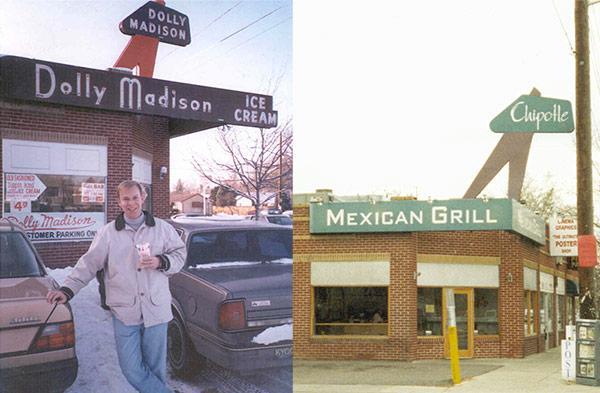
Outside of the iconic logo representing the brand, Chipotle itself has a fascinating story of how it got to be the famous fast food chain we know. Chipotle Mexican Grill was originally founded in 1993 by Steve Ells.
He was working as a chef in San Francisco and was trying to earn enough money to open a fine-dining restaurant. Instead of focusing on finding the funds, he opened a burrito shop in Colorado. This small shop would cost less to open and was a low-risk investment. He planned to open one small restaurant to bring the money in for him to open a full-scale restaurant.
Ells was completely new to anything business-related; however, he still wanted to start a new venture.
He modeled the burrito shop after similar shops and taquerias that he ate at while he was working in San Francisco. Although San Francisco homed many of these that Ells got to experience, Colorado didn’t have the diversity, so Ells chose Denver as the location to open his burrito shop.
He remodeled an ice cream store in Denver, Colorado, and opened the restaurant’s doors in July 1993. From the second the doors opened, the shop got sales, and then every day, the sales gradually increased as word spread.
Within only the first few months of the business being open, Ells could pay his father back the money he had borrowed and was making a profit. Ells opened a second Chipotle in Denver a year and a half later.
The demand was continuing to grow, and although Ells was still planning to open a full-service restaurant, he couldn’t miss the opportunity to meet the demand for the burritos and open another. In 1996, he opened a third location; by 2017, Chipotle had opened 2,300 locations across the country.
In 1998, McDonald became an investor in Chipotle and put over $360 million into the brand. With the money, Ells continued to expand, and by 2001, McDonald’s became the majority shareholder of Chipotle. The restaurant continued to grow in success, with Chipotle shares skyrocketing to $758.61.
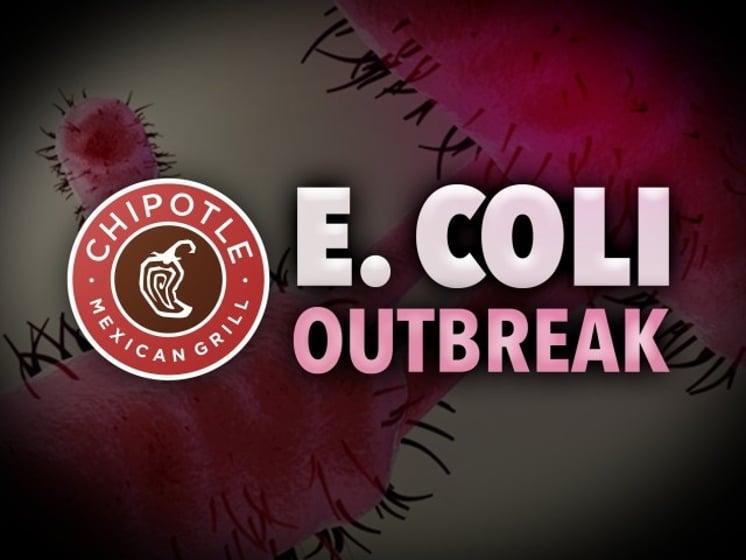
The E.Coli Outbreak
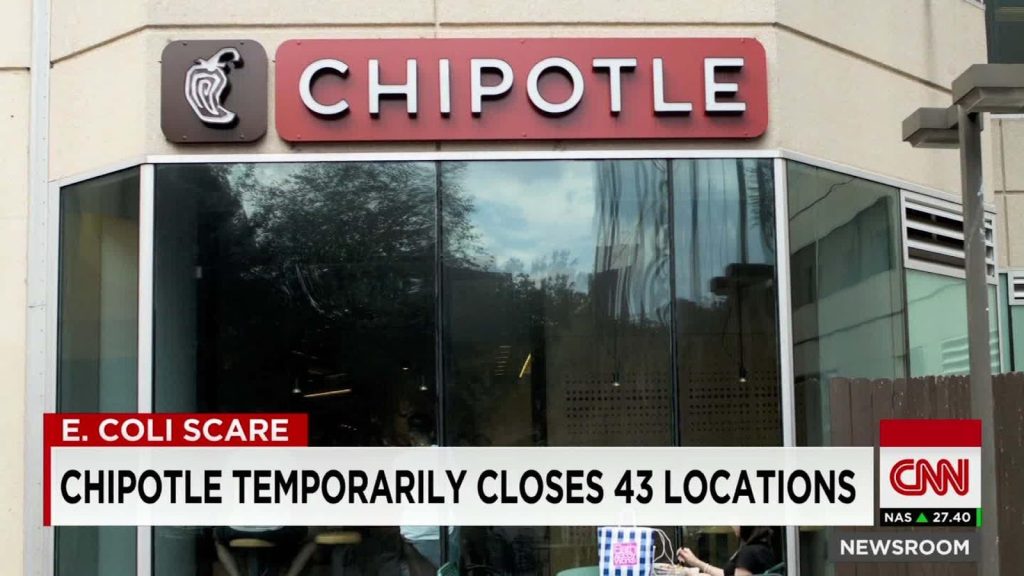
In October 2015, Chipotle was linked with an E. coli outbreak. The restaurant was linked to sickening over 1,000 people from different restaurants across the state.
The outbreak lasted from 2015 to 2018, and the restaurant was charged with the largest fine of its kind. They paid a fine of $25 million to resolve criminal charges related to the outbreak. The Justice Department charged Chipotle with two counts of Federal Food, Drug, and Cosmetic Act violation.
Chipotle blamed the outbreak on individual employees at their different locations who had failed to act by FDA regulations. Ultimately, Chipotle officials said their employees had failed to follow proper hygiene procedures and violated policies requiring sick employees to stay home.
This outbreak took Chipotle years to recover; however, they built their brand up the outbreak by reassuring customers that new policies were implemented.
Conclusion
Chipotle is a famous Mexican fast-food chain that has made its mark worldwide. The company has only gotten more famous throughout the years, with more people tasting the food and becoming returning customers.
However, the one thing we can be certain of is that the brand wouldn’t be as identifiable and legendary as it is today without the iconic logo that symbolizes the company. Above, we looked at the history behind the famous logo, the colors that make it so iconic, and the company’s history.
Both the company and the brand have a history reflecting the growth that has made the company reach the fame we see today.
Check out these awesome Logo Contests run on Hatchwise:


