


For a certain generation of designers, the Cartoon Network logo is one of the most iconic images of their childhood. Cartoon Network was established in 1992 as a cable channel playing all-day animation, anime, cartoons, and more. Their logo has gone through a few design refreshes since then, but still maintains a powerful brand identity.

Learn more about Cartoon Network and what makes its clean, minimalist logo stand out, making it an iconic design, that has lasted through the years.
About Cartoon Network
American businesswoman Betty Cohen founded Cartoon Network in 1992. At first, the station aired 24 hours of classic animated cartoons from the Turner Broadcasting System archives. As animated content became more popular, Cartoon Network started to branch out. The channel started working with animation studios to produce new content.

The network branded its overnight programming as Adult Swim in 2001. This block of mature, adventurous, and avant-garde shows is aimed at older teens and adults. Today, Cartoon Network is a major broadcasting station that reaches around 94 million American families.
Cartoon Network produces a wide range of shows for all ages. Their content includes classic and vintage cartoons, original shows, live-action programs, feature-length films, and more.

The Cartoon Network Logo Over Time
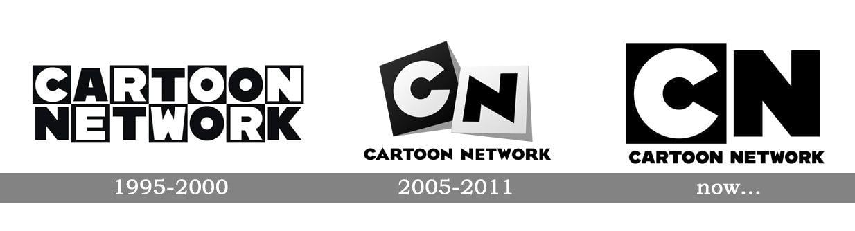
Cartoon Network’s first logo was created and used in 1992. Since then, the network has updated or refreshed its logo only twice. All three iterations share design elements and speak to the same design sensibilities.
The bold black-and-white color scheme pops against brightly colored animated shows. These logos are also clear and recognizable on printed and physical applications. This consistency helps people identify Cartoon Network products at a glance, no matter the era.
The Original Cartoon Network Logo
Cartoon Network’s first logo was designed for the 1992 network launch by Corey McPherson Nash. The text-based logo featured a black-and-white checkerboard design. Capitalizing on the fact that “cartoon” and “network” each have seven letters, the design featured the two words stacked on top of each other.
The “Cartoon Network” wordmark was negative against the checkered background. Sans serif letters on a black square were rendered in white, and letters on a white square were displayed in black. This custom font had a sharp, modern look thanks to bold lines, elongated corners, and strong angles. The black-and-white contrast and pop-inspired characters gave the logo some playfulness that was perfect for a cartoon company. Cartoon Network used this logo from 1992 until 2004.
The Cartoon Network Logo From 2004-2010
Cartoon Network moved in a more minimalist direction in 2010. The station redesigned its logo in-house, along with design services from Animal Logic Studio. Based in Sydney, Australia, Animal Logic Studio suggested including bigger, bolder elements. They kept the original checkerboard idea but dropped most of the squares. The “C” and “N” squares were enlarged, shifting the brand identity slightly to CN.
These two elements were rotated to give the logo some movement. Cartoon Network also added a shadow behind the squares, adding some dimension. The wordmark “Cartoon Network” was added beneath the graphic elements as a firm foundation for the design.
The Current Cartoon Network Logo
The most recent redesign took place in 2010. This time around, the network worked with Brand New School. This design and animation kept many of the elements from the 2004 logo while giving it a more modern appeal. The current logo offers a streamlined take on many of the 2004 design ideas.
The current logo keeps the “C” and “N” squares from the 2004 iteration. However, these elements are more in line with the original 1992 design. Brand New School removed the shadow and rotation effects. The current logo presents the initials in a clean, straightforward manner.
The initials and bottom wordmark also use a different font from Cartoon Network’s first two logos. The current logo uses CN Bold, a custom font designed just for this logo. The elongated corners and angled elements of the previous versions have been stripped away. The new font is a bold sans serif that still preserves the initial brand identify. Straight lines and blocky lettering set the current logo apart.

The Cartoon Network Logo Main Design Elements
All three Cartoon Network logos are similar, sharing many elements. This consistency makes the logo easy to recognize in any era.
- Shapes
Every Cartoon Network logo has used square boxes in its design. The very first logo used a clear checkerboard logo that featured 14 different boxes. Ever since the 2004 redesign, the logos have used two boxes to achieve a similar effect. The second logo included two squares with shadows that gave a three-dimensional pop.
- Cartoon
Network’s current logo features a single black box. White space around the letter “N” clearly implies a second box.
- Font
Cartoon Network has used its signature font in each logo design. The first and second logos featured a pointier font with more movement. Currently, the logo uses the CN Bold font.
- Colors
The Cartoon Network logo has always used a classic black-and-white color scheme. This combination gives a graphic appeal that’s ideal for an animation network. The colors also help the logo pop against bright cartoon backgrounds, printed materials, and more.
Lessons From The Cartoon Network Logo
Cartoon Network has enjoyed decades of brand recognition thanks to a series of well-designed logos. Consistent design elements and thoughtful redesigns help the Cartoon Network logo stand out. Designers everywhere can study this logo to learn more and constantly improve their own craft.


.svg)
.svg)