Chances are at some point in your life, you’ve stumbled upon a Gap or one of Gap’s seven brands. Gap has a strong marketing and media campaign, their stores are in almost every mall or shopping center, either you, or someone you know, surely owns a piece of clothing from the store, and their logo is ingrained in your memory.
Even if you aren’t a huge Gap shopper, you know the brand. And the reason you know the brand so well is because their logo is everywhere. With every recognizable logo, comes a story of how it came to be – and Gap has a tremendous story!
Read on below to learn more about not only this iconic brand but also the story behind its logo’s evolution and how a simple logo first created in 1969 has grown to be one of the most recognizable logos in the world.
Meet Gap
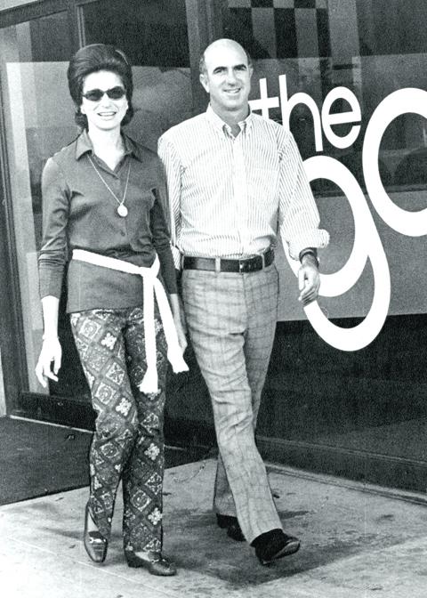
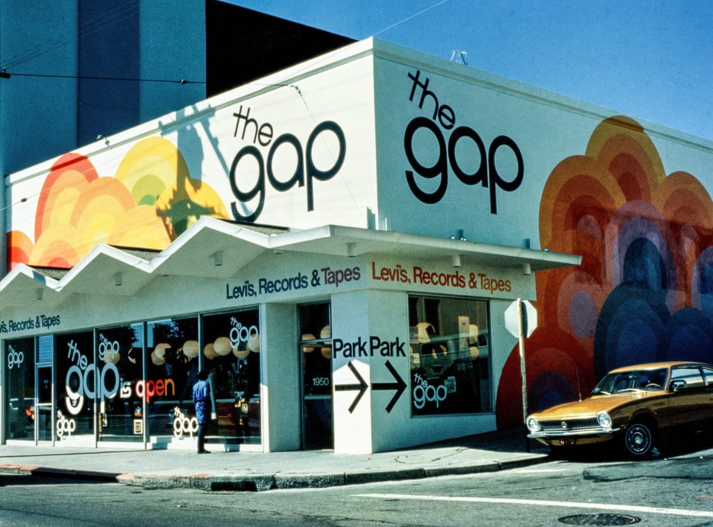
Gap was first introduced to consumers back in 1969 in San Francisco. Donald and Doris Fisher came together to launch the brand after becoming frustrated that they couldn’t find a pair of jeans that properly fit. The couple took $63,000 of seed capital and opened their first store on Ocean Avenue. The first Gap store looked a little different than Gap today and sold Levi’s brand jeans and LR records.
Before opening the store, Donald connected with Walter Haas Jr., the president of Levi Strauss & Co., for inspiration. His conversation with Walter led him to Bud Robison, Walter’s Director of Advertising. While Donald and Bud drafted up a legal plan, Doris created the company name, Gap. This working relationship between Donald and Bud was structured as a partnership. Donald was required to exclusively sell Levi products, whereas Bud was required to pay a 50% advance in Gap’s radio advertisements. This backing and support from Levi’s helped Donald and Doris to open their first store in San Francisco.
This first store attracted a younger demographic than competing retailers and to help the market to this generation, Gap played LP records while customers shopped.
While there has been debate around what Gap stands for with its name, the founders have been clear in what the meaning behind the name is. Once the founders noticed that there was a generational gap within the clothing industry, Gap was born. Gap quickly came together to fill the void that existed from many brands selling clothing that wasn’t as appealing to the younger generation. Gap quickly became the go-to brand that filled this gap between supply and demand for a younger crowd. This background implies that those that believe that the name Gap is an acronym, are incorrect.
Gap’s Evolution
1969: Gap Inc. is founded
On April 21, 1969, Gap Inc. was founded by Donald and Doris Fisher in San Francisco, California.
1970-1973: Gap opens additional stores and opens a corporate office
Just one year after opening their first store, Doris and Donald opened their second store in San Jose in 1970. This second store was 6,600 square feet, with half of the space being used to stock inventory. By 1973, after only four years of operations, Gap had opened approximately 25 retail stores.
In 1971, Gap made a corporate home in Burlingame, California, where they set up their headquarters.
1972: Gap’s logo is trademarked
While its original logo debuted in 1969 when the company was founded, the logo wasn’t trademarked until 1972. This monochromatic logo has become one of the most widely recognizable logos in the country, so it was crucial for Gap to get this trademarked. Gap applied for this with the United States Patent and Trademark Office on February 29, 1972. This application was approved on October 10, 1972, and Gap’s logo officially became trademarked. While their logo has evolved through the years, the current one is also trademarked, therefore you won’t find any of their logos in the public domain.
1974: Gap expands their inventory
Five years after Gap was founded, it began to sell private-labeled products.
1976: Gap goes public
Due to Gap’s rising success and continuous growth, Gap went public in 1976. When the company went public, 1.2 million stocks were offered at $18 per share. This move forced Gap to be in an expansion mindset, so they stayed on the path of growth and expanded to include two retail chains.
1983: Gap purchases Banana Republic (and expands their offerings)
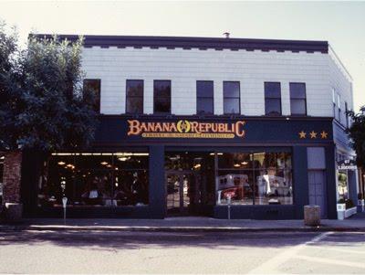
Banana Republic back in 1983 was a different Banana Republic than you know today. Back then it was a safari and travel-themed retail store with two locations. Since the company was also founded in California, Gap took an interest in them and purchased the store in 1983.
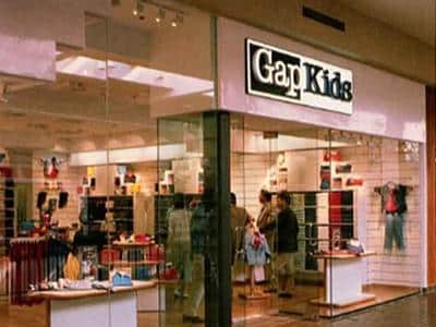
A year later, Gap first introduced their iconic pocket-t-shirt in 21 diverse colors. Another two years later, Gap goes on to open its first Gap kids’ store in San Mateo, California.
1991: Gap stops selling Levi products
While Gap’s partnership with Levi’s helped launch the company, in 1991 Gap officially stopped selling Levi’s apparel in their stores.
1999-Today: Gap’s new leadership and publicity
In 1999, Gap was named “Company of the Year,” by the San Francisco Chronicle. This helped them generate sales and grow even more.
Donald remained a part of the board, serving as the Board Chairperson, up until 2004. Donald passed away in 2009 and following his death, his family became in charge of Gap. Today, Gap is led by Sonia Syngal, Gap’s CEO.
Roadblocks Along the Way
Just like most companies, Gap has experienced similar roadblocks like navigating competition, acquisition deals, and partnership agreements. A unique roadblock that Gap has experienced is related to its iconic logo. Gap never underwent a drastic change to its logo but after a decline in revenue, they opted to redesign it a little more drastically in 2010. The unexpected roadblock they encountered though was that their consumers hated this updated logo and took to social media to express how much they disliked it. This caused Gap to revert to their former logo and they had to rerelease this back to their consumers.
The Meaning of Gap’s Logo and Gap’s Logo History
Since being first created in 1969, the Gap logo has only been updated 4 times. As you dive into the logo history below, you’ll see that while the logo was altered for the first three updates, the final update was a return to the 1986 logo.
Throughout the years, the Gap logo has consistently revolved around minimalistic features. The company has always opted for a wordmark to be the focal point and neglected to add any additional graphic elements.
Below we take a closer look at the logo’s evolution and each of the components that make up this simple logo.
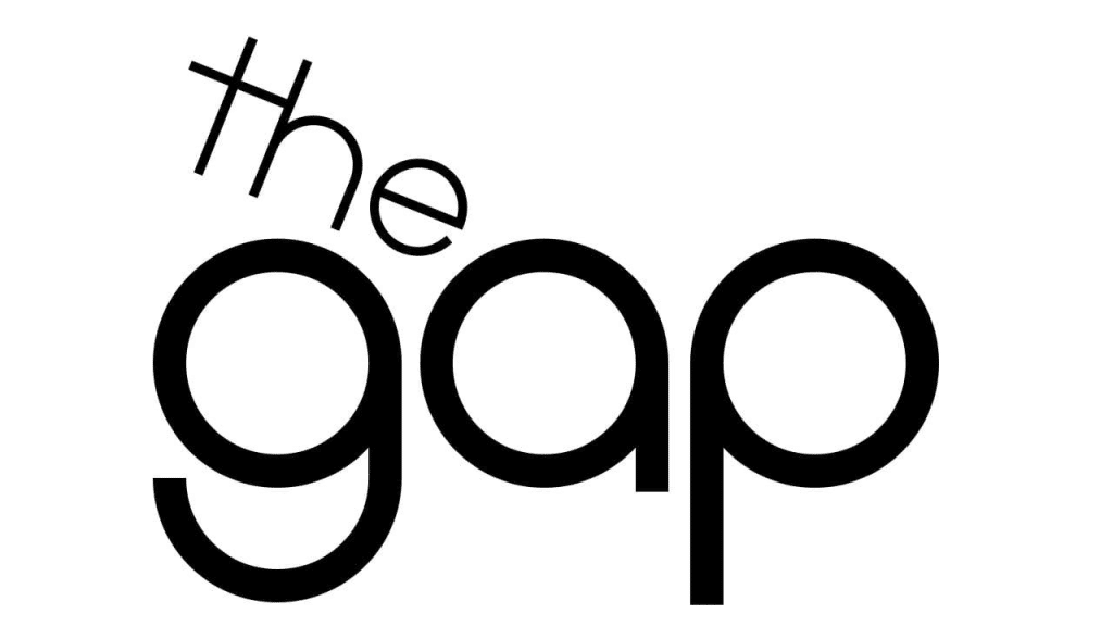
1969-1976: The first version of the Gap logo
In 1969, the first logo for Gap was released. This logo featured a lowercase wordmark that was slightly tilted. The “the” was above “gap” and after a closer look, you’ll notice that the “g,” “a,” and “p,” each make up an even-sized circle. At the same time though, the lines on each of the letter’s sides make them look slightly different. This monochromatic logo lasted until 1976.
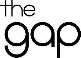
1976-1986: The second version of the Gap logo
Gap unveiled the second iteration of its logo in 1976. This updated logo was like the original logo; however, the tilted lettering was removed. Instead, the “the” was straightened out which gave this logo a bolder look to it. While the first logo lasted for seven years, this version lasted for ten.

1986-2010: The third version of the Gap logo
In 1986, the company went through another redesign with its logo. This one had a different style than the past two versions. For the third iteration, Gap opted to place a white wordmark inside a blue square. Unlike the lowercase lettering used previously, this time the wordmark was written in only uppercase letters. One other edit was the removal of the word “the.” Now the logo just read “GAP” and with this logo came a new nickname – “Blue Box.”

2010-2016: The fourth version of the Gap logo
While the third logo lasted for almost 25 years, in 2010, Gap hired Laird and Partners to update their logo for the third time. This decision came after a decline in revenue, so Gap thought that redesigning its logo could get sales back on track. This version kept the blue square but unlike the last version, this had the wordmark in front of the square. The wordmark remained bold, but the frame was less prominent. After this update was released on social media, there was much negativity around this change and the look of this new logo from experts and consumers. After a week, Gap went back to its 1986 logo design to please its consumers.
2016-Today: The fifth (and current) version of the Gap logo
The final logo update happened in 2016, and what came out of this update is the logo we know today. This iteration kept many of the prominent features from the iconic 1986 (and 2010-2016) version, with only one minor change – the blue frame was removed. With this removal, there became more blank space between the serif font letting. By electing to keep the monochromatic color palette, the logo still managed to stand out.
Gap’s logo font:
While Gap has transitioned between fonts, all their choices have been legible ones. In 2010, their font choice was Helvetica, which many of us are familiar with. Not only was this legible, but this was also bold, confident, and clean. The current font is like Spire Regular, which is a font designed especially for Gap by Ann Pomeroy. This font embodies the same elements as Helvetica, yet with this serif font variation, it also evokes clarity.
Gap’s logo color:
When it comes to Gap’s color choices, the company has stuck to three colors: black, white, and blue. Black is often chosen to convey mystery, formality, authority, and elegance. This neutral color choice conveys these positive emotions, yet sometimes the color can also evoke feelings of fear, evil, death, and sorrow. Gap worked hard to convey the positive feelings versus the negative ones when it came to using black.
Blue was first introduced in 1986. This color choice is often associated with the colors of the sky and the ocean. Blue is commonly used to symbolize loyalty, safety, stability, trust, tranquility, and serenity. Because of these characteristics, blue is a usual branding color choice, so it’s no surprise that Gap incorporated this color. A final color Gap used for their logo is another neutral color, white. The use of white helped to balance the other bolder colors within the logo. Using white helps convey positivity, goodness, humility, simplicity, and loyalty – all traits that are important to Gap.
Gap’s logo symbols:

Gap has only incorporated one symbol into their logo all these years – and that symbol is a square. The square first appeared in 1986 and is a common choice among graphic designers. Squares are used to symbolize unity, safety, security, and order. Just like with their color choices, the use of the square helped to convey Gap’s mission.
Gap Today
In the 50+ years since Gap was founded, Gap Inc. has steadily grown to become the retail clothing tycoon we know the company to be today. With global operations across not only the United States but also across Canada, the United Kingdom, China, Japan, France, Mexico, Taiwan, Italy, Hong Kong, and Ireland, Gap, and its logo, have a universal presence.

The Gap Inc. brand also encompasses six major brands beyond Gap – Banana Republic, Old Navy, Athleta, Intermix, Janie and Jack, and Hill City. Together these brands have collectively generated $13.8 billion in sales in 2020. In 2020, Gap also reported having 117,000 workers that were employed worldwide. It’s important to note that this is down 129,000 from the previous years, but even today, the company is still going strong and operates 3,100 stores across the world. And even with a decline in physical store locations, Gap remains one of the largest and most widely recognized clothing brands globally.
Today, Gap is led by Sonia Syngal, who serves as Gap Inc’s CEO. As of September 29, 2021, Gap Inc. had a reported net worth of $9.28 billion.
Lessons Learned from Gap
Gap is a company that we all can learn from when it comes to redesigning. Since they haven’t undergone drastic logo changes, yet their logo is recognizable across the world, what they have done works! So, what have they done?
Well, Gap has kept its logo simple for starters. Their designers have always only used minimal design elements to highlight the messaging of the brand. Other companies opt for many different elements and by doing this, their messaging can often become lost. Secondly, their logo is highly legible with their wordmark and font choice. No matter what medium the logo is printed on, it is easy to read! Along the same lines, it is highly versatile so it can be scaled up or down with ease.
Most importantly though, Gap’s logo is memorable and timeless. The clean features help consumers quickly identify the logo and since the designers never elected trendy elements, the logo has stood the test of time.


