


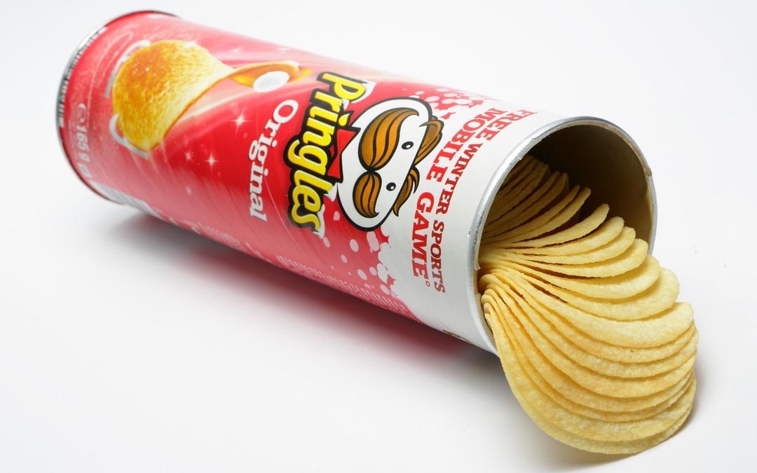
When you hear the slogan “Once you pop, you can’t stop,” what comes to mind? Chances are, you immediately think of a Pringles chip.
Brands that have an iconic slogan are part of an iconic brand with an iconic logo – and Pringles is no exception. Since its inception, Pringles has been loved and adored by consumers. It’s not only that the chip’s shape is different than its competitors, but it’s also that it’s hard to find a chip brand that brings you the same joy as when you see Mr. Pringles on a label and pop that tube of chips open.
Beyond every logo is a story and that’s what we’re going to dive into in this blog. Pringles has a story of how its iconic logo came to be and it’s a story we can all learn from. Keep reading below to learn the history of the brand and to learn how one of the most widely recognized chip logos was created.
Meet Pringles

While the Pringles chip wasn’t first introduced to the public until 1968, it was in development nearly 10 years before that. Unlike other potato chips we regularly consume, the Pringles chip only contains 40% of potatoes. To keep its shape, texture, and flavor, the potato ingredients are mixed with wheat flour, starch, vegetable oil, and emulsions. While this has caused some controversy over the years, the Pringles crisp is a snack we grew up loving and still love today.
The person we must thank for creating this iconic snack is Alexander Liepa, a chemist for Procter & Gamble. What Alexander created was a saddle-like chip that had a taste on par with competitors. The only difference was that Pringles weren’t as greasy and didn’t break as easily as the other chips on the market.
When it came to naming the brand, one story we love is that the marketing department for Pringles simply looked in a phone book for inspiration. It was in that phone book that they found “Pringle Drive” in Ohio. As the legend goes, the marketing department fell in love with the name “Pringles” and that was the name of the brand moving forward.
What the brand did right in its creation was that it didn’t introduce Pringles to the public prematurely. After Alexander developed the chip, it wasn’t released until 1968 and it was released with a fully vetted marketing plan, name, and design. It was a marketing plan that worked, because even today, it’s a brand we all can immediately recognize.
Pringles’ Evolution
1956: The Pringles idea is formed
Before Pringles were developed, chips were often seen as being too greasy and too breakable. In 1956, Procter & Gamble set out to find a solution to this so that chip lovers could continue eating chips in a non-greasy and non-breakable way. To craft the perfect chip that wouldn’t break and would have proper packaging, Procter & Gamble brought in a chemist, Frederic J. Bauer.
1965: The early days of Pringles

Bauer first began creating the saddle-shaped chips we know and love today in 1965, almost 10 years after Procter & Gamble enlisted his help. While this chip design was his idea, he was never successful in executing the chip to be a chip that consumers would want to eat.
One thing he is credited with though is creating the tube-shaped can that the chip still uses today for packaging. This packaging was crucial to the design because it allowed for the chips to never break.

1968: Procter & Gamble finally begins selling Pringles
After Bauer was unable to create a tasty recipe for his chip, a different researcher for Proctor and Gamble, Alexander Liepa, was able to do this. Since Alexander was the chemist who created the taste of the chip, his name is on the patent, not Bauer’s. In 1968 the chip was ready to be sold and Proctor and Gamble began selling the chip in Indiana after a targeted marketing campaign. It wasn’t long after that that Pringles was accessible across the United States.

The 1980s: Pringles began to take off
It wasn’t until the 1980s after a marketing campaign titled, “Fever for the Flavor of Pringles,” and a television commercial with Brad Pitt, that Pringles began to see sales take off. With this new following of Pringles lovers, the brand took this as an opportunity to update its logo.

1991: Pringles grows internationally
After gaining popularity in the United States, the Pringles brand began to expand its global reach, expanding to international markets. This was the same year that Pringles released their catchy slogans, “Once you pop, the fun don’t stop,” and “Once you pop, you can’t stop.” By 1995, the brand was selling Pringles in Europe, Latin America, and Asia. With these new markets, came new flavors to appeal to a new audience. These new flavors were out-of-the-box like Prawn Cocktail, Seaweed, Serrano Ham, and Blueberry.

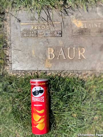
2008: Bauer passes away
While Bauer was not credited with creating the chip, only the can, he is the reason why the Pringles chip is what it is, and he is an important part of the brand’s evolution. When he passed away in 2008, his family honored this by burying his ashes in a Pringles can, just like he designed years ago.

2013: Pringles remains relevant with new hacks
Nearly ~47 years since the Pringles chip was developed, people are still finding new ways to eat the chip. In 2013 for instance, the web was taken over with videos about how you can slip a piece of paper into the side of the Pringles tube and slide all the chips out a once. Another viral Pringles video was a video of a Pringles lover creating a Pringles “ringle,” a free-standing ring of Pringles.
Roadblocks Along the Way
The first roadblock the brand encountered was in 1975. Competitors began to demand that since Pringles weren’t actually “chips,” they needed to stop calling themselves chips. The reason behind this was that Pringles aren’t made from potatoes. After The Food and Drug Administration backed up these complaints, Pringles opted to refer to the brand as “crisps.”
A second roadblock was in 2008 in London. Along the same lines as the past roadblock, the brand received complaints from the London High Court that Pringles were not actually “crisps.” Unlike the prior roadblock though, Procter & Gamble successfully argued and won their case in London.
The Meaning of Pringles’ Logo and Pringles’ Logo History
No matter what version of the Pringles logo you are viewing, you will always be looking at a logo that is cheerful and joy filled. The first iteration introduces us to the brand’s mascot, Mr. Julius Pringles, and that mascot remains tied to the brand even today. This mascot has a story behind it though which you might not be as familiar with – and that story is that Mr. Pringles’ real identity is that he is a good-natured baker.
When crafting the logo, some features were intentionally added to have a hidden meaning. For instance, the oval shape of the face in the early version was meant to resemble what the brand is, a potato chip. To dive more into the various version of this logo, and any other hidden meanings that have been uncovered, keep reading below.

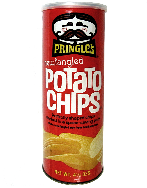
1967 – 1986: The first version of the Pringles logo
While the first Pringles logo still used a face for an emblem, the face looked different than the one you know today. This early iteration included a thick black outline of a man’s face. This oval outline featured hair and a mustache that was red and black, and cheeks that were brought to life with a red and white striped pattern. The placement of the brand name was below the outline. This first version introduced us to the mascot of the brand, the man in the outline, Mr. Julius Pringles.

1986 – 1996: The second version of the Pringles logo
Almost twenty years after the first logo was introduced, the logo was updated to include the shortened brand name, “Pringles,” and a redesigned Mr. Pringles. Mr. Pringles now had a circular face, with circular eyes and his mustache had softer, rounder features. This logo felt different to consumers than the first iteration and with the updated look and font choice, the logo had a new fun energy about it.

1996 – 2002: The third version of the Pringles logo
Even though the second iteration attracted a fun audience, this updated version only lasted ten years. When it was time to update the logo again, this time Mr. Pringles was placed diagonally, and the colors used were brighter. The rounded features of Mr. Pringles’ face were removed, and an earthy brown color was introduced. The designers also played around with the font choice, choosing a cleaner and neater font. All these features combined made the logo appear more stylish.

2002 – 2009: The fourth version of the Pringles logo
The last two versions of the logo conveyed fun and stylish vibes, but Pringles wanted to redesign the logo again to make it a tad fancier and more contemporary. To do this, Mr. Pringles’ hair and mustache colors were updated to a lighter brown, his eyebrows were removed from the emblem, and he was given a red bow tie.

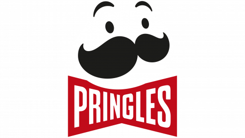
2009-2021: The fifth version of the Pringles logo
This fifth iteration of the logo only featured slight updates to the logo design. The Pringles’ brand name now included a white border to further emphasize the shadow of the wordmark. The bow tie feature that was formally included remained, except now it was lighter, and white was incorporated. The elements of this logo helped to convey a child-like energy, tapping into the nostalgia of long-time lovers of the brand, as well as a new generation of Pringles enthusiasts.

2021 – Today: The sixth (and current) version of the Pringles logo
To keep up with the evolving times, Pringles unveiled a new logo in 2021, that remains the logo today. Mr. Pringles resembles an avatar that many consumers may find in a virtual world. Stylistically, Mr. Pringles is now bold, with smaller, beadier eyes, and more dramatic eyebrows. This logo redesign was crafted by a new design studio, Jones Knowles Ritchie (JKR), with Pete Matthews leading the design charge as Pringles’ Brand Design Manager. These new features were chosen to modernize the logo and bring the iconic emblem to life. This logo update went beyond the logo and new packaging was also released with this new iteration.
Pringles’ logo font:

The Pringles logo font is one designed specifically for the brand. The font is similar to the Bodega Sans Medium font, a sans serif font. This font was designed exclusively for the brand by Greg Thompson and Thompson opted to include geometric elements in his design to create this iconic typography.
Pringles’ logo color:

Throughout the year Pringles has stayed true to a specific color scheme. Red is a color choice that has been a brand staple throughout the years and was chosen to convey passion and excitement. Another staple is yellow which is a bright color choice that conveys youthfulness. Other colors present in the logo are white, brown, and black. These color choices convey purity, reliability, and elegance respectfully. These color choices were intentional and together they capture the attention of their audience.
Pringles’ logo symbols:
Whenever you grab a can of Pringles, you are greeted with the same logo – and that same logo will always include the face of a fictional character. Resembling a cartoon drawing, the name tied to the face is “Julius Pringles.” Julius has been the face of the brand and in 2002, the symbol went through a redesign where he was given eyebrows and a black bow tie. This 3D version of the logo was designed by Louis R. Dixon and on this updated design today, you can find the Pringles name on the bow tie.
Pringles Today

The Pringles today that you purchase from your local grocery store may very well be the same Pringles you remember from your childhood. While the brand and the recipe behind the iconic chip have not changed much over the years, the company has continued to grow.
In 2011, Proctor & Gamble agreed to sell Pringles for $2.35 billion to Diamond Foods of California. This purchase would have helped Diamond Foods triple in its snack division. This deal never closed though so Diamond Foods never was able to benefit from the brand. Instead, Kellogg’s purchased Pringles for $2.695 billion in 2012. This acquisition was part of a larger strategy to expand their international business. With this acquisition, Kellogg’s became the second-largest snack brand across the globe.
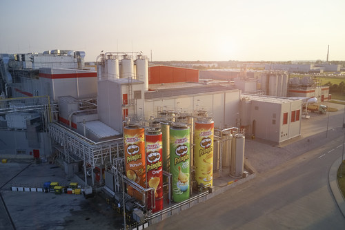
Today the brand has 5 global factories, expanding its international reach. These factories are in Tennessee, Belgium, Malaysia, Poland, and China.
Lessons Learned from Pringles
With any logo, there are lessons you can take away from their redesign triumphs, and tribulations. For Pringles, those lessons revolve around relevance, memorability, simplicity, and timelessness.
When Mr. Pringles was designed, the brand kept the emblem tied back to the brand’s mission, vision, and values. This design was always relevant to its target audience, and it accurately always depicted the brand’s identity. Secondly. The logo is memorable. Without even thinking twice, many of us can likely associate Mr. Pringles with the Pringles chip (even before reading this article). This logo has been easy to remember for decades and it’s impossible to mix up this unique design with competitors, or other brands. Part of the reason the logo is so memorable is that it is simple and not overcrowded with various features and components. As consumers, we only have a short attention span for brands to grab our attention so it’s important for logos to be kept simple. Finally, the Pringles logo is timeless. Despite the current logo feeling more modern and digitized, all the iterations stayed clear of the latest trends. Instead, the brand focused on intentional elements that could capture the attention of consumers no matter what decade it is.


)
)