Pepsi has been a fixture of American restaurants, sports venues, and picnics since the turn of the last century. This notable soft-drink brand has a visual identity just as iconic as its beverages. In fact, its famous red-white-and-blue logo is distinctive enough to be recognized even without the brand name. That’s an amazing feat, especially in a market as oversaturated as the beverage industry!
Let’s take a look at the history of this notable brand’s logo and marketing.
The Origin of Pepsi
Pharmacist Caleb D. Bradham created Pepsi in 1893 as a medicinal beverage. Inspired by Coca-Cola’s burgeoning success, Bradham combined kola nut extract with various spices and essential oils. The resulting “Brad’s Drink” was promised to relieve tension and promote overall vitality.
It wasn’t long before Bradham realized he needed to set his drink apart from Coca-Cola. He began marketing it based on its digestive benefits, similar to the enzyme “pepsin” (which was not an ingredient). And so the name “Pepsi-Cola” was born.

The first logo was…interesting, to say the least. The wild font seems like an erratic twist on Coca-Cola’s famous Spencerian typeface. Bradham had sketched the logo himself, perhaps with his soon-to-be competitor. The original design, while unusual, laid the foundation for what would become a friendly, energetic brand.
Bradham filed his trademark in 1903. The beverage quickly took off, appearing throughout 24 states within the following decade.

A new and improved logo emerged with this growth. This design preserved the linked tails of the “P” and “C” but cut down on the serifs. It also added a dramatic “flag” to the “C’s” upper.
To clarify the meaning of these strange new words, the company eventually added the instruction “Drink” to the flag. The typeface changed, too, embracing a carnival blackletter style. The new logo helped solidify Pepsi as a fun, innovative alternative to certain other medicinal soft drinks.
Unfortunately, the magic was about to end for Bradham.

In the early 1920s, he suffered massive financial problems. He’d over-speculated on sugar company shares and lost nearly everything. But Pepsi was the biggest loss. The company took a hit as Bradham was unable to keep up with production demands. On May 31, 1923, Bradham and Pepsi declared bankruptcy.
The company bounced among various owners throughout the Great Depression. Somehow, it persisted — perhaps because great products are more resilient to economic strife.
By 1940, Pepsi had been reformulated as both a beverage and a company and was ready for prime time.
The Rise of Pepsi-Cola

Once the company stabilized, Pepsi resumed its exponential growth. To usher in a modern era, the brand redesigned its wordmark. The serifs, extra flourishes, and “Drink” were all gone. But the swirling letters and crisp typeface preserved the brand’s fun vibes.
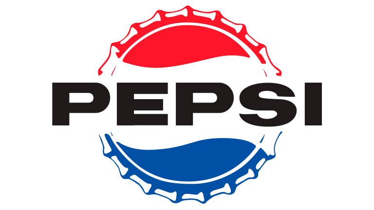
Like its main competitor, Coca-Cola, Pepsi had to defeat copycats that diluted its brand identity. The easiest solution was to make their bottles as distinctive as possible. And thus the famous red, white, and blue cap design emerged. It both evoked patriotism in post-war America and helped Pepsi stand out from Coke’s red aesthetic. Plus, it doubled as a logo!
The “triple-wave” pattern paired well with Pepsi’s midcentury slogan, “More bounce to the ounce.” While rival Coca-Cola sold 6-ounce bottles for 5 cents, Pepsi doubled the serving size. The rippling design also reflected Pepsi’s dynamic brand personality and emphasis on vitality.
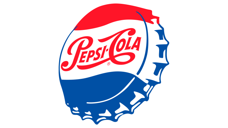
In 1962, a bold sans-serif typeface replaced the swirly font, and the old-fashioned word “Cola” vanished. The dramatic new “Pepsi” was ready to take over the market.
This version of the logo retained the bottle-cap shape, with the brand name splashed in black across the white inner wave. It became a symbol of the baby boomers, or the “Pepsi Generation,” as the company called them. They were coming of age as Pepsi began promoting their beverage as a vibrant, delightful drink for fun young people.
In time, though, bottle caps became a thing of the past. Pepsi needed to adapt yet again to a changing market. It was time to truly modernize the brand.
Pepsi Around the Globe

Starting in the early 1970s, the Pepsi logo lost the bottle-cap details and became more abstract. The new design was a simple circle shape encompassing the triple wave. The word Pepsi shrunk down to fit within the globe, reflecting Pepsi’s ever-more-international success. It was now blue for a classier vibe. The entire design was set in negative space against a red-and-light-blue backdrop, as though to illustrate Pepsi’s role within the global market.
The next step was to revamp the font for a second time. Pepsi wanted to appear forward-thinking and lively. Their new typeface featured blockier letters, tighter kerning, and curved details for a futuristic feel. Indeed, if you look closely at the “S,” you’ll see a resemblance to the typeface used for Star Wars.

The company’s message was clear: they were modern, friendly, and accessible, yet an innovative player in the international beverage industry.
They were also completely immersed in popular culture. Since Pepsi president Al Steele married film star Joan Crawford, the company had forged strong relationships in the entertainment industry. Throughout the 1970s and 80s, Pepsi frequently booked famous musicians and actions to appear in its commercials.
Pepsi Makes It Big
By the 1990s, Pepsi was instantly recognizable by its iconic red-white-blue triple-wave. And so the company split the globe logo from their brand name. They knew that the image would catch attention by itself, but first, it needed to stand separately from the word “Pepsi.”
And so in 1991, Pepsi debuted its new logo, which depicted the globe at the tail end of a fierce red stripe. The typeface was italicized and centered across the top. The overall aesthetic suggested innovation and movement.
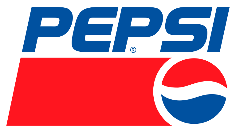
At the time, Pepsi was expanding its celebrity and entertainment partnerships. It became a fixture of sports arenas and a frequent sponsor of various teams. So, the dynamic new logo reflected the energetic athletic partnerships that drove Pepsi’s ever-soaring success.
As Pepsi approached its hundredth birthday, the design team took advantage of gradients and glow effects popular at the time. The circle finally became a sphere that illustrated the company’s global success. The centennial version of the logo placed the triple wave sphere behind a dramatic white brand name. Blue dropshadows created a pop-up effect.

Iterations of this logo persisted over the next decade, including a glossy version and the “ice-cold” look of the late 2000s. Even the serifs returned in a short-lived millennial design.

However, Pepsi’s design journey was not yet complete. The next phase was the most controversial — and yet further affirmation of this company’s exceptional branding skills.
Pepsi’s Brand Takes a Tilt
In 2008, Pepsi abandoned both its blocky typeface and the classic tai-wave design, as well as all 90s-era gradients and glosses. The new logo was 2-D, minimalist, and … slanted?
Both consumers and graphic designers had mixed responses to the logo. Some found it too simple or “soulless” compared to the well-established globe design. Others welcomed the fresh, contemporary take on the triple wave. The slim new sans-serif typeface also drew controversy. But the subtle wave in the “e” and round lettering helped retain the bubbly, futuristic aesthetic of the brand.

Most importantly, the red-white-blue pattern remained. This was critical to preserving Pepsi’s brand recognition. And controversy aside, no one could argue that the new logo was unrecognizable.
The final and current version of the logo emerged in 2014. Pepsi removed the blue outline from the globe and tweaked the typeface a bit. The font is a bit more legible, and the use of negative space creates a clean, friendly aesthetic. As some consumers have noticed, the former tri-wave now resembles a grinning face — a sure symbol of this iconic brand’s fun-loving personality!
Wrapping Up
Pepsi’s brand identity has evolved drastically over the past 100-plus years. And yet it’s retained the sense of whimsy and vitality that inspired its creation. While the typeface and imagery changed, the wavy lines and patriotic color palette have made Pepsi highly recognizable. And one need not be American to appreciate the brand’s cohesive visual identity. The contrasting red and blue create a dynamic energy that reflects the beverage’s famous “pop–fizz–ahh.”
That color scheme, along with the curves and dynamism, helped preserve Pepsi’s brand identity despite all the logo redesigns. It’s truly a testament to the power of a brand’s core values and energy. Those are what make a memorable brand identity, not the design itself. Pepsi proves that a company can endure more than a century with a vibrant aesthetic and promise at its core.