
There comes a time when many companies will choose to go through a rebranding. Maybe that company has had a logo since its inception, but that logo now seems outdated.
Maybe that business sought out external advice on its marketing strategy, and from that, an idea for a new logo was born. Or maybe, a company is relaunching an existing product or service under a new name and marketing campaign. The latter is the case for Hatchwise Unlimited, which is now called Hatchwise Infinite.
You already know what we’re all about at Hatchwise, but you may not now know that we also run logo contests to find our next logos. For our service, Hatchwise Infinite, we turned to a logo contest, and after 874 entries, we chose a winning design that you’ll now find on our Hatchwise Infinite page.
What is Infinite?
Infinite is everything you love about Hatchwise but packaged into a monthly service. For those clients that have a wide range of logo design and naming needs, Infinite offers unlimited design and naming contests for a flat monthly rate of $595. Rather than paying for each contest separately, Infinite can save you money while getting you the same high-quality designs.
Everything else is the same as what you are used to. Each project will be crowdsourced to Hatchwise’s creatives all over the globe, and once your contest concludes, you’ll award a winner. After one contest ends, your next contest can begin, running as many as you can fit into a month!
With Infinite, you get more than that, though. You also gain excess to tons of extra perks like dedicated support, free upgrades, unlimited revisions, and project extensions. With Infinite, everything is included, with no hidden fees!
What Was Requested
While Infinite falls under the Hatchwise umbrella, this design needed not to incorporate any of Hatchwise’s existing branding. That means that the Hatchwise colors and its signature bird couldn’t be incorporated into the design. Additionally, the creative brief asked designers to create a mostly text-based logo featuring the new name of the service, Infinite, and for the designers to stay clear of any neon and pastel colors. Since Infinite allows clients to run unlimited design and naming contests for a set, one-time monthly rate, the “Infinite” name is a fitting name for this Hatchwise service.
Below we highlight ten of the logo entries Hatchwise Infinite contest received, as well as the winning logo design, so you can see the wide range of our designers’ work for yourself.
A Few Entry Comparisons
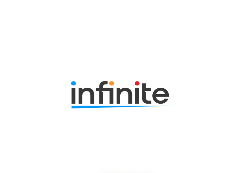
This first entry may not have been a winning design, but it was a runner-up and a favorite. This logo featured the wordmark in lowercase letters, which is like an Ariel font. Each dot over each “I” is a different color, and below the wordmark is a horizontal line that fades out from left to right.
The line represents the name of the brand “Infinite,” and the three colors used represent the creativeness of the brand. This design’s wide range of colors represented the wide range of designs you’ll get when you sign up for Infinite’s services.
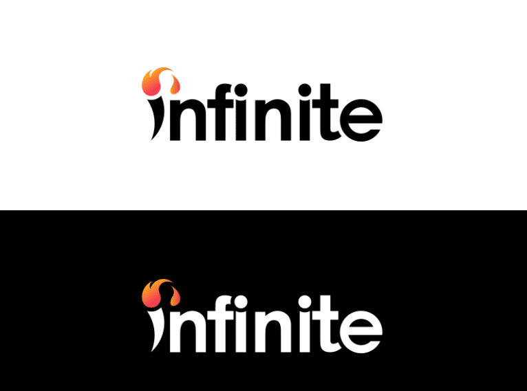
This design features lowercase letters printed in a clean, uniform form. The first letter of the wordmark is where your eyes first go. Coming off the “I” is a fire-like flame printed in orange. Flames are a symbol of eternal life, tying into the meaning behind the Infinite name.
The designer printed this logo on both white and black backgrounds, which helped with seeing how this design would be printed based on the medium used.
This designer elected to play up the wordmark in a way different than other designers. While this logo also featured bold block lettering, instead of using a universally symmetrical font, this designer chose the opposite. The letters are different heights, all aligning at the bottom, though.
The tops of some of the letters feature a slice of orange, adding color to the design. With this simple color palette, this design can be used across a variety of mediums and will stand out no matter the background color.
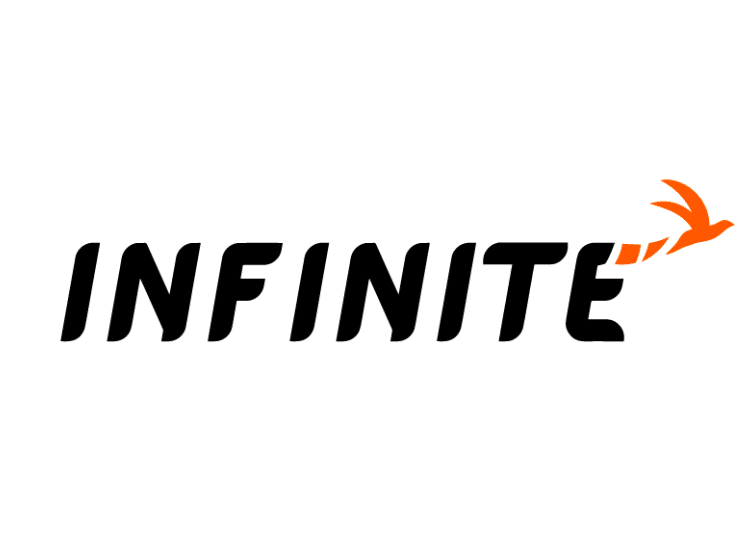
This was one of the few logo designs that incorporated a bird into the logo. The designer followed the creative brief, not using the same bird as the Hatchwise one, though.
Since a bird has been the symbol of the Hatchwise brand, it makes sense that this designer would include a different type of bird for this design. The bird is seen flying away from the logo, out into infinity.
Beyond that feature, the letter features uppercase, thick letters with rounded edges, adding a softness to the design.
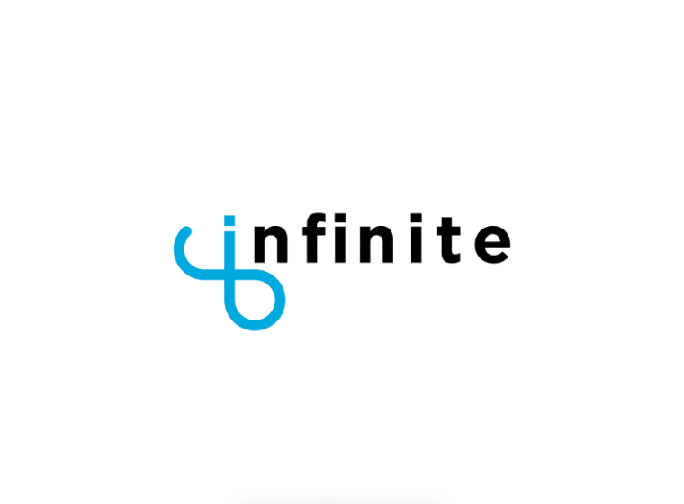
This entry did a terrific job at making the wordmark the focal point while making it tie into the brand. The font is a lowercase font that features block lettering, like an Ariel font, that is precisely spaced out from one another.
While the font is written in black, the designer incorporated color into the first letter, the “I,” by turning that letter into a blue infinity symbol. While this logo wasn’t the winning design and opted to use a Hatchwise color, it still stood out from other entries.
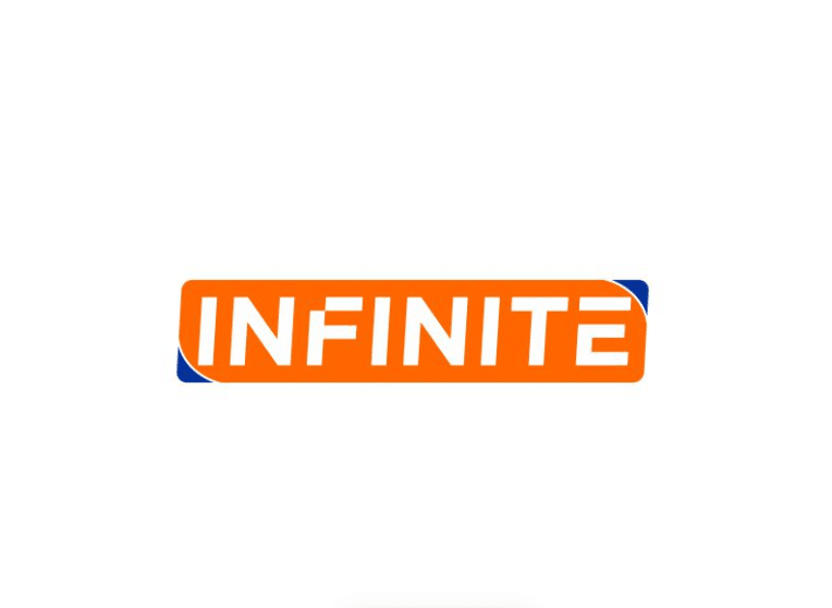
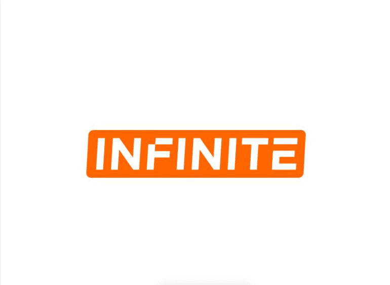
Sometimes designers take a concept and run with it, recreating various logos built off that initial design. That is what this creative did. Offering two versions of a similar design, both feature the same uppercase lettering. The lines that form the letters resemble the thinness of the numbers on a digital clock, making this font digitized.
Given Infinite’s place as an online design and naming provider, this digitized font made sense. The primary color is orange, but you’ll see that the designer played around with the first design, adding a dark blue to two of the corners.
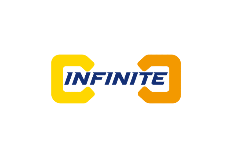
What makes this logo design unique is this designer’s take on Hatchwise’s creative brief. Like other submissions, the use of yellow, orange, and navy was incorporated. The font choice displaying the Infinite name is a bold, capital letter font that is hard to miss.
Surrounding each end of the wordmark, though, is half of an infinity symbol. The wordmark makes up the middle part of the symbol, highlighting in more than one way this theme of unlimited design options.
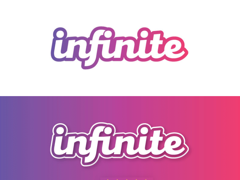
This submission resembles the font that is used across other tech, online-based based companies. This is intentional, as designers sometimes repurpose a similar font, with updated touches, to help clients and users stop and look when they see your logo design.
The bubble lettering offers a friendly touch, signifying Hatchwise’s friendly team of designers. This designer designed this logo in a variety of colors so Infinite could see how it would look in different color schemes, but this purple color scheme was a favorite!
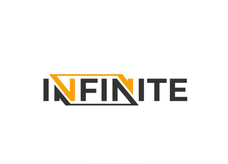
For this entry, the designer opted to use black and a yellow-orange color for the logo design. The font features uppercase letters with sharp, angular lines.
The tops of both “Ns” connect, playing off the “infinite” word. This logo design was drastically different than any of Hatchwise’s existing branding and made a statement with its bold design.
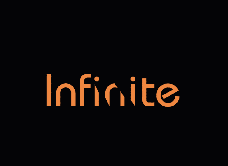
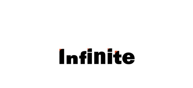
This designer included this logo design against a black background, so Hatchwise could easily see what this logo’s draw was. The lettering was printed in orange with some of the “I,” “n,” and “I” cut out.
The lapse of some of this lettering creates the illusion of infinity, where the letters continue into the abyss. Not many other designers took this approach with the logo, so this design served as a fun point of comparison.
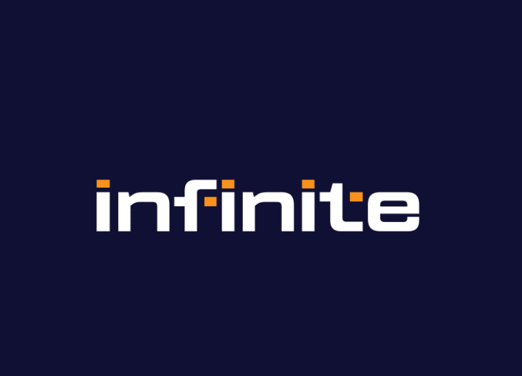
For this entry, the designer used the wordmark for inspiration. The Infinite name is written in lowercase, block, and white lettering. This sits on a dark grayish-blue background with orange accents.
The orange comes into the design as the dots for the “I” letters and for the extensions of the “f” and the “t.” Using the orange dots in this way makes the logo look digitized, which is something, not many other designers tried out.
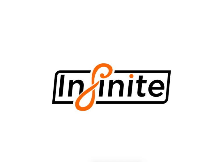
It’s not uncommon for the designers at Hatchwise to provide more than one design concept, which this designer did. For this entry, even though the logo included various features, it still looked like a simple, clean design.
The wordmark featured thin lettering that was enclosed in a black border. The “f” was written in a stylized, cursive font that formed an infinity symbol. That symbol and the dot over the last “I” were printed in orange, adding a pop of color to the logo.
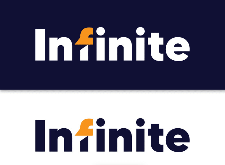
What sets this logo design apart is the use of navy, orange, and white and its lack of incorporating the literal meaning of infinity into the design. Instead, this designer did what was requested and focused on the text itself.
The text is exciting and bold, with each letter evenly spaced out. The text choice captures your attention, and overall, this logo feels fitting for a company like Hatchwise.
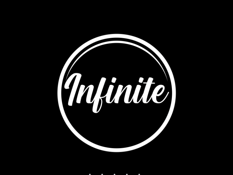
While many designers elected to design a logo on a horizontal scale, this designer chose to do something different, which was a nice point of comparison against other submissions. This design includes a circle, forming an emblem, that can easily be scaled up or down and printed on a wide range of media.
The circle, though, has a deeper meaning because a circle is the ultimate symbol of infinity. In the center of the circle sits the brand name in a cursive font, another subtle representation of the brand name, as cursive lettering is connected letter by letter.
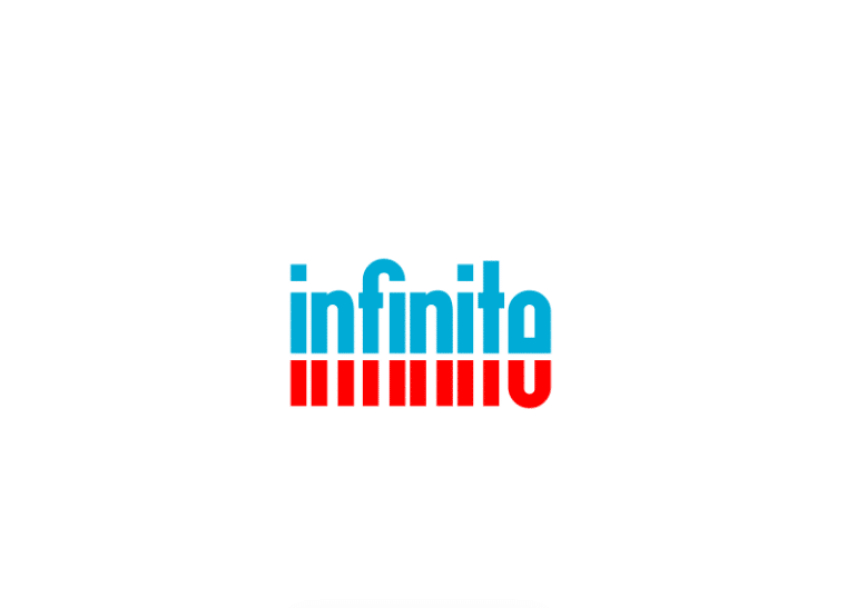
Even though this design only includes the Infinite wordmark, the way the wordmark was designed was intricate. The designer chose two colors, red for the bottom of the letters and blue, which is like the Hatchwise blue for the top of the letters.
The font is entirely lowercase, resembling an Ariel Narrow font, and halfway through each letter is a white horizontal line striking through the entire wordmark. This makes the illusion that the words continue into infinity.
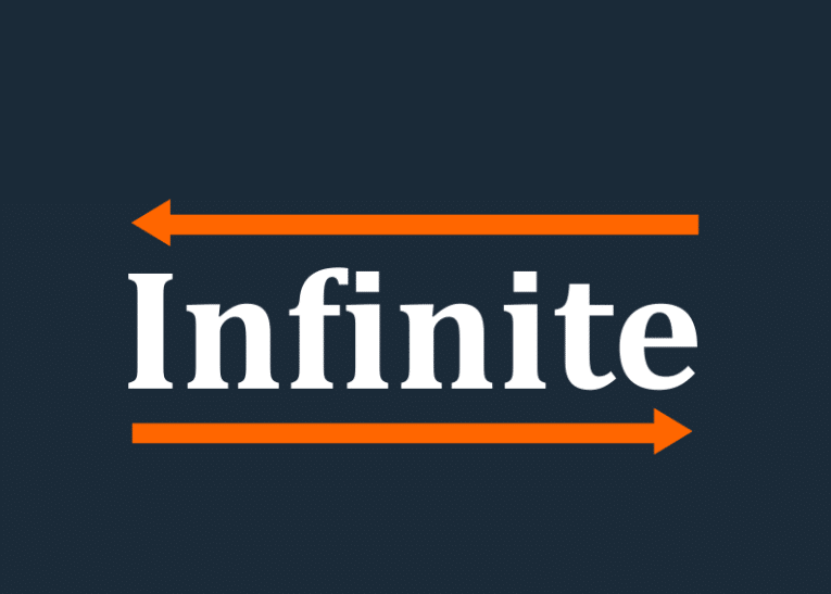
Many designers elected to play off the infinity symbol, but this submission went in a different direction. This designer opted to display two arrows, one at the top of the logo and one at the bottom, each pointing in a different direction.
The arrows represent that the brand goes on and on, representing that Infinite is truly for unlimited design. The designer obliged by the creative brief, including colors different from Hatchwise’s branding, choosing a dark gray/blue, white, and orange.
The Winning Design
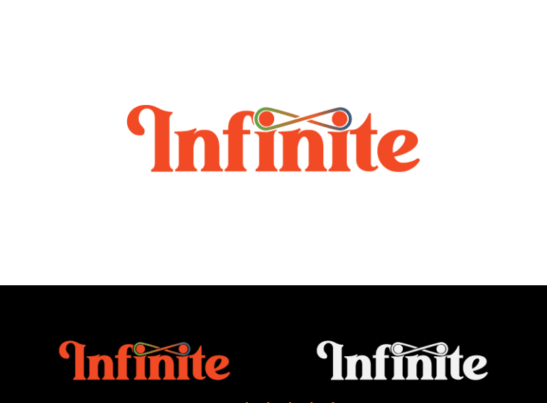
Out of 874 submissions, Hatchwise awarded this design as its contest winner and awarded RGR design $100. While other submissions incorporated the infinity symbol, this design did it uniquely.
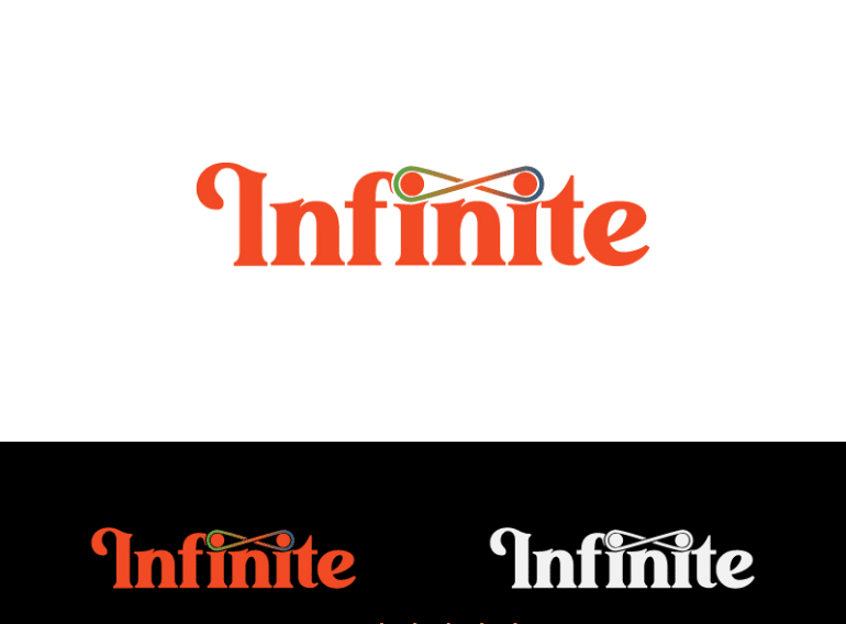
The font choice was unique, with elongated lines resembling a custom font that could have been created for Infinite exclusive. The second and third “I” letters are connected by an infinity symbol that spans the colors of the rainbow.
The Infinite name is printed in an orange-red color, and the designer showcased this design in black and white so Hatchwsie could see how this logo would look without color. The designer stayed clear of any of Hatchwise’s current branding elements, making this a truly original logo for Infinite.
After awarding this design as the contest winner, Infinite will begin rolling out this logo design across its branding.
Other Official Hatchwise Contests
Reimagining The Pride Flag, Hatchwise Style – This Pride Month, we wanted to see what unique takes on the Pride Flag our community of designers could imagine. Entries ranged from slight variations of the classic rainbow to full reimaginings that blew our minds. Our pool of talented artists took this contest by storm, submitting over 100 designs.
Community Logo Design Contest: Redesign the Rhode Island State Logo – On March 28th, Rhode Island unveiled its new logo, part of a $5M marketing campaign. Despite the fact that the logo was designed by Milton Glaser, a renowned designer previously responsible for the ILoveNY logo, among others, response has been largely negative, with some going as far as describing the logo as “embarrassing“..
Hatchwise Redesigns The US Space Force Logo – When we first saw the new logo for the newest branch of the United States military, Space Force, we were very underwhelmed, to say the least. In addition to being bland and uninspired the new logo bears an uncanny resemblance to the fictional Starfleet design from the fictional series Star Trek.
Popular articles
Browse by category
- Branding and Naming
- Business
- Design
- Entrepreneurship
- How to use Hatchwise
- Logo Design Case Studies and History
- Logo Design Contests
- Website Design Contests
- Company Naming Contests
- Product Naming Contests
- Domain Name Contests
- Slogan Contests
- Shirt Design Contests
- Tagline Contests
- Business Card & Stationery Design Contests
- Custom Graphic Design Contests
- Banner Design Contests
- Brochure Design Contests
- Character & Mascot Design Contests
- Photoshop Contests
- Photo Colorization Contests
- Photo Restoration Contests
- AI Image Prompt Contests
- AI Generated Image Contests