
Successful businesses stand out in what they do and how they look. That’s why quality logo design is so important. A good logo tells your customers who you are at a glance and helps them remember you.
At Hatchwise, our creatives are experts at creating visually stunning logos that tell your brand’s story and help you connect with your target audience. Here’s what they cooked up for a cognitive wellness supplement brand.
What Was Requested
Fungist is an Oregon-based company that sells mushroom tablets for medicinal and recreational use. They came to Hatchwise in search of a logo they could use on merchandise to attract the attention of their target audience.
Obviously, Fungist is not your run-of-the-mill hum-drum company. They wanted a logo that was as unique as their business. They describe themselves as “fun and eccentric.”
While they gave their creatives the freedom to experiment with different color palettes, they did specify a preference for loud colors. The logo had to include a mushroom and the company’s slogan, “Unlock Your Brain.“
A Few of the Entries
Hatchwise creatives submitted 171 logo designs to this contest. Here are a few that went above and beyond!
3119042 by BOYLANG
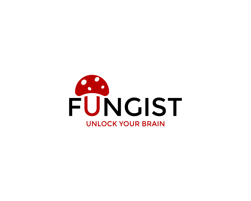
This first design was relatively minimalistic. The designer used only black and red for the color palette and a streamlined, sans-serif font for the word mark.
What is particularly interesting is how the designer seamlessly blended the image of a mushroom into the word mark by making the “U” in Fungist the mushroom’s stem.
3119093 by msg99
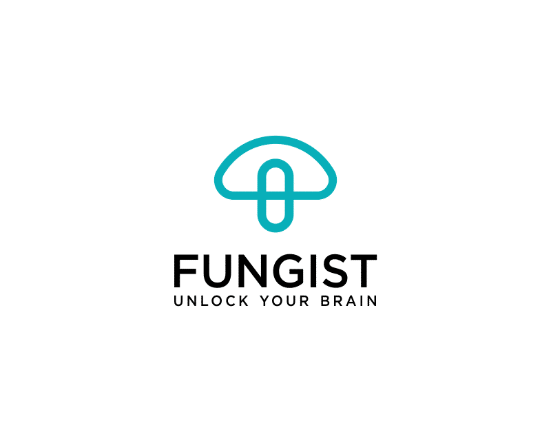
Here we have another relatively simple design. Again, this designer used only two colors—teal and black—and a sans-serif font with clean, simple lines. The simple outline of a mushroom is separate from the word mark.
However, the edge of the mushroom cap intercepts with the stem to create a pill capsule, highlighting the product’s medicinal use.
3119120 by dhanny09
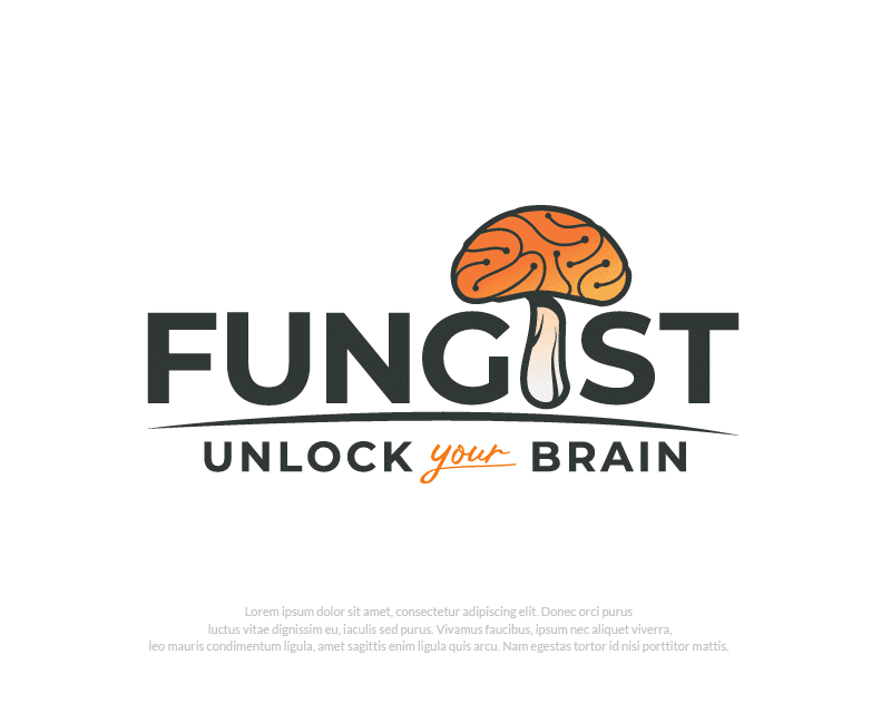
Another designer also chose to integrate the image of a mushroom with the word mark, this time as the letter “I.” This mushroom is more detailed than the other two examples we have looked at.
Also, this mushroom cap is designed to look like a human brain, emphasizing the cognitive benefits Fungist offers.

3119122 by Kang okim
This design incorporates many of the elements we have seen in other designs. While it separates the mushroom from the word mark, it uses the image of a brain for the mushroom cap and a pill capsule for the mushroom’s stem to convey the product’s intended use to potential customers.
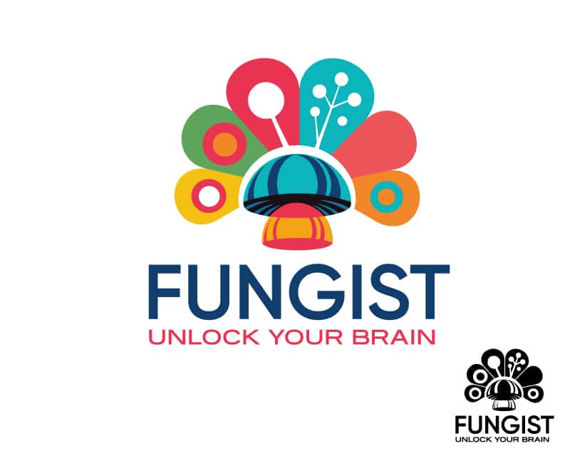
3119227 by marianaa
The brand asked for loud colors and a fun and eccentric logo to match their brand, and this designer delivered. This logo is more abstract than some of the others we looked at.
It is also far from simplistic, using a rainbow of bold colors and several non-geometric shapes. This logo would grab consumers’ attention and be hard to forget.
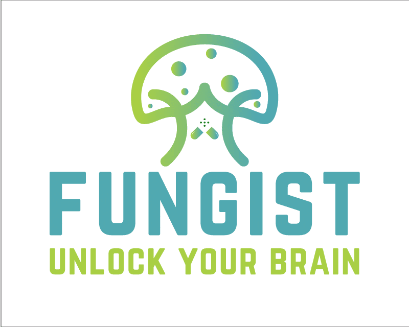
3119527 by Anum
The greens and blues used in this design, especially as a gradient, connect Fungist to science and innovation. The simple line art of the mushroom also has an almost futuristic look. The designer also included a subtle reference to the product’s medicinal qualities with an open pill capsule on the stem.
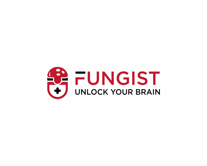
3119740 by Mza
Red, black, and white are often associated with medicine—think of First Aid kits, ambulances, and the Red Cross. This designer leaned into the medicinal properties of Fungist by using this color palette. They also combined other medical imagery—a small cross—with the mushroom and the image of a pill capsule.

3119856 by Tony_Brln
This futuristic design highlights that Fungist is an innovative, forward-thinking company. The light blue and teal gradient easily brings to mind an LED display, especially on the black background.
What stood out about this design was that it included two different backgrounds to show how well it works on both.
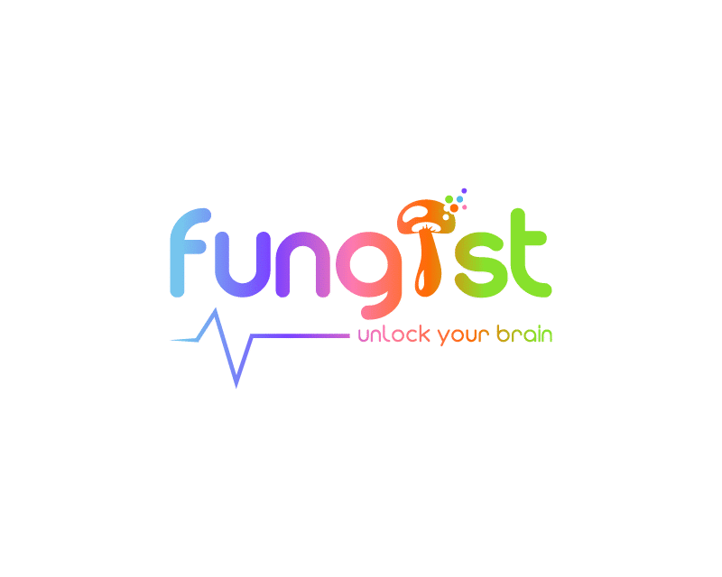
3120246 by Mozzarella
This design stands out from a lot of the others we’ve seen. Instead of picking only two or three colors, this designer used six colors in a gradient to represent a rainbow.
They designed a playful, rounded wordmark instead of a linear, streamlined font. Using an EKG line to underline the word marks was a unique way of showcasing the product’s medicinal uses.
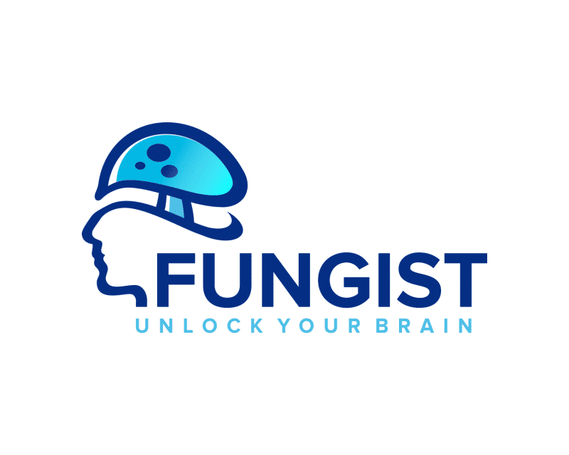
3120251 by agusart
Instead of using a brain for the cap of a mushroom, this designer used the mushroom cap as a person’s brain! This is a unique twist on an idea we’ve seen in other designs. It’s also the only design that incorporates the image of a person.
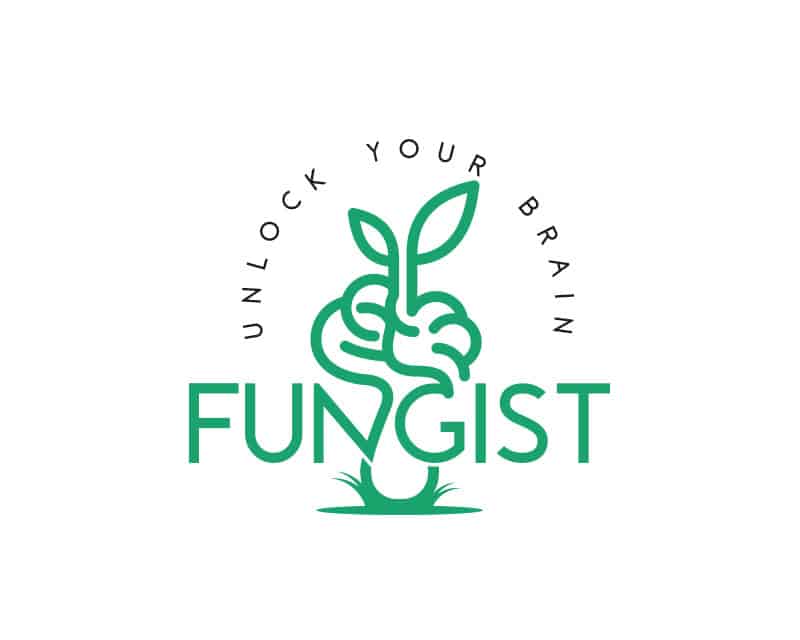
3120365 by bartous
One of the appeals of Fungist is that it provides medicinal and recreational benefits using a natural ingredient—mushrooms.
The fresh green color palette and simple line art of this design give the product a very natural feel. Notice how this designer also used the imagery of a brain for a mushroom cap.

3120459 by Baghusmaulana
This design is abstract and futuristic. The angular, disconnected lines of the word mark emulate a digital display. This designer also chose to use a wide variety of bright, fun colors instead of just one or two.
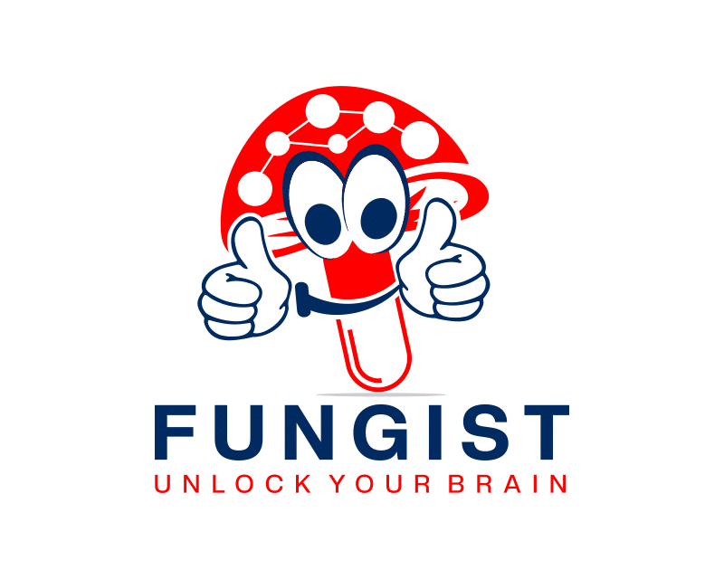
3120831 by sella
Some of the most successful brands use a character or mascot to help sell their product. This desirer created a cartoon out of an anthropomorphic mushroom!
Like some previous designs, this logo uses a pill capsule as the mushroom’s stem. The white spots on the cap look like a collection of atoms in a molecule to highlight the science behind the product’s medicinal properties.
The Winner
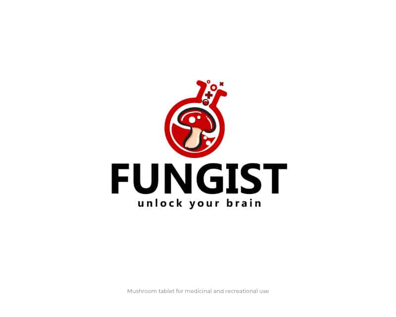
3119195 by FXF Creations
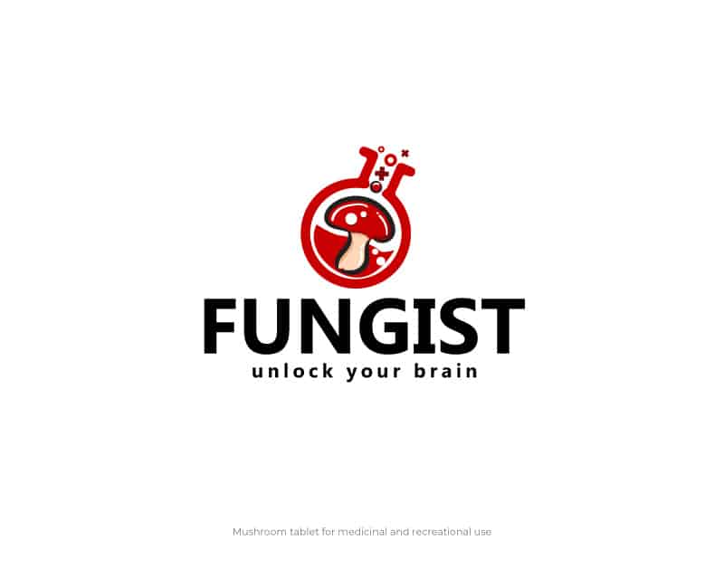
We saw so many great designs in this contest, but this is the one that impressed the team at Fungist the most. Like some of its competitors, it used red and black to create an association between the brand and its medicinal properties.
What was unique about this design was how the designer integrated a beaker to suggest science and innovation.
The winning designer was awarded $230 for this logo.
Check out other (legal) recreational drug company logo contests:
Mr Greens Cannabis – Looking for a logo for a marijuana/cannabis retail location. The name is “Mr. Greens Cannabis” OR just “Mr. Greens” This will be used on buildings, signs, business cards, billboards, and apparel.
Kronik Cannabis – A Washington State legal cannabis producer/processor company named Rochester Farms. Looking to start another brand/line called Kronik Cannabis.
Cannabis Connection – An up-and-coming new legal cannabis store in the BC area. They have a target audience of people who are looking for marijuana for their needs so must be of legal age.
Vapy Wednesday – A growing medical and recreational cannabis market, information platform (medicine, usability, science, etc.), medical cannabis, CBD.
Cannabis Company Logo – A cannabis retailer looking for a logo and name design. The name they are considering should be included in the design.
Popular articles
Browse by category
- Branding and Naming
- Business
- Design
- Entrepreneurship
- How to use Hatchwise
- Logo Design Case Studies and History
- Logo Design Contests
- Website Design Contests
- Company Naming Contests
- Product Naming Contests
- Domain Name Contests
- Slogan Contests
- Shirt Design Contests
- Tagline Contests
- Business Card & Stationery Design Contests
- Custom Graphic Design Contests
- Banner Design Contests
- Brochure Design Contests
- Character & Mascot Design Contests
- Photoshop Contests
- Photo Colorization Contests
- Photo Restoration Contests
- AI Image Prompt Contests
- AI Generated Image Contests