


LeBron James, now one of the best-known basketball players of all time, was picked for the NBA in 2003 straight out of high school.
He has been through many changes throughout his career, but it wasn’t just himself and his team that has changed — his logo has seen some changes too.
LeBron James Childhood
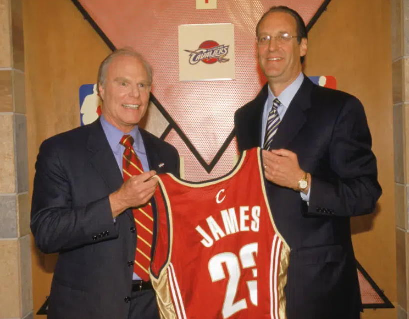
LeBron James was born to be a star. Born on December 30, 1984, in Akron, Ohio, James began showing his basketball skills at an early age. He was already recruited for St. Vincent-St. Mary High School’s basketball team before turning 15 years old.
In just four years, he was able to score an astonishing 2,657 points, 523 assists, and 892 rebounds. He was already averaging 18 points per game his freshman year and led his team through the championships.
By senior year, his average points per game was 31.6 and he eventually became a leading player of the National Basketball Association.
Because of his talents, James was drafted by the NBA in 2003 straight from high school to join the Cleveland Cavaliers.
LeBron James Professional Career
LeBron James’ professional career began with the Cleveland Cavaliers in the 2003 to 2004 season, where he made history as the youngest player and the first in the franchise to win the NBA Rookie of the Year Award.
Averaging 20 points per game, he joined the ranks of Michael Jordan and Oscar Robertson. By his second season, his average increased to 27.2 points per game. James quickly became the youngest player to score 50+ points in a game in 2005.
He led the Cavaliers to multiple playoff appearances, including the NBA Finals in 2007, where they lost to the San Antonio Spurs.
During the 2007 to 2008 season, he led the league with about 30 points per game, and speculation about his free agency status dominated discussions leading up to 2010.
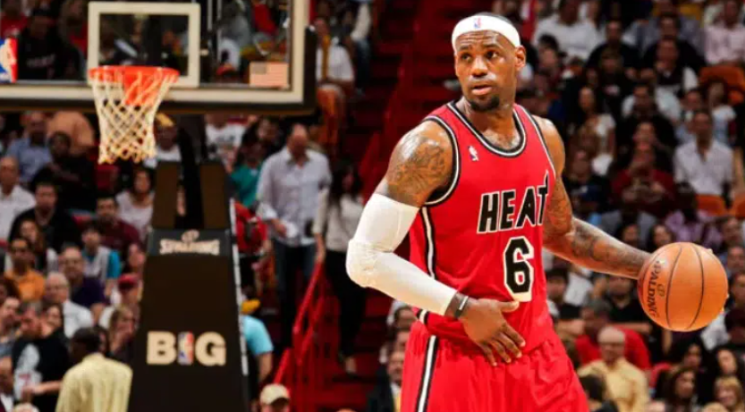
James’ career took a bit of a turn in 2010 when he decided it was time to move on from the Cleveland Cavaliers and join the Miami Heat. This decision caused significant backlash from Cleveland fans.
He won his first NBA title in 2012 against the Oklahoma City Thunder and a second in 2013 against the San Antonio Spurs, becoming the youngest player to score 20,000 points. Despite another Finals appearance in 2013-14, the Heat lost to the Spurs.
In 2014, James returned to the Cavaliers. Despite injuries in the 2014-15 season, he led the team to the NBA Finals. They unfortunately lost to the Golden State Warriors.
However, The following season, he made an extraordinary comeback after trailing 3-1 to secure victory in the NBA Finals against the Warriors and was awarded the Finals MVP title. He continued to lead the Cavaliers to the NBA Finals each year until 2018, although they lost to the Warriors in 2017 and 2018.
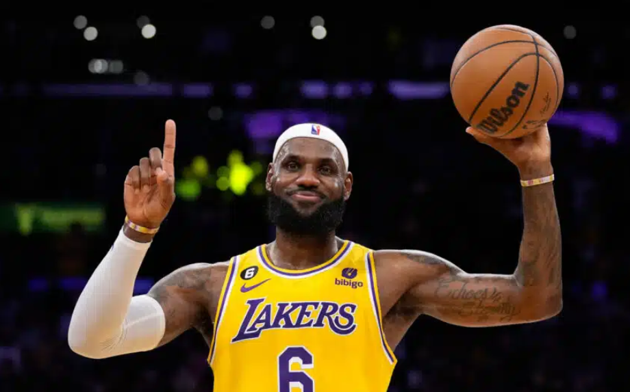
In 2018, James made one more team swap. He signed his name to a four-year contract with the Los Angeles Lakers. His first season was marked by injuries and team struggles, leading to his first missed playoffs in 13 years.
However, with the addition of Anthony Davis, he rebounded and became the first player to have a triple-double on record against all 30 NBA teams in 2019.
The First LeBron James Logo

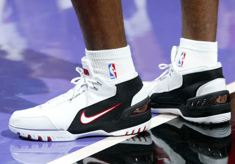
The LeBron James logo was first released in 2003 following a partnership with Nike for the Air Zoom Generation shoes.
Apparently, Nike had been keeping an eye on James before he was even in high school, and this show was already being made before he graduated. This was allegedly the first time Nike had ever done this.
The intention was to present LeBron with the shoe once he graduated.
The logo itself was made of bold black lines drawn into a symbol. This symbol included a small crown on the bottom left side.
It also included his initials and his Cleveland Cavaliers jersey number, 23.
Although the logo was creative, some could find it hard to decipher, which gave Nike some rethinking to do.
The LeBron James Logo Redesign

The first Lebron James logo did stay around for the better half of a decade, but once he switched to the Miami Heat, Nike decided it was time for a fresh start.
Nike’s own brand designer, Darrin Crescenzi, spearheaded this project when he was just a midlevel designer who was just three years out of school. He was invited by David Creech, who was the Nike Basketball creative director at the time.
Crescenzi claimed people within the Nike company had been wanting to change the logo for years because while the original logo was very creative, it was complicated and hard to place on their physical products.
Before he was Crescenzi was officially hired, several other popular agencies and designers were brought on board to help come up with new logo ideas. While they cam,e up with many great options, the company was still waiting for the right time to make the change.

That time inevitably was when James went to the Miami Heat, and his number “23” was no longer relevant. His new number was “6,” making his old number no longer accurate and causing a two-week scramble for creating the new logo.
Crescenzi said the brief he received was simply to design a more timeless “King James” crown that was both elegant and easy to replicate on their products and would remain relevant for years to come despite whatever career changes may unfold.
The Final Logo
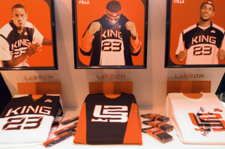
The final version of the LeBron James logo was much simpler and more versatile than the original. It debuted in 2010. This logo was made up of three creatively drawn shapes.
The mirrored letters “L” and “J,” and a crown centered on top of the the bottom curve of the “L” and “J.”The crown was the exact same shape it was drawn in the original logo, and the “L” and “J” — the LeBron James initials — matched a similar style.
The creativity didn’t end there. Although the crown was carried over from the original design, it was a representation of James’s nickname — “King James” — and his status as a basketball icon.
The spacing in the logo also had some meaning to it. The negative space within the logo was designed to subtly reference the shape of a basketball court.
The Lebron James Logo Design Elements
Even though it seems relatively simple, there are many defining features of the Lebron James logo.
The Crown
The crown has been an integral part of Lebron James’ logo since day one. It has been a consistent element in both logos, representing his “King James” nickname and high status in basketball. The nickname was actually given to James before he even made it to the NBA.
It was actually his freshman year of high school that James realized the potential he had for becoming a star. After winning the state championship with his friend, many of the other kids ran around the hotel, referring to him by that name.
Since then, it stuck, and the crown symbol even made it into his first official logo. The exact same crown symbol appeared in his original logo and was retained throughout the years.
The Style
Oftentimes when we talk about logos, one of the main elements that get focused on is the font. For LeBron James’ logo, this doesn’t really apply.
Instead, the designers opted to go for more of a monogram style, where all the elements, including the letters, became a part of one full symbol. This unique approach made the logo even more versatile and gave it the ability to work with whatever colors were needed for the particular product it was to be placed on.
The Basketball Court
The design of the current LeBron James logo cleverly incorporates subtle visual references to a basketball court within the negative space. This creative use of negative space adds depth and layers of meaning to the logo, highlighting the connection between James and the basketball world.
The incorporation of these subtle details not only showcases the thoughtfulness of the design but also reinforces the strong association between James and the sport of basketball.
The Initals
The logo prominently features LeBron James’ initials, “LJ,” which stands for his first and last name. These initials are central to the logo’s design and are integrated in a stylized manner.

The current design blends the initials “LJ” with the crown in a way that is both memorable and representative of LeBron’s brand.
The style they are written in is unique and designed to be versatile, allowing the logo to be used across various Nike products and apparel. James’ initials have always been a central point of his branding.
What We Can Learn From The LeBron James Logo
Although the LeBron James logo was only remade once, many ideas can be gleaned from it.
Keeping It Simple
The first design for the LeBron James logo was creative, but many found it to be overwhelming and hard to incorporate into products. Nike had been wanting to change the lgo for several years for this reason. That is why the redesigned logo in 2010 focused on creating a simpler, more iconic design.
In addition to being more memorable, the new design was easier to use for appealing branded products. It was also designed to work with various color schemes that would allow for more creative freedom in its application across different Nike products. This flexibility is important for a long-lasting brand identity.
Incorporating Symbolism
The logo incorporates multiple layers of meaning. Since the creation of the first logo, LeBron James’ logo has always included the same crown to represent his nickname—“King James.”
His initials have always been a large chunk of the logo design, and later added were subtle references to a basketball court. This strong symbolism makes the logos very distinctly designed for him and helps to create a deeper connection with fans.
Staying Relevant
While the original logo was relevant at the time, it didn’t always stay that way. Including James’s number for the Cleveland Cavaliers worked at first, but it became less relevant when he switched teams, and the number was changed to “6.”
Nike quickly released this, pushing the design to happen fast. The willingness to redesign the logo in 2010 shows the importance of evolving a brand to stay relevant and effective. The new design addressed issues with the previous logo and better aligned with James’s career trajectory.
Creating A Timeless Design
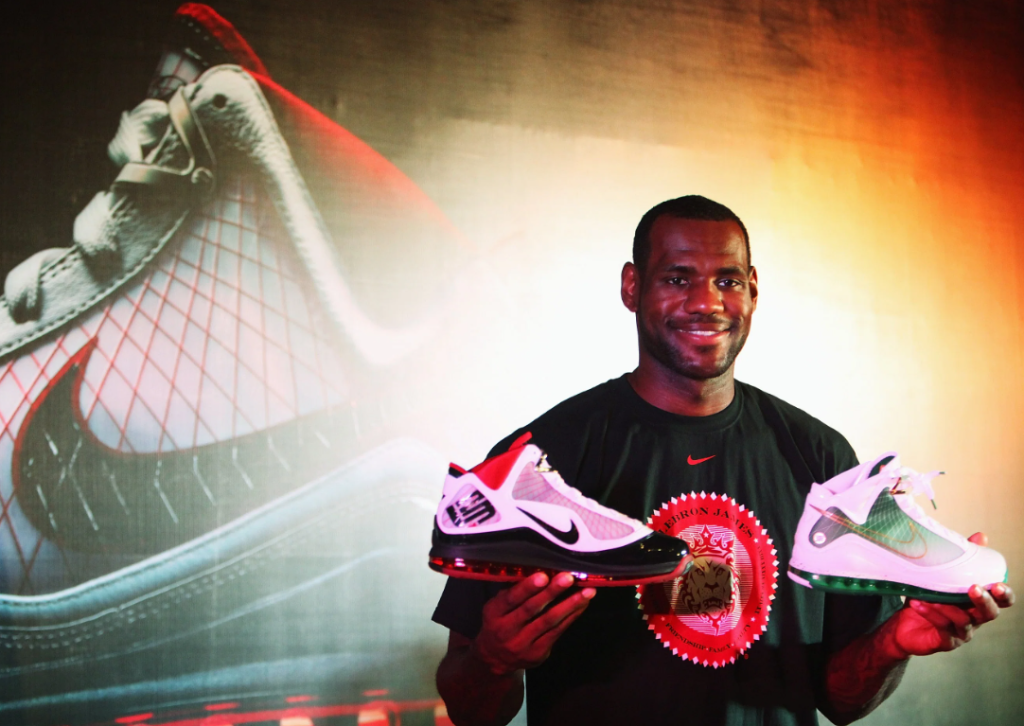
On the topic of the number 23 no longer being relevant, it was a wise choice when Nike decided they wanted to make a less specific logo during the rebranding.
By focusing on core elements of James’ identity, like the crown and his initials, rather than specific team affiliations or numbers, the logo has remained relevant throughout his career changes.
Creating more impactful and timeless logos early on causes less need for changes later. Even today after a couple more team changes, that same logo made in 2010 remains and is still effective.
LeBron James, one of the greatest basketball players of all time, began his NBA career straight out of high school in 2003. Since then, he has had two very memorable and versatile logos that have evolved with his career. The first logo, introduced in 2003 by Nike, featured his initials and jersey number but was more complex. In 2010, coinciding with his move to the Miami Heat, Nike redesigned the logo to be simpler. Today, James a a logo that will remain as timeless as his name in the NBA.
Check out these awesome Logo Contests run on Hatchwise: