


The Walgreens logo has undergone many transformations since the company’s inception in the early 20th century.
Over the years, the brand has successfully maintained its brand identity through its logo, balancing tradition and relevance to modern times.
The History of Walgreens

The story of Walgreens began when Charles R. Walgreen Sr. was working as a pharmacist in a Chicago drugstore.
In 1901, he decided to buy the business and soon began manufacturing a line of drug products that were designed to produce high-quality results at low cost.
In 1909, Walgreen Sr. opened a second store, and by 1916, he had opened nine stores under the name “Walgreen Co.” From there, the business grew exponentially.
In 1922, Walgreens became nationally known for its creation of the malted milkshake, and by 1926, they celebrated the opening of their 100th store in Chicago. Just one year later, Walgreen Co. stock became public.
The company was also credited with setting the tone for future drug store layouts as it celebrated Chicago’s World Fair in 1933 and opened four more stores around the fairgrounds featuring unique fixture designs, colors, and lighting techniques.
When Walgreen Sr. died in 1939, the now huge chain of drug stores was passed down to Charles Walgreen Jr.
Under his presidency, the company saw many more achievements, including opening a 6,000-foot drugstore in the Pentagon, entering foreign markets, adding a self-service section, and becoming the first major drug chain to put prescriptions into child-proof packaging.
The company reached over $1 billion in sales under Charles Walgreen III. Since then, the company has opened nearly 9,000 stores and has continued to expand its products and services and bring them to every corner of the world.
The First Walgreens Logo

The first Walgreens logo was released in 1921. At the time, it had become famous for selling whisky and bypassing prohibition by marketing it as a medicine.
This is why when it created its first logo, it read “Walgreen Co.” with the phrase “Drugs With A Reputation” beneath it.
All of the text was written in bold black text, with unique curved bubble letters with pointed tips for the company’s name.
The phrase “Drugs With A Reputation” was written inside of a scroll-like banner with an uneven serif font.

The 1929 Logo
A second Walgreens logo was released in 1929. This was the year the company began using cursive letters for its typeface.
This new logo featured the same letters and layout as the previous logo.
However, “Walgreen Co.” was written in bold cursive letters and was no longer all capitalized, while “Drugs With A Reputation” was written in more even bold print capital letters.
The design of the scroll has had a slight variation. Rather than having an almost curled, relaxed effect, it was more straight with heavier shading to create a 3D effect.
Most notably, this logo is where the pretzel-like shaped “W” began – similar to what we still see today.
They also made some other choices, such as a strongly curled “C” in “Co.” and extending the bottom of the “g” and “n” in “Walgreen Co.”
The 1931 Logo
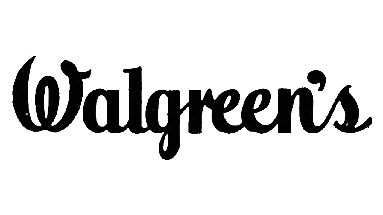
Just a couple of years later, the company decided it was time for another logo change. In 1931, a third logo was released. This time, the ribbon and phrase “Drugs With A Reputation” was removed. Most importantly, this is when the name was officially changed from “Walgreen Co.” to “Walgreens,” as it is still known today. Although the letters still had a unique handwritten appeal, they were straighter this time, stretched vertically, and the extended letters were less exaggerated.

The 1932 Logo
The following year, Walgreens got even more creative with their logo. This time, the logo read “Walgreen” with the words “DRUG STORE” written beneath it in all capital letters. This is the first time the company implemented bright red letters into their logo instead of all-black text. The “Walgreen” also featured a black outline and the “W” partially covered gray medicine masher behind it.

The 1938 Logo
After about six years of the new creative red logo, Walgreens went back to using a much simplistic variation. The 1938 logo was once again written in all-black text depicting the word “Walgreen.” This time, the tails on the “W” and “G” were shorter, and the “W” sat lower than the rest of the text. This is the same variation of the logo that would remain for the next decade.

The 1946 Logo
Although the new official logo wasn’t changed yet, Walgreens did release a special holiday 1946 variation. This logo depicted a black rectangular shape with a bell in the top left corner and text reading “Walgreen’s” with the phrase “YOUR CHRISTMAS GIFT STORES” written beneath it.

The 1948 Logo
The next official logo change was in 1948. It read “Walgreen” in cursive with the words “DRUG STORE” beneath it in print lettering. This variation looks very similar to the logo we see today. The biggest change made in this logo variation was the style of the “Walgreen” text. In this variation, the extension to the “W” was moved to the left side, and a space separated the “g” and “r.” Additionally, this time the letters were slanted to the right. Another variation of this logo was also used this year without the words “DRUG STORE” beneath it.

The 1955 Logo
The 1960 logo looked almost identical to the 1948 logo, except this time, the apostrophe before the “S” in “Walgreens” was removed.
The words “DRUG STORE” were also removed from the logo. However, the exact same style and typeface were used.

The 1960 Logo
Just five years later, another almost identical logo was released.
Instead of the bright cherry red or pale black colors, this logo variation was a dark bold black color.
This same logo would remain for the next nine years.

The 1969 Logo
In 1969, Walgreens made another adjustment to their logo. Much like the last few previous versions, there were no dramatic changes. This time, the logo looked identical to the 1960 logo, only this time it featured the words “THE NATIONS NAME FOR DRUG STORES” beneath it in bold uppercase letters. Italics were used for the word “NAME” and the words were written around the low stroke of the “g.”

The 1981 Logo
Reflecting the change in the drug store’s operations, Walgreens changed its logo again in 1981. In this version, the logo is a large black rectangular shape with the silhouette of parents holding hands with their child in the bottom left corner. On the bottom right side, the logo reads “The Shopper’s Center” in white print lettering. Across the top of the logo was their iconicly styled lettering for “Walgreens.” This entire logo was created in just black and white despite being one of the more complex logo variations. This logo was an attempt to show how the store catered to a large variety of people – both parents and children alike.

The 1991 Logo
For the 1991 logo, the company went back to a more simple and traditional style. This logo looked a lot more like their logo variations in the 1960s, only this time, the logo simply read “Walgreens” with smaller printed and uppercase text below the right side reading “DRUG STORES.” This variation of the logo was simple, modern, and completely black. However, it would only last for about one year.

The 1992 Logo
In 1992, the company swayed back to going for a more detailed and colorful logo approach again, and this time it would last for over a decade. In this variation of the logo, the same style was used for the “Walgreens” letters.
However, this time they were written in bright red. Beneath the text was written “The Pharmacy America Trusts” in a blue serif typeface.
To the left of the logo was the silhouette of a large blue medicine bowl filled with white stars that seemed to be leaving the containers.
Some stars were also drawn exiting the container, where the red instead of white.
This was to represent both the powdered medicine that would have been in the medicine-crushing bowl – otherwise known as a “mortar” – and the company’s growth.

The 2005 Logo
In 2005, Walgreens once again adopted a much simpler logo approach. This time, the new logo was simply their brand name in their iconic font, but this time, it was bright red. All of the additional features were removed from the logo.

The Current Logo
One final change was made to the logo in 2020. This is the same variation of the logo used today. This time, the company made the red color of their logo darker, and most notably, they reattached the “g” to the “r,” making it one full cursive word. Additionally, this variation of the logo appeared to be slightly more bold than its previous versions.
Elements Of The Walgreens Logo
There are many distinct elements that make up the Walgreens logo. Some have been through big changes over the years, while others have remained mostly the same.
Typography

One of the Walgreens logo’s most notable features is its distinctive cursive script font. Although it has undergone many changes throughout the years, one feature it has always maintained is its distinct lettering and handwritten type style.
The Walgreens font primarily consists of a script font known as “Walgreens Script,” which is used in their branding and marketing materials. This font is characterized by its cursive style, giving it a friendly and approachable appearance while still maintaining its deep historical roots.
Colors
Throughout the years, Walgreens has predominantly used black, red, white, and blue for its logo variations. Most variations of the logo have either been in a bold black color or bright red.
These colors are used to create a more eye-catching appeal with high contrast. Specifically, the Hex code for the red color used today is #ef2729. This color is often used in logos to create a more energetic feel and is also commonly used to represent health and alertness.

Symbols
Walgreens has experimented with adding different symbols to their logos over the years.
Today, the brand is still commonly associated with its mortar, and there are even some smaller logo variations depicting the iconic “W” in just that.
They have also experimented with other symbols, such as parents holding hands with their child, banner scrolls, and even Christmas decor. Each of these symbols has reflected the growth of the brand and changing times.
What We Can Learn From The Logo
Strategic Color Schemes
Walgreens has been a prime example of the power of making the right color choices in logos. The brand has always gone from more striking colors, whether it was more contrasting color schemes of black and white or more bright, energetic colors like red.
The blue, which has also been used in some of the logo variations, is also associated with trust, safety, and professionalism, making it another common color among health and wellness brands.
Altogether, these colors have helped shape the logo we see today and gave the brand a strong visual identity.
Using Iconography
The use of iconography in the past, such as the mortar of a family with their child, helped establish a strong association with pharmacy services made for everyone of every age.
These logos have been used to help effectively communicate the brand’s message, history, and services. They are what made some of their older logos more memorable and meaningful even today.
The logo is still widely recognized today by its mortar symbol, which is still sometimes used for its shortened logo variation.
Staying Consistent
Despite changes over the years, the Walgreens logo still has many of the same core elements it did early on, such as its distinct typography and color choices.
These core elements have helped the company remain highly recognizable over the years and carry a part of its history with it even as the brand itself has changed.
Adapting To The Modern World
Although the brand has done a good job at maintaining many of its original features, it also knew when it was time to adapt and make more modern changes. This helped them stay relevant and fit in with new trends that would help gain them more attention.
Each logo, from intricate initial designs to the modern, minimalist appearance of today, has reflected the current trends of the time period in which each logo was made. This adaptability allowed the brand to remain both current and attractive even more than 100 years after it first began.
The history of the Walgreens logo shows the power of strategic design and thoughtful branding. By using color, symbols, consistency, and staying adaptive, Walgreens has created a logo that has lasted and resonates with customers even nearly 125 years after the company’s founding.