Home / Blog Posts / Featured Design Contest: Finagy – Financial Services Logo

The Finagy Logo Design Contest was held on Hatchwise, a website that connects companies seeking creative services with creatives from all over the world. Finagy was looking for a distinctive logo that would capture its spirit of innovation, reliability, and professionalism in relaying its financial services.
Let’s examine the designs that were submitted in more detail and discover the inventiveness, diversity, and originality that this competition produced.
Finagy is a leading provider of electronic financial services and a division of TOSD Corporation. Their emphasis on effectiveness and simplicity is a reflection of Finagy’s elegant design aesthetic.
Individuals, companies, and organizations searching for simple and safe electronic fund transfer options make up their target market.
The requirements for the logo were very clear: it needed to be simple, uncluttered, and not overly intricate. The designers’ approach was influenced by Finagy’s minimalist philosophy. Funky fonts were strictly prohibited because they didn’t fit with the company’s sophisticated, minimalist aesthetic.
The contest was brightened by the black-and-yellow color scheme. The black color indicates refinement and authority while yellow expresses positivity and creativity. This dynamic combination realized Finagy’s goal.
The Finagy Logo Design Contest received 719 entries from creative designers worldwide. The entries showed Finagy’s essence in different ways, demonstrating creativity. The winner would receive $230, a worthy reward for their originality and innovation.
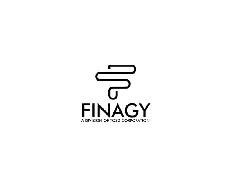
The first Finagy logo contest entry embraced simplicity amid a sea of creativity. This entry included a brilliant black unfolded file pin. Standing tall, the pin symbolized strength and stability.
With “Finagy,” prominently written in black beneath the emblem, this design conveyed professionalism and clarity. It stood out from the competitors because its simple approach captured Finagy’s electronic funds transfer services.
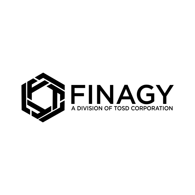
This logo features a sleek black hexagon on a clear white background. The logo has “Finagy” in bold, symbolizing accuracy and invention. The hexagon, inspired by its stability and efficiency, represents Finagy’s streamlined electronic payment transfer. Modern simplicity makes this logo appropriate for Finagy’s services.
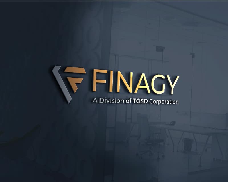
Finagy’s commitment to financial advancement is symbolized by this stylish black and yellow design with a symbol of being equal or greater than. The black “Finagy” proudly stands in front of the sign, while the white motto powerfully conveys Finagy’s affiliation.
This design has a strong emphasis on the hexagon symbol, which radiates refinement and style. In front of the symbol, the bold “Finagy” shines out.
A touch of classic elegance is added by the black-on-white background, signifying Finagy’s dedication to class and simplicity.
The fifth design is a sleek circular emblem with a contemporary letter F that represents originality and creativity. In front of the emblem, the dark, powerful word “Finagy” stands tall and exudes strength.
A hint of refinement is added by the traditional black-and-white color scheme, which represents Finagy’s ageless appeal and modern outlook.
With its “Greater or Equal to” emblem, the sixth design radiates inclusivity and confidence. With a stunning black backdrop, the predominant yellow color indicates positivity and innovation, highlighting Finagy’s audacious attitude in the financial sphere.
An open box with a folded edge takes center stage in this design, signifying development and potential. The word “Finagy,” which is tastefully rendered in white, appears boldly in front of the emblem, conveying inventiveness and clarity.
Beneath, a well-placed tagline provides depth against a background dominated by a harmonic combination of white and yellow, representing Finagy’s innovative approach and boundless possibilities.
The central element of this logo is a classic hexagonal symbol that stands for balance and stability. The word “Finagy,” displayed with confidence and elegance in black, rests elegantly in front of the emblem.
Finagy’s design is dominated by the timeless black-and-white combination, which perfectly captures his dedication to subtlety and clarity.
In the following design, a flexible, innovative cube-hexagon icon takes center stage. The big word “Finagy,” in front of the image, conveys strength and clarity.
The vivid yellow and black against a clean white backdrop symbolizes Finagy’s dynamic approach and financial adaptability.
This design radiates sophistication and expertise with its elegant letter F enclosed in an upright rectangle. Beneath this emblem, the term “Finagy” and a skillfully composed tagline rest elegantly.
The design is dominated by the classic black and white color scheme, which represents Finagy’s dedication to fintech sophistication and clarity.
Two stylish Fs in this design blend to create a vivid hexagon. The colors sky-blue and yellow stand for optimism, inventiveness, and trust. In front of this chic emblem, the word “Finagy,” rendered in a brilliant white, rises tall, exuding modernity and clarity.
This logo perfectly captures Finagy’s innovative solutions mixed with a solid foundation of reliability.
Here, the letter F becomes a sophisticated icon, blending simplicity and complexity. The word “Finagy” is placed in front to show confidence.
The timeless appeal of the logo is enhanced by the traditional black-and-white combination, which represents Finagy’s dedication to elegance and simplicity in the financial sphere.
A finely constructed circular icon that radiates style and sophistication takes center stage in this design. The confident and clear “Finagy” is softly imprinted below in an exquisite manner.
The design is dominated by the timeless black-and-white color scheme, which represents Finagy’s enduring class and competence in the financial industry.
In this design, the letter F becomes an exceptional symbol, demonstrating the ultimate simplicity. Beside the emblem, the phrase “Finagy,” arrogant and self-assured, radiates professionalism.
The icon’s vivid yellow color draws the eye, while the rest of the design, which is all white, highlights purity and clarity. This design exemplifies Finagy’s dedication to quality and simplicity.
A carefully made circle blends black and yellow in the 15th design, expressing energy and sophistication. The confident “Finagy” stands opposite the vivid insignia and the slogan provides depth and clarity.
This logo stands out in the financial world and represents Finagy’s dynamic approach and dedication to excellence.
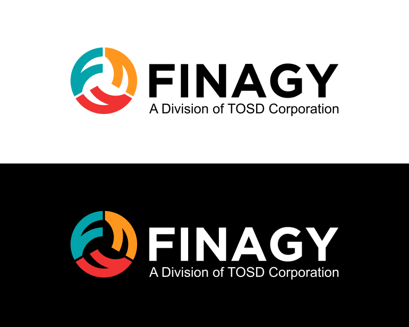
Artfully combining three bright letter Fs into a circle, the winning design is simple and creative. Red, green, and yellow represent passion, growth, and creativity. Finagy, bold and dominating, dominates the circle. The slogan below elaborates on the company’s vision.
This unique design comes in two versions: one with a clean white background for clarity and the other with a dramatic black background for refinement. Finagy’s broad approach and innovation set it apart in finance.
Check out other financial services and investment Logo Design contests:
One Realty Group/ One Investment Group – Real Estate company targeting listings. A unique way of selling homes. Within one week or one weekend.
Valorem Investment Partners – Identifies real estate investment opportunities, performs analysis of such opportunities, and raises capital for such investments from high-net-worth investors. The property type will be apartment properties. The target audience is the investors, who we expect to be over 40 years old, financially successful, and sophisticated.
MLT Investment Group – Real estate investments, property management, and buy/sell.
Global Alternative Investment Management, LLC – Global Alternative Investment Management, LLC is a private fund management company that creates and manages private funds that make opportunistic investments in areas such as Technology/Big Data, Social Media, Cannabis/CBD, Specialty Retail, Fintech (banking, crypto, consumer finance), Telecommunications Infrastructure (cell towers/submarine cable-fiber optics), for its accredited (high net worth) clients.
Y-Invest Enterprises – Y-invest is an umbrella holding company for various business ventures including real estate, online endeavors, and other entrepreneurial opportunities.