

- BACK TO CONTEST
- CREATIVE BRIEF
- ENTRY # 22990


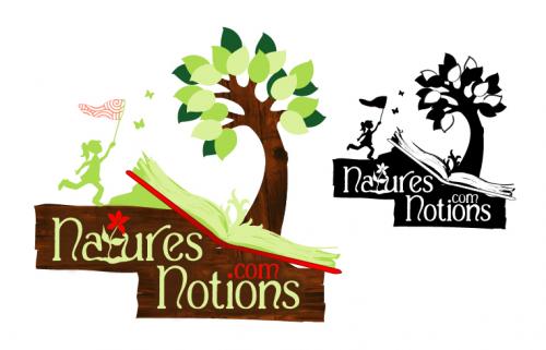
Comments for entry # 22990
Hopefully, you can see this comment. I like this font better than the other versions. 1. Make the letters white. 2. Pull the "m" of ."com" off the book cover but keep it in line with the dot in the "i". 3. The book pages has some green blots in them on the edges and through the book. Can be make them a bit finer by alternating color and create the illusion of more pages? 4. It would be nice to try the butterflies soft yellow or soft orange just to see what happens. 3.
This font might be too formal for the overal feel of the design. From a distance you cannot even tell between the light green and the white, but up close the white make a big difference. Just not sure I like the white. Right now it's a toss up.
Here is a variation with a different font.
Browse other entries from this Logo Design Contest


Fast. Awesome. Affordable
About the Creative
8
Similar Entries