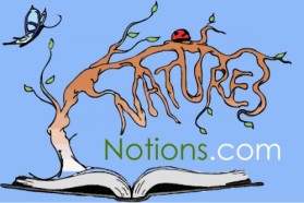
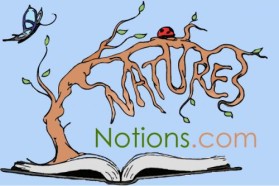
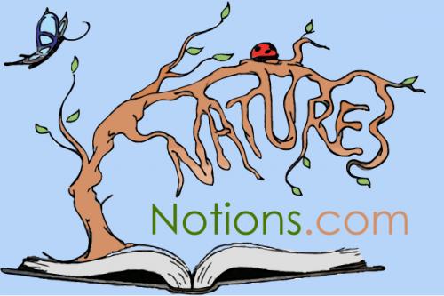
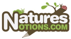
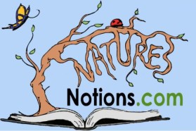
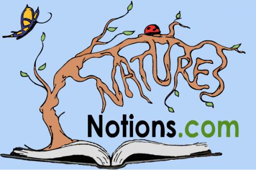
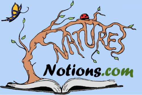
Logo Design Contest

www.naturesnotions.com

by author

Contest received 321 entries and the contest holder has awarded a winner.

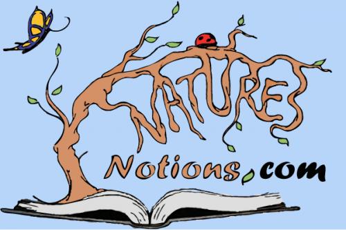
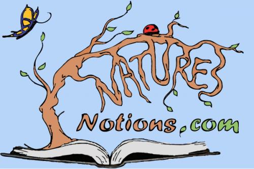
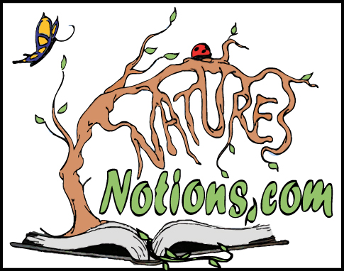
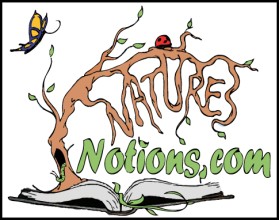
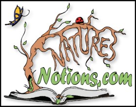
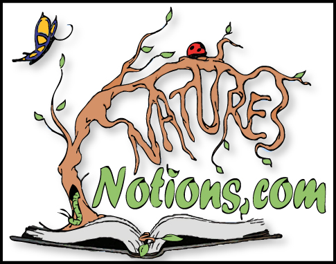
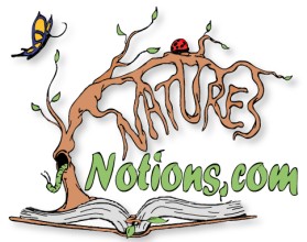
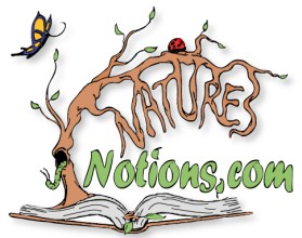
Winning entry by B.T.Klemensowski

Congratulations to winner B.T.Klemensowski ! They were awarded the contest prize of $250.00

Discussion:

user-image
author Contest Holder
Note to everyone. I will be very "interactive" with this contest so everyone is able to achieve potential success. It is my hope that some effort will be put forth. I'm not interested in a hodgepodge of "canned" graphics seen in so many of these web contests. You MUST be original. Thanks in advance!
user-image
author Contest Holder
Thanks for the entries thus far. I'm going to commment in general as to not target anyone specific. I've been in computer science for 35 years and had Photoshop since the mid 90's. I can spot "canned graphics" a mile a way being a webmaster myself and having created my share of professinal icons (hacks). The point is, I cannot DRAW or ILLUSTRATE. I suck at it. I can munge here and there, but that's not the look I need and this is for "me", not my profession. I'm seeing a little of this here, but I'm also seeing the "canned" look too. (See my next comment for more clues...)
user-image
author Contest Holder
Clue/Idea: This is about "writing" so I have been waiting to see a leaf stem, confier bough for something like that with a pencil coming out of it. Wood to wood transistion. It could even be possbily writing NaturesNotions.com on the landscape, around a border or something.
user-image
author Contest Holder
Other initial observations: 1. I've seen some drop the ".com" from the grahpic. I'm going to "brand" NaturesNotions.com. I already have a pending trademark for "Natures Notions" itself. So, it's very important to keep this in mind. 2. Some of the logo are too wide. This is site on the left corner of a web site, on the upper corner of a business card, etc. So, please consider this.
user-image
author Contest Holder
Okay, a few more tips:
user-image
author Contest Holder
Okay, a few more tips: 1. Though it makes sense to put that "apostrophe" into Nature's I'm branding it as a web site name, which has none. In my pending trademark it's indeed there as it should be for a textual name. Please do not use it. 2. If you notice in the early going here, we have three people with a score of 3. 2 out of 3 of them are somewhat "sketched" which is the feel that I'm looking for. The other is more percise and clever, yet conveys things better. THIS IS WRITINGS FOR CHILDREN/YOUNG PEOPLE ABOUT NATURE. Thanks for everyone's effort thus far.
user-image
author Contest Holder
Everyone: 1. Giving the logo a bit of "fantasy" would be okay as long as it conveyed the outdoors an the writing. 2. You can even stack the name to work thing out in your design and keep it tighter. Thanks again!
user-image
author Contest Holder
Everyone: This has been another busy day and I have awarded some 4's. I need to clear a few things up: 1. When I refer to "floating" the image I really meant it needs to sit on a common colored or transparent background so I can integrate it as web site banner logo on the left so it appears "suspended". 2. In reality all I want it the image and not the supporting background unless I can match that color to the banners background. In other words, it the graphic is irregular in shape than cropping just that is appropriate. 3. Also aspect size/ratio needs to be compact enough to get this logo on a business card or a web site corner without dominating, which means in many cases (designs above) that the name needs stacked to fit. However turning it into a total square for the sake of this would not be good either. A little tradeoff both ways would ultimately work. I want to really thank everyone for their efforts!
user-image
author Contest Holder
Designer's: I have mentioned to some of you that my daughter will be helping me with the decisions regarding the logo's. We will attempt to review new entries every evening and I will provid any feedback possible. This may not happen till 9:00 P.M - 10:00 P.M PST and I may not get my individual comments posted till the next morning. It just depends on how soon she calls, when I can post to you talented people. Thanks for your understanding.
user-image
author Contest Holder
I'll try to keep up with these entries, but I do go back to work today. One thought I woke up to last night was that the background color may need to change for any given graphic depending on the "theme" used in my banner/header strips/widgets, etc. - so there is a consistent look and feel to things. Now, I can easily do that myself as long at the background layer is not "merged" with rest of image. I can flatten it myself. I doubt background gradients will work. Encapsulated logos (seals, etc.) without the "open" backgrounds will not pose as much as a problem. I have not "decided" on my color theme yet, though some of your logos are steering me in a particular direction. Thank You.
user-image
author Contest Holder


!!!PRIZE MONEY!!!

Designers: My daughter and I have decided to award a 2nd and 3rd place prize -- as long as the winners still agree to giving up the graphics and all rights for the allotted prize monies awarded. (eLogoContest has agreed to this and will disburse the prizes.) 1st Place: $275 (+$25 more) 2nd Place: $175 3rd Place: $125 We intend to showcase your winning graphics and user names on our site along with the contest URL link by eLogoContest. Of course first place will also grace our landing/banner page on the webblog site and the winners will have our permission to reference our site www.naturesnotions.com (once built) as part of their online portfolio. We really appreciate the efforts and creativity many of you have shown here. Thank You

user-image
B.T.Klemensowski Creative
...NICE!
user-image
author Contest Holder
Designers: We are nearly at the halfway point and I must say this has turned into quite a project for my daughter and me. A bud of thought is blooming with these graphics. Many have put a great deal of effort into this and most of you really seem to enjoy this. I'm learning a great deal. Here's some considerations: 1. We will need a "vector" graphic so I can resize it to a thumbnail and not loose the image's perspective. At least that's my understanding. 2. I'm going to print off some of the 5's and a few 4's to see how they look on a color printer. This may provide me further insights and reality. Thanks for all your comments and efforts.
user-image
author Contest Holder
Designers: I'll be off the grid later today (Friday 10/20/09) as I must go out of town for 1/2 a day. I will probably get to see my daughter in person and we may look at these together before I leave. So, my comments may not be a timely today. Thanks.
user-image
author Contest Holder
Designers: Also wanted to mention that I'm counting COLORS now. Less is more in this area and will have an impact on the winning decisions. Simple designs with about 5 colors that convey the feel we are looking for will be optimal. Take Care
user-image
Machineman Creative
Some really great entries in this one! :) congrats!
user-image
author Contest Holder
Machineman: Yes, there are some really GREAT entries here already. It’s going to make it VERY difficult to choose winners. We did not expect to find this much talent in one place on the web. We feel very fortunate.
user-image
author Contest Holder
Designers: Clearly those of you who have been actively engaged in this contest are catching on fast as to what "works". I'm awarding 5's everyday now. We expected to have about 2 - 3 images we liked, but after 1/2 the contest is over we like 7 already! When the contest is over, we may need a day to sort this caliber of work out and PM those we pick to see if you are willing to accept your prize. Then we will post the winners for all to see as well as flag the overall contest winner. Thanks
user-image
author Contest Holder


!!!PRIZE MONEY AMENDMENT!!!
Designers: We have decided to amend the prizes awarded so that we can own a nice portfolio of logos for the web world to enjoy in the future and hopefully aid us in our viral marketing ideas. We plan to award ONE prize per user and will PM them as to whether they will accept the prize monies and terms via eLogo. Then all prize winners will be posted in the comment area of the contest and the 1st place winner flagged for the contest. (We will reserve the right to add a 6th & 7th place prize.) 1st Place $275 2nd Place $250 3rd Place $225 4rd Place $200 5th Place $175 ----------------- 6th Place $150 (optional) 7th Place $125 (optional) We believe this is a very equitable arrangement for everyone given the financial upheavals in our world right now. We only ask that you allow us some time to ascertain the entries and their awards. Thank You

user-image
author Contest Holder

Designers: Please note that we take your work very seriously and appreciate all your ongoing cooperation in maturing these logos. This does not mean we always know what we are doing. So, please don’t hesitate to provide us input where appropriate. My advice for any newcomers or existing designers who haven’t scored well – please take a look at the posted scores of 5 to get a sense of what we “feel” will work. Thanks