

- BACK TO CONTEST
- CREATIVE BRIEF
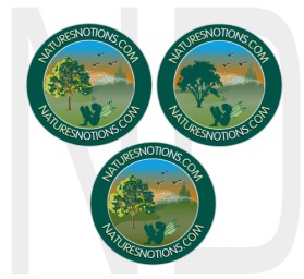
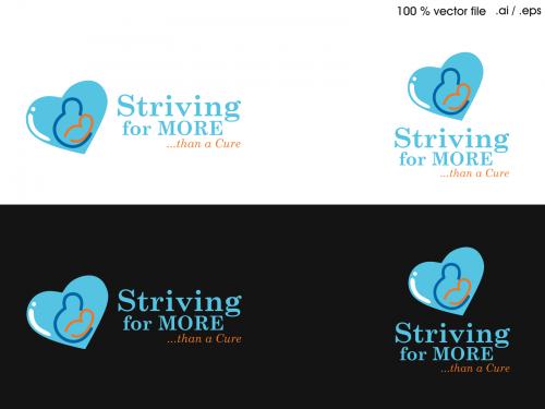
- ENTRY # 22327


Comments for entry # 22327
but i think it's only fair that we understand that you are buying it NOT as the primary logo for your company. in fact, i'm not really sure why you even want it.
sure, if you'd like the logo for $50, it's yours.
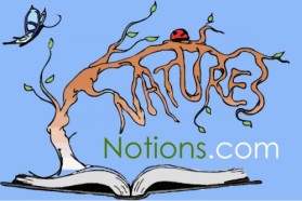
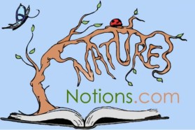
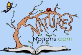
Yes, to everthing you just said. Especailly the twig touching the water and the stack "N"'s -finally. It does improve this simple, but effective them. Not sure what my dauthter's going to think but I can't deny its visual value at this point.
I took a look at this last night and decided to go with the caps. I really like the way the N's stack, and I've made the "water" below a bit larger. I think it's important for the left edge of the blue to be touching the edge of the twig "pen" so that it implies writing...And I think this is now at a good place, with the bit of whimsey combined with the simple readability. I hope you agree.
Browse other entries from this Logo Design Contest


Fast. Awesome. Affordable
About the Creative
1
Similar Entries