

- BACK TO CONTEST
- CREATIVE BRIEF
- ENTRY # 22299


Comments for entry # 22299
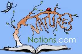
Yes, I just go some advice from another experienced logo designer awhile ago not to get too carried away with the colors and such. So, you are 2nd one in an hour now. I confess, I've helped evolved some of those "fancy" ones. And yes, we both like some of them. Not many though. And, I can clearly see those that are very "focused" on the logo concept - keep it simple and to the point. Having said that, is there anything in this logo of your that would prefer to do? 1. On my end, the water trail could be as short as the end of .com. 2. The water trail could even be pulled up closer to the name almost like an underline, but keep that first part under the globe alone. 3. Maybe capital "N"'s, but that's up to you. This is a clean, simple and efficient logo and it does appeal to me now.
i've incorporated all of the positive elements that you liked into this one option. i must say that as a professional who has designed logos for over 20 years, there are several that you seem to like that have extensive detail to them that in my experience go against everything that makes a good logo. i sincerely hope you find something that you and your daughter like!!!
Browse other entries from this Logo Design Contest


Fast. Awesome. Affordable
About the Creative
1
Similar Entries