
Logo Design contest
www.naturesnotions.com
Awarded
Congratulations to winner B.T.Klemensowski ! They were awarded the contest prize of $250
Prize Awarded
$250
Creatives
7
Entries
321
Contest Views
24,010
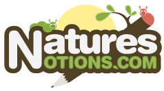
Winning entryby B.T.Klemensowski
Creative Brief
What the contest holder asked for
- Company or website name
- www.naturesnotions.com
- Slogan or Tagline
- NO
- Describe your company and organization and target audience
- 1. Keep the name outside the illustrated logo on embedded on the border, so it's distinguished. 2. You may break up "Natures" & "Notions" to keep things more compact, if necessary. 3. Have green or shades of green is essential. 4. Logo should appe
- The design should have the following
- I would like an illustration-like logo that has a fun look to it, but conveys nature well. I doubt that abstract will work, but cookie-cutter graphics will not work either. One must be inventive here.
- This logo will be used for
- -
- This design should not have this in the entries
- Children, young adults mostly, but some writings will be appreciated by adults too.
- These values are what the logo should communicate
- -
- What style of logo would you like?
- -
- Colors to use in the design
- 1. This one is fun, has an open background, no embedded name, some green, colorful, and not square. http://www.elogocontest.com/entry_detail.php?contestid=316&entryid=19334 2. This one has an atypical shape, practical, fun, some shade of green, outdoorsy, and a offset name. http://www.elogocontest.com/entry_detail.php?contestid=316&entryid=18667 3. The trees, the green, the open background, simplicity. The name is offset too much for a logo though. (This image does not belong to me!) www.naturesnotions.com
- Other Facts
- -
- Upload files
- -
- Briefly describe your contest
- The Notions of Nature Through Writings