

- BACK TO CONTEST
- CREATIVE BRIEF
- ENTRY # 22526


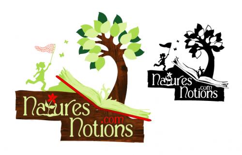
Comments for entry # 22526
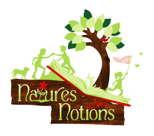
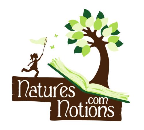
Thank you for your comments. I made changes to my design using your suggestions. Let me know what you think!
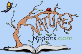
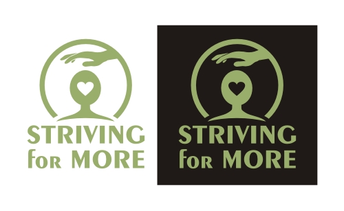
This is pretty and does convey the message. I think this: 1. Too much green or too many green people. 2. Hard to read the actual name with the colors and the arrangement and special graphics. 3. The bird in the tree is unnecessary. 4. It's just TOO BUSY. (Less is more.) As a side note, the tree and the leaves are very nice.
Browse other entries from this Logo Design Contest


Fast. Awesome. Affordable
About the Creative
8
Similar Entries